Tuesday, November 21, 2023

User Experience Evaluation of Indian Passport Seva Website using Nielsen's Usability Heuristics

By Amit Morade


Introduction:

The Passport Seva Website is an important platform for passport applications across India. Almost every citizen of India would at least once visit the website. Having such a huge user base, improving the user experience (UX) of the Passport Seva website is crucial for enhancing efficiency and user satisfaction. I have used Nielsen's 10 Heuristics to gain valuable insights into the usability issues of Passport Seva website. For each issue identified, I have tried to provide a solution that can effectively address these problems, provide severity rating to detect problems that need more attention and that needed to be fixed immediately, and significantly enhance the website's usability.  

The problems are categorized into different severity levels as low, medium, and high.

The green boxes in figures indicate proposed solutions and red boxes or red arrows highlight the problems.

About Passport Seva Website:

Passport Seva enables simple, efficient, and transparent processes for delivery of passport and related services in India. This project creates a countrywide networked environment for Government staff and integrates with the State Police for physical verification of applicant's credentials and with India Post for delivery of passports.

What is Heuristic Evaluation:

It is a method used for identifying problems in user interfaces, and to measure the usability of user interface designs. The evaluation is performed based on a certain set of guidelines that are aimed to make systems easy to use. I have used Nielsen’s 10 usability heuristics, a set of guidelines considering human behavior, psychology, error handling capability to assess usability of Indian Passport Seva Website.  


Fig. 1: Nielsen 10 Usability Heuristics


Passport Seva website usability issues:

Problem – Password policy is not directly visible to the user and user cannot view entered password.

Fig. 2: Password policy not visible, entered password cannot be viewed.

Issue: -

The website uses some rules to setup the password. These rules are not displayed directly on the page, but the user must click a link that opens a dialog box displaying the password policy. This reduces users’ efficiency, and the user must remember the password policy and enter the password accordingly. The user is also unable to view the entered password. Thus, while keeping the password policy in mind the user also has to remember the new password resulting in increased cognitive load on users memory.

Severity: High

Heuristic Violated: Recognition rather than recall and  Consistency and Industry Standards

Proposed Solution: - 

Fig. 3: Solution with password view button and password policy visible

A more feasible and efficient solution would be to provide the password policy information next to the password field so that the password requirements remain in front of the user as the user enters the password. Providing a clickable button to toggle the visibility of the password will help to check if the user has entered the right password giving more confidence on his actions.

Problem – Browser back button does not work to navigate between pages.

Fig. 4: Browser back button does not work to go to previous page

Issue:

The website does not use browser default back button to navigate to any previously visited pages. All modern websites make use of browser’s default back button for navigation. Also, no message is if browser back button should not be used. For instance, to change the district after selecting it, the user had to navigate to the “Applicant Home” page and then redo all the process. This may irritate the user. Also, upon selecting the “district” field value the form automatically gets submitted and the user is directed to the next page for further information. This takes away the control from the user. If the user mistakenly chooses the wrong district then he won’t be able to update it and since there is no back button to revisit the page and change the form, he will have to restart the entire process which could be very annoying for most people.

Severity: Medium

Heuristic Violated: User control and freedom and Visibility of System Status.

Proposed Solution: -

Use browser back button same as all the modern websites do for navigation, else provide a physical back button (specific to the site) to navigate to previous pages. If the website expects the user to enter the “district” details only once, then they should have provided a message for user that “You cannot modify the below information”. A button should be provided so that user can navigate to the next page after he has entered the required information.

Problem - Repetitive Information resulting in cluttering and reduced efficiency.


Fig. 5: Applicant home page cluttering with small font size and repetitive information

Issue 1:

On the home screen, the user can see the page is divided into 2 parts, “Services” and “Applicant Home”. All the information listed in the right section i.e., under “Applicant Home” is also displayed in the left section under “Services”. This way of putting up the information is confusing because when clicking on a link, there is an implicit assumption that the link in right section will be the correct link and not the one displayed in the other section. This issue could be a serious problem, especially for new users resulting in frustration, and difficulties in navigation.

Severity: Medium to High

Issue 2:

The font size is also very small, and it is difficult to read the information correctly because this view appears to be cluttered making it challenging for users to navigate and absorb information quickly. It might cause strain on the user’s eyes and might reduce user’s efficiency to find and locate information.

Severity: Medium

Heuristic Violated: Aesthetic and minimalist design and Recognition rather than recall   

Proposed Solution: -

All this information could be displayed under one heading with the most visited or the most important links being positioned at the beginning of the list. This way users might feel easy to find what they need without having to decide between sections. By displaying all the information(links) under one heading, there will be more room on the page and so this information could be displayed in a better way with increased font size and spacing between individual links.

Problem: No hint/help provided to understand the meaning of shortforms used.


Fig. 6: No help documentation provided for shortforms used

Issue:

The website has used some shortforms such as “PSK/POPSK/PSLK” without providing any help to understand the meaning of these terms which may cause confusion for the user. Use of such unfamiliar text would make it difficult for user to take further actions and without any provided help the user will have to figure out their meaning by themself, reducing efficiency and increasing time to complete the task. Also, the “Click here” links are not easy to identify.

Heuristic Violated: Help and Documentation and Match Between System and Real World.

Severity: Medium

Proposed Solution: -

Fig. 7: Solution with help documentation, next button and updated click here link

A message could be displayed somewhere below the form like “Click here to know more about PSK/POPSK/PSLK”. This can provide immediate help on unfamiliar terms, making the user feel confident and in control of their next actions. Users will have more control over their interactions with the website if clear messages are given to them.

Problem: Finding payment amount and payment status information is difficult.

Fig. 8: Payment amount missing, success message hard to find

Issue:

Finding the payment success information is difficult. The font used is very small and the light green color which is used for success message is undervalued by the red text that is dominating the screen. Also, the information about the payment amount is missing.

Severity: Medium

Heuristic Violated: Visibility of System Status and Aesthetic and Minimalist Design

Proposed Solution: -

Fig. 9: Solution with payment amount and payment status icon

A more intuitive way of putting the success message could improve readability. A recommendation would be the use of a green tick icon with a “payment successful” message and a field showing the amount paid that gives the payment status enhancing visibility, providing more clarity and confidence to the user about the successful completion of the payment task. The green tick icon will grab user’s attention allowing user to quickly identify success status without the need to navigate or search for information. Displaying payment amount will provide user with the needed critical information preventing any confusion about transaction status.

Conclusion: -

The Indian Passport Seva website has some minor drawbacks in the user interface and design with respect to the Nielsen’s heuristics mentioned above. I have tried to provide some solutions for each of the problems discussed along with their severity. With implementation of recommended solutions, it would result in increased user efficiency and enhanced user experience with the website. 

Acknowledgements: - 

To make the grammatical corrections, enhance the overall quality of the content and address potential language-related concerns Grammarly was used.  

References: -

[1] https://medium.com/@sef.gustingurah.yama/visual-design-the-face-of-your-apps-67a03427824f

[2] https://www.nngroup.com/articles/ten-usability-heuristics/

[3] https://www.passportindia.gov.in/AppOnlineProject/welcomeLink#

[4] https://app.grammarly.com/


Usability Evaluation of Microsoft Teams: Focusing on Text Chats and Video Meetings

 By Behrad Moeini

Microsoft Teams: Crucial for Remote Collaboration

In today’s era of remote work and virtual classrooms, tools like Microsoft Teams have become indispensable in bridging the gap between colleagues and classmates worldwide. Despite its widespread adoption, there's always scope for enhancement in such platforms. In this blog post, I have assessed Microsoft Teams using Nielsen's heuristics, a set of established usability principles, to identify areas where it can evolve to more effectively meet our changing needs. This evaluation spans from the intuitive ease of text chats to the seamless flow of video meetings, with each facet offering potential for refinement. My exploration is not merely a critique but a pathway to improvement, guided by the principle that our digital tools should not only meet but anticipate and adapt to our evolving demands. This approach offers a structured and systematic analysis, ensuring that the critique is grounded in proven usability standards.


Text Chat: Finding and Fixing Issues

Issue


Fig 1 –  Inefficiency in Message Retrieval on Microsoft Teams

My analysis of Microsoft Teams' text chat functionality uncovered a significant discrepancy in the search feature. As demonstrated in Figure 1, a search for '512' reached no results, suggesting an absence of relevant data. However, a following search including an additional digit, '5122', surprisingly retrieved messages containing '512'. This inconsistency in search results can lead to missed critical information and unnecessary time expenditure, pointing to a need for a more robust search mechanism within the platform. Given the obscured visibility of system status in search functionality, I rate this issue a 3 out of 5 for its moderate impact on user efficiency and confidence.

Suggestion

Fig 2 - Refined Search Capabilities in Microsoft Teams (Visualized with DALL.E)


Acknowledging that Figure 2 may not precisely mirror the current aesthetic of Microsoft Teams, it serves as a conceptual illustration to underscore my proposed enhancement. This visual representation depicts an advanced search algorithm, potentially incorporating elements of natural language processing. The key focus here is on a search functionality that transcends mere exact word matches. Instead, it intelligently identifies and suggests content that is contextually related to the user's query. By integrating such a sophisticated search mechanism, we aim to significantly reduce the time and effort users spend sifting through chat histories. This advancement is not just about finding exact phrases; it's about intuitively connecting users to the information they need, thereby refining the overall user experience and efficiency on the Microsoft Teams platform.


Video Meeting: Interface Challenges

Issue

Fig 3 – Navigational Difficulties with Video Meeting Controls in Microsoft Teams


In our exploration of Microsoft Teams' video meeting interface, as showcased in Figure 3, we encounter a layout that can be confusing, especially during critical meeting moments. The current design places various controls - like 'Dial pad,' 'Hold,' 'Transfer,' 'Chat,' and others - together in a single toolbar. This setup often makes it difficult for users to quickly locate and access specific functions, such as the 'Mute' button. In fast-paced or large meetings, this can lead to unnecessary delays and even disruptions. The confusing layout of video meeting controls, which impacts user control and freedom, merits a rating of 2 out of 5 for its potential to disrupt user experience during important meetings.

Suggestion

Fig 4 – Proposed Notification Interface in Microsoft Teams


The suggestion for improvement, as we can imagine in Figure 4, involves redesigning the video meeting controls to be more intuitive and user-friendly. The focus here is on rearranging the existing controls so that key functions like the 'Mic,' 'Camera,' and 'Leave' button are easy to find and use. We could group similar controls together and even introduce a customizable toolbar, allowing users to organize the functions they use most frequently in a way that best suits their needs. Testing different layouts with actual users and applying their feedback would be crucial in achieving an interface that not only looks good but also feels right to use. The goal is to make the video meeting experience on Microsoft Teams smoother and more efficient, reducing the time users spend searching for controls and increasing their focus on the meeting itself.


Notification Overload: Balancing Alerts and Attention

Issue

Fig 5 – Excessive notifications disrupting a user in Microsoft Teams.

A significant challenge identified in Microsoft Teams is the management of notifications, as illustrated in Figure 5. The issue arises from an influx of repetitive alerts from a single contact or thread, which can clutter the user's workspace. This excess of notifications not only hinders productivity but also risks important messages being overlooked or ignored, as the user may become desensitized to the constant stream of alerts. The problem with notification overload in Microsoft Teams, primarily violating the heuristic of aesthetic and minimalist design, receives a rating of 2 out of 5, reflecting its impact on user focus and screen clutter.


Suggestion

Fig 6 – Customizable notification interface in Microsoft Teams  (Visualized with DALL.E)


To address this, as conceptualized in Figure 6, a redesign of the notification system is suggested. The focus of this redesign is on simplicity and user control. One approach is to group similar notifications, thereby reducing the number of individual alerts. The system could also offer features like a 'snooze' option, enabling users to pause notifications for a set period. Additionally, customization settings could allow users to prioritize notifications based on their relevance or urgency. Such enhancements aim to not only declutter the notification area but also empower users to tailor their notification settings to their specific workflow needs. Implementing these changes can significantly improve focus and efficiency by ensuring that users receive only the most pertinent alerts, allowing them to maintain their concentration on the task at hand.


Incorporating Authentic User Feedback for Practical Enhancements

To ensure that the proposed changes truly resonate with the needs of Microsoft Teams users, I integrated direct feedback from actual users into my evaluation process. This approach was complemented by a structured heuristic analysis, aligning with Nielsen's Usability Heuristics. By combining real-world insights with established usability principles, I was able to identify a range of usability challenges – from clear-cut functional issues to more subtle user experience obstacles. This blend of authentic user input and expert analysis forms the cornerstone of my recommendations, ensuring that the suggested improvements are not only theoretically sound but also practically relevant to everyday users.


Conclusion

Microsoft Teams, as a vital tool in our remote work and education era, has several areas primed for improvement to enhance its overall utility. By addressing the specific concerns highlighted in text chat functionality, video meeting interfaces, and notification management, we can significantly improve the platform's usability. These enhancements, rooted in genuine user feedback and expert analysis, are geared towards creating a more intuitive, efficient, and user-friendly experience. Such continuous evolution is essential in keeping pace with the dynamic needs of modern communication and collaboration, ensuring that Microsoft Teams remains a robust and reliable tool for users worldwide.


Acknowledgements

I used Grammarly to check and correct grammar in this blog post, ensuring the writing is clear and accurate. This helped improve the overall quality of the content.


References

[1] Nielsen Norman Group - 10 Usability Heuristics for User Interface Design: https://www.nngroup.com/articles/ten-usability-heuristics/

[2] Nielsen Norman Group - How to Rate the Severity of Usability Problems: https://www.nngroup.com/articles/how-to-rate-the-severity-of-usability-problems/

[3] Microsoft Teams admin documentation: https://learn.microsoft.com/en-us/microsoftteams/

[4] Grammarly - English Grammar Check: https://www.grammarly.com/grammar-check

How Culture Shapes Web Design


By Dipeeka Luitel


Introduction

Hello, web design enthusiasts! Ever noticed how websites vary globally? It's more than language; cultural factors significantly shape web design. A comparative study of three papers - by Kondratova and Goldfarb, Sun, and Alexander et al. - offers insights. This blog post highlights the key findings and implications from these studies and examines how cultural aspects can impact our daily web experiences.


1. Colours Speak Louder Than Words

This study by Kondratova and Goldfarb revealed that colours play a massive role in how different cultures perceive websites. The authors looked at web design preferences across 26 countries and focused on colour use, fonts, image frequency, and layout.

Observations and Findings:

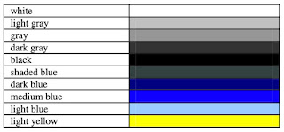
    • Although some colours like white, grey, and black are universally popular (no surprise there!), each country has its unique colour preferences. 
    • Countries that use reds in their colour scheme are less likely to use green and vice versa. Vibrant colours, such as red, can have diverse cultural meanings. In some places, it's the colour of joy and celebration. In others, it's a stop sign, signaling caution or even danger. 

    • To create a more user-friendly online experience, it's important to customize the colour scheme of websites for different country-specific domains. 
    Figure 1 displays the international colour palette, while Figure 2 offers an overview of the predominant colours used in country-specific websites


    It's also interesting to note that different cultures don't just associate various meanings to colours, but they might even perceive them distinctly! Historically, in the Japanese language, the term ‘ao’ encompassed both blue and green. This was because the language initially recognized only four primary colours: black, white, red, and blue. This linguistic interpretation of colour has real-world implications, as seen in Japan's traffic lights, where the universally recognized green "go" signal uses the bluest possible shade of green to meet international driving standards.

     It is important for web designers to understand cultural interpretations of colour to enhance the adaptability of websites across different cultures. In the digital world, colours are more than just aesthetic choices—they express the unique visual and cultural experiences of users worldwide!


    2. It's Not Just About Colours

    Sun's work also emphasized the importance of colour in web design. However, it broadened the scope to explore how cultural markers like national symbols, colour schemes, and spatial organization play a role in the design of multilingual websites. This research centres on two major software companies, Lotus and Adobe, comparing their global and country-specific web pages as shown in Figure 3.


    Observations and Findings

    • Lotus and Adobe showed varying degrees of cultural adaptation in their country-specific websites. Lotus had significant differences in design, while Adobe's changes were primarily linguistic.
    • Users tend to favour usability over cultural elements in web design if it comes to a trade-off, although cultural preferences do influence user evaluations.
    • The study's conclusions are drawn from a small, predominantly male sample, raising questions about their representativeness.
    • Effective localization involves adapting visual and structural elements, not just language translation.
    • When incorporating cultural markers in website design, it's important to be cautious not to perpetuate cultural stereotypes.

    This paper, despite its limitations, highlights the necessity for web designers to consider a variety of cultural elements to effectively cater to a global audience.


    3. Navigating Through Cultural Lenses

    Alexander et al. diverge from previous research by focusing not on cultural markers but on the structure of website navigation. It explores how users from different cultural backgrounds - specifically, high uncertainty avoidance (Australia) and low uncertainty avoidance (China) - interact with websites that are either familiar or foreign in design.

    Observations and Findings:

    • The study confirmed that users showed higher task completion rates on websites aligned with their cultural background. Australians excelled on Australian-designed sites, while Chinese users performed well on Chinese sites.
    • Interestingly, while Australians showed a preference for their native designs, Chinese users displayed no clear preference, possibly due to their familiarity with Western-style web layouts.
    • Some design elements, like the “Fat Footer,” were successful across both cultures, indicating certain universally appealing aspects in web design, similar to the international colour palette.

    These results suggest that users with limited technology exposure may have stronger cultural biases, likely due to the minimal influence and exposure of Western web formats. Therefore, culturally tailoring websites may be especially impactful for users less familiar with Western designs.


    Key Takeaways

    Colours Matter: Different cultures have different colour preferences in web design. While some colours are universally accepted, others can vary dramatically.

    Cultural Markers: Things like national symbols and layout styles can make a website feel more comfortable to users from a specific culture.

    Navigation Preferences: How we like to explore a website can depend on our cultural background.


    Conclusion and Looking Ahead

    As the internet becomes more global, understanding these cultural nuances is crucial for web designers. It's not just about translating the text; it's about creating an experience that resonates culturally with the audience.

    There's so much more to explore in this field, especially considering regions that weren't covered in these studies, like South Asia and Africa. As more people come online from these areas, understanding their cultural context will be key to designing websites that are not just accessible but also engaging. So, next time you're browsing a website, take a moment to notice these subtle cultural influences. 


    Happy surfing! 🏄


    Lost Connections: The design deficiencies plaguing LinkedIn's website

     By Zelina Wankadiya


    Introduction

    In the expansive world of professional networking, LinkedIn serves as a pivotal platform connecting individuals across industries and fostering opportunities. However, as users, we often find ourselves navigating a digital landscape that, despite its vast potential, may leave much to be desired. In this blog post, we venture into some design nuances within the LinkedIn website, further delving into the user experience.

    As we navigate through the design landscape of LinkedIn, our aim is not to critique merely for the sake of criticism but to initiate a constructive dialogue. Through the identification and comprehension of design challenges, we strive to contribute to a shared conversation about how platforms such as LinkedIn can progress to more effectively cater to their diverse user base.

    Process

    These findings were drawn from observations made while testing the website with a varied user group. These users were instructed to think aloud while performing specific tasks on the site. In addition to user testing, expert heuristic evaluations were employed to identify any underlying weaknesses in the design of LinkedIn's website.

    Following were the most prominent design imperfections identified:


    #1: Inconsistency in call-to-action buttons on users' profile


    Usability Rating: Average

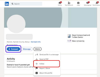
    In LinkedIn user profiles, the call-to-action buttons displayed vary. As shown in Fig 1 below user profile 1 has a prominent "Connect" button on the page, while in Fig 2 user profile 2 hides it in the "More" menu. Similarly, user profile 2 features a prominent "Follow" button, while it is hidden away in the "More" menu for user profile 1


    Fig 1: Follow call-to-action button is hidden in the "More" dropdown


    Fig 2: Connect call-to-action button is hidden in the "More" dropdown


    Recommendation: 
    • Standardize the call-to-action placement to maintain consistent colours and positioning of essential call-to-action buttons prominently, including "Connect," "Follow," and "Message," on all user profiles.


    #2: Difficult to retract a connection request


    Usability Rating: Bad

    Users faced a challenge while trying to retract a mistakenly sent connection request. Although a mechanism was in place to retract connection requests by utilizing a toggle button, the button was labeled as "Pending", accompanied by an icon of a clock denoting the same status. Unfortunately, users failed to recognize that this toggle button could be activated to withdraw the connection request due to the absence of any clear indication or guidance, thus not making it easy for a user to recover from an error.


    Fig 3: It is unclear what action will be performed when the button is clicked


    Recommendation: 
    • Accurately label the button to incorporate a textual label that explicitly conveys the next state once the user interacts with it, for example, "Retract Request." Simultaneously, the icon can serve the purpose of indicating the present system state, such as "Pending".
    • Integrate a tooltip feature to furnish users with information about the control's function and the anticipated result upon clicking the button.


    #3: Cluttered search recommendations


    Usability Rating: Average

    The search recommendation list displayed lacks hierarchy and contains excessive information when users perform searches. Each search result includes the person's name, a number indicating the closeness of "connection" (which most users don't even seem to understand), and their headline. However, this often leads to the truncation of headlines, making it difficult to comprehend it. This not only creates cluttered search results but also impedes the user's ability to understand the information presented effectively.

    Fig 4: Information in the search recommendations appear cluttered

    Recommendation: 
    • Include only relevant details to ensure user understanding. Avoid unclear elements like connection number (Eg. 1st or 2nd or 3rd) ; focus on workplace or education background for a more informative experience with a clean and minimalist design.
    • Organize search recommendations with structured hierarchy, rather than displaying all the information in one line. This will enhance both aesthetics and usability.

    #4: Inconsistent link behaviour


    Usability Rating: Average

    Consistency in design patterns is crucial to avoid surprising users with unexpected actions when interacting with similar-looking controls. In this case, we've identified an inconsistency in the system where both "Contact Info" and "Number of Connections" appear as links with identical visual characteristics. However, when users click on these links, their outcomes differ. 

    Fig 5: Contact info link opens up as a new webpage


    Fig 6: Contact info link opens up as a modal dialog in overlay


    Recommendation: 
    • Maintain a design system document that clearly defines the expected behaviour for different types of links and controls throughout the system. Ensure that all design decisions align with these standards.


    Conclusion

    While exploring the complexities of LinkedIn's website design, we have identified several issues that affect the user experience. These range from inconsistent call-to-action buttons to difficulties in withdrawing connection requests and crowded search recommendations. This blog focused on precisely pinpointing these weaknesses, leveraging both user testing and expert heuristic evaluations. I have also proposed recommendations to standardize design elements, improve labeling, and enhance overall usability. Given LinkedIn's continued significance as a pivotal platform in professional networking, addressing these design imperfections has the potential to create a smoother and more user-friendly experience for individuals across various industries.


    Acknowledgement

    I acknowledge the use of Grammarly to refine the grammar and the use of ChatGPT to improve upon the title of this blog post.


    Share your experience or ideas about this blog post in the comments below! 👇


    Evaluating the Usability of British Airways Website: A Detailed Analysis

    By Sayed Us Sadat


    Introduction

    Heuristic evaluation enables users to quickly and efficiently identify potential usability problems in software based on expert knowledge and established usability principles in books or research papers. It's a crucial part of the design process, ensuring that products are user-friendly and accessible. I investigated the British Airways website's user experience (UX), focusing on its alignment with Nielsen's ten usability heuristics as a reference framework. British Airways (BA) is the second largest UK-based flag carrier airline. Besides providing online flight booking, they are providing add-ons such as car rentals, hotel stays, sharing flight plans, picking up from the airport, etc. In this blog post, I will discuss the significant opportunities to enhance usability and increase customer satisfaction and company sales. Additionally, I will also include some recommendations that can be implemented by developers or designers to avoid those issues while designing a similar website.


    Usability Issues and Recommendations

    Defect 1: Lack of loading indicator while flight result is not displayed 😕

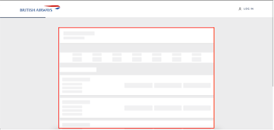
    Result loading after users filter flight details and click the Find Flight button. Shown in the red box, the information is still being fetched.

    Figure 1: Result loading after users filter flight details and click the Find Flight button. 
    Shown in the red box, the information is still being fetched.

    The website needs to provide clear feedback to users after they take action. For example, when users perform a flight search using the filter form, there may be a delay in fetching the results. This leads the users to be made aware of what is going on.
    This issue falls under Nielsen's heuristic of "Visibility of System Status," which discusses the importance of informing users about what is going on through appropriate feedback within a suitable time.


    Recommendations:

    You can implement a loading indicator. The indicator could be an animated Aeroplan icon or any icon relevant to your website niche with a progress circle or a percentage, which will clearly let the users know how much the system will take to show the result. This will also ensure that the website is still processing and not stuck or crashed.


    Defect 2: Confusing baggage-carrying rules and regulations 🧳

    Figure 2: Shows the baggage allowance when a desired flight is selected.
    Shown in the red box, the term ‘checked baggage’ may confuse some users.

    On the BA website's baggage information section, the website has terms like "checked baggage allowance," "cabin baggage," "hand luggage," and "personal item" through their baggage information page. Usually, these are standard words used by the airline industry. Still, there can be a scenario where a traveller who is traveling for the first time using an aeroplane might need help understanding the differences between these terms. For instance, "checked baggage allowance" might mean that it refers to how many items they can put, their weight, or their dimensions. Similarly, "cabin baggage" and "hand-carry" could be confusing because both can be carried on board, but they have different restrictions on the dimensions.

    This scenario violates Nielsen's usability heuristic of "Match between the system and the real world," which states that systems should use words, phrases, and concepts familiar to the user rather than system or business-oriented terms. If a customer needs to be clearer about the baggage they can carry, it can affect the company's revenue as the correct ticket won't be purchased. 

    Recommendations:

    You can include a website feature called tooltips or a reference link to a glossary explaining the different baggage terms clearly. The guide or popup can consist of icons and visuals of baggage to represent the type of luggage, the dimension policy, and the weight.


    Defect 3: Unable to fix a mistake in flight search quickly 🔍


    Figure 3: No way to rectify the filters in one shot. 
    Shown in the red box, there could be a ‘Reset’ button to clear all the filters.

    Sometimes, a user may change their mind or realize they have made a mistake while filtering out the flight options to narrow down their choices. If they wish to modify their preference, they will find that the form is not allowing them to reset the entire search. Rather, they need to change each field individually, which can be a time-consuming and frustrating experience.

    This situation violates Nielsen's heuristic of "User control and freedom." Users should be able to exit or undo changes without going through a lengthy process.

    Recommendations:

    You can add an easily accessible and clearly labelled 'Reset' option on one end of the filter form. This would allow users to modify individual filters without starting over.
    You can also implement a mechanism when users are in edit mode; clicking on individual fields may populate a 'cross' icon, which, when clicked, will reset the field. Right now, users must click on the backspace button until the field is empty. An 'undo' feature can also be added to allow users to revert to their last change without clearing the whole form.


    Defect 4: Website design inconsistency across different services 🎨

    Figure 4: Shown in the red arrow, the left side is the new version of the website, 
    and on the right is the old version or a different style with a different font, color, etc.

    I observed that the BA website needs consistent interface elements across different pages. When the Flight + Hotel, Flight + Car, Hotel, and Car search criteria are chosen, it can be observed that the redirected result page has a different website design. This could be an old website design, and the new layout only works for the flight search. This can confuse users and hamper brand trust. A study on website consistency shows that an inconsistent website design can lead to a high bounce rate, which means that the user will leave the website without interacting or purchasing from the website.

    This problem violates Nielsen's heuristic of "Consistency and Standards," which specify that users should not have to wonder whether different design, situations, or actions mean the same thing. If web design is consistent, it will allow the users to interact with the website interface with prior knowledge.


    Recommendations:

    When developing a website, you may set design standards must be set to ensure visual consistency across all web pages. Also, interaction design standards must be set, which will define how the customers should interact with different pages and elements.


    Defect 5: Overuse of promotional ads and large text blocks to divert customers away from the target 🔈

    Figure 6: Screenshot showing Promotional banners in the red rectangular box.

    At the checkout page, the website might have a design issue as the element on the page is cluttered. This leads to a visually overwhelming experience for users. As shown in Figure 6, the third-party service advertisements filled the page, distracting users from their primary task of booking and confirming their flight. Moreover, the website does not follow a consistent visual hierarchy (colour scheme, typography scale, and component styles). The flight details are shown on top of each other, making the height of the information larger.  The main call to action on the checkout page is confirming the purchase after seeing the flight purchase summary. Here, the users will be confused and lose the purchase button, resulting in a bounce rate and loss of sales. The issues above violate Nielsen's heuristic of "Aesthetic and Minimalist Design," which states that in a system interface, there should be no irrelevant information. It is a severe issue as it will lead to a loss in sales.

    Recommendations:

    You can use a design pattern that takes up less space. For example, a carousel is a great idea that will allow users to browse through promotions without them all competing for attention at once. More importantly, the promotions should be placed as a sidebar or below the purchase confirm button, or there could be a step where it will ask the user if they are looking for an additional service. The flight summary is a dense text block, and it can be broken up into bullet points and shorter paragraphs. The content must be modified to have a more concise meaning.

    Conclusion

    The heuristic evaluation of the British Airways website shows the importance of bridging the gap between user expectations and actual experience. Addressing identified issues, such as lack of immediate feedback, navigational inconsistencies, and insufficient error prevention, is crucial. This exercise was an enlightening journey for me into the world of UI/UX design. It is fascinating to see how even small changes can significantly impact the overall user experience. I hope you found these insights interesting and maybe even a little inspiring for your web projects!

    References


    [1] Nielsen, J. (n.d). How to Conduct a Heuristic Evaluation. Accessed February 9, 2005, http://www.useit.com/papers/heuristic/heuristic_evaluation.html
    [2] Nielsen Norman Group, https://www.nngroup.com/articles/ten-usability-heuristics/
    [3] Markettailor. (n.d.). Why consistency is key in website design. https://www.markettailor.io/blog/why-consistency-is-key-in-website-design
    [4].  British Airways, URL: www.britishairways.com


    Feel free to share your experience or ideas about this blog post in the comments below.