By Jinzhi Cao
With the surge in mobile app usage, the role of icons within the mobile user interface has become increasingly significant. Think about it – that small graphic image on your mobile device is more than just a visual embellishment. It's a representative symbol with the ability to quickly impart information, making it easy for users to recognize and recall. Beyond aesthetics, these icons play multifaceted roles, from branding and designation purposes to capturing visual attention within the user interface. They're the unsung heroes of efficient space utilization, enabling quick recognition at a glance without the need for translation, all while adding a touch of visual appeal.
Multiple app icons
However, the power of an icon can backfire if its purpose isn't crystal clear to the user. In such cases, what should enhance user experience might instead lead to confusion, hindering individuals from completing tasks seamlessly. That's where the art of designing a stellar icon comes into play – a skill that can truly elevate the user experience of any software.
In this blog post, we'll delve into the world of icon design, exploring the key factors that contribute to an icon's effectiveness. From the nuances of color and shape to the broader realm of aesthetics, we'll uncover the insights gleaned from various studies in the field. Let's unravel the secrets of crafting icons that not only captivate the eye but also enhance the overall usability of your favorite apps.
What factors matter?
When you design an icon, there are usually a whole host of design elements that need to be carefully considered. What factors are important? How can these factors be designed to make the user experience better? Here are some advice.
Recognizability
Recognizability is when things are easy to recognize in a computer program. Icons that use common images are usually easier for people to understand. When icons are easier to understand, search performance gets better too. When we simplify the style, use shapes with clear edges, and adapt realistic images, icons become even more recognizable. So, it's better to
use recognizable icons when we want to make connections and get attention.
Color
Color is an attribute of an object that can produce distinct visual effects. The brightness and hue of an icon are related to the user's focus. When designing an icon, it is advisable for designers to adhere to the
following guidelines.
1. Use bold contrasting colors and vivid graphics to link clusters of events and essential actions.
2. Choose colors for their impact, clarity, significance, narrative, and context.
3. Attain a consistent layout with powerful icon sets via effective design practices, color schemes, and adaptability.
4. Choose brand-appropriate background colors and refrain from using transparency.
Shape
Shape means the appearance of icons and showing the shape of an object helps people quickly understand and recognize the icon. The shape of the background also affects how easily users can search and how much they like the icon.
It is shown that shapes with no borders make the icon easier to identify and like.
Simplicity
Simple means clear and easy to understand. Simple icons are
easier and faster to find than complex icons and they effectively communicate information. Use two-dimensional, simple graphics for icons and keep their design basic. Additionally, keep the background plain and avoid transparency.
Uniqueness
Uniqueness means having special or unusual qualities and creating creative app icons. Having unique colors on app icons
helps find them easily among other icons on a single screen. When app icons are perceived as unique, they receive more clicks, downloads, and purchases.
Concreteness
Icons must be concrete and not abstract for improved concreteness. The more concrete an icon is, the more effective it is. The concreteness of an icon is crucial in defining user performance compared to complexity. Concrete icons perform better than abstract icons. Perception is more strongly associated with solid and concrete icons than with flat and abstract ones.
Are your users satisfied?
When your software is released, you need to know if users are happy with the icons and improve the icon design based on their experience. How to get real and objective user data to better improve the design? Here are some experimental approaches that can be taken.
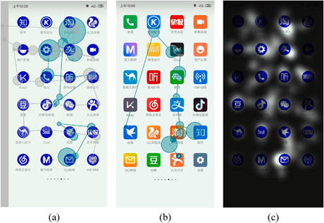
Eye-tracking
Eye-tracking is a valuable tool for assessing the efficiency of visual searches in terms of icons. In this experimental setup, participants wear specialized glasses that meticulously track their eye movements, providing a rich source of experimental data. The key metric, task completion time, quantifies the duration between presenting the task and successfully locating the target icon, while eye gaze indicates the act of resting one's eyes on a particular spot.

Experimental equipment for eye-tracking
After collecting the raw gaze point data, you can obtain a series of data such as scan path, time to first fixation, first fixation duration, fixation count, average fixation duration, fixation sequences, etc., and visualize them as scan paths and focus maps. This data will be an indication of whether your icon design is appealing to your users.
The scan paths and focus maps
Questionnaire
Unlocking the secrets of an icon's user experience involves more than just objective eye-tracking data; it requires tapping into users' subjective feedback. What should be involved in a questionnaire? From a functional point of view, the purpose of an icon is to serve as an entry point to an application, so the recognizability of the icon, which is an indicator of user evaluation, should absolutely be a part of a questionnaire. Additionally, as icon design continues to evolve, its structure now includes elements of art and design to provide a better aesthetic experience for the user. Therefore, the study also needed to know how users rated the aesthetic aspects of the icons.
After collecting data from the questionnaire, you need to analyze the relationship between icon design factors and user experience. One thing that should be noted is that the feelings users evoke about a product are often over described. To better solve this problem, researchers usually utilize
Miryoku Engineering's qualitative EGM to construct respondents' abstract feelings into concrete and real ones and to represent the results in a hierarchical diagram of evaluation appeal factors. Here's how it works.
The EGM hierarchical diagram of app icon preference
In this approach, the appeal and factors influencing appeal are segmented into upper, middle, and lower layers using a visual hierarchy technique. The upper layer includes abstract phrases that represent users' emotional attitudes. The middle layer comprises evaluation elements, which generally refer to the primary reasons why users enjoy a product, also known as the original evaluation items; these are the reasons why respondents express their preferences during interviews. The lower layer pertains to the design aspects of the product.
Your turn to design!
In the ever-evolving landscape of icon design, the pursuit of a better user experience continues, guided by the insights uncovered in this exploration. Here's to icons that not only catch the eye but also leave an indelible mark on the user's digital journey. And now, with adequate design theory, it is your turn to start on this journey!


Techlancers Middle East is one of the top mobile app development companies in dubai, renowned for crafting innovative and scalable apps tailored to your business needs. With cutting-edge technology and user-focused designs, we help transform ideas into impactful mobile solutions.
ReplyDelete