By Li Tian
Why This Matters
Air France, ranked 8th in the World Airline Awards's top 100 airlines, serves millions of customers through its official website for purchasing and managing flight tickets. Identifying and addressing major problems is critical to prevent customer loss. After conducting cognitive walkthroughs and heuristic evaluations, several key issues and bugs were identified on the Air France website. This blog aims to highlight these key issues and offer suggestions for improvement.
Issues and Suggestions
The Case of the Mysterious Google Ad Link🕵️♂️
The first search result for "Air
France" on Google is an advertisement leading to a different webpage than
the official website. This discrepancy can confuse users and cast doubt on the
authenticity of the sites. Below are screenshots of the homepages accessed via
the advertisement link and the official website link, respectively.
Suggestion: The best practice for Air France is to replace the advertisement link with the official website link because the official website webpage does not lack any functions compared to the advertisement page. Unifying these links will eliminate user confusion and maintain consistency.


The Vanishing Menu Icon on the sidebar 🎩
Sidebar often refers to the top and bottom side function areas of the website. Consistent sidebar design is crucial for
user recognition of a website’s important functions. For example, the menu icon next to the logo of the Air France website is on the top sidebar. However, when accessing the website via the
advertisement link, the menu icon next to the logo was missing. This could be a
bug or a design oversight, potentially reducing functionality.
Suggestion: Standardize Standardize sidebar designs across the website. If this inconsistency is due to bugs, partial website maintenance should be conducted to address the issue.


The Eternal Wait... for Flight Searches ⌛
Despite a high-speed network connection, the website's average response time was 8 seconds when searching for international flights from Ottawa to Paris. This delay could be related to the server's geographical location or backend code issues (Link to Search flights from Ottawa to Paris). Moreover, when loading the search page, there is a blank not indicating how long it would take.
Suggestion: Developers should investigate whether server location or code structure is more impactful on response speed. While server relocation might be costly, optimizing code and algorithms could offer significant improvements. Besides, when loading the search page, a progress bar with percentages should be the better widget to inform users of the estimated remaining time for response.


Resize and Surprise: Unpredictable Fashion of Login Page 🔍
In the Login Page, an issue arises when the browser window's
length is less than 50% of the screen, resulting in a white background and
disproportionate text boxes and buttons, compared to the usual scenic image
background.
Suggestion: Adjust the background image and text boxes
to scale proportionally with the window size, maintaining visual consistency.

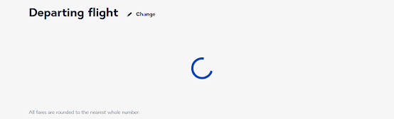
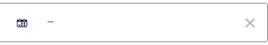
Hidden Treasure: The Elusive Price Calendar 🗓️
Customers often seek the best price for flight tickets, which is easy to achieve with a price calendar (displaying the lowest price for each day of the month). Nevertheless, it is only visible when no specific date is selected, a scenario unlikely for most users. It was under an accidental situation where I did not have a particular date input that I eventually discovered the price calendar. The first image illustrates an empty date selection, while the second shows the price calendar of the Air France website.
Suggestion: The website should just provide some tips or hints to inform users that there does exist this feature! Price calendars are really helpful to help customers decide when they want to travel.

"Oops, Something Went Wrong..." – The Vague Error Message of Despair 🤷
If there are no tickets available in the selected date range, the webpage will prompt an error "Sorry, something went wrong... Please try again." This is a typical bad error message, indicating no useful information instructing users how to deal with the problem. Additionally, the website repeatedly redirects users to the previous page after a failed attempt, continuously presenting the same error message.
Suggestion: Redirect users to the search page with a clear message stating no flights are available for
the chosen date.
In Conclusion
To summarize my little adventure on the Air France website, by employing cognitive walkthroughs and heuristic evaluations, I have identified six primary user experience problems on the Air France website. These evaluations considered two user
personas: tech-savvy and non-tech-savvy, allowing a comprehensive discovery of
practical issues.
What about you? Ever had a funny, frustrating, or fabulous experience booking flights online? Share your ideas in the comments!
No comments:
Post a Comment