Showing posts with label user experience. Show all posts

Monday, December 18, 2023

Impact of gamification on user experience


By Thomas O. Ajayi

Introduction


The Entertainment Software Association(ESA) reported in 2016 that 65% of US households are home to at least one person who plays more than 3 hours of video games every week.
The success of digital games in the entertainment industry has made product owners and designers of non-game digital products turn to learning from digital games in order to understand what makes them engage the players and success in order to apply the same knowledge to improve not only improve the user experience of their products but also to make them enjoyable.

Interestingly, academicians and user experience design practitioners alike have researched what makes games successful and how to implement them to motivate and engage users of digital products that are non-games to interact more with the products and improve overall user experience. This concept of applying game-like elements  to non-game situations, with the goal of motivating and engaging users is now popularly referred to as “Gamification”.Popular game-like elements used in gamification are leaderboard, avatar, points and badges.

Surprisingly, my recent research into understanding the impact of gamification on user experience showed both the positive and negative influence of gamification on users as opposed to the assumption that gamification is only full of positive rewards. Below are the highlights of the positives and negatives effects of gamification on user experience and how to apply gamification to support more positive user experience in digital products  based on the insights from academic researches of Hammedi et al. , Koivisto & Hamari and Vanroy & Zaman and user experience design practitioners


The positive effects of gamification on user experience

  1. It enhances users' motivation to interact with products:


Vanroy & Zaman researched the effects of rewards with  game elements of badges, points and leaderboard on university students in Belgium based on their participation in a Google+ community created for a course. Analysis of the students' response to online surveys and focus groups confirmed that the rewards they get based on their participation either as individual or group on the Google+ community motivated them to interact with the Online community more.


  1. It boosts users' engagement and focus:


Hammedi et al  found out that gamified health care helps patients focus all their attention on the activity that they are performing. A practical example was the case of when patients used the Vr4Child app (a game-like application designed to relax children to ensure that they will remain calm during medical procedures), their engagement helped them to not focus on the nurses’ and therapists’ actions. Thereby helping the medical practitioners to perform their procedures without the interruption of the kids(patients).

  1. It helps transform boring/tedious activities into more exciting and entertaining ones: 


Through the implementation of Wii Fit Plus- an innovative technology that allows patients to improve their balance through challenges such as a snowboarding simulation or walking on a tight, patients with various medical problems, such as the amputation of a limb, a stroke were report by Hammedi et al. reported to continually improve their physical exercise and to work harder to reach their limits. Without this gamified solution, such patients could find exercise which supports their healing process boring.


The negative effects of gamification on user experience

1. It can encourage users to cheat to get rewards: This was seen in the study by Vanroy & Zaman as students were reported to repeatedly perform the behaviour for which they were already rewarded in order to receive more badges.

2. The enjoyment and usefulness of gamification can decline with time Thereby leading to abandonment of the products where gamification is implemented: This negative effects is shown in the study of Koivisto & Hamari on the users perceived benefits of fitocracy where the younger user demography found the online fitness coach marketplace useful when they start tracking their daily fitness achievement using fitocracy application but after some times, they do not find the rewards they get for tracking their fitness motivating again. 


3. Gamified platforms can become addition for users: Lilith & Tamm reported some digital products especially social media e.g Facebook, youtube or Twitter implemented  gamification using Pull-to-refresh feature to see new posts continuously and the users might be attached to the social media because of the gamification experience. Thereby spending their productive time on the applications.


How digital product owners and user  designers can implement gamification to enhance positive user experience

The negative effects of gamification on user experience highlighted above has shown that integration of game elements in digital elements is not always motivating, engaging or sustainable. The question is now how do product owners and or user experience designers implement gamification to support positive effects while the negative effects are reduced or removed. Scholars and design practitioners proposed that using the Yu-kai Chou behavioural framework named “Octalysis” shown in the Figure 1 below could help in designing gamification for good.
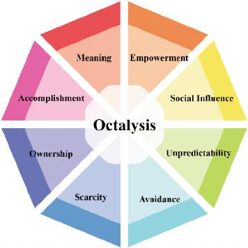
Figure 1:  Yu-kai Chou behavioural framework. Source

The proposition is that one can easily understand what drives users' motivation using this framework and that subsequently will guide the game elements used in the gamification process.

Below are the highlights of what the 8 drivers of human motivation in the behavioural  framework stands for.
Meaning: means that users believe that the meaning of what they do is more important than the thing itself, giving a sense of self-mission.
Accomplishment: means the progress and new skills gained by users when they complete things.

Empowerment: providing creative channels for users to take initiative.
Ownership: means users’ ability to own and control things. 

Social influence: users’ interconnection with other users.
Scarcity: means that some things can be owned by only some users. 

Unpredictability: means mobilising users’ curiosity by showing limited things.
Avoidance: means showing the disadvantages of bad events, and users will choose to avoid losses. More details about this can be found here.

In addition to using the above framework as a guide while designing gamification to tailor the game elements based on the motivation factor(s) of users, designers it could also be helpful for designers to monitor products for side effects( i.e choosing which behaviours to encourage, figuring out how to measure those behaviors, and ensuring that the metric being tracked reliably correlates to the behavior that is wanted) and Set engagement limits. For example a mobile app can be designed to  automatically disable  notifications if a user is driving or remind the user to take screen to avoid distractions that can lead to accidents.

Conclusion
Considering the benefits of the gamification in digital products highlighted in this article and the quest for businesses and user experience designers to compete in the digital era to gain users attention and get them glued to their products,  one can say that  the strategy of gamification has come to stay.
A cue can be taken by product owners and designers alike from the successful implementations of gamification or the proposed fireworks from academics and industry
However, it is important to note that no one size fits all framework or guidelines to implement gamification successfully. Instead more research into who the users are, what the users want to achieve with the use of the product and the game elements that match the users types are needed in order to design digital products where gamification enhances positive user experience.


Tuesday, November 21, 2023

Evaluating the Usability of British Airways Website: A Detailed Analysis

By Sayed Us Sadat


Introduction

Heuristic evaluation enables users to quickly and efficiently identify potential usability problems in software based on expert knowledge and established usability principles in books or research papers. It's a crucial part of the design process, ensuring that products are user-friendly and accessible. I investigated the British Airways website's user experience (UX), focusing on its alignment with Nielsen's ten usability heuristics as a reference framework. British Airways (BA) is the second largest UK-based flag carrier airline. Besides providing online flight booking, they are providing add-ons such as car rentals, hotel stays, sharing flight plans, picking up from the airport, etc. In this blog post, I will discuss the significant opportunities to enhance usability and increase customer satisfaction and company sales. Additionally, I will also include some recommendations that can be implemented by developers or designers to avoid those issues while designing a similar website.


Usability Issues and Recommendations

Defect 1: Lack of loading indicator while flight result is not displayed 😕

Result loading after users filter flight details and click the Find Flight button. Shown in the red box, the information is still being fetched.

Figure 1: Result loading after users filter flight details and click the Find Flight button. 
Shown in the red box, the information is still being fetched.

The website needs to provide clear feedback to users after they take action. For example, when users perform a flight search using the filter form, there may be a delay in fetching the results. This leads the users to be made aware of what is going on.
This issue falls under Nielsen's heuristic of "Visibility of System Status," which discusses the importance of informing users about what is going on through appropriate feedback within a suitable time.


Recommendations:

You can implement a loading indicator. The indicator could be an animated Aeroplan icon or any icon relevant to your website niche with a progress circle or a percentage, which will clearly let the users know how much the system will take to show the result. This will also ensure that the website is still processing and not stuck or crashed.


Defect 2: Confusing baggage-carrying rules and regulations 🧳

Figure 2: Shows the baggage allowance when a desired flight is selected.
Shown in the red box, the term ‘checked baggage’ may confuse some users.

On the BA website's baggage information section, the website has terms like "checked baggage allowance," "cabin baggage," "hand luggage," and "personal item" through their baggage information page. Usually, these are standard words used by the airline industry. Still, there can be a scenario where a traveller who is traveling for the first time using an aeroplane might need help understanding the differences between these terms. For instance, "checked baggage allowance" might mean that it refers to how many items they can put, their weight, or their dimensions. Similarly, "cabin baggage" and "hand-carry" could be confusing because both can be carried on board, but they have different restrictions on the dimensions.

This scenario violates Nielsen's usability heuristic of "Match between the system and the real world," which states that systems should use words, phrases, and concepts familiar to the user rather than system or business-oriented terms. If a customer needs to be clearer about the baggage they can carry, it can affect the company's revenue as the correct ticket won't be purchased. 

Recommendations:

You can include a website feature called tooltips or a reference link to a glossary explaining the different baggage terms clearly. The guide or popup can consist of icons and visuals of baggage to represent the type of luggage, the dimension policy, and the weight.


Defect 3: Unable to fix a mistake in flight search quickly 🔍


Figure 3: No way to rectify the filters in one shot. 
Shown in the red box, there could be a ‘Reset’ button to clear all the filters.

Sometimes, a user may change their mind or realize they have made a mistake while filtering out the flight options to narrow down their choices. If they wish to modify their preference, they will find that the form is not allowing them to reset the entire search. Rather, they need to change each field individually, which can be a time-consuming and frustrating experience.

This situation violates Nielsen's heuristic of "User control and freedom." Users should be able to exit or undo changes without going through a lengthy process.

Recommendations:

You can add an easily accessible and clearly labelled 'Reset' option on one end of the filter form. This would allow users to modify individual filters without starting over.
You can also implement a mechanism when users are in edit mode; clicking on individual fields may populate a 'cross' icon, which, when clicked, will reset the field. Right now, users must click on the backspace button until the field is empty. An 'undo' feature can also be added to allow users to revert to their last change without clearing the whole form.


Defect 4: Website design inconsistency across different services 🎨

Figure 4: Shown in the red arrow, the left side is the new version of the website, 
and on the right is the old version or a different style with a different font, color, etc.

I observed that the BA website needs consistent interface elements across different pages. When the Flight + Hotel, Flight + Car, Hotel, and Car search criteria are chosen, it can be observed that the redirected result page has a different website design. This could be an old website design, and the new layout only works for the flight search. This can confuse users and hamper brand trust. A study on website consistency shows that an inconsistent website design can lead to a high bounce rate, which means that the user will leave the website without interacting or purchasing from the website.

This problem violates Nielsen's heuristic of "Consistency and Standards," which specify that users should not have to wonder whether different design, situations, or actions mean the same thing. If web design is consistent, it will allow the users to interact with the website interface with prior knowledge.


Recommendations:

When developing a website, you may set design standards must be set to ensure visual consistency across all web pages. Also, interaction design standards must be set, which will define how the customers should interact with different pages and elements.


Defect 5: Overuse of promotional ads and large text blocks to divert customers away from the target 🔈

Figure 6: Screenshot showing Promotional banners in the red rectangular box.

At the checkout page, the website might have a design issue as the element on the page is cluttered. This leads to a visually overwhelming experience for users. As shown in Figure 6, the third-party service advertisements filled the page, distracting users from their primary task of booking and confirming their flight. Moreover, the website does not follow a consistent visual hierarchy (colour scheme, typography scale, and component styles). The flight details are shown on top of each other, making the height of the information larger.  The main call to action on the checkout page is confirming the purchase after seeing the flight purchase summary. Here, the users will be confused and lose the purchase button, resulting in a bounce rate and loss of sales. The issues above violate Nielsen's heuristic of "Aesthetic and Minimalist Design," which states that in a system interface, there should be no irrelevant information. It is a severe issue as it will lead to a loss in sales.

Recommendations:

You can use a design pattern that takes up less space. For example, a carousel is a great idea that will allow users to browse through promotions without them all competing for attention at once. More importantly, the promotions should be placed as a sidebar or below the purchase confirm button, or there could be a step where it will ask the user if they are looking for an additional service. The flight summary is a dense text block, and it can be broken up into bullet points and shorter paragraphs. The content must be modified to have a more concise meaning.

Conclusion

The heuristic evaluation of the British Airways website shows the importance of bridging the gap between user expectations and actual experience. Addressing identified issues, such as lack of immediate feedback, navigational inconsistencies, and insufficient error prevention, is crucial. This exercise was an enlightening journey for me into the world of UI/UX design. It is fascinating to see how even small changes can significantly impact the overall user experience. I hope you found these insights interesting and maybe even a little inspiring for your web projects!

References


[1] Nielsen, J. (n.d). How to Conduct a Heuristic Evaluation. Accessed February 9, 2005, http://www.useit.com/papers/heuristic/heuristic_evaluation.html
[2] Nielsen Norman Group, https://www.nngroup.com/articles/ten-usability-heuristics/
[3] Markettailor. (n.d.). Why consistency is key in website design. https://www.markettailor.io/blog/why-consistency-is-key-in-website-design
[4].  British Airways, URL: www.britishairways.com


Feel free to share your experience or ideas about this blog post in the comments below.


Sunday, November 19, 2023

Emotional design, mental health, and user experience, inspired by the Yale School of Art

By Qiyun Feng,

Qiyun Feng is a data scientist currently working at Innovations, Science and Economics Canada. He writes out of pure interest in psychology and technology. You can reach him by his email or his LinkedIn.

A journey of user experiences

There’s an infamous website, the Yale School of Arts front page, which features the most absurd combinations of visual assets and page placements. It conforms to none of the modern design languages, and it almost evokes a sense of the 90s and 2000s with the design language. Despite these characteristics. There are two feelings that this website evokes. Being born in the 90s, I have very deep sense of nostalgia for the olden days where websites were laid out into sitemaps, and we had to navigate through endless hyperlinks to find what we were looking for. The other side of me groans and wants to turn this website off immediately.

A journey of user experiences

Figure 1: Front page of the Yale School of Art

There’s a term in the industry that dubs the culmination of design and customer experience as user experience. It is known by many names throughout time, user centred design, usability, user experience but they are all about the same thing.

Don Norman, the creator of the term usability, defines it as a cohesive integrated set of experience from initiation to the disposal. It is designed to fit that entire experience together seamlessly. The International Organization for Standardization defines use experience as “A person’s perception and responses that result from the use or anticipated use of a product, system, or service.” Steve Krug, the writer of the book, Don’t Make Me Think, considers user experience to be an amalgamation of a dozen different disciplines from interactive design to visual design, to content management, coming together to make a product.

There’s very little disagreement on what it means to create a good design. You need a good product with good functionality, and you need different talents coming together considering various parts of the product so that it fits like a glove to the use case.

However, I want to look at it through a different lens. What about the actual emotional and physical experiences. How about looking at it from the lenses of the user and the customer. While there is an importance to the immediate response of the user, and the reaction of the user, the focus of user design generally seems to end at that point. We want to look at it from the perspective of emotional designs.

Emotional design and UX

Emotional design can be divided up largely in to visceral, behavioural, and reflective, according to Don Norman. Visceral is the physical appearance of a product. Obviously, everyone wants the product that looks “nice” but nice can be defined in a variety of ways. The second is the behavioural design. How usable is a product or how effective is a product is generally the question we ask to figure out how well a product is designed in this category. Finally, there’s the reflective designs, the things that makes the user think back about their experiences.

Using an adequate mix of these different designs is the key to creating a user experience that makes the user appreciate the product. Let’s go back to the front page of Yale School of Art for a demonstration of this.

If we were to analyze this page, solely based on what we would see, the visceral design of this is terrible. There’s no cohesive design language. The fonts are all different. It’s not reactive so everything is left aligned, there’s a different background on every page making it extremely difficult to understand. By this alone, it would seem like this is a terrible design.


Figure 2: A sitemap of the Yale School of Art

Let’s look at the behavioural design of the website. From the behavioural aspects, it would seem all the functionalities are there. There’s a navigation bar, the animations can be paused, most of the assets are in the form of cards with a details button. They even have something that tends to be missing from some websites, a sitemap! From this perspective, this is a functional website though we would have to deduct points for their accessibility.

Finally let’s look at the reflective design of this webpage. On the side of the webpage, there’s a quick blob of text explaining the origin story of the website.

“This website exists as an ongoing collaborative experiment in digital publishing and information sharing. Because this website functions as a wiki, all members of the School of Art community—graduate students, faculty, staff, and alums—have the ability to add new content and pages, and to edit most of the site’s existing content.

Content is the property of its various authors. When you contribute to this site, you agree to abide by Yale University academic and network use policy, and to act as a responsible member of our community.”

This finally makes sense. This is an arts project that is based on the collaboration of the Yale School of Art community. The intent is not to create a website for the public in the traditional sense but to create a piece of modern art that is available to be browsed by the public. Finally, this makes sense.

One of the importance of modern art is experimentation and we are obviously witnessing a large-scale experimentation that an entire community is undertaking individually and witnessing the result. If this was a commercial product it would never work but as a piece of modern art, it will live on.

How does mental health play into this?

There’s a copious amounts of mental health application out there now. The majority of which falls under these following categories.

1. Online therapy sessions: Basically, a glorified chat client that enables text-based or even video-based conversations with a therapist.

2. Meditation: Basically, a glorified audible that contains large amounts of meditations that is aimed to make the user use meditation

3. Journaling: Basically, a prompted notebook that captures your moods and provides feedback.

If we applied emotional design to all these applications, all these applications have an immaculate design. They certainly have good visual artists. They are also very functional in terms of the usability aspects. The chat client does what it is supposed to, the meditation is certainly calming.

The challenge is the reflective aspects. 

There’s a variety of different mental health issues. To give a brief overview, here are a three. ADHD, or Attention-Deficit/Hyperactivity Disorder, is a mental health challenge where the person suffers from persistent or hyperactivity-impulses that interferes with functioning. Depression is a mood disorder that causes persistent feeling of sadness and a loss of interest. Anxiety disorders is a group of mental health disorders characterized by significant feelings of anxiety and fear.

People with ADHD and Depression faces a completely different challenge from those with Anxiety. People with ADHD and depression are more likely to never use the application or product in the first place whereas people with anxiety are at risk of using the application either too much or getting anxious of the very thought of the application itself. 

What is apparent is that the designer of any given application, for mental health needs to provide accommodations for people that are neural-divergent. For example, for those that are ADHD, they will need a reminder to do the activities in this application when they are less busy in their schedule. ADHD is blindness to the time and thus the application will only be successful if they help guide ADHD time manage their therapeutic process. For those are that depressed, on the other hand, this is a case where they need impulsive breaks and a strong external force to break them out of arguing against themselves. This is where the application will require strong reminders and enforced actions to make the individual partake in the therapy process. 

The only way that the mental health therapy works is the have the reflection design built into the process and create an environment where those that are struggling from mental health can leverage the functions of the product to cater to whatever their usage is.

How to leverage this in my designs?

There are a couple of philosophies of design that should be implemented but it is worth mentioning the one that is fundamentally the most important, which is testing whether your application made a positive impact with the user. The marker of a positive impact should be positive mood changes for a prolonged time and the sustained usage of your application. You can only verify this through user testing and user survey.

There is however a couple principle that is necessary to build an application that caters to people that are neural-divergent. The first of the principle is to follow nelson’s heuristics number 7, provide flexibility and efficiency of use. Provide people the ability to set up their schedules for integrating the application for their use. If the application is distracting, people with ADHD should be able to set the time frame they use the application. If it’s people with depression, then depending on whether your application is for therapy, or for other tasks, you will want the application to show customized notifications to enforce the usage of the applications. 

The second important principle is preventing errors, creating a consistency and rules for the customization that people can make in an accessible way to those that are neural-divergent is extremely conducive to the reception of the application. If the customizations are standardized, the range of states the system can be in is standardized and will drastically reduce the likelihood for errors. This is necessary so that people can expect the same customization to function the same way facilitating a community to develop.

The third important aspect is helping users recognize, diagnose, and recover from errors. It is critical to let the users know whether what they did was a slip or if it was a mistake with the system. If it is a slip up or a mistake from the user’s part, then they need to be able to fix it easily. If it is a system mistake, then the user will also need to know that it wasn’t the user’s fault. For those that are neural-divergent, it is simple to be critical of themselves when mistakes or errors occur, and we want to maintain a positive reinforcement for the users in the application.

Finally, allowing the community to be personalized is another important step to allowing the user get help. Yes, having help and documentation is a necessity, but for this day and age, having some sort of chat, or bulletin board where questions can be asked, achievements can be shared, is critical to the success of any platform. Having that ability will simplify help and improve the feedback process.


Figure 3: Communal management of the page

If we bring back the Yale School of Art, these criteria are met perfectly. They provide the maximum flexibility, which is allowing any student, faculty members and professors to contribute to their page. The website is basically a blog with custom stylings. They have both instructional tools and error prevention by design with sitemaps for those finding it challenging to navigate the site. Finally, the entire website is essentially a community bulletin board. For those purposes, this ends up being a great reflective design that not only has the community members examine art in a nuanced way, even if it is not built specifically to cater to the neural-divergent individuals.

Conclusions

Mental health is a topic that has gained a lot of traction over the period of covid, and more people are becoming aware of the individual differences that exists. While this has been fantastic to the understanding and acceptance of those that faces mental health challenges, this has also highlighted various challenges in design faced both in general applications and mental health applications.

This calls for the need of a more intricate investigation into what is done until now.

In the end, I leave you with a simple thought experiment. Using this game here , please leave me a comment on from a scale of 1 to 10, how furious did this game make you. Now I want you to imagine this is what it feels like when you are neural-divergent. People that are neural-divergent face this kind of design as a normality. 

I hope you don’t break your computer out of pure computer rage, and I wish you the best on your journey to good design!