By Sayed Us Sadat
Introduction
Heuristic evaluation enables users to quickly and efficiently identify potential usability problems in software based on expert knowledge and established usability principles in books or research papers. It's a crucial part of the design process, ensuring that products are user-friendly and accessible. I investigated the British Airways website's user experience (UX), focusing on its alignment with Nielsen's ten usability heuristics as a reference framework. British Airways (BA) is the second largest UK-based flag carrier airline. Besides providing online flight booking, they are providing add-ons such as car rentals, hotel stays, sharing flight plans, picking up from the airport, etc. In this blog post, I will discuss the significant opportunities to enhance usability and increase customer satisfaction and company sales. Additionally, I will also include some recommendations that can be implemented by developers or designers to avoid those issues while designing a similar website.
The website needs to provide clear feedback to users after they take action. For example, when users perform a flight search using the filter form, there may be a delay in fetching the results. This leads the users to be made aware of what is going on.
This issue falls under Nielsen's heuristic of "Visibility of System Status," which discusses the importance of informing users about what is going on through appropriate feedback within a suitable time.
Recommendations:
You can implement a loading indicator. The indicator could be an animated Aeroplan icon or any icon relevant to your website niche with a progress circle or a percentage, which will clearly let the users know how much the system will take to show the result. This will also ensure that the website is still processing and not stuck or crashed.
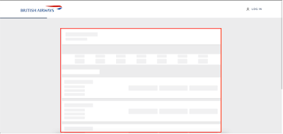
Shown in the red box, the term ‘checked baggage’ may confuse some users.
On the BA website's baggage information section, the website has terms like "checked baggage allowance," "cabin baggage," "hand luggage," and "personal item" through their baggage information page. Usually, these are standard words used by the airline industry. Still, there can be a scenario where a traveller who is traveling for the first time using an aeroplane might need help understanding the differences between these terms. For instance, "checked baggage allowance" might mean that it refers to how many items they can put, their weight, or their dimensions. Similarly, "cabin baggage" and "hand-carry" could be confusing because both can be carried on board, but they have different restrictions on the dimensions.
This scenario violates Nielsen's usability heuristic of "Match between the system and the real world," which states that systems should use words, phrases, and concepts familiar to the user rather than system or business-oriented terms. If a customer needs to be clearer about the baggage they can carry, it can affect the company's revenue as the correct ticket won't be purchased.
Recommendations:
You can include a website feature called tooltips or a reference link to a glossary explaining the different baggage terms clearly. The guide or popup can consist of icons and visuals of baggage to represent the type of luggage, the dimension policy, and the weight.
Sometimes, a user may change their mind or realize they have made a mistake while filtering out the flight options to narrow down their choices. If they wish to modify their preference, they will find that the form is not allowing them to reset the entire search. Rather, they need to change each field individually, which can be a time-consuming and frustrating experience.
Recommendations:
I observed that the BA website needs consistent interface elements across different pages. When the Flight + Hotel, Flight + Car, Hotel, and Car search criteria are chosen, it can be observed that the redirected result page has a different website design. This could be an old website design, and the new layout only works for the flight search. This can confuse users and hamper brand trust. A study on website consistency shows that an inconsistent website design can lead to a high bounce rate, which means that the user will leave the website without interacting or purchasing from the website.
This problem violates Nielsen's heuristic of "Consistency and Standards," which specify that users should not have to wonder whether different design, situations, or actions mean the same thing. If web design is consistent, it will allow the users to interact with the website interface with prior knowledge.
Recommendations:
When developing a website, you may set design standards must be set to ensure visual consistency across all web pages. Also, interaction design standards must be set, which will define how the customers should interact with different pages and elements.Recommendations:
Conclusion
References
[1] Nielsen, J. (n.d). How to Conduct a Heuristic Evaluation. Accessed February 9, 2005, http://www.useit.com/papers/heuristic/heuristic_evaluation.html
[2] Nielsen Norman Group, https://www.nngroup.com/articles/ten-usability-heuristics/
[3] Markettailor. (n.d.). Why consistency is key in website design. https://www.markettailor.io/blog/why-consistency-is-key-in-website-design
[4]. British Airways, URL: www.britishairways.com
Feel free to share your experience or ideas about this blog post in the comments below.


No comments:
Post a Comment