Showing posts with label CSI5122. Show all posts

Monday, December 18, 2023

Impact of gamification on user experience


By Thomas O. Ajayi

Introduction


The Entertainment Software Association(ESA) reported in 2016 that 65% of US households are home to at least one person who plays more than 3 hours of video games every week.
The success of digital games in the entertainment industry has made product owners and designers of non-game digital products turn to learning from digital games in order to understand what makes them engage the players and success in order to apply the same knowledge to improve not only improve the user experience of their products but also to make them enjoyable.

Interestingly, academicians and user experience design practitioners alike have researched what makes games successful and how to implement them to motivate and engage users of digital products that are non-games to interact more with the products and improve overall user experience. This concept of applying game-like elements  to non-game situations, with the goal of motivating and engaging users is now popularly referred to as “Gamification”.Popular game-like elements used in gamification are leaderboard, avatar, points and badges.

Surprisingly, my recent research into understanding the impact of gamification on user experience showed both the positive and negative influence of gamification on users as opposed to the assumption that gamification is only full of positive rewards. Below are the highlights of the positives and negatives effects of gamification on user experience and how to apply gamification to support more positive user experience in digital products  based on the insights from academic researches of Hammedi et al. , Koivisto & Hamari and Vanroy & Zaman and user experience design practitioners


The positive effects of gamification on user experience

  1. It enhances users' motivation to interact with products:


Vanroy & Zaman researched the effects of rewards with  game elements of badges, points and leaderboard on university students in Belgium based on their participation in a Google+ community created for a course. Analysis of the students' response to online surveys and focus groups confirmed that the rewards they get based on their participation either as individual or group on the Google+ community motivated them to interact with the Online community more.


  1. It boosts users' engagement and focus:


Hammedi et al  found out that gamified health care helps patients focus all their attention on the activity that they are performing. A practical example was the case of when patients used the Vr4Child app (a game-like application designed to relax children to ensure that they will remain calm during medical procedures), their engagement helped them to not focus on the nurses’ and therapists’ actions. Thereby helping the medical practitioners to perform their procedures without the interruption of the kids(patients).

  1. It helps transform boring/tedious activities into more exciting and entertaining ones: 


Through the implementation of Wii Fit Plus- an innovative technology that allows patients to improve their balance through challenges such as a snowboarding simulation or walking on a tight, patients with various medical problems, such as the amputation of a limb, a stroke were report by Hammedi et al. reported to continually improve their physical exercise and to work harder to reach their limits. Without this gamified solution, such patients could find exercise which supports their healing process boring.


The negative effects of gamification on user experience

1. It can encourage users to cheat to get rewards: This was seen in the study by Vanroy & Zaman as students were reported to repeatedly perform the behaviour for which they were already rewarded in order to receive more badges.

2. The enjoyment and usefulness of gamification can decline with time Thereby leading to abandonment of the products where gamification is implemented: This negative effects is shown in the study of Koivisto & Hamari on the users perceived benefits of fitocracy where the younger user demography found the online fitness coach marketplace useful when they start tracking their daily fitness achievement using fitocracy application but after some times, they do not find the rewards they get for tracking their fitness motivating again. 


3. Gamified platforms can become addition for users: Lilith & Tamm reported some digital products especially social media e.g Facebook, youtube or Twitter implemented  gamification using Pull-to-refresh feature to see new posts continuously and the users might be attached to the social media because of the gamification experience. Thereby spending their productive time on the applications.


How digital product owners and user  designers can implement gamification to enhance positive user experience

The negative effects of gamification on user experience highlighted above has shown that integration of game elements in digital elements is not always motivating, engaging or sustainable. The question is now how do product owners and or user experience designers implement gamification to support positive effects while the negative effects are reduced or removed. Scholars and design practitioners proposed that using the Yu-kai Chou behavioural framework named “Octalysis” shown in the Figure 1 below could help in designing gamification for good.
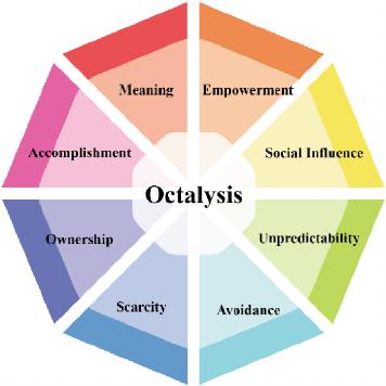
Figure 1:  Yu-kai Chou behavioural framework. Source

The proposition is that one can easily understand what drives users' motivation using this framework and that subsequently will guide the game elements used in the gamification process.

Below are the highlights of what the 8 drivers of human motivation in the behavioural  framework stands for.
Meaning: means that users believe that the meaning of what they do is more important than the thing itself, giving a sense of self-mission.
Accomplishment: means the progress and new skills gained by users when they complete things.

Empowerment: providing creative channels for users to take initiative.
Ownership: means users’ ability to own and control things. 

Social influence: users’ interconnection with other users.
Scarcity: means that some things can be owned by only some users. 

Unpredictability: means mobilising users’ curiosity by showing limited things.
Avoidance: means showing the disadvantages of bad events, and users will choose to avoid losses. More details about this can be found here.

In addition to using the above framework as a guide while designing gamification to tailor the game elements based on the motivation factor(s) of users, designers it could also be helpful for designers to monitor products for side effects( i.e choosing which behaviours to encourage, figuring out how to measure those behaviors, and ensuring that the metric being tracked reliably correlates to the behavior that is wanted) and Set engagement limits. For example a mobile app can be designed to  automatically disable  notifications if a user is driving or remind the user to take screen to avoid distractions that can lead to accidents.

Conclusion
Considering the benefits of the gamification in digital products highlighted in this article and the quest for businesses and user experience designers to compete in the digital era to gain users attention and get them glued to their products,  one can say that  the strategy of gamification has come to stay.
A cue can be taken by product owners and designers alike from the successful implementations of gamification or the proposed fireworks from academics and industry
However, it is important to note that no one size fits all framework or guidelines to implement gamification successfully. Instead more research into who the users are, what the users want to achieve with the use of the product and the game elements that match the users types are needed in order to design digital products where gamification enhances positive user experience.


Tuesday, November 21, 2023

Usability Evaluation of Microsoft Teams: Focusing on Text Chats and Video Meetings

 By Behrad Moeini

Microsoft Teams: Crucial for Remote Collaboration

In today’s era of remote work and virtual classrooms, tools like Microsoft Teams have become indispensable in bridging the gap between colleagues and classmates worldwide. Despite its widespread adoption, there's always scope for enhancement in such platforms. In this blog post, I have assessed Microsoft Teams using Nielsen's heuristics, a set of established usability principles, to identify areas where it can evolve to more effectively meet our changing needs. This evaluation spans from the intuitive ease of text chats to the seamless flow of video meetings, with each facet offering potential for refinement. My exploration is not merely a critique but a pathway to improvement, guided by the principle that our digital tools should not only meet but anticipate and adapt to our evolving demands. This approach offers a structured and systematic analysis, ensuring that the critique is grounded in proven usability standards.


Text Chat: Finding and Fixing Issues

Issue


Fig 1 –  Inefficiency in Message Retrieval on Microsoft Teams

My analysis of Microsoft Teams' text chat functionality uncovered a significant discrepancy in the search feature. As demonstrated in Figure 1, a search for '512' reached no results, suggesting an absence of relevant data. However, a following search including an additional digit, '5122', surprisingly retrieved messages containing '512'. This inconsistency in search results can lead to missed critical information and unnecessary time expenditure, pointing to a need for a more robust search mechanism within the platform. Given the obscured visibility of system status in search functionality, I rate this issue a 3 out of 5 for its moderate impact on user efficiency and confidence.

Suggestion

Fig 2 - Refined Search Capabilities in Microsoft Teams (Visualized with DALL.E)


Acknowledging that Figure 2 may not precisely mirror the current aesthetic of Microsoft Teams, it serves as a conceptual illustration to underscore my proposed enhancement. This visual representation depicts an advanced search algorithm, potentially incorporating elements of natural language processing. The key focus here is on a search functionality that transcends mere exact word matches. Instead, it intelligently identifies and suggests content that is contextually related to the user's query. By integrating such a sophisticated search mechanism, we aim to significantly reduce the time and effort users spend sifting through chat histories. This advancement is not just about finding exact phrases; it's about intuitively connecting users to the information they need, thereby refining the overall user experience and efficiency on the Microsoft Teams platform.


Video Meeting: Interface Challenges

Issue

Fig 3 – Navigational Difficulties with Video Meeting Controls in Microsoft Teams


In our exploration of Microsoft Teams' video meeting interface, as showcased in Figure 3, we encounter a layout that can be confusing, especially during critical meeting moments. The current design places various controls - like 'Dial pad,' 'Hold,' 'Transfer,' 'Chat,' and others - together in a single toolbar. This setup often makes it difficult for users to quickly locate and access specific functions, such as the 'Mute' button. In fast-paced or large meetings, this can lead to unnecessary delays and even disruptions. The confusing layout of video meeting controls, which impacts user control and freedom, merits a rating of 2 out of 5 for its potential to disrupt user experience during important meetings.

Suggestion

Fig 4 – Proposed Notification Interface in Microsoft Teams


The suggestion for improvement, as we can imagine in Figure 4, involves redesigning the video meeting controls to be more intuitive and user-friendly. The focus here is on rearranging the existing controls so that key functions like the 'Mic,' 'Camera,' and 'Leave' button are easy to find and use. We could group similar controls together and even introduce a customizable toolbar, allowing users to organize the functions they use most frequently in a way that best suits their needs. Testing different layouts with actual users and applying their feedback would be crucial in achieving an interface that not only looks good but also feels right to use. The goal is to make the video meeting experience on Microsoft Teams smoother and more efficient, reducing the time users spend searching for controls and increasing their focus on the meeting itself.


Notification Overload: Balancing Alerts and Attention

Issue

Fig 5 – Excessive notifications disrupting a user in Microsoft Teams.

A significant challenge identified in Microsoft Teams is the management of notifications, as illustrated in Figure 5. The issue arises from an influx of repetitive alerts from a single contact or thread, which can clutter the user's workspace. This excess of notifications not only hinders productivity but also risks important messages being overlooked or ignored, as the user may become desensitized to the constant stream of alerts. The problem with notification overload in Microsoft Teams, primarily violating the heuristic of aesthetic and minimalist design, receives a rating of 2 out of 5, reflecting its impact on user focus and screen clutter.


Suggestion

Fig 6 – Customizable notification interface in Microsoft Teams  (Visualized with DALL.E)


To address this, as conceptualized in Figure 6, a redesign of the notification system is suggested. The focus of this redesign is on simplicity and user control. One approach is to group similar notifications, thereby reducing the number of individual alerts. The system could also offer features like a 'snooze' option, enabling users to pause notifications for a set period. Additionally, customization settings could allow users to prioritize notifications based on their relevance or urgency. Such enhancements aim to not only declutter the notification area but also empower users to tailor their notification settings to their specific workflow needs. Implementing these changes can significantly improve focus and efficiency by ensuring that users receive only the most pertinent alerts, allowing them to maintain their concentration on the task at hand.


Incorporating Authentic User Feedback for Practical Enhancements

To ensure that the proposed changes truly resonate with the needs of Microsoft Teams users, I integrated direct feedback from actual users into my evaluation process. This approach was complemented by a structured heuristic analysis, aligning with Nielsen's Usability Heuristics. By combining real-world insights with established usability principles, I was able to identify a range of usability challenges – from clear-cut functional issues to more subtle user experience obstacles. This blend of authentic user input and expert analysis forms the cornerstone of my recommendations, ensuring that the suggested improvements are not only theoretically sound but also practically relevant to everyday users.


Conclusion

Microsoft Teams, as a vital tool in our remote work and education era, has several areas primed for improvement to enhance its overall utility. By addressing the specific concerns highlighted in text chat functionality, video meeting interfaces, and notification management, we can significantly improve the platform's usability. These enhancements, rooted in genuine user feedback and expert analysis, are geared towards creating a more intuitive, efficient, and user-friendly experience. Such continuous evolution is essential in keeping pace with the dynamic needs of modern communication and collaboration, ensuring that Microsoft Teams remains a robust and reliable tool for users worldwide.


Acknowledgements

I used Grammarly to check and correct grammar in this blog post, ensuring the writing is clear and accurate. This helped improve the overall quality of the content.


References

[1] Nielsen Norman Group - 10 Usability Heuristics for User Interface Design: https://www.nngroup.com/articles/ten-usability-heuristics/

[2] Nielsen Norman Group - How to Rate the Severity of Usability Problems: https://www.nngroup.com/articles/how-to-rate-the-severity-of-usability-problems/

[3] Microsoft Teams admin documentation: https://learn.microsoft.com/en-us/microsoftteams/

[4] Grammarly - English Grammar Check: https://www.grammarly.com/grammar-check

How Culture Shapes Web Design


By Dipeeka Luitel


Introduction

Hello, web design enthusiasts! Ever noticed how websites vary globally? It's more than language; cultural factors significantly shape web design. A comparative study of three papers - by Kondratova and Goldfarb, Sun, and Alexander et al. - offers insights. This blog post highlights the key findings and implications from these studies and examines how cultural aspects can impact our daily web experiences.


1. Colours Speak Louder Than Words

This study by Kondratova and Goldfarb revealed that colours play a massive role in how different cultures perceive websites. The authors looked at web design preferences across 26 countries and focused on colour use, fonts, image frequency, and layout.

Observations and Findings:

    • Although some colours like white, grey, and black are universally popular (no surprise there!), each country has its unique colour preferences. 
    • Countries that use reds in their colour scheme are less likely to use green and vice versa. Vibrant colours, such as red, can have diverse cultural meanings. In some places, it's the colour of joy and celebration. In others, it's a stop sign, signaling caution or even danger. 

    • To create a more user-friendly online experience, it's important to customize the colour scheme of websites for different country-specific domains. 
    Figure 1 displays the international colour palette, while Figure 2 offers an overview of the predominant colours used in country-specific websites. 


    It's also interesting to note that different cultures don't just associate various meanings to colours, but they might even perceive them distinctly! Historically, in the Japanese language, the term ‘ao’ encompassed both blue and green. This was because the language initially recognized only four primary colours: black, white, red, and blue. This linguistic interpretation of colour has real-world implications, as seen in Japan's traffic lights, where the universally recognized green "go" signal uses the bluest possible shade of green to meet international driving standards.

     It is important for web designers to understand cultural interpretations of colour to enhance the adaptability of websites across different cultures. In the digital world, colours are more than just aesthetic choices—they express the unique visual and cultural experiences of users worldwide!


    2. It's Not Just About Colours

    Sun's work also emphasized the importance of colour in web design. However, it broadened the scope to explore how cultural markers like national symbols, colour schemes, and spatial organization play a role in the design of multilingual websites. This research centres on two major software companies, Lotus and Adobe, comparing their global and country-specific web pages as shown in Figure 3.


    Observations and Findings

    • Lotus and Adobe showed varying degrees of cultural adaptation in their country-specific websites. Lotus had significant differences in design, while Adobe's changes were primarily linguistic.
    • Users tend to favour usability over cultural elements in web design if it comes to a trade-off, although cultural preferences do influence user evaluations.
    • The study's conclusions are drawn from a small, predominantly male sample, raising questions about their representativeness.
    • Effective localization involves adapting visual and structural elements, not just language translation.
    • When incorporating cultural markers in website design, it's important to be cautious not to perpetuate cultural stereotypes.

    This paper, despite its limitations, highlights the necessity for web designers to consider a variety of cultural elements to effectively cater to a global audience.


    3. Navigating Through Cultural Lenses

    Alexander et al. diverge from previous research by focusing not on cultural markers but on the structure of website navigation. It explores how users from different cultural backgrounds - specifically, high uncertainty avoidance (Australia) and low uncertainty avoidance (China) - interact with websites that are either familiar or foreign in design.

    Observations and Findings:

    • The study confirmed that users showed higher task completion rates on websites aligned with their cultural background. Australians excelled on Australian-designed sites, while Chinese users performed well on Chinese sites.
    • Interestingly, while Australians showed a preference for their native designs, Chinese users displayed no clear preference, possibly due to their familiarity with Western-style web layouts.
    • Some design elements, like the “Fat Footer,” were successful across both cultures, indicating certain universally appealing aspects in web design, similar to the international colour palette.

    These results suggest that users with limited technology exposure may have stronger cultural biases, likely due to the minimal influence and exposure of Western web formats. Therefore, culturally tailoring websites may be especially impactful for users less familiar with Western designs.


    Key Takeaways

    Colours Matter: Different cultures have different colour preferences in web design. While some colours are universally accepted, others can vary dramatically.

    Cultural Markers: Things like national symbols and layout styles can make a website feel more comfortable to users from a specific culture.

    Navigation Preferences: How we like to explore a website can depend on our cultural background.


    Conclusion and Looking Ahead

    As the internet becomes more global, understanding these cultural nuances is crucial for web designers. It's not just about translating the text; it's about creating an experience that resonates culturally with the audience.

    There's so much more to explore in this field, especially considering regions that weren't covered in these studies, like South Asia and Africa. As more people come online from these areas, understanding their cultural context will be key to designing websites that are not just accessible but also engaging. So, next time you're browsing a website, take a moment to notice these subtle cultural influences. 


    Happy surfing! 🏄


    Saturday, November 18, 2023

    Usability Evaluation of the TorontoCupcake Website

     By Mohammadreza Davoudi (Payam Davoudi)

    Introduction:


    The TorontoCupcake website is an online marketplace that provides Canada's finest selection of gourmet cupcakes and chocolate treats. They make delicious handmade cupcakes in many flavors. Toronto Cupcake is a small business established in August 2010 and owned by Ms. Michelle Harrison.

    Why Did I Choose Toronto Cupcake?

    Torrento Cupcake is number one on the Google search for cupcakes in Toronto! In Google Maps, users have given TorontoCupcake a 4.9-star review for their fantastic cupcakes and outstanding customer service. On the other hand, their website earned a 1-star review as well! Small businesses should have the best websites to attract more users to grow their business. Moreover, they can prevent customer loss by identifying and addressing significant issues on their website. 

    I conducted heuristic evaluations and cognitive walkthroughs on the Toronto Cupcakes website and identified several key issues and problems. This blog aims to highlight these issues and offer suggestions for improvement.


    Issues and Recommendations:

    Lack of a Beautiful Homepage and Minimalist Design:

    According to Nielsen Norman Group, designing beautiful and minimalistic website pages and focusing on the essentials is the key to improving user experience. All websites must have an attractive design on their homepage for a better first impression. 

    The website's homepage is where we welcome our users. Unfortunately, On the homepage of TorontoCupcake, we see more packaging of the product instead of the cupcakes. Although TorontoCupcakes has gorgeous product packaging, this website is a Cupcake shop and not a packaging shop website. 

    They also used the company logo eight times in a row on the top of the website, which is redundant. These icons are not even clickable and are just there for decoration. The best place to put the website logo is on the top-left side of the website. That is the first place most users look when they enter a website. 


    In the middle of the homepage, there is a picture of a cupcake with low resolution. As you can see in the picture, images like this will be pixelated when the user zooms on it or opens the page on a high-resolution monitor. Another issue I can mention on this page is that they didn’t follow any pattern and alignment for their contents, and each line has its length, and there is also a typo mistake. 


    Recommendations: 

    • A beautiful layout will make users feel comfortable on the website. The best practice for TorontoCupcake is to replace the homepage design and add a more attractive and informative design for the homepage, focusing on cupcakes and flavors instead of the packaging. 
    • Using proper alignment for all the elements on the page that can be adopted based on the screen size 
    • Always use a high-resolution image for a better look on high-end monitors.
    By making these changes, we will improve the consistency as well as usability of the website.

    Lack of Efficiency of Use: 

    TorontoCupcake does not support filtering or sorting cupcakes on the cupcake selection page. There is a very high chance that a user wants to filter items based on flavors or their allergy to the foods or sort cupcakes based on popularity and rating on the website. Unfortunately, the lack of these features can lead to frustration for users to find their favorite cupcakes. According to Nielsen Norman Group, it is best practice to design web pages as efficiently as possible, including in the item selection, to improve usability.  

    Moreover, the users cannot change the size of the text or switch between light mode and dark mode. Another problem is in the checkout process. In the final step, when the user wants to pay for their cupcakes, the owner should process their request and manually send them an invoice request based on their order, which means more waiting time for the user to finish an order. This will dramatically reduce the efficiency of use.

    Recommendations: 

    • It is a good idea to implement good filtering options based on the ingredients of cupcakes or tastes. Also, it is a good idea to execute a search and sort based on the popularities and other factors. 
    • It is also a good practice to bring theme customization, like font size and colors, to help older adults and disabled people work with the website more efficiently. 
    • For payment, using different gateways from banks or PayPal is highly recommended to ensure the checkout process is automatic. 


    Lack of Consistency and Standards on Website:

    According to Nielsen Norman Group, for all eCommerce websites, it is essential to have standard features like proper page navigation and search. The lack of these features can confuse the users and frustrate them. TorontoCupcake has a navigation menu, but it is minimized by default. If you look at the top left of the website, there is a three-line icon (Hamburger icon) for the navigation menu.

    The problem is that the menu is minimized by default, even for the desktop screens. Although it is a good practice to have a hamburger icon for mobile screens, in the desktop version, it is recommended to show the full-size navigation menu to make the navigation easier.


    Moreover, we need more consistency in the website's pages. In other words, there is no menu bar or footer on some pages, like the checkout page, and the style of each page is slightly different from the others. Some pages have a menu bar and footer, and some don’t.   

    Recommendations: 

    • To solve these issues, developers usually use a Master page. A master page is like a container to wrap other pages and all the necessary elements.
    • For navigation, we can also use the proper navigation and search bar based on the device's screen size; if the user opens the website on a mobile device, we can use a minimized menu and a hamburger icon, and if it is on a desktop screen, we can show the maximized version of the menu to the users to improve website usability.


    How Can I Bring the Removed Items Back to The Cart?

    Upon removing any item from the cart, the website gives users no feedback or confirmation prompt to check if they want to delete that item or click by mistake. Moreover, the “Undo” option is missing as well. So, if the user removes items from the carts even by mistake. Items are gone forever, and the users have to reselect them again from the selection page.

    Another problem is that users don’t have a cancel button on the cart page, and continuing shopping is the only way to cancel the checkout process. 

    Recommendations: 

    • According to Nielsen Norman Group, implementing a multilevel undo and redo functionality for the website is a good idea. 
    • When trying to clear the cart, give the user a confirmation prompt
    • Use proper naming and labeling for the buttons.

    Progress bar missing and showing Cart's Items in a bad way:

    According to Nielsen Norman Group, system status should always be visible to the user. A progress bar is necessary here to make it easier for users to know the current state and upcoming tasks. Moreover, the place order button looks like it will complete the ordering process, but in the actual scenario, it does not end the process and moves the user to the next page to gather more information. In addition, the unnecessary spacing on this page makes it hard for users to read and track the items at a glance.

    As we can see in the picture, there are four chocolate peanut butter cupcakes in the shopping cart, but the system, instead of showing it in one line and adding the quantity of that, shows it in 3 separate lines, which is not the best way to show items on a cart.


    Recommendations: 

    • Adding a progress bar on top of the page for each step is necessary to show the user the current state and give them an idea of what they will do in that step.
    • In addition, instead of auto jumping to the cart page, we can let the user add items to the cart together, and when the user finishes the Cupcake selection, then go to the shopping cart list and place the order.
    • Moreover, reducing the spacing in the cart’s lines is also recommended to make reading more accessible for the user. 

    In Conclusion:

    To summarize my adventure on the Torrento Cupcake website, by employing cognitive walkthroughs and heuristic evaluations, I have identified many user experience problems on the Torrento Cupcake website. It is very important for all website designers to follow at least the basics of user experience guidelines. This will help their users achieve their goals on the website more efficiently.

    Based on my experience, usability improvement is an ongoing process. We should always look for improvement in our work and accept criticism for our designs. Even when a design is good, the designers must constantly search for methods to improve their designs and keep them up to date. I hope this blog post helps the Toronto Cupcake team enhance their design in their future web application.


    Acknowledge:

    Thanks to Grammarly for improving my writing for this blog post.


    Please share your experiences or ideas about this blog post in the comments!