By Harpreet Kaur
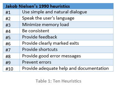
Usability is to measure the ease-of-use in user-centered interaction designs. I will discuss usability issues found on LinkedIn. These issues were discovered during heuristic evaluation following Jakob Nielsen’s heuristics (1990) [1]. Heuristic evaluation is a usability inspection method that helps in identifying usability issues in the user interface design. The aim of this inspection is to evaluate the website, to discuss the issues and propose the recommendations to improve the usability of user interface design. Below mentioned ten heuristics were used, focusing on the core functionality of LinkedIn. The following table highlights Nielsen’s ten heuristics:
Application and system configuration:
I performed heuristic evaluation on LinkedIn, a social networking website for professionals to connect and manage their network. Members of LinkedIn can look for jobs, search for new contacts and interact with each other using this reliable connection. Windows 10 and Mozilla Firefox were used for this evaluation.
Usability Issues
Inefficient color coding scheme
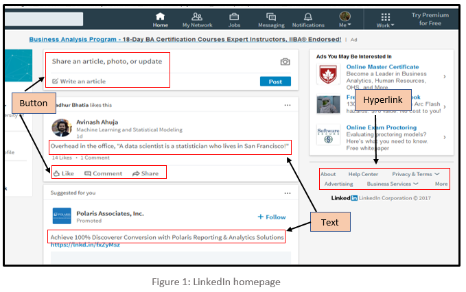
As demonstrated in Figure 1, the font colour of text, buttons, and hyperlinks provided throughout LinkedIn is light grey in colour which is very dull. Due to the light-colour text, the user has to strain their eyes, making it difficult to read long posts; for users with low vision, this problem is particularly evident. In addition, same font colour has been used throughout the website to display different content. Due to this, it is tough for users to identify the difference between normal text, action buttons, and hyperlinks. It doesn’t instinctively makes the user click the hyperlinks and buttons because it resembles just a normal readable text. This violates Heuristic #1 which states that simple and natural dialog should be used.
Recommendation:
It is recommended that the important items should stand out such as the title of the articles, action buttons, and hyperlinks. The font colour should be darker shade so that users can read it without the strain on their eyes, headings should be large and bold. The font used for the action buttons such as like, comment & share and hyperlinks should be assorted from the normal text so that users can easily differentiate between items and perform their actions accordingly.
Comments cannot be edited
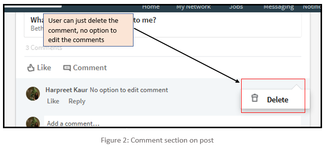
LinkedIn offers their users a functionality to add or share posts and on these posts, users can write their comments, but it does not provide an option to edit the posted comment. To correct the wrong posted comment a user has to follow a lengthy path of deleting the posted comment followed by reposting the correct comment. By just giving delete option on the comments it is not proving user the flexibility to undo their mistakes as demonstrated in Figure 2 below. This violates Heuristic #6, which states that clearly marked exits should be provided.
Recommendation:
It is suggested that LinkedIn should add functionality to edit the comment along with the delete functionality so that users can rectify their mistakes. This will enhance user’s experience and confidence in commenting on the posts. Also, it will keep away users to follow the long path of deleting the comment first and then reposting the correct.
Withdraw the request to connect
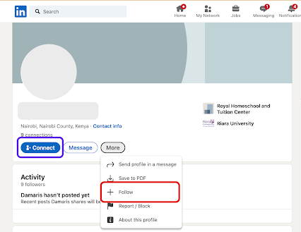
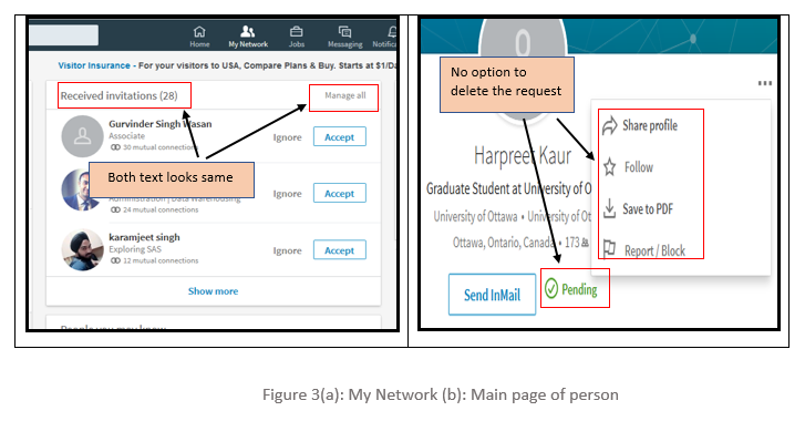
LinkedIn helps their members to build their professional network by sending and accepting invitations to connect. But, the process to delete any wrong sent invitation is very complicated, which is ambiguous to the users. The option to delete or withdraw the sent invitations is hard to find for users in LinkedIn which forces users to try several different options before reaching to the correct destination. There is a button titled ‘Manage all’ which is placed adjacent to the text field ‘Received invitation’ as shown in Figure 3, firstly the font colour for both button and text is same grey colour. Secondly, it is inside the received invitation panel which makes the user think that this button only manages received requests, however, ‘Manage all’ button is to manage all sent and received invitations. Thus, the user never clicks this button in the first place.
Addition to this, there is no option to delete the request on the main page of the person whom user sent the request. There is just a text which shows that request is still pending from that person’s side.
This violates heuristic #1, #3 which states that a simple and natural dialogue should be used, and memory load should be minimized.
Recommendation:
Just like the Received invitations section, LinkedIn should provide another panel for sent invitations where users can view and manage all their sent invitations. Also, ’Manage all’ button should stand out so that users can identify it as the action button. Furthermore, an option to delete the sent invitation should appear on the homepage of the user to whom it is sent. This will provide users another option to quickly delete the request from that person’s main page whom they sent the invitation. This will save a lot of user’s time as unnecessary navigation trail is avoided and will provide them the straightforward way to perform their action.
No Button to close the window
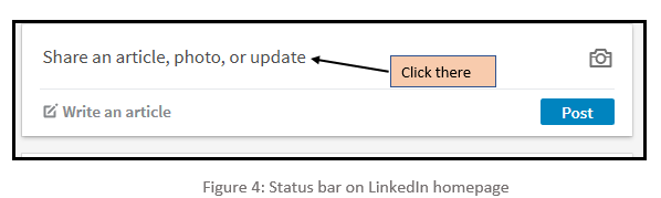
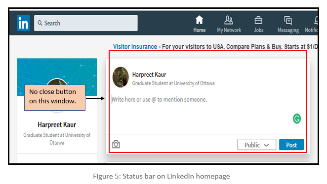
There is no option to close the sub-window which pops up when the user selects to write their post on the homepage. On the user’s homepage, there is a window with the text ‘Share an article, photo, or update’ as shown in Figure 4, when the user clicks on that, a sub-window pops up as shown in Figure 5, which let the user write or share in that provided space. But if the user needs to exit from that section without performing any task, then there is no cancel or close button. This violates Heuristic #6, which states provide clearly marked exits.
Recommendation:
LinkedIn has provided clearly marked exits as the close button throughout the website but failed to do so for post option. So, it is recommended that there should be cancel or close button on the sub-window which pops up when users try to post their content. It would help users to come out from that sub-window without performing any tasks and also support consistency.
Error while adding new contacts using registered email address.
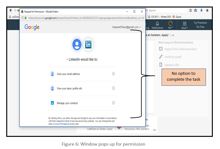
LinkedIn provides a functionality where users can use their stored contacts from their personal email account to connect with them. To do this, users have to import their address book with the provided email address and upon doing so, a new window pops up. This window has an option to allow or deny the permission which is imperative to complete the task. But those options are not visible and to make them visible, users need to maximize the window. Furthermost, there is no scroll bar to indicate more options down the page. This is not an instinctive action and often forces the users to try several options before reaching to the correct solution. Figure 6 highlights this error in the popped-up window. This is violating Heuristic #5 which states Provide feedback.
Recommendation:
There could be several options to rectify this glitch. One could be, to align the content in such a way that the permission buttons should be visible in the default window which pops up. Another recommendation is to provide a scrollbar so that users can easily scroll down and click on the desired options. Yet Another recommendation is to open the window in maximized size so that the options are visible by default.
Conclusion
There is much functionality on the LinkedIn platform which aids us in achieving our tasks. But most of the content is disorganized and this pattern is reflected throughout the layout. Despite numerous changes and improvement, LinkedIn still needs improvement so that users can use the application more efficiently. We highlighted several usability issues in their User-Interface. The content of the website should be clear in terms, easy to navigate and important items should stand out. For experienced users, it would be relatively easy to perform their trivial tasks but the new users struggle due to complexities and usability issue in the interface design. The recommended changes could be helpful in removing the issues mentioned and could also make its user-interface more efficient, adaptable, and interactive.
References
[1] Nielsen, J. (n.d.). Ten Usability Heuristics. Accessed February 9, 2005,
at https://www.nngroup.com/articles/ten-usability-heuristics/
[2] Nielsen, J., and Molich, R. (1990). Heuristic evaluation of user interfaces,
at Proc. ACM CHI'90 Conf. (Seattle, WA, 1-5 April), 249-256
[3] Lethbridge, Timothy. Studying user-interfaces, heuristics evaluations, task analysis,
at http://www.site.uottawa.ca/~tcl/csi5122/coursenotes/
[4] Ali H. Al-Badi, Michelle, O. Okam, Roobaea Al Roobaea and Pam J. Mayhew (2013), "Improving Usability of Social Networking Systems: A Case Study of LinkedIn," Journal of Internet Social Networking & Virtual Communities, Vol. 2013 (2013), Article ID 889433, DOI: 10.5171/2013.889433