By Akhil Nandyala
Introduction
E-Commerce has become a trending topic for the past few years. It
basically means buying and selling of products online using the internet. In this blog post we will be discussing the usability issues with an
e-commerce application of an organization which is by far the most popular,
most used and most profitable organization in India, that is, Flipkart. A Heuristic evaluation of the software was performed using the Jacob Nielsens 1990 Heuristics and the 1994 heuristics as the guidelines and the results were recorded. Suggestions and recommendations
are provided wherever they seemed applicable.
Description of the Software Evaluated
Flipkart is an Indian e-commerce company founded by Sachin Bansal and
Binny Bansal in 2007. The company product catalogue ranges from books to
consumer electronics. Consumers can browse along various categories of products,
add products to cart and then order the product after successful billing. Users
can also add their favorite products to wish list to keep track of all their
favorite products.
 |
| Figure 1. Flipkart Homepage |
User experience issues encountered
1. No guest checkout available,
every user is required to have an account to buy products.
Every user needs to have his/her account registered, to order
products from the site. A guest check out option is not available for an
instant, hassle free ordering of items. This violates the heuristic ‘User control
and freedom’ which states that user
should be given control of his actions. This might cause potential users
to try out other available e-commerce companies that do have this option available and require users to sign in each time they want to buy something.
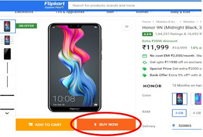
Suppose a user wants
to buy a mobile as depicted in the picture below. He has two options, ‘ADD TO
CART’ and ‘BUY NOW’. If he wants to continue shopping he can add to cart and
continue and if he needs immediate checkout he can opt for ‘BUY NOW’.
 |
| Figure 2. Product page |
Suppose he opts
for ‘BUY NOW’, he will be taken to the next screen as can be seen in picture
below, which requires him to create an account or sign in.
 |
| Figure 3. Check Out page |
As you can see
in the picture there is no Guest checkout option available which enables instant
checkout of required items. A guest checkout feature
is even provided by other e-commerce companies which is found to be very useful.
Suggested improvements to resolve issue
A guest user option can be made available to users for faster
checkout of items, for people who do not like to spend much of their time
creating an account or logging in each time they want to buy stuff.
2. No option to sign up using email ID, only Mobile numbers are allowed.
An option to allow users to create an account using their email ID
was previously available, but was removed recently due to some undisclosed
reasons. At this moment there is only option available , that is, creating an account only through
Mobile number. This is a very inflexible move by the company as many customers
would prefer using their email ID instead of their mobile number, as this is the
common procedure with many other e-commerce companies and users are very well
used to this.
It can be seen in the
screenshot below that during Sign in, I was able to sign in through either
Email ID or Mobile number. I guess this is for customers who have previously
created account using their Email ID. This violates the heuristic ‘Consistency
and standards’, since for 'Signing in', Email is allowed, but for signup it is not.
 |
| Figure 4. Login page |
As we can see in the below screenshot on how I was forced to use my mobile number and there is no
option available to sign up using Email ID.
 |
| Figure 5. Sign up page |
Another constraint is that users need to have their mobile with them
when signing up, as they are required to enter the OTP (One Time Password) which they will receive during the
process, to complete the registration process.
Suggested improvements to resolve issue
An option to
sign up through Email ID can be made available to users, in addition to Mobile
numbers. In this way users are not forced with any particular option and users
who are comfortable with either one can choose their respective choices.
3. Return to homepage option is not available
An option to
return to the home page of the website is not explicitly available, the only way to return is by clicking the Flipkart logo located at the top left of the page.
This is something a new user is not quite acquainted with.
Suppose a user is at the homepage of the website as depicted in the below pic and in the section of Deals of the Day, if he wants to view all the items, he will be clicking on the ‘VIEW ALL’ button as can be seen in below screenshot.
Suppose a user is at the homepage of the website as depicted in the below pic and in the section of Deals of the Day, if he wants to view all the items, he will be clicking on the ‘VIEW ALL’ button as can be seen in below screenshot.
 |
| Figure 6. Home page |
The ‘VIEW ALL’ button once clicked, lands him at the page as
presented in the screenshot below.
 |
| Figure 7. Page after clicking VIEW ALL option |
Now if the users wants to get back to homepage, there is no option
available on-screen that explicitly mentions homepage. The operation of getting
back to homepage can only be achieved if the user clicks on the Flipkart logo
presented at the top of the page. Not just from this particular page, if the
user is at any page in the website except for the home page, there is no option
made available indicating how to get back to home. This violates the heuristics
‘Prevent Errors’ and ‘Provide clearly marked exits’.
Suggested improvements to resolve issue.
Suggested improvements to resolve issue.
An option indicating ‘HOME’ or
‘Return to Home’ can be made explicitly available in every page of the website,
so that whenever the user wants to return to the home page from which ever page
he is on, he can be able to do that without any confusion.
In addition to that, a trail of breadcrumbs (home ->
page X -> page Y -> …) of pages, indicating the path the users has gone
through, starting from homepage can be made available so that the user can go
back to any page he has traversed through, not just the homepage. This option
is made available in some pages of the website, but not throughout the website.
4. Logo has another link right just below it, misleading users to different
page other than Homepage.
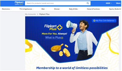
As we have discussed in the previous issue that the logo has the function of leading users to the home page, it has another very critical issue related to it. The Flipkart logo which is located at the top left of the page has another link which is closely located right below it named Explore Plus.
As we have discussed in the previous issue that the logo has the function of leading users to the home page, it has another very critical issue related to it. The Flipkart logo which is located at the top left of the page has another link which is closely located right below it named Explore Plus.
It can be seen in the
screenshot presented below
 |
| Figure 8. Congested logo design |
The Explore plus
option leads users to a page with details regarding the advantages of having a
flipkart plus account, instructions on how to register and more.
The page is as presented below
 |
| Figure 9. The Explore Plus page |
The arrangement of this option right below the logo is causing users to
accidentally land on this page, when all they want is to return to home page.
There is not any space between the two links, so it is difficult for users to
even differentiate them. This violates the heuristics ‘Prevent errors’, ‘Use
aesthetic and Minimalist design’ and ‘Provide clearly marked exits’.
Suggested improvements to resolve issue
The location of
the Explore Plus option can be moved away from the logo, so that users will not
be accidentally landed at an unwanted page. It can also be completely removed
as the Plus feature is already available in the drop down menu available in our
account settings.
If needed to be
placed in the same position, then the font size of the option must be increased
and the font color must be changed to be different from the Flipkart logos font
color, so that they contrast each other and users will easily be able to
differentiate both the options.
5. No option to get back to product page or the cart, once we are at the ‘check out’ page.
If a user decides to buy an item, he will be directed to the
checkout page once he clicks the ‘BUY NOW’ button from the product page. At
this point, if the user chooses to continue with shopping instead of ordering
the product, he cannot go back to shopping as there is no option explicitly
available asking if the user wants to continue shopping or wants to continue
checkout. This violates two heuristics ‘Give the user control and freedom’ and
‘Prevent Errors’.
Suppose a user decides to buy an item and clicks on the ‘BUY NOW’
option, as seen in the below screenshot.
 |
| Figure 10. Product page highlighting the buy now option |
He will be directed to the following page as seen in screenshot,
 |
| Figure 11. Check out page with no option to continue shopping |
We can see that there is option only to ‘CONTINUE CHECKOUT’, but there
is no option to continue shopping or return to shopping cart made available to
user. The customer is forced to continue with ordering the item at this point.
Suggested improvements to resolve issue
An option can be made available to users at this point indicating ‘CONTINUE
SHOPPING’, ‘RETURN TO CART’ or ‘RETURN TO MAIN’, so that users will have an
option to either continue with checkout or continue to shop or else, in case
they want to order some more products from cart along with the current one,
they can return to cart.
6. Inconsistent icons and text for the Remove and Delete options
Various divergent icon and text designs, for remove and delete operations are used throughout the interface which users may find difficult to interpret. Few users were even confused between the handling of the operations during user testing. They were not sure, whether the operation they performed was remove or delete. In the below series of screenshots we can see the difference in the display of the Icons and text.
In the screen to ‘Manage
Addresses’, we can see that the option to delete saved addresses along with an
option to edit the addresses is presented only when the user clicks the options
icon (icon with three vertical dots). This can be seen in the screenshot
below.
 |
| Figure 12. Visual element for Delete option in Manage Addresses page |
In the screen
where we ‘Manage Saved Cards’, the option to delete saved cards is presented as
an Icon (Trash Can shaped). Users need to click on this icon to delete the
saved cards. There is no longer an option icon containing Edit and Delete
options.
 |
| Figure 13. Visual element for delete in Manage Saved Cards page |
In the screen of
‘ORDER SUMMARY’, we can increase or decrease the item count of a particular
item, the option to remove an item from the cart is presented using a ‘REMOVE’
option in text.
This can be seen in the screenshot below
 |
| Figure 14. Remove option in Order Summary page |
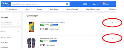
Where as in the ‘My Wishlist’ page, where all the items we tagged as
favorite are saved, the option to remove an item from the list is provided as
an Icon (Trash can Icon). Users need to click on it to remove it from the
wishlist. This can be seen in the below screenshot.
 |
| Figure 15. Different Visual element for Remove/Delete in My Wishlist page |
There is clearly
a misconception on the usage of the Delete and Remove options and this is
causing a lot of confusion among the users. The usage Trash Can icon
interchangeably for Remove and Delete operations is creating a situation where
users are puzzled. This violates the heuristics ‘Prevent errors’, ‘Be
consistent’ and ‘Speak the user language’.
Suggested improvements to resolve issue
Suggested improvements to resolve issue
A common method
of visualizing the remove and delete operations must be implemented throughout
the website, as in, the ‘My Wishlist’ page, the Cart page, the Checkout page,
the Manage Addresses and Manage Saved cards page, all must have the same method
of accessing the options.
Since in our
case the number of options are only 2, namely ‘Edit’ and ‘Delete’, we can make
those options readily available on screen rather than a separate Options option
containing set of options that can be performed.
Also it is better to use an Icon (‘X’ or ‘Trash Can Icon’) for Delete operations throughout the website. This may be either to remove items from cart, remove items from wishlist, remove saved addresses or remove saved cards.
The combination of both the recommendations is to make the Edit and Delete options readily available on screen and for Delete option, instead of displaying text, an icon will cause less confusion and more clarity for users.
7. Different mechanisms to check
if delivery is possible to required location
Different
options for delivery were made available to user when viewing different items
from the website. For instance for few products, the delivery option was a text
box, where we could type the pin code and check if the delivery is available
for that area but for few products, the delivery option contains a dropdown,
where we can select an address from the list of saved addresses and also check
for the pin code. This difference in options can be seen in the below
screenshots.
In the first
screenshot we can see that a Text box is provided to check if delivery available for pin code.
In the second
screenshot we can see that a drop down is provided to select from the list of saved addresses,
with the last option in list containing the text box to enter pin code and
check availability.
 |
| Figure 17. A Different option to check delivery availability from Product page |
Suggested improvements to resolve issue
This appears to be as an issue in the design of the interface, where
the delivery option is presenting different ways of checking the availability
of product. The option with the drop down seems more preferable and advantageous
to users, as they can easily select their preferred location from the list of
saved addresses. This also saves time to user as they do not need to again
select the complete address later during the checkout process, since the location that we select here, is automatically set as our location during checkout
also.
Conclusion
Flipkart is one of the major e-commerce companies which has become
successful in India. But even though most of its online purchases happen
through its web application, it still has some major shortcomings when it
comes to usability of its interface. I have tried to analyse some major issues
concerning its usability and presented a brief description of them in this blog post.
Many of the issues are concerning inconsistency in the design and usage of elements
on the screen and furthermore few of the reasons for those errors are bugs in design and many are mainly due to confusing screen design and lack of knowledge to do the task.

No comments:
Post a Comment