By Preyank Kumar
The IRCC Study Permit Application website is a pivotal gateway for international students aspiring to engage in Canada's dynamic academic landscape. This meticulously curated digital platform, overseen by Canadian immigration authorities, plays a crucial role in simplifying and expediting the intricate process of securing a study permit.
In an era marked by increasing global interconnectedness, the significance of the digital interface in immigration procedures becomes even more pronounced. The IRCC Study Permit Application website stands as a guiding light, deftly leading students through the complex immigration landscape and unlocking pathways to educational opportunities in Canada.
In this blog post, I have conducted a comprehensive evaluation of the IRCC website, exploring challenges associated with key areas such as session management, document uploads, application status tracking, authentication procedures, and feedback clarity. Anchored in Nielsen's Usability Heuristics, the analysis aims to provide a thorough understanding of these issues and offer practical recommendations for improvement, ensuring a more seamless and user-friendly experience for applicants.
User Experience Problems and Recommendations
If a user's active session expires, they encounter an "Invalid Session" error message without a direct link to the login page, as depicted in Screenshot 1.
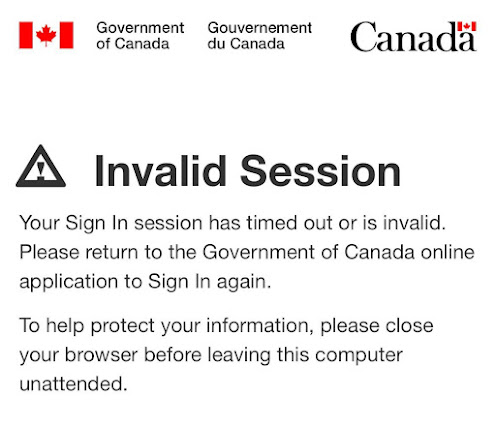
Screenshot 1: Invalid Session Page
Recommendation:
To address the Session Timeout Exception, it is recommended to implement an automatic redirection to the login page when a session expires. This proactive approach eliminates the need for the error message, directly resolving the issue and significantly improving the overall user experience.
This contravenes Nielsen's Heuristic 1, which underscores the significance of furnishing users with feedback to keep them apprised of ongoing events and expectations. To enhance the user's understanding of the situation and foster an improved user experience, providing a clear system status and an automatic redirection to the login page in such instances would be beneficial.
When a user endeavors to upload a document and subsequently finds no option to preview it, the process becomes challenging as there's no way to verify the accuracy of the submitted document.
As evident in Screenshots 2 and 3, after the successful upload, the document is displayed as uploaded. However, a critical missing feature is the absence of a document preview. Subsequently, when the user clicks the "update information" button, replacing the "upload file" button, a new document upload option appears. This new option signals that uploading this file will replace the previously submitted document.
Recommendation:
Introducing a hyperlink or a method for users to view the previously uploaded document would be beneficial in this scenario. It would empower users to review the document before making any replacements or updates, significantly improving the overall user experience.
The lack of a document preview for uploaded documents can potentially lead to errors or issues for the user, as they have no means to review the document they've uploaded. This absence of a preview feature obstructs user recognition and may result in recall errors, contradicting Nielsen's Heuristic 6, which advises providing menus and comparison tables to indicate users' paths and offering in-context help.
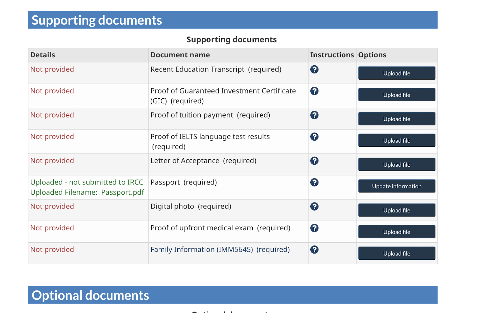
Screenshot 2: Supporting documents Uploading Page
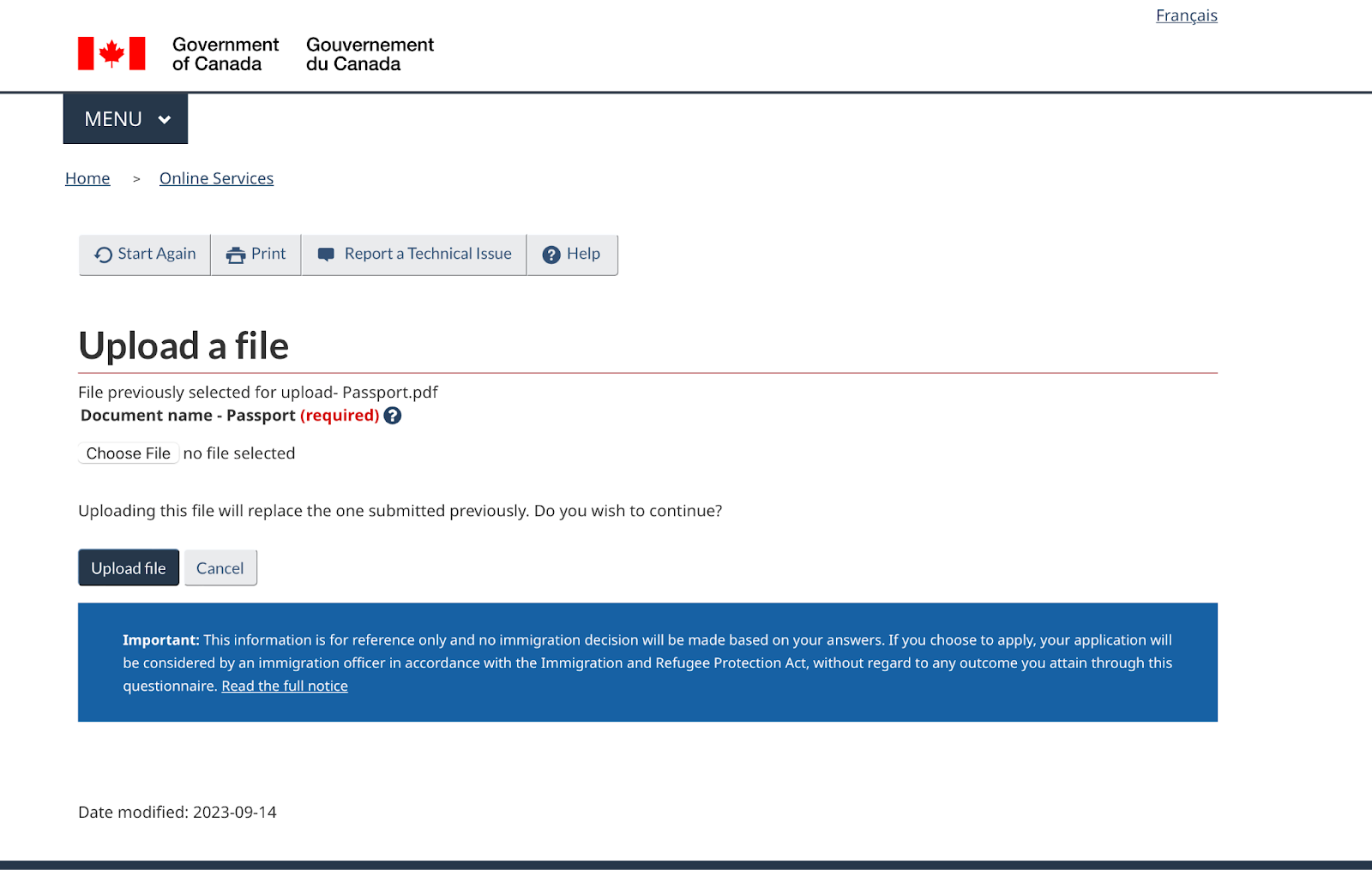
Screenshot 3: Uploading File Page
Users are encountering a discrepancy in the table that displays the application status, leading to confusion. While the final decision may have been made, certain steps are inaccurately labeled as "in progress," as illustrated in screenshot 4. The current feedback on application status lacks reliability and clarity, presenting an opportunity for improvement. Aligning the feedback with the actual application progression is crucial, even for applications that have already been approved and reached a final decision.
Recommendation:
To enhance user-friendliness, establish a logical and sequential order within the table. Accurately label steps such as "Review of Eligibility," "Review of Medical Results," "Review of Additional Documents," "Interview," "Biometrics," "Background Check," and "Final Decision," with completed steps clearly marked as "in progress." Introduce date highlights within the "Final Decision" section to improve transparency and clarity in the process.
From a usability standpoint, this issue is closely connected to Nielsen's Heuristic 1: Visibility of System Status, emphasizing the importance of keeping users informed and providing accurate feedback on the system's status. It also aligns with Heuristic 4: Consistency and Standards, stressing the need for a consistent and standard approach in presenting application status
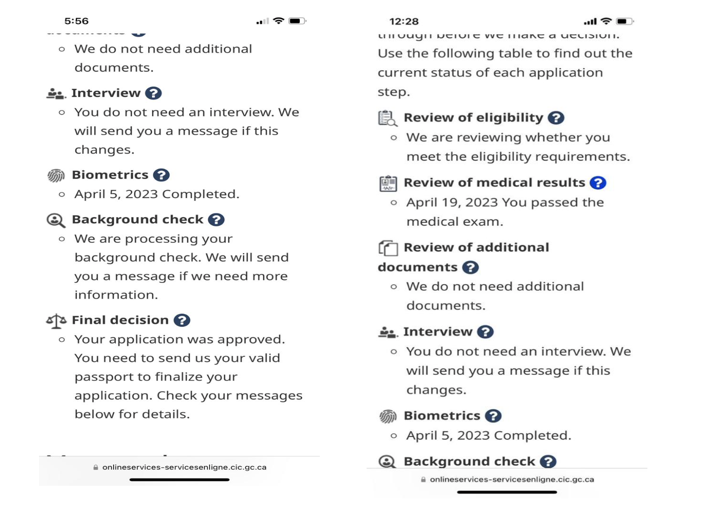
Screenshot 4: User Feedback Table Snapshot
When a user attempts to log in, they may encounter difficulties if another session is already active, and the feedback provided in such situations can be inadequate. In the specific instance captured in screenshot 5, the user is confronted with an "invalid session" error, which lacks the necessary clarity to explain the root cause of the login failure. This absence of informative feedback could lead to user confusion and misdirection.
Recommendation:
Automatically close the previous user sessions and let the user log in.
This usability concern aligns with Nielsen's Heuristic 1: Visibility of System Status, which emphasizes the significance of keeping users well-informed by providing clear and informative feedback about system events. In this particular case, the "invalid session" error message falls short in offering users the necessary understanding of why their login attempt failed. As a result, it violates Heuristic 1 by not providing a visible system status or effective communication.

Conclusion:
In conclusion, the IRCC Study Permit Application website is crucial for international students aspiring to study in Canada, but it faces notInable user experience challenges. This blog post highlighted key issues identified through heuristic evaluation out of a total of 9 problems found on the website. Grounded in Nielsen's Usability Heuristics, our assessment focused on session management, document uploads, application status tracking, and feedback clarity.
Addressing these concerns through website enhancement aligns the platform with established usability principles, crucial for providing a seamless, transparent, and efficient pathway for international students. In an era where the digital landscape shapes immigration procedures, prioritizing a user-centric approach is essential. These proposed improvements are integral to the platform's evolution, enhancing its role in facilitating educational opportunities for aspiring international students in Canada.
No comments:
Post a Comment