Showing posts with label Usability Evaluation. Show all posts

Tuesday, November 21, 2023

Lost Connections: The design deficiencies plaguing LinkedIn's website

 By Zelina Wankadiya


Introduction

In the expansive world of professional networking, LinkedIn serves as a pivotal platform connecting individuals across industries and fostering opportunities. However, as users, we often find ourselves navigating a digital landscape that, despite its vast potential, may leave much to be desired. In this blog post, we venture into some design nuances within the LinkedIn website, further delving into the user experience.

As we navigate through the design landscape of LinkedIn, our aim is not to critique merely for the sake of criticism but to initiate a constructive dialogue. Through the identification and comprehension of design challenges, we strive to contribute to a shared conversation about how platforms such as LinkedIn can progress to more effectively cater to their diverse user base.

Process

These findings were drawn from observations made while testing the website with a varied user group. These users were instructed to think aloud while performing specific tasks on the site. In addition to user testing, expert heuristic evaluations were employed to identify any underlying weaknesses in the design of LinkedIn's website.

Following were the most prominent design imperfections identified:


#1: Inconsistency in call-to-action buttons on users' profile


Usability Rating: Average

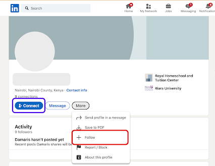
In LinkedIn user profiles, the call-to-action buttons displayed vary. As shown in Fig 1 below user profile 1 has a prominent "Connect" button on the page, while in Fig 2 user profile 2 hides it in the "More" menu. Similarly, user profile 2 features a prominent "Follow" button, while it is hidden away in the "More" menu for user profile 1


Fig 1: Follow call-to-action button is hidden in the "More" dropdown


Fig 2: Connect call-to-action button is hidden in the "More" dropdown


Recommendation: 
  • Standardize the call-to-action placement to maintain consistent colours and positioning of essential call-to-action buttons prominently, including "Connect," "Follow," and "Message," on all user profiles.


#2: Difficult to retract a connection request


Usability Rating: Bad

Users faced a challenge while trying to retract a mistakenly sent connection request. Although a mechanism was in place to retract connection requests by utilizing a toggle button, the button was labeled as "Pending", accompanied by an icon of a clock denoting the same status. Unfortunately, users failed to recognize that this toggle button could be activated to withdraw the connection request due to the absence of any clear indication or guidance, thus not making it easy for a user to recover from an error.


Fig 3: It is unclear what action will be performed when the button is clicked


Recommendation: 
  • Accurately label the button to incorporate a textual label that explicitly conveys the next state once the user interacts with it, for example, "Retract Request." Simultaneously, the icon can serve the purpose of indicating the present system state, such as "Pending".
  • Integrate a tooltip feature to furnish users with information about the control's function and the anticipated result upon clicking the button.


#3: Cluttered search recommendations


Usability Rating: Average

The search recommendation list displayed lacks hierarchy and contains excessive information when users perform searches. Each search result includes the person's name, a number indicating the closeness of "connection" (which most users don't even seem to understand), and their headline. However, this often leads to the truncation of headlines, making it difficult to comprehend it. This not only creates cluttered search results but also impedes the user's ability to understand the information presented effectively.

Fig 4: Information in the search recommendations appear cluttered

Recommendation: 
  • Include only relevant details to ensure user understanding. Avoid unclear elements like connection number (Eg. 1st or 2nd or 3rd) ; focus on workplace or education background for a more informative experience with a clean and minimalist design.
  • Organize search recommendations with structured hierarchy, rather than displaying all the information in one line. This will enhance both aesthetics and usability.

#4: Inconsistent link behaviour


Usability Rating: Average

Consistency in design patterns is crucial to avoid surprising users with unexpected actions when interacting with similar-looking controls. In this case, we've identified an inconsistency in the system where both "Contact Info" and "Number of Connections" appear as links with identical visual characteristics. However, when users click on these links, their outcomes differ. 

Fig 5: Contact info link opens up as a new webpage


Fig 6: Contact info link opens up as a modal dialog in overlay


Recommendation: 
  • Maintain a design system document that clearly defines the expected behaviour for different types of links and controls throughout the system. Ensure that all design decisions align with these standards.


Conclusion

While exploring the complexities of LinkedIn's website design, we have identified several issues that affect the user experience. These range from inconsistent call-to-action buttons to difficulties in withdrawing connection requests and crowded search recommendations. This blog focused on precisely pinpointing these weaknesses, leveraging both user testing and expert heuristic evaluations. I have also proposed recommendations to standardize design elements, improve labeling, and enhance overall usability. Given LinkedIn's continued significance as a pivotal platform in professional networking, addressing these design imperfections has the potential to create a smoother and more user-friendly experience for individuals across various industries.


Acknowledgement

I acknowledge the use of Grammarly to refine the grammar and the use of ChatGPT to improve upon the title of this blog post.


Share your experience or ideas about this blog post in the comments below! 👇


Thursday, November 16, 2023

Can OP.GG Keep Up with Gamers? An Usibility Evaluation of OP.GG

By Tiancheng Qin

What is OP.GG? A Gamer's Helper

Every 'League of Legends' match is a new battle, demanding not just skill, but also knowledge. If you play it, you might use OP.GG to get better at the game. It's like a helper that gives you lots of information. You can find out which champions are strong right now, what items to buy, and how other players are doing. We've talked to real players and looked at how they use OP.GG to find out what works well and what doesn't.


Clarity or Confusion? Real User Feedback

The Ambiguous Search Box 

Issue

Fig 1 – search box in OP.GG’s homepage.
 When you go to OP.GG, the first thing you see is a search box on the main page (see Figure 1). But it's not clear what you should search for. Is it for player names or champion names? This confusion can waste your time, especially when you're in a hurry to choose your champion before a game.

Suggestion

Fig 2 - search box in OP.GG Esports’ home page

OP.GG could make this easier. For example, the esports stats page (see Figure 2) has a search box with clear labels. If OP.GG did the same, it would help a lot. They could add labels like "Search for Players" or "Search for Champions" to the search box. This will make players more aware of what the search box does to find the information they need faster.


The sorting function is not intuitive

Issue

Fig 3 – Tier table sorted by Tier (descending order) of champion statistics in OP.GG’s champions page
Fig 4 – Tier table sorted by Win Rate (descending order) of champion statistics in OP.GG’s champions page

Fig 5 – Tier table sorted by Win Rate (ascending order) of champion statistics in OP.GG’s champions page

Players often want to sort champions based on various criteria such as win rates or specific performance metrics to inform their game strategy (see Figures 3, 4, & 5). However, this crucial feature of OP.GG is not immediately noticeable. This lack of intuitive functionality can be a major obstacle, especially when time is of the essence.

Suggestion

Fig 6 – tier table of heroes sorted by pick rate (descending order) in HSReplay.net

OP.GG can make sorting champion stats much simpler. They could look at how HSReplay.net does it (see Figure 6) and do something similar. For example, they can add clear signs or buttons to show you can sort by win rate or other stats. They could also add up and down arrows to show if the stats are from high to low or low to high. These changes would help players find the best champions faster and make better choices in their games.


lack of a 'back' button

Issue

Fig 7 – Champion page for Zed on OP.GG
Fig 8 – Zed’s champion page in OP.GG desktop apps. (image from op.gg apps, which can be downloaded here)

Have you ever clicked on a champion's page in OP.GG and then wanted to go back to where you were before (see Figure 7)? It can be annoying. On OP.GG, if you go to a champion's page, there's no easy way to return to the previous page. Even if you use OP.GG's desktop app, which has a back button (see Figure 8), it doesn't remember the filters or the page you were on before. This means you might have to start your search all over again. 

Suggestion 

OP.GG can make things better by adding a 'Back' button that remembers where you were. This button should not just take you back, but also keep the same settings or filters you had before. So, if you were looking at a list of champions with certain filters, and then clicked on one to see more, hitting 'Back' should take you to that list with your filters still there. This would save time and make the site easier to use.


Confusing Matchup Descriptions

Issue
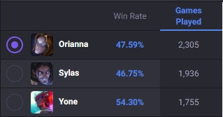
Fig 9 – The list shows Zed's win rate and the number of games played against a given champion on Zed's counters

Fig 10 – A list of counter champions indicating which are easy and which are difficult for Zed to play against

Imagine you're on OP.GG looking at champion matchups (see Figures 9 & 10). It's not clear whether the win rate shown is for Zed playing against other characters or the other way around. Furthermore, the terms "weak against" and "strong against" are ambiguous as to who is weak or strong - Zed or the other character. This confusion can be a big problem. When you're planning for a match, you need to know clearly who is strong or weak against whom. If you get this wrong, you might pick a champion thinking they have an advantage when they actually don't. This could lead to a tough game where you're already at a disadvantage from the start.

Suggestion 

OP.GG can make this easier to understand. They should change the way they show who's strong or weak against whom. For example, they could use clearer terms like "Champion A is strong against Champion B" or "Champion B struggles against Champion A."This way, players can quickly see which champions are good or bad against others, helping them make better choices for their games.


No Help with Spelling Mistakes

Issue


Fig 11 – search box at the top of Champions pages

When you use the search boxes on OP.GG, especially on the Champions pages, there's a problem (see Figure 11). If you make a spelling mistake, OP.GG doesn't help you fix it. This is really important in 'League of Legends' because the names of champions can be tricky. For example, if you type "Daruis" instead of "Darius" by accident, OP.GG won't correct you. This can mess up your search and waste your time, especially when you're trying to quickly find information about a champion.

Suggestion 
Fig 12 – search daruis in Google

OP.GG could improve by making their autocomplete feature more forgiving. For example, even if you type 'Daruis' instead of 'Darius', the system should still suggest 'Darius' as a possibility. This is similar to how Google works. When you make a typo in Google, it still understands what you mean and helps you find the right thing (see Figure 12). By making the autocomplete smarter and more tolerant of mistakes, OP.GG can help players quickly and accurately find the information they need, even if they're not sure about the exact spelling of a champion's name.


Understanding What Gamers Need

I talked to real 'League of Legends' players to see how they use OP.GG and what they think about it. This feedback is really important. Players told me that they need more than just numbers and statistics. They want OP.GG is easy to use and understand. When they're getting ready for a game, they often don't have much time. So, they need to find what they're looking for fast. My evaluation with gamers showed that a website that is easy and quick to use is just as important as having accurate stats. Players need a tool that helps them make decisions quickly, especially when they're about to play a game and every second counts.


Conclusion

For fans of 'League of Legends', OP.GG is a really useful site. It's full of data that can help you play better. However, our review found a few things that could be improved. The site could make it easier to find what you're looking for and move around. It could also help more with searches, like fixing typos. These improvements would make OP.GG is not just a place with lots of information, but a place where you can find exactly what you need quickly and easily. This is crucial because, in the game, fast and right decisions are key to winning. We hope that OP.GG listens to what players need and makes these changes. 

Acknowledge

This blog uses the Grammarly browser plugin to improve writing style.

Friday, March 12, 2021

User Experience Evaluation of Instacart

By Shuvankar Saha


Introduction

Instacart is a widely used e-commerce platform primarily focused on grocery items in Canada and the United States of America. Instacart service is available on websites and in mobile applications. This service has changed the conventional way of doing the grocery and brought the whole market of grocery items in a distance of one single click. A user can browse the grocery items by department, category, and supermarket. In addition, the users are allowed to sort the products by price and popularity within a single marketplace. Finally, a shopper assigned by Instacart delivers the grocery items to the user’s doorstep within a predefined scheduled time. It allows a user to schedule a delivery at any point of future time, communicate with the shopper while picking up the items, change the preferences on the fly, get an instant refund if the item is not available, and some other excellent features that have made this platform widely accepted and popular.

In the next section of this blog, I will talk about some of the major usability problems encountered while conducting a heuristic evaluation and an in-depth evaluation by real users on the most frequently features used within the platform. During the evaluation process, it has been observed that several usability heuristics are not followed, and it has been impacting on user experience at error prevention, user control, flexibility to use and in many other aspects. This blog will also share the recommendations that can resolve the usability issues and add more values to a user experience.


Evaluation Methods Used

This blog has focused on assessing the user experience in the Instacart website which still considered one of the most popular mediums of interacting with an e-commerce platform. As a UX expert, I have conducted the heuristic evaluation for the end to end process that includes searching for a product, determining the quantity, placing the item in the shopping cart, confirming the order, completing the payment, tracking the order, and finally providing the shopper's feedback. Additionally, I have chosen a set of six real users which is divided into the users who have previous experience in using Instacart and the others who have not worked with this platform before.


User Experience Problem in Instacart

1. Users cannot define the quantity in pounds (lbs)

Problem:

In Canada, a large number of people use the pound (lbs) metric system as a unit of measurement. Instacart only allows selecting the amount in pieces, and in kilograms. So, it does not display the amounts in pounds (lbs) for any product which is not measurable in pieces. Therefore, it leaves the users in between two compromising situations. They are either forced to do the mathematical conversion between kilograms and lbs by themselves or they purchase the product in an approximate quantity in kilograms. In both cases, it creates a non-convenient user experience. This problem violates the following two usability heuristics-

    1. Match between system and the real world
    2. User control and freedom

Figure 1: Users are not allowed to select the quantity in pounds (lbs)


Recommendations:

Instacart should introduce a choice between pounds (lbs) and kilograms (kg) for every product which is available to purchase in weight. In this way, users will have more freedom to pick up their preferred unit. The switch between the lbs and kg should act as a radio button. If a user opts for an item in lbs, the system should deselect all previous selections.


2. Users cannot recommend a particular grocery outlet

Problem:

An Instacart user can browse the items and place an order by supermarkets. But in the real world, each grocery outlet has a different set of available items in its inventory. But Instacart internally picks up the nearest grocery outlet (nearest outlet of larger supermarket like Costco, Walmart, Loblaws, Sobeys, etc.), and the shopper purchases the items from there. Sometimes, the user knows that some items are only available at a specific outlet from their own experience. But Instacart does not allow the users to mention the preferred outlet while placing the orders. Therefore, the shopper cannot find these (special) items from the nearest stores and it causes a large number of unsuccessful deliveries. This problem violates the following two usability heuristics-

    1. Match between system and the real world
    2. User control and freedom

Figure 2: Users are not allowed to select a particular Loblaws outlet 


Recommendations:

Instacart should introduce a new section to define a specific outlet if the user wishes. This field should require optional user-level input. Because not always the users will be eager to set a preference. By default, the system should pick up the nearest store and the user will be allowed to change it in any special circumstances. As the delivery fees are associated with the distance between the user's address and the outlet's address, Instacart will notify about the increase of fees if a user selects a distant outlet.


3. Misguiding the users to register before shopping at the homepage

Problem:

The initial visible portion of the Instacart home page asks a user to enter his/her respective delivery address and become a registered user of this platform. It is uncomfortable for first-time users who do not have a detailed understanding of Instacart items but still need to register themselves to browse the items and place orders. In many cases, the users prefer to complete the shopping as a guest, without registering for e-commerce service. Moreover, there is an option to start shopping right below the registration option that does not work and does not show the appropriate error message to users. Instacart has a feature to browse the items before registering which is not easily discoverable. The user needs to scroll all the way down to browse the Instacart products by different categories. Very often the users will struggle to find the guest access or forced to register for the service at the initial steps. This problem violates the following two usability heuristics-

    1. Error prevention
    2. User control and freedom

Figure 3: Users are asked to register at Instacart right after landing on the home page 

Recommendations:

Instacart should introduce a new "Continue as Guest" feature (placing a button right beside the login) that will allow the users to browse the items, add them to a shopping cart, make a payment, and place the order as a guest. Registering to Instacart should be an optional choice that should be left for the user's discretion. The system can ask to register for the platform once a user has successfully placed an order. During this time, it can attract the user by displaying the benefits of a registered user.


4. Redirecting the users to stores when they want to navigate to homepage

Problem:

Once the user steps out from the homepage and starts browsing the items at different stores, there is no system-defined way (back button, home icon, or any external event) to return to the homepage. The usability problem encountered when the user clicks at the "Instacart" icon at the top left corner. By default, the logo icon redirects a user to the system's homepage. Instacart takes the users to the "store" selection page. More importantly, the users are not allowed to go to the homepage even if the user types "instacart.ca" in the browser URL. In both cases, the system automatically redirects the users to "instacart.ca/store". The system also does not display any error message or proper guidelines to land on the initial home page. This problem violates the following two usability heuristics-

    1. Error prevention
    2. Consistency and standards

Figure 4: Users are redirected asked to select a store when they click the home page 

Recommendations:

The system should display a proper error or information message when a user is redirected to a different page that is opposite to the user's intention. The top menu should have an option to browse the products by multiple categories. This menu should be constant throughout the system so that the users do not need to frequently return back to the homepage to make a customized search.


5. Multiple terminologies used for the same item

Problem:

On the homepage, Instacart has defined the grocery stores as "Retail stores". Once the users have navigated to browse the items by the supermarket, the system has named each store as "Shop". Finally, the system has mentioned each supermarket as "stores" in the top left menu. There are three different namings to refer to a supermarket. It creates a lot of confusion among the real users. They assume these names as different types of shopping spaces and does the navigation back and forth multiple times. It increases the operational time to perform a specific task (i.e., searching an item in a particular supermarket, placing an order, etc.). This problem violates the following usability heuristic-

    1. Consistency and standards

Figure 5: Users are perplexed by the different terminologies 

Recommendations:

Instacart should name a single item constantly throughout the system. "Store" should be used as a unique identifier to refer to a shopping outlet. 


Conclusion

The usability issues mentioned in this blog have been affecting the user's operations and therefore influencing Instacart in a financial and strategical way. More importantly, some of these issues are encountered by only a set of six real users. So, the impact of user experience will be much higher if we consider a sample of a million users using this platform for their daily groceries. The product development team should have their eyes on the problems mentioned in this blog. A proper design, layout, workflow, and the dataflow between multiple widgets create a substantial impact on the user experience Proper implementation of these usability issues according to the recommended solutions can improve the operational time consumed by each user and help Instacart to increase the user-base.


References

1. Jakob Nielsen, 10 Usability Heuristics for User Interface Design, Nielsen Norman Group, Published Apr. 24, 1994; Updated Nov. 15, 2020. [Online]. Available: https://www.nngroup.com/articles/ten-usability-heuristics/. [Accessed on Mar. 12, 2021].
2. Jakob Nielsen, How to conduct Heuristic Evaluation, Nielsen Norman Group, Published Nov. 01, 1994. [Online]. Available: https://www.nngroup.com/articles/how-to-conduct-a-heuristic-evaluation/. [Accessed on Mar. 12, 2021].
3. Jakob Nielsen, Similarity Principle in Visual Design, Nielsen Norman Group, Published Sep. 06, 2020. [Online]. Available: https://www.nngroup.com/articles/gestalt-similarity/. [Accessed on Mar. 12, 2021].

Saturday, March 6, 2021

Usability Evaluation of AirIndia Website

 By: Archa Jain

 Introduction

The website "Airindia.in" is one such system that helps users to book flight tickets in advance over the internet using online payment methods from anywhere in the world. When purchasing a flight ticket, it offers users a variety of options, including the ability to choose between various ticket classes, such as economy, business, and first-class, as well as the ability to choose their preferred seat for their desired flight. This removes the need for the customer to purchase flight tickets in person at the airport. User values feature, but that is not the only thing they seek in software. The usability of the software is another such aspect that the user takes into account. The usability of an application is determined by its user interface, in addition to its functionality. If the software is difficult to use, it can lead to a poor user interface and applications that no one wants to use. 

In this blog, I will discuss some of the major usability problems discovered using various methodologies like heuristic evaluation using Jakob Neilson’s 1994 heuristics and think-aloud user testing of the Air India website. It also mentions the heuristics that are broken in those issues. Furthermore, it suggests some fixes for those issues that developers can use to make the software more usable. Then finally all the findings and the result are concluded.

Usability Issues and Recommendations

1.  Login page does not work and does not even provide any feedback or error message.

To login into a user account, the user needs to click on the login hyperlink on the home page. For logging in to an account, a user needs to fill in the registered email address and the password. Along with that, the user is required to fill in the captcha and click on the login button. On clicking the login button, only the page refreshes and the user does not get logged in even if the information provided is correct as shown in figure 1. Also, it does not provide any kind of feedback or any kind of error message about what is wrong.

This issue violates the following heuristics:

§  Heuristic #1 –Visibility of system status

§  Heuristic #5 –Error Prevention

§  Heuristic #9 – Help users recognize, diagnose, and recover from errors.


Screenshot of user performing Login

Figure 1: Screenshot of the user performing Login.

Recommendations 

There are two things that can be done to resolve this problem. 

  • One involves resolving the issue by improving the system to accept the login details and allowing the user to login into the website. 

  • Other involves making a clear error message if any fault occurs and with a relevant solution on how to proceed further from that specific issue.


    2.     Unclear input fields in enrolling/user registration form.

To create a new user account, there exist two options, either click on the login hyperlink on the home page and then click “New Users – Register” or by directly clicking on the “Enroll” hyperlink on the home page to access the registration form to create an account. While creating an account, the user needs to fill a huge form with all of them set as mandatory fields. One of the fields is “Name on Card” to fill as shown in figure 2, which does not specify any information on which card they are referring to. This kind of field made users very confused about whether to put a full name or just first name as some users mentioned they had some cards with full name on them and some with just first name.

This issue violates the following heuristics:

§   Heuristic #2 – Match between system and real world


Registration field on the Enroll page

Figure 2: Registration field on the Enroll page.

Recommendations

The solution has three parts for this problem. 

  • First one involves showing the descriptive or clearer label for the field so that user can clearly understand about which card the system is asking for. 

  • Second one includes a place holder with an example of the text that user needs to enter in the field. 

  • Last but not the least, a validation to check the value is not garbage and it matches the username that has been entered by user in other fields like first name, middle name, and last name. Also, show the error message if the validation fails with the description of what the exact error is and what user needs to change in it to make it correct. 


3. Country selection dropdown does not perform any action.

If a user wants to change the currency of the tickets on the website, then he needs to change the country from the country dropdown list on the homepage as shown in figure 3. But when the user changes the country to the UK to get the ticket prices in pounds, either the page just refreshes or sometimes it navigates to the error page as displayed in figure 4. There is no feedback provided to the user when the page refreshes. If the user continues to search the flights, he/she does not see the prices in the expected currency.

This issue violates the following heuristics:

§  Heuristic #1 – Visibility of system status

§  Heuristic #5 –Error Prevention

§  Heuristic #9 – Help users recognize, diagnose, and recover from errors


Country dropdown menu on home page

Figure 3: Country dropdown  menu on home page


Error message on changing the country.

Figure 4: Error message on changing the country.

Recommendations

There can be 2 parts to the solution for this problem. 

  • First is to show a message with the name of the country it is changed to and the name of the country it is changed from when the country changes, along with displaying correct country flag as it is a part of their design. 

  • Other part is to display the prices of the flight tickets in the currency of the selected country when user searches for any flight. 


4.  The Navigation menu covers the entire screen.

The navigation menu displayed on the home page helps to provide relevant paths or links to the users for easier accessibility. But it also hinders the entire aesthetics of the website as well by covering the whole display of the screen as displayed in figure 5. Also, there is excessive information displayed in the dropdown along with wastage of a lot of space (highlighted in the figure) of the navigation menu which is not mandatory to be shown there. Also, the navigation menu contains huge images (highlighted in the figure) which should not be included in the menu structure.

This issue violates the following heuristics:

§  Heuristic #4 – Consistency and standards

§  Heuristic #8 – Aesthetic and minimalist design


Navigation menu on the home page

Figure 5: Navigation menu on the home page

Recommendations

There can be a solution for this problem, which involves reducing the content in the navigation menu. Only display relevant links in the list without additional information, irrelevant images, and excessive space. Also, the width and height of the navigation menu should also be minimized or adjusted as per the content so that it should not cover the entire screen.


5.       Flexible dates radio button does not perform any action.

When the user searches for a flight, the user needs to fill out some of the specification related to the flight on the home page like from (the place from where you want to take a flight), to (the place you want to go), and some other details as well as shown in figure 6. There is one radio button on the form labeled as flexible dates which are selected by default (highlighted in the figure). When the user clicks on the flexible dates radio button, nothing happens. It does not get unselected nor even shown as disabled. Also, no error message or feedback is provided to the user when it is clicked.

This issue violates the following heuristics:

§  Heuristic #1 – Visibility of system status


Flexible dates radio button in the booking area of the home page

Figure 6: Flexible dates radio button in the booking area of the home page

Recommendations

One such a solution for this problem can be done by making the flexible dates as a checkbox instead of a radio button. As there can be two options in this case the user wants to search with flexible dates, and he does not. For a field like that, a radio button should not be used. Radio buttons are more useful in case of multiple mutually exclusive options. Also, the radio button is unselected only when another mutually exclusive option is selected.

 Conclusions

The website "AirIndia.in" is used by millions of people all over the world. When anyone wants to fly, they connect to this system to book a ticket for their preferred flight. However, after conducting the heuristic evaluation and think-aloud user testing, it was discovered that the application has several issues that can impede the user experience. There were several problems on the home page itself, leading to the user's decision not to use the website based on their first impression. As a result, with the explanation of the problem in the above section, some suggestions for resolving certain issues have been given to make the job easier. To conclude, several other improvements are needed to make the “AirIndia.in” website more user-friendly and accessible.


References

  1. Air India Ltd, Air India, [Online]. Available: http://www.airindia.in/. [Accessed 15 February 2021]

  2. J. Nielson, "10 Usability Heuristics for User Interface Design," Nielsen Norman Group, 24 04 1994. [Online]. Available: https://www.nngroup.com/articles/ten-usability-heuristics/. [Accessed 12 02 2021].

  3. J. Nielson, "How to Conduct a Heuristic Evaluation," Nielsen Norman Group, 1 11 1994. [Online]. Available: https://www.nngroup.com/articles/how-to-conduct-a-heuristic-evaluation/. [Accessed 12 02 2021]