By Zelina Wankadiya
Introduction
In the expansive world of professional networking, LinkedIn serves as a pivotal platform connecting individuals across industries and fostering opportunities. However, as users, we often find ourselves navigating a digital landscape that, despite its vast potential, may leave much to be desired. In this blog post, we venture into some design nuances within the LinkedIn website, further delving into the user experience.
As we navigate through the design landscape of LinkedIn, our aim is not to critique merely for the sake of criticism but to initiate a constructive dialogue. Through the identification and comprehension of design challenges, we strive to contribute to a shared conversation about how platforms such as LinkedIn can progress to more effectively cater to their diverse user base.
Process
These findings were drawn from observations made while testing the website with a varied user group. These users were instructed to think aloud while performing specific tasks on the site. In addition to user testing, expert heuristic evaluations were employed to identify any underlying weaknesses in the design of LinkedIn's website.
Following were the most prominent design imperfections identified:
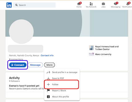
#1: Inconsistency in call-to-action buttons on users' profile
Usability Rating: Average
In LinkedIn user profiles, the call-to-action buttons displayed vary. As shown in Fig 1 below user profile 1 has a prominent "Connect" button on the page, while in Fig 2 user profile 2 hides it in the "More" menu. Similarly, user profile 2 features a prominent "Follow" button, while it is hidden away in the "More" menu for user profile 1.
Fig 1: Follow call-to-action button is hidden in the "More" dropdown
Fig 2: Connect call-to-action button is hidden in the "More" dropdown
Recommendation:
- Standardize the call-to-action placement to maintain consistent colours and positioning of essential call-to-action buttons prominently, including "Connect," "Follow," and "Message," on all user profiles.
#2: Difficult to retract a connection request
Usability Rating: Bad
Users faced a challenge while trying to retract a mistakenly sent connection request. Although a mechanism was in place to retract connection requests by utilizing a toggle button, the button was labeled as "Pending", accompanied by an icon of a clock denoting the same status. Unfortunately, users failed to recognize that this toggle button could be activated to withdraw the connection request due to the absence of any clear indication or guidance, thus not making it easy for a user to recover from an error.
Fig 3: It is unclear what action will be performed when the button is clicked
Recommendation:
- Accurately label the button to incorporate a textual label that explicitly conveys the next state once the user interacts with it, for example, "Retract Request." Simultaneously, the icon can serve the purpose of indicating the present system state, such as "Pending".
- Integrate a tooltip feature to furnish users with information about the control's function and the anticipated result upon clicking the button.
#3: Cluttered search recommendations
Usability Rating: Average
The search recommendation list displayed lacks hierarchy and contains excessive information when users perform searches. Each search result includes the person's name, a number indicating the closeness of "connection" (which most users don't even seem to understand), and their headline. However, this often leads to the truncation of headlines, making it difficult to comprehend it. This not only creates cluttered search results but also impedes the user's ability to understand the information presented effectively.
Fig 4: Information in the search recommendations appear cluttered
Recommendation:
- Include only relevant details to ensure user understanding. Avoid unclear elements like connection number (Eg. 1st or 2nd or 3rd) ; focus on workplace or education background for a more informative experience with a clean and minimalist design.
- Organize search recommendations with structured hierarchy, rather than displaying all the information in one line. This will enhance both aesthetics and usability.
#4: Inconsistent link behaviour
Usability Rating: Average
Consistency in design patterns is crucial to avoid surprising users with unexpected actions when interacting with similar-looking controls. In this case, we've identified an inconsistency in the system where both "Contact Info" and "Number of Connections" appear as links with identical visual characteristics. However, when users click on these links, their outcomes differ.
Fig 5: Contact info link opens up as a new webpage
Fig 6: Contact info link opens up as a modal dialog in overlay
Recommendation:
- Maintain a design system document that clearly defines the expected behaviour for different types of links and controls throughout the system. Ensure that all design decisions align with these standards.
Conclusion
While exploring the complexities of LinkedIn's website design, we have identified several issues that affect the user experience. These range from inconsistent call-to-action buttons to difficulties in withdrawing connection requests and crowded search recommendations. This blog focused on precisely pinpointing these weaknesses, leveraging both user testing and expert heuristic evaluations. I have also proposed recommendations to standardize design elements, improve labeling, and enhance overall usability. Given LinkedIn's continued significance as a pivotal platform in professional networking, addressing these design imperfections has the potential to create a smoother and more user-friendly experience for individuals across various industries.
Acknowledgement
I acknowledge the use of Grammarly to refine the grammar and the use of ChatGPT to improve upon the title of this blog post.
Share your experience or ideas about this blog post in the comments below! 👇


No comments:
Post a Comment