By Freddie Xu
Why CIBC📱?
CIBC is a top financial institution in North America with 11 million personal banking, business, public sector and institutional clients. Mobile banking is an online banking service provided by CIBC to their existing clients to get access to their banking account to conduct a variety of transactions on a mobile device. With the progress of mobile technology, more and more people choose to use mobile banking for their transaction activities. So it's really important to address and identify these usability issues. CIBC mobile banking is supported on iPhone, iPad, Android and many other devices. In this blog, some main user experience problems are discussed after conducting an evaluation with a set of guidelines (heuristics) on the most frequently used features in this app on iPhone. Then some suggestions will also be shared.
Problems and Suggestions
Limitations on Personalization❌
Problem:
Users with different or the same culture backgrounds may have different preferences of how the system should display like font size, theme etc. But this app says no to any users, there's no option except one default appearance. Users are not allowed to customize the system in any situation. In addition, although users are able to change a different language for the banking app, they have to leave this app and jump to the device settings manually.
Suggestion:
Customization option is really important for any app. CIBC should introduce some in the setting page. For example, lager font size for elder people or extra theme options for users with different visual preferences. Besides, the setting page in this app should provide a link to the device settings for other language options. Offering these will definitely enhance user satisfaction and maintain consistency.
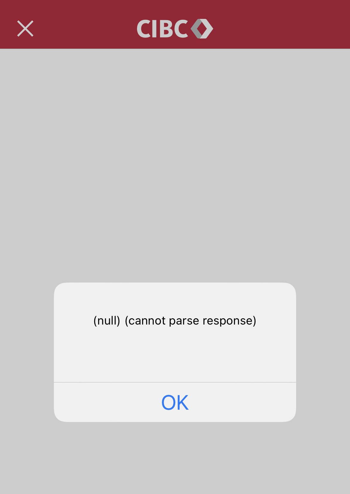
Long Response Time⏳
Problem:
It's crucial that the system should respond to users' input in a prompt way. But in this app things usually don't work like that. Users can feel a lack of smoothness in their operations, many features need more time to respond, sometimes the system even crashes without any warning. For example, when taping some button several times in a short time, the system may go on strike with a fuzzy feedback, which really annoys people.
Suggestion:
CIBC should and must develop a more robust system which can give
faster response. Users don't like lazy receptionists, the same for the response of software. In additional, a better error messaging system should also be introduced. Clear and readable feedback certainly beats technical jargon or cryptic error messages.
Stupid Messaging System📩
Problem:
System messages should match users' actions, but CIBC seems to have its own understanding about the word 'match'. When a user sets a new PIN for the card, the system alert a message at the top of screen to remind user to activate the PIN. However, this will still show even after user does what it said. Besides, users can receive some unrelated messages which are sent before the time(September) they opened the account. These messages don't match between the real world and really make some new users confused.
Suggestion:
The system should detect if users have already finished some specific actions through software or hardware in time and give
a real-time feedback. And for those new users, give some clear guidance about how to understand different messages and how to access messages they are interested in.
Obscure Expression about Wire Transfer💰
Problem:
When a wire transfer occurs, the information about it is really limited and hard to understand. When users try to get some details about the transaction from the banking statement, the system uses weird words to describe it. 'Branch Transaction:
Credit Memo' is the only information shown on the screen. Then you might think if you got some refunds because these words have nothing to do with a wire transfer. Looks like a joke but it's real.
Suggestion:
Users should be provided with more comprehensive information about this. According to some other banking systems, transactions are directly labeled as 'Wire' and fees are also calculated transparently. Some banks even offer more details like sender's name and the name of his bank. So the system should give a
more efficient review with more details.
Ambiguous Description on Account Statements📄
Problem:
Transaction history is an important feature for many users, but in this app it requires extra effort. When users try to check their bank statements for a certain period, the feedback is not very clear and sometimes descriptions may not match actual transaction that well. In some instances, users are left with 'no statement' though some transactions did occur. What's more, system continues telling users that you still need to pay for the credit even after users already made it.
Suggestion:
CIBC should consider to improve the calculation algorithm for this module, provide a more precise account statements description and clearer review of transaction history.
Confusing Redirecting Operation😵
Problem:
Once users try to explore different pages, there is no system-defined way like a back button to navigate previous pages. Then how do users get back to a specific feature or page? The answer is users have to rely on their own memory to target and navigate through menu list step by step. Actually it's more like restarting than redirecting. What's worse, in some pages there is a so-called back button, but this doesn't mean to you can go back to where you want, instead, system just returns to the homepage. And there're so many choices within the menu list which makes it a bigger challenge to get back. This is quite confusing.
Suggestion:
User freedom really maters a lot! A back button or cancel button should always help users with the system flexibility on every page. The system is supposed to go back to any page not just homepage. To have a better navigation, the introduction of search zone like a global search is highly recommended. Allow users to decide on their own if they want to go step by step from memory or they can go in an easier way, don't just follow the system limitation. And in most cases,
recall isn't that pleasing and effective.
Conclusion
CIBC mobile banking is one of the most widely used banking apps. So it's crucial to evaluate and determine the usability issues faced by users. By conducting heuristic evaluations, I have identified several problems and selected six significant ones in this blog. These problems have affected users' operations and their satisfaction, if we consider an extensive user base, these impacts will surely be higher. In summary, we know CIBC mobile banking has complicated features and modules, but these shouldn't be an excuse for lack of usability, learnability and efficiency. It's supposed to provide a more user-friendly design, straightforward navigation, efficient message services and robust responses. CIBC still have some work to do to make it a more successful app.


No comments:
Post a Comment