Saturday, March 25, 2017

Heuristic Evaluation of LinkedIn

By Harpreet Kaur
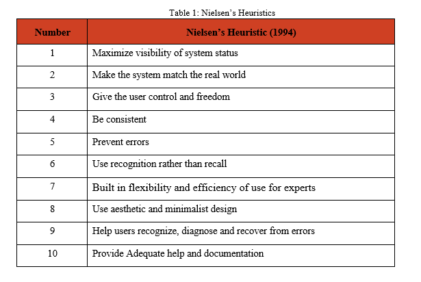
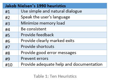
Usability is to measure the ease-of-use in user-centered interaction designs. I will discuss usability issues found on LinkedIn. These issues were discovered during heuristic evaluation following Jakob Nielsen’s heuristics (1990) [1]. Heuristic evaluation is a usability inspection method that helps in identifying usability issues in the user interface design. The aim of this inspection is to evaluate the website, to discuss the issues and propose the recommendations to improve the usability of user interface design. Below mentioned ten heuristics were used, focusing on the core functionality of LinkedIn. The following table highlights Nielsen’s ten heuristics:


Application and system configuration:
I performed heuristic evaluation on LinkedIn, a social networking website for professionals to connect and manage their network. Members of LinkedIn can look for jobs, search for new contacts and interact with each other using this reliable connection.  Windows 10 and Mozilla Firefox were used for this evaluation.
Usability Issues
  1. Inefficient color coding scheme
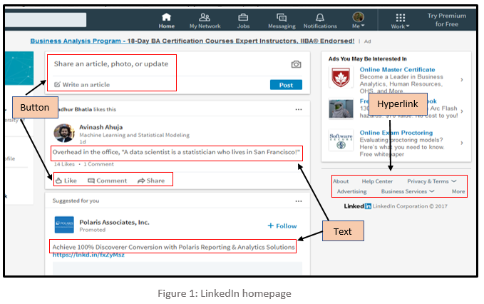
As demonstrated in Figure 1, the font colour of text, buttons, and hyperlinks provided throughout LinkedIn is light grey in colour which is very dull. Due to the light-colour text, the user has to strain their eyes, making it difficult to read long posts; for users with low vision, this problem is particularly evident. In addition, same font colour has been used throughout the website to display different content. Due to this, it is tough for users to identify the difference between normal text, action buttons, and hyperlinks. It doesn’t instinctively makes the user click the hyperlinks and buttons because it resembles just a normal readable text. This violates Heuristic #1 which states that simple and natural dialog should be used.   

Recommendation:
It is recommended that the important items should stand out such as the title of the articles, action buttons, and hyperlinks. The font colour should be darker shade so that users can read it without the strain on their eyes, headings should be large and bold.  The font used for the action buttons such as like, comment & share and hyperlinks should be assorted from the normal text so that users can easily differentiate between items and perform their actions accordingly.

  1. Comments cannot be edited
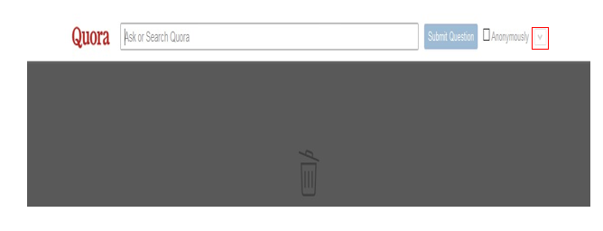
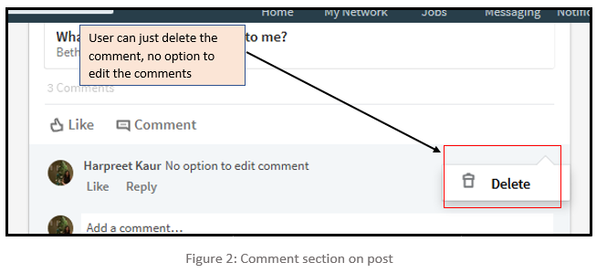
LinkedIn offers their users a functionality to add or share posts and on these posts, users can write their comments, but it does not provide an option to edit the posted comment. To correct the wrong posted comment a user has to follow a lengthy path of deleting the posted comment followed by reposting the correct comment. By just giving delete option on the comments it is not proving user the flexibility to undo their mistakes as demonstrated in Figure 2 below. This violates Heuristic #6, which states that clearly marked exits should be provided.
Recommendation:
It is suggested that LinkedIn should add functionality to edit the comment along with the delete functionality so that users can rectify their mistakes. This will enhance user’s experience and confidence in commenting on the posts. Also, it will keep away users to follow the long path of deleting the comment first and then reposting the correct.

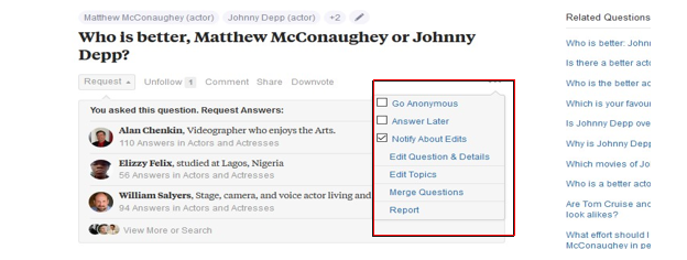
  1. Withdraw the request to connect
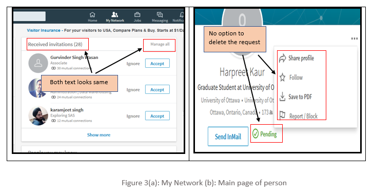
LinkedIn helps their members to build their professional network by sending and accepting invitations to connect. But, the process to delete any wrong sent invitation is very complicated, which is ambiguous to the users. The option to delete or withdraw the sent invitations is hard to find for users in LinkedIn which forces users to try several different options before reaching to the correct destination. There is a button titled ‘Manage all’ which is placed adjacent to the text field ‘Received invitation’ as shown in Figure 3, firstly the font colour for both button and text is same grey colour. Secondly, it is inside the received invitation panel which makes the user think that this button only manages received requests, however, ‘Manage all’ button is to manage all sent and received invitations.  Thus, the user never clicks this button in the first place.
Addition to this, there is no option to delete the request on the main page of the person whom user sent the request. There is just a text which shows that request is still pending from that person’s side.
This violates heuristic #1, #3 which states that a simple and natural dialogue should be used, and memory load should be minimized.


Recommendation:
Just like the Received invitations section, LinkedIn should provide another panel for sent invitations where users can view and manage all their sent invitations. Also, ’Manage all’ button should stand out so that users can identify it as the action button. Furthermore, an option to delete the sent invitation should appear on the homepage of the user to whom it is sent. This will provide users another option to quickly delete the request from that person’s main page whom they sent the invitation. This will save a lot of user’s time as unnecessary navigation trail is avoided and will provide them the straightforward way to perform their action.

  1. No Button to close the window
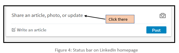
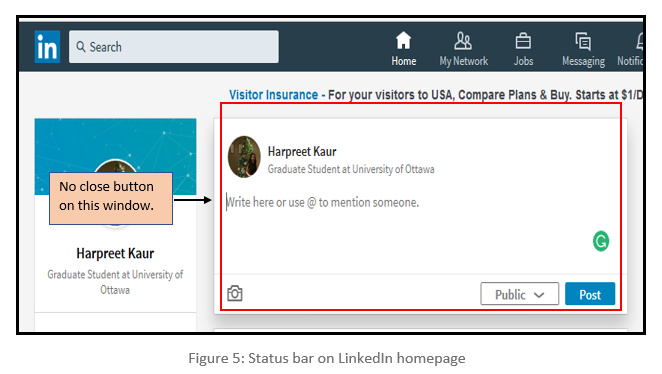
There is no option to close the sub-window which pops up when the user selects to write their post on the homepage. On the user’s homepage, there is a window with the text ‘Share an article, photo, or update’ as shown in Figure 4, when the user clicks on that, a sub-window pops up as shown in Figure 5, which let the user write or share in that provided space. But if the user needs to exit from that section without performing any task, then there is no cancel or close button. This violates Heuristic #6, which states provide clearly marked exits.

Recommendation:
LinkedIn has provided clearly marked exits as the close button throughout the website but failed to do so for post option. So, it is recommended that there should be cancel or close button on the sub-window which pops up when users try to post their content. It would help users to come out from that sub-window without performing any tasks and also support consistency.
  1. Error while adding new contacts using registered email address.
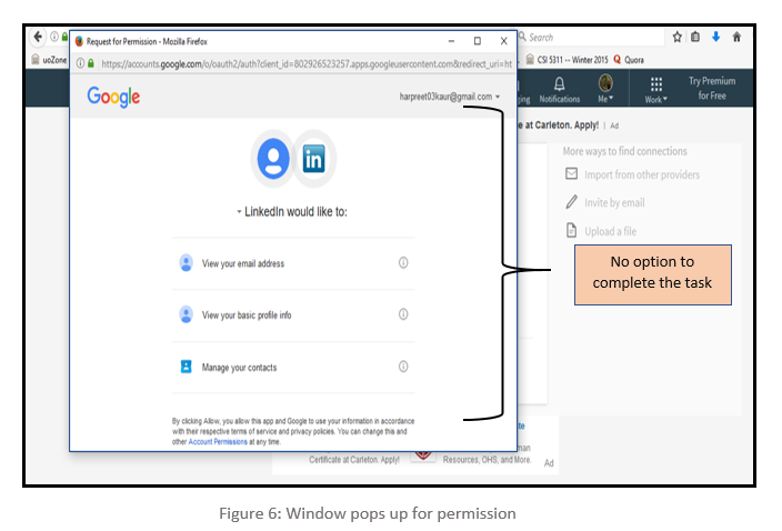
LinkedIn provides a functionality where users can use their stored contacts from their personal email account to connect with them. To do this, users have to import their address book with the provided email address and upon doing so, a new window pops up. This window has an option to allow or deny the permission which is imperative to complete the task. But those options are not visible and to make them visible, users need to maximize the window. Furthermost, there is no scroll bar to indicate more options down the page. This is not an instinctive action and often forces the users to try several options before reaching to the correct solution. Figure 6 highlights this error in the popped-up window. This is violating Heuristic #5 which states Provide feedback.


Recommendation:
There could be several options to rectify this glitch. One could be, to align the content in such a way that the permission buttons should be visible in the default window which pops up. Another recommendation is to provide a scrollbar so that users can easily scroll down and click on the desired options. Yet Another recommendation is to open the window in maximized size so that the options are visible by default.

Conclusion   

There is much functionality on the LinkedIn platform which aids us in achieving our tasks. But most of the content is disorganized and this pattern is reflected throughout the layout. Despite numerous changes and improvement, LinkedIn still needs improvement so that users can use the application more efficiently. We highlighted several usability issues in their User-Interface. The content of the website should be clear in terms, easy to navigate and important items should stand out. For experienced users, it would be relatively easy to perform their trivial tasks but the new users struggle due to complexities and usability issue in the interface design. The recommended changes could be helpful in removing the issues mentioned and could also make its user-interface more efficient, adaptable, and interactive. 

References

 
[1]     Nielsen, J. (n.d.). Ten Usability Heuristics. Accessed February 9, 2005,
              at https://www.nngroup.com/articles/ten-usability-heuristics/

[2]    Nielsen, J., and Molich, R. (1990). Heuristic evaluation of user interfaces,
at Proc. ACM CHI'90 Conf. (Seattle, WA, 1-5 April), 249-256

[3]    Lethbridge, Timothy. Studying user-interfaces, heuristics evaluations, task analysis,
at http://www.site.uottawa.ca/~tcl/csi5122/coursenotes/ 
[4]    Ali H. Al-Badi, Michelle, O. Okam, Roobaea Al Roobaea and Pam J. Mayhew (2013), "Improving Usability of Social Networking Systems: A Case Study of LinkedIn," Journal of Internet Social Networking & Virtual Communities, Vol. 2013 (2013), Article ID 889433, DOI: 10.5171/2013.889433

Usability Issues on Amazon Website

By: George Patrick Xavier


What makes an e-commerce website like Amazon (amazon.ca) that started off as a simple online book selling business, one of the biggest retail giants of today? Strongly expanding their catalog of products from books, music/movies, clothes, electronics, household goods, kid’s products and their own production of television series and movies. The answer to the question asked above is without a doubt the billions of customers that amazon has been able to please and retain with their impeccable customer services. Each and every need of the people found at one domain, spreading across various parts of the globe, delivering products at customer’s doorsteps. The main question we need to ask now is “How well does the Amazon website fare in terms of usability standards today?”

In this post I perform a heuristic evaluation on their online retail website. We see a detailed analysis using Nielsen’s 1994 heuristic(Nielsen's 1994)


USABILITY ISSUES AND RECOMMENDATIONS


1.  Filter Section on Search Page


When navigating through the website looking for different products be it as simple as searching for a product or trying to look through products in various categories that amazon offers. The search result page has a side filter menu (Fig 1.a) that lists a lot of options such as categories; sub-categories; sub-sub-categories of items related to the list of product being viewed.The following issues can be observed here:

  • Options such as brands; type; discounts; price range; which could be relevant to a user looking to find a product is placed way below in the lower-left section of the webpage.
  • These options have small fonts, with a large selection of filters for users to choose from. This confuses the user rather than help them narrow down to the product they are looking to find.
  • Each time the user selects a filter option the page refreshes. Now the issue with this is that the website does not let you make multiple filter selections at once and then refresh the page. When you are at the bottom of the page viewing the various products in a category, you decide to see a different filter option you have to scroll all the way back to where that particular option is and then select it.
  • Each time you select a filter the page refreshes and take you to the top of the page, causing users to scroll back to that section and chose the next filter and repeat this process till they reach what they are looking for.
These defects do not comply with the usability standards such as flexibility and efficiency. Also, it restricts user control and freedom.


                                                                   Fig 1.a: Search result page

1.1 Recommendation:


The possible solution for this problem are as follows:


  • The filter options section should be dynamic and move along with the page, it should not be static and stay in one section causing users to go back and find the option they want to choose. As the user scrolls down viewing different products available the filter section of the page, have this section move along with the page as the user scrolls down to the bottom of the page, this allows the user to choose different filter options from the same location on the page rather than have to go scroll back up to the top to view all the options and find the relevant one.
  • Give the user an option to select all the options they wish to and then search for it, rather than the page refreshing on its own after each selection. This will give control to the user to decide if he or she wants to look for any additional option or move straight to the options that they want to access.

2. Product information


The website mainly focuses on the cross-sell of products (Fig 2.b) which are similar to the ones you are searching for (Fig 2.a) or any product that can be bought along with the current item. These are given priority and placed on the at the top of the page and seen initially on the first view of the page.

Some of the usability issues here are as follows:

  • The list of products along with some advertisements displayed in the product view page as seen in figure(Fig 2.a), results in relevant information that a user may be interested in regarding the particular product to be pushed to the very bottom of the page. This forces the user to look at all the advertisements and options before they can actually read more information and reviews about the item actually came to the page to view.


                                                                      Fig 2.a: Product View Page

  • The user is forced to scroll up to the top of the page view the product price and basic shipping and delivery information and then scroll all the way back down as they want to view the reviews and other relevant description and information or ask any questions regarding the product.
                                                     
                                                     Fig 2.b: Cross Sell Products and Advertisement

  • The user has to go through various other product listings seen in above figure(Fig 2.b) to reach the product description section seen in figure (Fig 2.c) below:


                                                         Fig 2.c: Product Description

  • We can see more sponsored products figure(Fig 2.d) as we scroll down.


                                                           Fig 2.d: Sponsored Product Links

  • Finally, we reach the product reviews section at the bottom of the page (Fig 2.e)
                                                                 
                                                              Fig 2.e: Customer Reviews 


2.1 Recommendation:


The few ways this usability issue can be overcome are as follows:
  • First, place the relevant information about the products to the top of the page along with the initial description of the product and move the cross sell items to the lower section of the page, thus giving the user the freedom to view these if they are not satisfied with the current product they are looking at.
  • Move the advertisements to the side of the page and not occupy the main area of the webpage. Users can be given an option to close this section if they are not interested in viewing them.

  • Place shortcut buttons on the webpage in a  more visible manner, using bigger text, font and try to make it stand out on the page. This allows the user to navigate freely to the review section of the page or the product description section of the page quickly and head back to the top of the page by clicking these shortcut buttons. This gives user control over the content they wish to view and navigate through the webpage freely.

3. Wish List Section

The "Wish List" (Fig 3.a) is one of the attractive features that the website offers, allowing users to maintain a list of different products that they like, when browsing through different categories of products in the website. This gives the users an option to save the products they are interested in and wish to purchase at a later time when required

Some of the issues identified here are give below:

  • “Add a friend or family” with whom you would like to share the wish list with or receive the wish list from. This option give you two choices, one to search the person by name and the other by email id. The first option does not provide appropriate results most of the time as it suggests too many people with the same name and confuses the user. The user eventually has to search the person by email id.
  • Now when the user shares a particular wish list with that person, there is no email or webpage notification received by the recipient of this request. This leave the recipient unaware of such a share request, in order to accept the invitation to remember and add the wish list of the sender.
  • Forcing the user to manually search for this person and accept the wish list being shared does not comply with the heuristics such as flexibility and efficiency of use, as well as recognition rather than recall.


                                                                   Fig 3.a: Wish List Page  


3.1 Recommendation: 


A notification on the home page when the user logs in would be good way to start, for example a pop-up on the wish list short cut in the home page seen in figure (Fig 3.a) to help users be aware and respond to such requests. The user can be given an option to accept or ignore this request.


4. Edit Payment Method at Checkout 


This usability issues occurs in the proceed to purchase page. Where the user is not allowed to edit the payment method that has already been saved once you add your card. There is no option provided to edit the card details once it has been added to the users profile during the checkout process of the website. This issue forces the user to do the following:
  • The user will have to cancel the payment and exit the checkout, to go back to the account settings in order to find the option to edit the credit card that has been added to the account.
  • This does not comply with the principles of heuristics like provide feedback to the user with the necessary information regarding how to edit the credit card information once it is added to the user’s profile.
  • It require the user to depend on their memory to find this option and also affects the efficiency, flexibility of the user on the website.

                                                                   Fig 4.a: Payment Method


4.1 Recommendation: 


Provide user the option to edit the credit card details once it has been entered, it can be in any of the following ways:


  • First, an information pop up on the page giving users directions to the edit payment method page.
  • Second, it can be and edit button on the page once the credit card details have been added along with the option to remove cards on the “payment options” page as it is more convenient for them to take out expired or lost credit cards.


This helps the user have a better experience and efficiently work around the payment method options while not having to waste time trying to find the edit option.


CONCLUSION


Amazon web interface will be able to provide users with more simplified look, giving users a better experience as they navigate through the website. The website having millions of customers on a daily basis will be able to enhance the user experience by fixing some of the identified issues.

Heuristic Evaluation on Quora


Heuristic Evaluation on Quora

            By: Damanpreet Singh   


Introduction


Quora (www.quora.com) is a knowledge sharing website where users can ask as well as answer questions related to the field in which they either have experience or have academic understanding. Also, it allows users to have blogs and live question and answer sessions which attract and interest a lot of users. Overall, Quora boasts a very neat design and functions with very high speed due to which it receives 100 million new visitors per month with people from various age groups and regions across the globe [5]. But there are few usability issues with its interface which diminish its overall performance and attractiveness.

In this blog post, I am highlighting the results of heuristic evaluation performed on the user interface of Quora.com. The evaluation is performed using the heuristic usability inspection method, based on Jakob Nielsen’s Ten Heuristics of User Interface design (1994 version).[1, 2]. It consists of 10 critique criteria based on which the User Interface of a website or an application is evaluated while a system completes a task it intends to perform. They are outlined in the table below:
Table.PNG
                                                                                               

Usability Issues  
 
  1. Scrolling through Quora Homepage:
     While browsing through several questions and answers through quora, I noticed this vital error which irritates the user to such an extent that they prefer to use mobile application of quora rather than using its website.

  To read an answer the user is interested in, they click on the answer and a new sub-window pops up with the complete answer which is often scroll-able as many answers are long. As soon as the user reaches the end of the answer, they can keep on scrolling so that the sub-window closes and they go back to its previous window, but upon doing so, the sub-window closes and the page in the previous window is also scrolled and the user loses track.

  This error violates Heuristic #3 which states that user should be given control of his actions. In this case, an action is being performed on behalf of the user without his consent. This is classified as major usability error as this error occurs very frequently and is bothersome to, especially but not limited to, expert users who spent a long time on quora and scroll down to great depths of a page and when this happens, it becomes difficult to find the last answer they were reading to continue their trail.
 
  To read the answer highlighted by light gray color as shown in Figure 1, I click on the ‘more’ option at the end and it opens a new sub-window as shown in Figure 2.
Figure 1.PNG
                                                           Figure 1


                                                   Figure 2

This newly opened sub-window is also scroll able. As soon as I reach the end of the answer, I   should keep on scrolling to reach the window in the background as shown in Figure 3.

                                                               Figure 3

But upon doing so, even the window at the background is scrolled down. 
 
Recommendation:  
                             The solution to this problem is to develop an event handler which ensures to kill the action of scrolling as soon the sub-window is closed, and should not be executed until it is scrolled again which means that the user really wants to scroll.  Another alternative would be to not pop up the answer in the first place. Yet another alternative would be to not close the pop-up without the user taking some action like hitting escape


  1. Limited visibility of link to register via email:
    Often, new users are not able to find the link to register for an account via email. Due to very limited visibility, the link to register is concealed among other options and this forces the user to register either via Gmail account or via Facebook account. This violates Heuristic #5, which states that a system should not force the users into committing errors. In this case users are forced to perform an erroneous action to register via another social network profile and many users may not want to do so.
  The Figure 4 below demonstrates the user concerns and validates it. The link to register via an email account, which is highlighted by a red rectangle, is concealed among other options. Moreover, its size is very small and even the color coding is such that it requires users to properly scan the web page.  

Figure 4.PNG
                                                       Figure 4

Recommendation:
                           Though the page is not flooded with redundant details or flashy images, it still is unable to guide the users in the right direction. I would recommend to make this link stand out from the other options and be highlighted using proper color coding in the future versions. 

  1. Placement of advertisements at improper places :

   The web page of quora could be divided into here parts, the left pane, right pane and the center pane. Essentially, all the content is in center pane and others have just void area. As the user browses through his content, he gets advertisements on the center in between the question and the answer. This issue violates Heuristic #8 which states that aesthetic and minimalist design should be used and irrelevant information should not be made visible in between the digestible content. This is a major usability problem because it distracts the user from the actual question and it leads to many users dropping out from the website or use an ad-blocker.
 
Though there are not plenty of advertisements in quora, users will be irked if they pop up in between their answers. Figure 5 below captures one such advertisements.

Figure5.PNG
                                               Figure 5


Recommendation:  
                              Though it is overall a neat layout, I would still recommend that the right pane or left pane of the web page should be used for advertisements. It should be done not to fill the empty void, but to eliminate the annoyance generated when the adverts are flashed in between the question and answer, or in between the trail of answers. Another possible recommendation could be to display the advertisements at the end of the answer trail.    
 

  1. Content deleting is not allowed:

    A small but significant error is that a user is not allowed to delete a question it has asked after a certain amount of a grace period has passed. This grace period is based upon the activity on the page and if I exceeded some predefined threshold, then a user cannot erase the question.  
This violates Heuristic #3 which states that user should be given freedom for the content he wishes to be generated.

  Figure 6 below shows a question which I asked over a year ago, and I can no longer delete this question.
Figure 6.PNG
                                                     Figure 6
                                                           
As you can see, there is no option to delete the question. This feature is useless as often user might ask some question which they don’t want to be featured in their profile anymore. 

Recommendation:
                             User should be allowed to delete something which is reflected in his profile. In the 21st century, where social structure is of utmost importance, any sensitive content or detail about user can degrade his image and can might prompt him to either create a new account and start over again or stop using the website at all. The system should match the real world in its usability.  


  1. Difficulty in Adding Additional Details while asking Questions:
       The option to add additional details while posting a question is not as obvious as the Design team of quora thought it to be. To a new user, it could be difficult to figure out how to add details even after exploring several options and spending significant amount of time.
     This once gain Heuristic #8 which states to use simple and minimalistic design. In this case, to ensure a neat layout, extra information, which should be on a button, is ignored.
   Figure 7 below highlights the problem user faced while adding details to the question. The option to add a question is properly highlighted, but additional details can only be added through a small arrow pointing downwards. This option is neither properly highlighted nor it reflects an obvious instinct that this button is intended for additional details. The button to perform this task is highlighted with red square. 
Figure 7.PNG
                                                    Figure 7

Recommendation:  
                              
I would recommend that the option to add additional details to the question should be highlighted properly using a different color coding such that there shouldn’t be any ambiguity over the intended function of the button. Moreover, this button should be labelled and placed at such a location where a new user can impulsively know that this for adding additional details. 
 

CONCLUSIONS

  
  While Quora is a very easy-to-use website, with limited scope of improvement, a detailed heuristic evaluation based on Nielsen’s criteria surfaced several usability issues.  

 Generally, experienced users are easily able to perform the trivial tasks on this platform but new or novice users are likely to struggle to achieve the completion status of these tasks. This indicates that its user interface needs a few modifications. These modifications could be essential in increasing the overall efficiency of the existing users and attract other users to the platform.

  By investigating these usability issues in more depth and implementing user-centered solutions, Quora designers will be able to make an already well-designed website even easier to use.  

REFERENCES  

 
[1]       Nielsen, J (1994), Nielsen Norman Group, ‘Nielsen’s Heuristics 1994’,
            at https://www.nngroup.com/articles/ten-usability-heuristics/

[2]       Nielsen, J. (n.d.). Ten Usability Heuristics. Accessed February 9, 2005,
           at http://www.useit.com/papers/heuristic/heuristic_list.html 

[3]       Lethbridge, Timothy. Studying user-interfaces, heuristics evaluations, 
           at http://www.site.uottawa.ca/~tcl/csi5122/coursenotes/ 

[4]      Wikipedia, ‘Heuristic Evaluation’,
           at https://en.wikipedia.org/wiki/Heuristic_evaluation

[5]      Quora Website,
            at https://www.quora.com/