- By Swetha Narayan
Introduction

In today’s blog post, I will be telling you why I think Habitica is not the app you want to use if you want to organize your life digitally and what I would recommend for each issue found.
Before we begin with any of these, you may ask, what is Habitica?
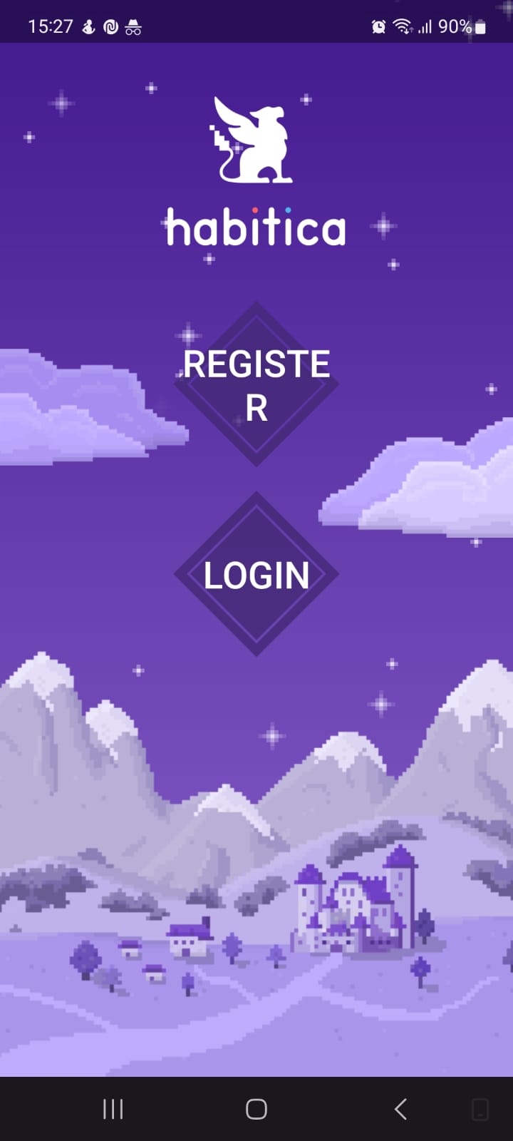
Habitica, initially called HabitRPG, is a free habit and productivity app. It is a task management system developed by HabitRPG, Inc., which the company released on January 30, 2013. The system uses gamification as a role-playing game to organize tasks.
Habitica, initially called HabitRPG, is a free habit and productivity app. It is a task management system developed by HabitRPG, Inc., which the company released on January 30, 2013. The system uses gamification as a role-playing game to organize tasks.
Okay, now that we know what Habitica is, you may ask if I am testing based on my personal preference or if there are any official guidelines that I am following?
I will use Nielsen’s 10 usability heuristics, which are 10 general principles developers or testers should follow while developing or assessing an app. Along with this, I will also be using a method called Cognitive Walkthrough, where the evaluator tries to test the applications as different types of users that are generally the targeted audience of the application. So, don’t worry, the issues I will tell you about are there, not just because I didn’t like something!
Before we jump into the actual issues, let me clarify that I will be testing this system as different types of stereotypical users and to make it more enjoyable for me to test and you to read, I have made up this family who will be acting as my actors (This is the method of cognitive walkthrough, testing as a type of user that might use the app.). So, in the family, we have James, a student in his local high school and a new user of Habitica; his elder sister Emma, a new working professional and an expert user of Habitica; their mother, a new user of Habitica but also one who is not technologically inclined.
Issues and Recommendations
1. No alerts or reminders are sent to the users for their task deadlines!
Emma loves trying out new productivity apps and websites. She hates being late on completing a task and always likes to be on top of things. She also loves planners, but she has become digital as it will allow her to access her to-dos everywhere and will send her a reminder as and when some due date is nearing.
She likes the concept of Habitica, and she used it as a student but has since stopped using it. Her main problem with Habitica? It has no reminders or alerts! Unlike other productivity apps, it doesn’t show her the tasks she has to complete each day, never sends any notification with the daily tasks reminder at the start of the day, nor does it send an alert when some deadline is nearing.It is mindboggling to Emma, who wants an app primarily to remind her of all her tasks so she can be on top of her things! Wait, what is this? She can turn on reminders on her mobile app! Maybe she should give this app another chance!
This behaviour of Habitica, where it does not send any push notification or email when the user’s task deadlines are nearing or give a reminder at the beginning of the day with the tasks of the day, is inconsistent and not standard with what usually is an industry standard for productivity app.
The main task of the productivity app is to ensure that the user completes their task on time. When the day ends, if a user does not check off their tasks of the day, then it usually causes their avatar to lose points. This action is an exemplary use of gameplay if, before this happens, the user is reminded of their open tasks and maybe even how they will lose points if they don’t do something by the day’s end. Since Habitica doesn’t give any reminders to the user, it does not prevent the user from making errors, which is not good.
Although the mobile app allows users to enable reminder settings, it is not discoverable and thus, many users won’t even know that the app has such a feature.
Recommendation
- Push notifications on the app should be enabled by default. The system should also add in-app notifications since they are a common feature for web and mobile apps. It will help make the system consistent. Additionally, the system can also give users an option to add email notifications during the setup. Email notifications will work better if the user uses the web version more than the app.
- Near the end of the day, if some task is not marked complete, the system should prompt the user with a push notification or an email saying, “The deadline monster is rapidly approaching you. Before you lose health, quick, come and see which tasks need your attention.” It should be something like how Duolingo, a language learning app, sends to their users when the learning streak is going to break.

Fig. 1: Duolingo alert

2. There is a counter button, but no numbers to be seen! Habit creation is becoming a more difficult task than following the habit!
 |
| Fig. 2 Both positive and negative buttons enabled during habit creation |
 | |
|
Now that Emma has decided to give this app another chance, she started by inputting her habits so she can keep track of them. What are these plus and minus buttons, and why are they in purple? Oh, and on click, it becomes white, but what does that mean exactly? After a few minutes of trial and error, Emma finally understood that white means disabled and Habitica has an opportunity to create positive, negative and neutral (with both positive and negative) habits. That was tough! If that is how setting up everything will be, then she might just look into switching over to some other app again.
You know an app is terrible when setting it up becomes difficult. Habit creation is a fundamental thing. If not on any other day, at least it is used a lot on the New Year’s! Now, anybody who has made their New Year resolution and stopped following through with it in the next month knows how hard it is to follow a habit (if you can do it, then good for you! You definitely don’t need this app). Creating a habit as a new user is difficult and takes more brain power than it should be! As Nielsen says, the system should be designed such that the user should recognize the system rather than memorize every process!
Recommendation
- Along with the button icons showing the current state, it would be better if there was text below the button saying what will happen once the user clicks it. In other words, the text will show the upcoming state of the button, as is the best practice in the industry and will help users recognize the buttons better.
- To further educate a new user, the app could also start a tutorial stating the use of various fields when the user first clicks the create new habit button.
3. Party creation – where is the party name?
 |
| Fig. 4 Party Home Page |
Let’s now come to the gamification aspect of the app, more specifically, the party feature. The party feature sounds very attractive, with the possibility of working with friends, old or new, real-life or online, towards a similar goal, talking with people about your achievements and motivating each other. Yes, it all sounds enjoyable, but is it really that good?
James wants to find out the same thing. He wants to create a party where he can work with his friends and maybe even make new friends. The first step he decides on is creating a party, which seems simple enough, but what is this? The party was already created, but he was not prompted to name the party! Where should he go to name the party? Oh, he sees a view party button. Maybe that’s where you go to edit the details, but no, it has no edit button. Hmmm, where is it? Oh, it is in the dropdown in the menu button beside the invite button. Good, now he can change the party name to something cooler!
Creating the party with a specific name is not intuitive to the user. James had to do quite a lot of trial and error before seeing where the edit name for the party was. Creating a party happens without confirmation from the user, so it is easy to create a party accidentally.
Recommendation
- Once the user clicks “Create Party,” they should be shown a popup with the default name of the party with a warning that on clicking “OK,” the party will be created. The user can then change or keep the name and confirm party creation. This single popup will solve both of our problems.
4. Real-time update, add new members to party – Fail!
 |
| Fig. 5 Party member list when the invited member has accepted invitation |
Now that James has created a party, he wants to invite his friends to his party. It seems easy enough, and it is. He still had to call some of his friends personally to tell them he had sent his invitations because, apparently, they don’t get any mobile or in-app notifications if an invitation is sent to them. Huh, who knew? The only notification they send, apparently, is an email!The potential member list is not updated in real time, and the user must refresh the list for the new changes to appear. The user who invites the party member gets no notification when a new member accepts their invite, whether in-app, push or email.
Anyway, now that his friends have joined the party, he wants to add a few more members. Maybe he will get a few new friends this way! Now, how should he add new members? Where is the option? Oh, he found it, and what is this? He can see two people who want to join the party, let’s invite them! Hey, my friend tells me we have a new member in the party. Why are they still on my potential member list if they have already joined 🤔?
Recommendation
- The system should implement real-time updates, but if it is tough to do so or they are unable to do them for some reason, they should give some permanent message saying that no real-time update will happen and to refresh to see new members, if any.
- A new notification should be added that should inform the leader of the party (the person who adds new members) when a member has accepted their invitation and joined the party. Ideally, it should be both in-app and push notifications.
5. Party Chat feature – Pass or Fail?
Now, he has these new members and wants to get to know them. Why not talk with them? The party does have a chat feature; after all, he messages in the group with his app. What is this? He received a notification that he just messaged in the group, weird. And his friend, who is using his laptop, did not receive any alert even though he was on the Habitica web page! Anyway, it’s good that they were together when this happened so he could tell him to go to the chat and see. However, both his friend and him are bummed out because even if they keep the chat open, they are unable to see new messages until they reload the page. James at least gets push notifications. His friend doesn’t even get that! He is going to download the app as soon as possible!
Although it is a good thing that in the mobile app, the user is getting push notifications, it is weird to get a push notification when it is the users themselves who are messaging. For the web page, though, the notification is entirely invisible! No notification either in email or in-app. The real-time update is terrible for both the mobile app and the website, as the user has to reload the page just to see the new messages, which is not a good user experience.
Recommendation
- Real-time updates are again the key solution to this problem. It is a much-needed update to this chat feature so that users can use it more easily without the frustration of reloading the page again and again.
- As for getting the notification in the app when the user sends a message, the solution is relatively easy. The system should filter the notification based on the username of the user who messaged.
- Another thing that I would like to add is that all the notifications that are already present in the app should be added to the in-app notification as well because that is a feature that works on both the website and the app. So, the user will be informed no matter if they are working on the mobile app or website.
6. Need to delete a party – how do you do that?
Emma (James’s sister) remembers the first time she started using this app. She had accidentally created a party when all she wanted to do was join a party, and what do you know, if you have your party, you can’t join another party! Now Emma had to figure out what to do to delete this party. She saw the “leave the party” option, but she was a particular person, and she did not want to just leave the party but completely delete it.It is not intuitive to the user that leaving the party would also delete a party. Granted, some people will just leave the party and not care what happens to the party, but there are also people like Emma who want to do them the right way. Another thing to note is that since it is relatively easy to create a new party, the users need an "emergency exit" or, in other words, an undo button to reverse this error quickly.
She decided the best way to find out how to delete a party was to search it on Google. Well, that is a surprise, because apparently, to delete a party, all you have to do is all the members have to leave the party! She knows for sure she would not have guessed that on her own!
Recommendation
- I agree that if the party has multiple members, the button should say leave the party, but if the party has only one member, the button could instead say “Delete Party.”
- Alternatively, if the above solution is too confusing, the developers could add another button saying “Delete Party” that should be disabled until the party only has one member when the “Leave the party” button becomes disabled and the “Delete party” button is enabled.
7. First-time users and using the website, prepare to be overwhelmed!
 |
| Fig. 6 Dashboard for first-time user |
James’s mother wants to start reading books as a hobby once again, so she decides to use Habitica to help her keep on track with the habit. She prefers websites over mobile, so she chooses to sign up using the website. Signing up was easy, and now she is on the home page, but what is this? There are so many habits, daily tasks, and to-dos. Does she need to follow all these habits, or is she required to update all these habits to fit her needs? Does she need to add five habits? That is not good. She only wants to work on one habit right now.The tutorial is present for first-time users in the mobile app but not on the website, which is inconsistent and thus confuses the user. The tutorial is a necessary help that is needed sometimes, especially for first-time users, and sure, documentation helps some, but the tutorial using visual format helps more to some kinds of users, as was the case with James’s mother. Too many dummy tasks and habits will overwhelm users and make them nervous.
Oh, she sees a help option on the menu and from the dropdown, she selects “Overview for new users.” Maybe that will help, but what is this? They are saying to create new tasks and habits. What should she do with all these existing ones? She is just so confused. She will ask James to help her once he returns from school. James, once he returned, was confused because when he signed up, he was shown a tutorial on the mobile app, so why did no tutorial come once his mother signed up on the website?
Recommendation
- Adding a tutorial to the website similar to the one in the mobile app will solve both the inconsistency and support issues.
- Making it so that the dummy tasks and habits are present just when the tutorial shows will ensure that the habit, dailies, and all the other columns remain minimal and do not overwhelm the user.
- One can say that the user may skip the tutorial the first time by accident and may not know how to do anything without the dummy tasks. In that case, we could add an info icon that will replay the tutorial should the user need to see it again.
8. Nested Task – Doesn’t work as expected!
 |
| Fig. 7 Main task checked but sub-tasks not checked - task shifts to completed tab |
 |
| Fig. 8 All sub-tasks checked but main task not checked - task remains under active tab |
Emma likes to break a huge task that she has given into multiple smaller sub-tasks for easier planning, and what do you know? Habitica has a nested task feature that will surely work for her. She added the task of cleaning her house. After all, she wanted to thoroughly clean her house before Easter when her parents were going to visit her. She washed the kitchen finally, and when she checked off the sub-task, what was this? No reward was given to her…she was expecting at least part of her reward to be given to her when she completed each sub-task. Maybe it will only come after she completes all her sub-tasks!
It was a long day for Emma, but she was finally done with cleaning her house. Now let’s see, she checked off all the sub-tasks, but what is this? The main task is still open even after she marked off all her sub-tasks and has not received any reward yet. She checked off the main task, and the system finally rewarded her, but it did disappoint her. What is the point of creating a sub-task like this if she doesn’t feel rewarded once she accomplished a sub-task...☹️
Although present in the app, the nested task is not integrated with the point system or in general, which is disappointing as it is a feature with a lot of potential. We have three main issues in the nested task.
First, the system awards no points on the completion of the sub-task. Users expect each sub-task to give them a portion of the point provided for completing the main task.
Second, the sub-tasks are not marked complete on checking off the main task as complete even though the whole task shifts from open to completed tab.
Last but not least, checking off all the sub-tasks does not automatically check off the main task and push the task into the completed tab. The user has to manually check off the primary task, and only then does it move to the completed tab. This action seems like an unnecessary extra step.
Recommendation
- The system should give points for completing each sub-task
- Once the user completes all the sub-tasks, the main task should be automatically marked complete and moved to the completed tab.
- Should the user directly check off the primary task, then in reverse to the previous point, all the sub-tasks should be marked complete.
9. Distortion on enlarging the font 😱
 |
| Fig. 9 Distortion on main page of mobile app |
.jpeg) |
| Fig. 10 Distortion on login page of mobile page |
 |
| Fig. 11 Distortion in website |
James’s Mom now uses the app in both her mobile and website interchangeably, and she likes to keep the font of her app and website on the larger side as it is easier on her eyes. But what is this in the mobile app? Both the main page and the login page are not as beautiful as they previously were! Also, she cannot read what is written on the button. How can she click the right button if she doesn’t know what it says? She doesn’t mind the website distortion as much as all her tasks are still visible, but Emma, her daughter, really hates it, saying it is a terrible user interface.
In the mobile app, if the user changes the font size from the setting to the largest size, they see that there is distortion in both the main page and the form page. Similarly, if the user zooms in on the website, there is a slight distortion near the avatar information section. However, the web distortion is relatively minor compared to the app, but it still gives a lousy user experience.
Recommendation
- The developers should also update the dynamic design used in the mobile app to indulge this case. That is, they should increase the size of the diamond and the input fields so that the text doesn’t break or get partially hidden.
- As for the website, they could simply bring down the additional information.
Conclusion
Although Habitica as an app seems interesting, it fails in some pretty important areas. It doesn’t give alerts; for reminders, you have to explicitly set it on their app by going to the settings. If you are a website user, though, then you have no reminder option at all. Although gamification is one of their selling points, their party feature has a severe issue, like no real-time update for party chat and potential party member list. The system does not notify the user when someone they have invited has joined their party. Another main issue is the inconsistency between their website and app. The mobile app has tutorials to onboard new users, but the website simply leaves you on the home page to figure it out on your own. They have a nested task feature, which was poorly integrated into the system, although it has a lot of potential. There are also some minor usability issues with distortion when zooming in, like hidden button texts. Overall, I will say although Habitica looks like an exciting app and seems to have a lot of potential, they have some major rework to do to make it a proper productivity app.
References
- Lethbridge, Timothy. http://www.site.uottawa.ca/~tcl/csi5122/coursenotes
- Nielsen's 10 usability heuristics: https://www.nngroup.com/articles/ten-usability-heuristics/
- Habitica URL: https://habitica.com/
- Duolingo URL: https://www.duolingo.com/
Acknowledgement
I want to acknowledge that I used the app Grammarly to improve my grammar and statement structure in this paper.
No comments:
Post a Comment