By Helia Hashemolhosseiny
In today's modern world, banking apps have changed the way we manage and monitor our finances. We can easily check our accounts, pay bills, and transfer money with just a few taps on our smartphones. These online platforms provide users the ability to access numerous services from anywhere, at any time. In this blog post, I discuss some significant user experience problems of the TD bank app, which is one of the top 10 North American banks and has over 27 million customers worldwide. The problems are identified using the Heuristic Evaluation (Nielsen's Heuristics) and Think-Aloud methods, and recommendations for solving each issue are provided.
To do the think-aloud test, I asked two people who regularly use the TD app to continuously express their thoughts aloud while interacting with the system and doing the following tasks:
Checking all the accounts and their balances
Depositing cheque
Paying credit balance
Finding the history of transfers
Blocking credit card or debit card
User Experience Problems and Recommendations:
“Send Money” icon is not available in section of each account:
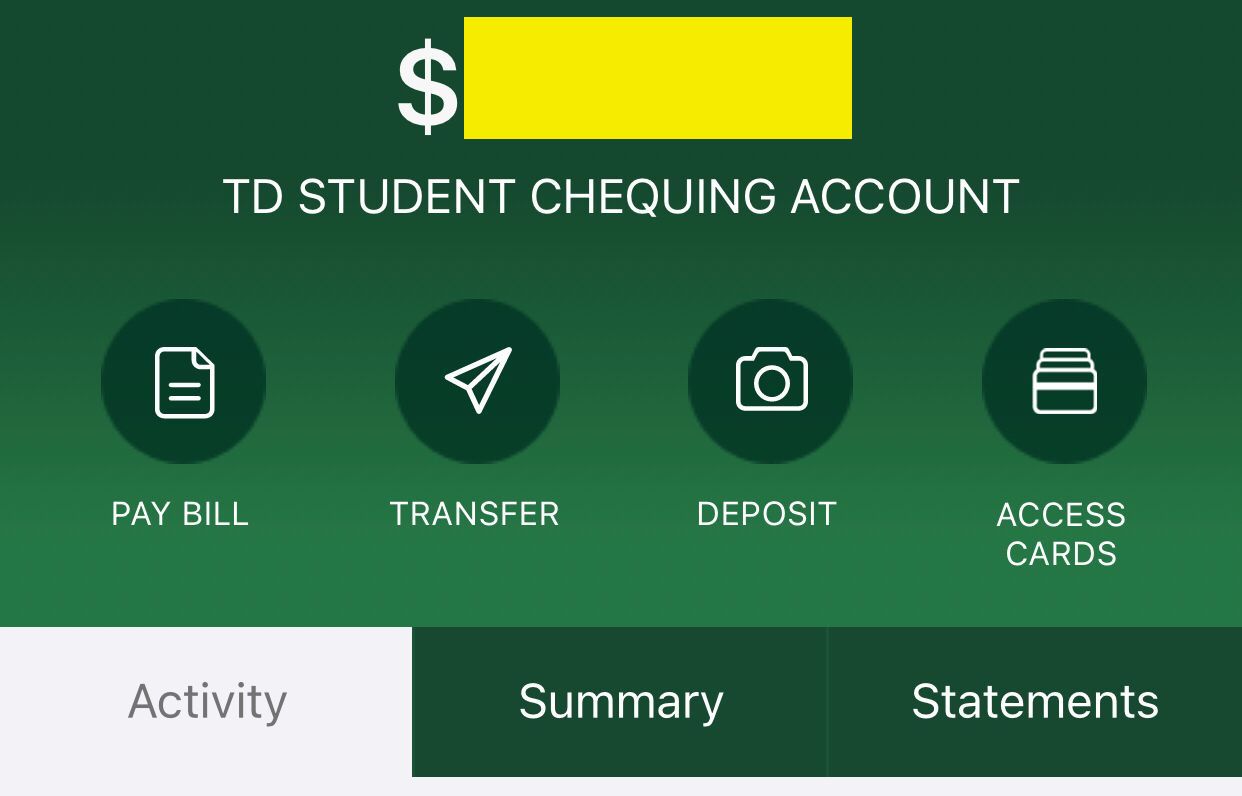
Figure1- Absence of the “Send Money” Icon in each Account Tab
There is a notable delay to update the credit card balance:
After paying the statement balance for a credit card, the money is withdrawn immediately from the user's account. However, there is a significant delay in updating the balance on a credit card. In some cases, it is necessary to log out and then log back in to view an updated balance. Therefore, increasing the updating speed or providing feedback that indicates the delay in updating would be more practical for users. Moreover, it would be better not to immediately withdraw money from the user's account if the credit balance update is delayed.
This issue is related to Response Times and Visibility of System Status, because the response time is not fast enough and any warning about this delay is not provided. In many cases, the statement balance is paid at least monthly, but it may occur more frequently, and this delay may make some users nervous.
Received and Sent Money sections are not properly separated:
In the transfer history list, it's very challenging to distinguish between “Money Sent” and “Money Received”, since these sections are not separated properly. At first, only the “Money Sent” section is displayed, and only after scrolling down does the “Money Received” section appear. The problem can be solved by creating two sub-tabs within the history tab: one for “Received” and another for “Sent”, which makes the history tab look more organized, as you can see in Figure 2.
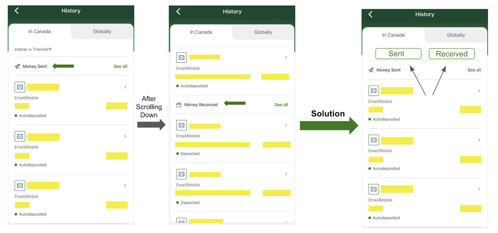
Figure 2 - Adding Sub Tabs for “Money Sent” and “Money Received”
Some elements in the “My Accounts” tab are excessively large:
The “Add Accounts and Services” section within the BANKING category appears extremely large, sharing the same size as the user's banking accounts. Similar to this, in the CREDIT section, a significant amount of space is allocated to “Apply for credit”, whereas users occasionally wish to add services and accounts. An efficient layout would emphasize the most significant elements, such as accounts and their balances, and minimize the size of less important items (Figure 3).
This concern is associated with Aesthetic and Minimalist Design, as it emphasizes focusing on the essentials. Users probably access this menu weekly to review their financial status, and the oversized presentation of less important items is distracting and unsatisfactory to them.
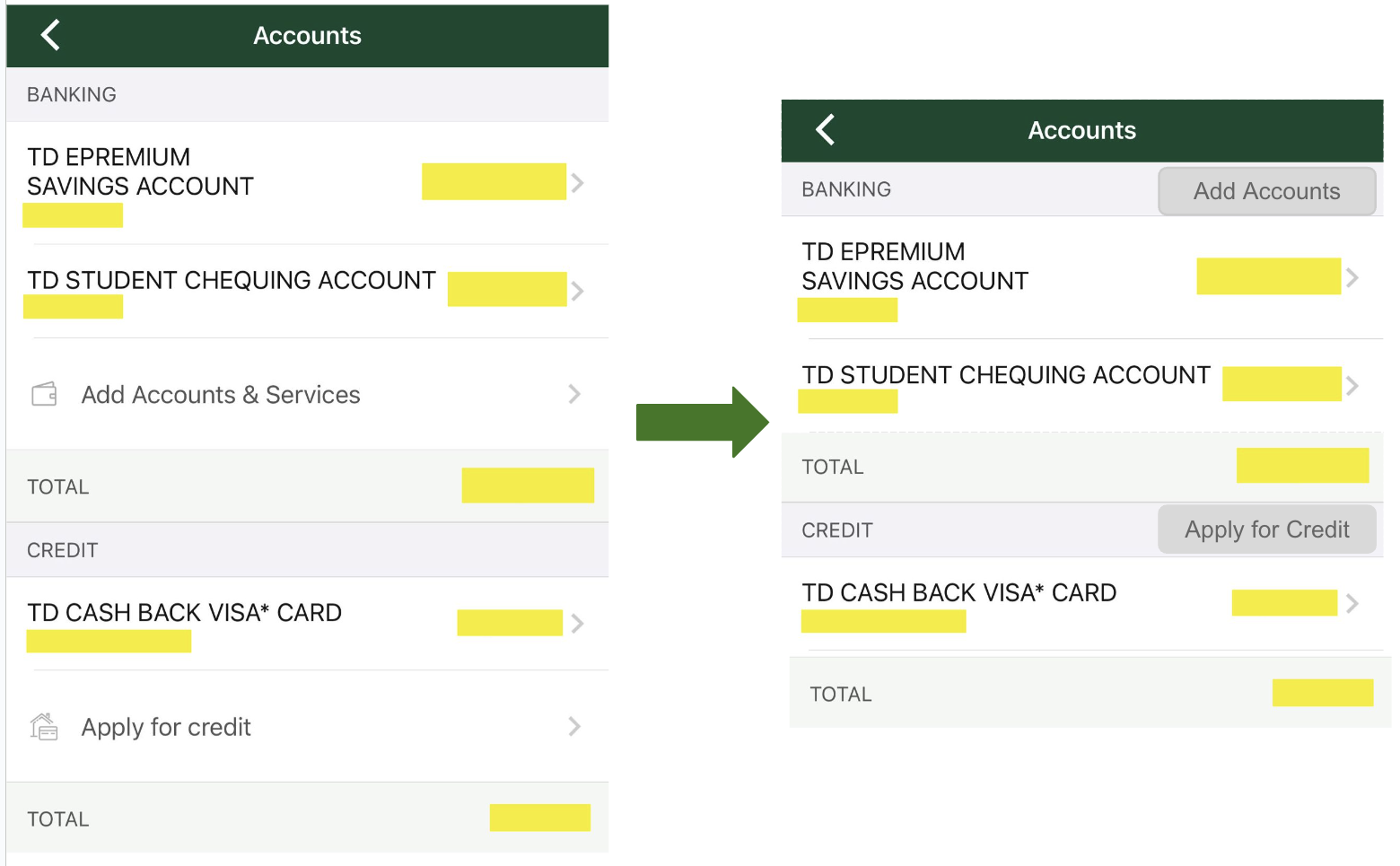
Figure 3 - Changing some UI Elements in “My Accounts” Tab
A list of autopay accounts is not available:
Users might want to track the specific charges and details from accounts with automatic payment, such as Netflix and Amazon. Although it can be challenging for them to recall all their accounts, and it might take them some time to do so. Currently, the TD app does not provide a feature to easily view this information, so it would be helpful if it listed all online accounts set up for automatic payments.
This concern is related to Flexibility and Efficiency of Use . It might not be necessary to access this list on a regular basis, but when it becomes essential to review the service provider or the amount withdrawn from your bank account, it will save you valuable time. Due to the fact that you do not need to sign into all your accounts which require you to remember or find your username and password in order to check this information.
Inappropriate use of swipe gestures in the TD bank app:
When users are navigating within one banking account tab and swipe the screen, the tab related to another banking account appears. However, in various iOS apps, such as Messages, Telegram, and Instagram, swiping from left to right typically indicates moving backward. In spite of using the TD app for more than a year, I still tend to swipe from left to right for the purpose of going backwards. To address this problem, it's recommended to design two distinct icons for navigating to the next and previous account tabs (Figure 4). Meanwhile, maintain the traditional function of swiping from left to right in iOS, which indicates moving backward.
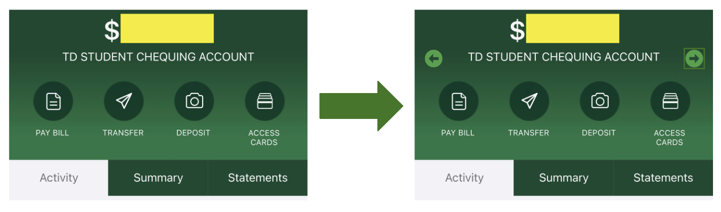
Figure 4 - Adding Backward and Forward Icons to Navigate Between Accounts
As in the TD app, a UI element behaves in a different way than in other applications, this issue is related to Consistency and Standards.
Conclusions
In this blog post, I’ve discussed crucial user experience problems of the TD bank app, identified using Heuristic Evaluation and Think-Aloud methods. The banking apps should be designed and updated based on the customers needs and try to improve the users experience. Absence of send Money icon in each account tab, notable delay in updating credit balance and improper separation of received and sent money transactions are the main problems that are highlighted in this post. In addition, poor use of some UI elements in the “My Accounts” tab, lack of list of autopay accounts, and inappropriate use of swipe gestures are the other significant issues. Solutions for these mentioned problems are also provided.
Acknowledgement:
In order to make my sentences more organized and professional, I used Wordtune and Grammarly.
No comments:
Post a Comment