By Samee Mohammad Sayeed
Introduction
E-commerce has completely changed the way we shop for by enabling us to make purchases whenever and wherever we choose. One of the biggest names in this online industry is AliExpress, a globally recognized platform that has redefined the landscape of online shopping.
The website offers a wide range of products, including electronics, apparel, and household goods, as well as buyer protection rules and options for worldwide shipping. This piece on the blog explores the user experience of AliExpress's e-commerce platform, which has become immensely popular globally due to its broad choice of products and effective cross-border trading. To gain deeper insights, we conducted a comprehensive Heuristic evaluation of the software, using both Jakob Nielsen's "10 Usability Heuristics for User Interface Design'' [1] and Nielsen Norman Group's (NN/g) heuristics [2] for e-commerce websites as our guiding principles. The evaluation provided us with valuable findings regarding the usability and user interface design of AliExpress's application. In the following section, we will discuss these findings in detail, offering targeted suggestions and recommendations, all aimed at improving the worldwide shopping experience for users.
Usability Issues and Recommendations
Inconsistent Price Sorting Functionality


Fig1. Demonstration of the sort by price feature
As depicted in Fig1., the price sorting feature in the application appears to be misleading. An upward arrow indicates that products will be arranged from the lowest price to the highest price when customers use the price sorting feature, and vice versa. However, this is not the case for the men’s clothing category, where items are not listed according to this expectation. Users who are seeking to find products within a specified price range or who are looking for the lowest options may find this inconsistency to be problematic. This violates the Match between System and the Real World heuristic and the Nielsen Norman Group’s Effective and Efficient Search Functionality. The results of the price sort do not provide the user's natural understanding of how prices are sorted since a unique, undisclosed algorithm is used instead of the conventional sorting algorithm.
The impact of this issue is considered moderate. While it may lead to confusion and inconvenience for the user, it does not completely hinder them from fulfilling their primary objective on the platform.
Recommendation
It is recommended to adopt a standard sorting algorithm where the upward arrow sorts items by ascending prices and the downward arrow does the opposite. This change would better meet user expectations regarding price sorting.
Single-Entry Password Risk in Registration Process

Fig2. Demonstration of the Registration Process
The registration process is notably streamlined and user-friendly, minimizing the number of required fields to avoid discouraging new users, as illustrated in Fig2. Validating the email address format is a crucial step in this procedure. But there might be a problem during the password-setting stage. Users are only asked to input their password once, which raises the risk of them mistakenly entering an incorrect password and facing login difficulties later. Although there is an option to display the password for verification, this is not advisable in public settings due to security concerns. This violates the Error Prevention heuristic and the Nielsen Norman Group’s Error Handling and Recovery heuristic. It does not validate the user input, making it very possible for the user here to set an incorrect password and later cause an error.
The impact of this issue is considered low. It does not hinder the registration process in its entirety, although it presents a risk of users inadvertently setting unintended passwords. Additionally, users still have the choice to reset their passwords by email if necessary.
Recommendation
To mitigate this risk, the introduction of a 'Confirm Password' field is advised. The likelihood of inadvertent password errors is greatly decreased by requiring users to input their password twice for verification. Additionally, this change would reduce the need for password resets in the future because of incorrect entry the first time.
Disorganized Category Structure in Navigation
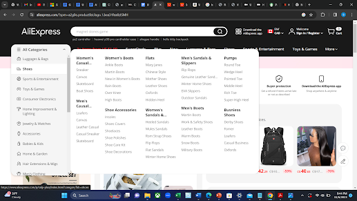
Fig3. Categories not listed in alphabetical order
As highlighted in Figure 3, the arrangement of categories, subcategories, and sub-subcategories on the platform lacks a clear and logical order. This disorganization can make it very difficult for users to find the precise goods they're looking for, which could cause annoyance and make their searches take longer. Users must currently sort through a list of categories that is arranged randomly, which can be time-consuming and inefficient. This violates the Aesthetic and Minimalist Design heuristic. The category information is not provided in a clean and minimalist manner, thus violating the specified heuristic.
The lack of product titles on the website is a serious concern, with a high level of severity. It poses substantial difficulties for users who are visually impaired. This oversight can make the site difficult to navigate and use for these groups, potentially causing them to abandon the website.
Recommendation
To enhance user navigation and efficiency, it is recommended to organize the categories, along with their respective subcategories and sub-subcategories, in alphabetical order. This orderly setup will make it easier to find requested things quickly and intuitively, which will enhance the platform's user experience overall.
Lack of Product Titles in Featured Listings

Fig4. Screenshot of the AliExpress website’s homepage
The homepage of the website displays a section called SuperDeals, where products are featured with their images and prices but lack titles. Customers who are unable to distinguish products only by their visual representation may become confused as a result of this lack of titles. People who are color blind or have other visual impairments may find it difficult to identify objects without textual descriptions, making this a particularly problematic issue for them. This violates the Recognition Rather Than Recall heuristic since relevant information such as product names is not visible. Generally, visitors to this site are looking to either buy specific items or explore various options, making it vital for product titles to be distinctly visible. The website should not assume that users can identify products solely from their images.
This issue's impact is rated as medium. While this lack of organization may lead to increased search times and potential user frustration, it is unlikely to completely prevent users from eventually finding the desired category. Still, there is no denying that this problem seriously impairs the user experience.
Recommendation
This can be fixed by including clear, concise titles or labels for each product in the featured rows, together with their prices and pictures. These titles should briefly describe the product, aiding users in understanding what they are viewing.
Complex and Long Product Titles

Fig5. Screenshot of the AliExpress website showing a particular product page
The website's product titles, as seen in Fig.5, are excessively long and filled with unnecessary information, making it more difficult for users to navigate the product page and locate particular items. This situation is a breach of the Aesthetic and Minimalist Design principle, as the product names are not concise or elegantly presented, being cluttered with redundant wording that detracts from the core product information.
This problem is regarded as having a low severity level. Although the long titles may be an inconvenience, users can usually adjust by quickly reading or ignoring the unnecessary portions of the titles. Even though this might not offer the best user experience, users can still utilize the website to achieve their goals.
Recommendation
This can be fixed by ensuring the product titles are clear and easy to read by reviewing and editing them. This can be done by rewriting the titles to remove unnecessary material and concentrate on delivering the essential details required for product identification. The revised, shorter titles should incorporate precise, descriptive keywords that succinctly summarize the most important features of the product, aiding users in quickly grasping the essence of the product.
Conclusion
After completing the heuristic analysis of AliExpress, it is clear that although the website provides a wide variety of products, there are certain important areas where the user experience may be improved. Throughout this evaluation, we've identified several key issues, which hinder usability and accessibility. Looking forward, it’s clear that continuous heuristic assessments are essential for evolving digital platforms like AliExpress. UX design methodologies need to adapt as user needs and technology environments do. By regularly assessing and updating its user interface, AliExpress can stay ahead of the curve, ensuring that it not only meets but exceeds user expectations in an increasingly competitive e-commerce world.
References
- [1] Nielsen, J. (10). Usability heuristics for user interface design.
- [2] Nielsen, J., & Molich, R. (1990, March). Heuristic evaluation of user interfaces. In Proceedings of the SIGCHI conference on Human factors in computing systems (pp. 249-256).
No comments:
Post a Comment