Showing posts with label uOttawa. Show all posts

Sunday, March 7, 2021

Usability Evaluation of MakeMyTrip Website

By Heli A. Patel

Introduction 

Usability evaluation identifies if the product is usable and learnable enough using which users can achieve their goals. This blogpost presents an evaluation of MakeMyTrip website which is an Indian online travel agency they provide booking for hotels, flights, train, cab, visa, and the evaluation is based on the usability of the system.

MakeMyTrip is one the best online travel service firms in India. They have 14 company-owned travel stores in 14 cities, over 30 franchisee-owned travel stores in 28 cities, and counters in four major airports in India. MakeMyTrip has offices in New York, Singapore, Kuala Lumpur, Phuket, Bangkok, and Dubai. In the figure 1 we can see the Home Page of MakeMyTrip.        

   Figure1. MakeMyTrip Home Page 

The evaluation was performed using heuristic evaluation and think aloud user testing. For directing the heuristic evaluation, 10 usability heuristic by Jakob Nielsen were used. User testing was done by 4 users with no experience of using this website. Recommendations to resolve issues have also been suggested.


Usability Issues and Recommendations

1.   Vertical filter bar is inefficient to use.

Every time users select any filters; website immediately updates listing, and user will be again shown top of the page, in other words users brought back to top of the page. When users scroll down to the filters and select something from the bottom part then they will have to begin from top as website’s listing update will force them and have to go through unwanted filter listing to reach back to where they were. Also, when users are accessing these filters, they have to remember lot of things as they scroll down, because they cannot see in one go what type of filter are available as shown in Figure 2. It is inefficient to use and I also believe that, it increases the cognitive load. 

Heuristics violated are as follows:

  •  Heuristic #7 – Flexibility and efficiency of use                

Figure 2. MakeMyTrip Flight Listing Page

Recommendation:

  • According to me, filters can be added horizontally exactly below search bar and above flight listing. That way users will be able to access filters efficiently. There will not be any issue regarding scrolling up and down whenever webpage gets updated as per filter selection.
  • Filters can be categorized, grouped, and can be presented as drop-down menu. Users will be able to see and use whatever the filters are provided in one go.
  • If we do not want to make changes to existing design then we can keep “Apply” button at the end of filters as well as at top part of page so after selecting filters users can click on “Apply” button, then only listing will be updated.


2.    System fails to show the amount to pay status.

If users select “Yes”, to the insurance(Figure 4), to see how much they’d have to pay, users have to scroll up all the way back to the top to see the final amount(Figure 3). Even, when they remove default opt-in the “good cause” amount, they have to scroll up to see it in their invoice breakdown. The interface fails to show the user, how the changes made affected the overall amount they will have to pay. 

Heuristics violated are as follows:

  • Heuristic #1 – Visibility of system status
  • Heuristic #7 – Flexibility and efficiency of use    

Figure 3. Review Flight Booking Page(Top portion)


Figure 4. Review Flight Booking Page(Bottom portion)

Recommendation:

  • This issue can be solved by giving instant feedback to users that can keep users updated on their current amount to pay. I suggest keeping the invoice part of the web page stable and the rest of the part movable so that users can stay updated of the status of their total amount to pay whenever they make any purchase or anything else. This will decrease the work of constantly scrolling up and down and increase the flexibility as well as the efficiency of the current system.


3.    Ambiguous error.

There was an issue loading the review booking page for the flight I already choose to book, but system gave an error something like this “No flights found on this route for the requested date” as highlighted in Figure 5. That made me think, did not I already choose the flight? and I was expecting to review my chosen flight, its rules for cancellation, timing, etc. This given error is so unacceptable, it can confuse the user by giving such system status and the user might not be able to get correct information.

Users can start using another websites as well because no proper guidance is available. So, a confused person might just leave the website and look for another source.

Heuristics violated are as follows:

  • Heuristic #1 – Visibility of system status
  • Heuristic #9 – Help users recognize, diagnose, and recover from errors
  • Heuristic #10 – Help and documentation
     

Figure 5. Review Flight Booking Page

Recommendation:

  • I think the proper error is required suggesting the reason for not able to show the review of booking. Also, solution should be given along with the error. The solution can be some documentation, help , or something that can guide users to complete their goal.

4.   Incompetent listing of rooms.

The way rooms of any selected hotels are presented is very incompetent. Basically, it is forcing users to remember a lot of things. Suppose users need to select a room that offers free Wi-Fi, so users have to scroll down and analyze these things by themselves only.

Given list of rooms can make users frustrated as it is not helpful to choose the room as per the user’s requirements and it seems to increase cognitive load because users have to scroll through all the unwanted information even if they are exploring options they need. In Figure 6, the room listing is shown.

Heuristics violated are as follows:

  • Heuristic #7 – Flexibility and efficiency of use  
  • Heuristic #8 – Aesthetic and minimalist design

Figure 6.  Room Listing during Hotel Booking 

Recommendation:

  • There can be listed as per the facilities, the number of people, price, size of the room, etc. For that, we can arrange drop-down menus, filters which can help users with sorting and list out rooms as per their requirements.
  • Also, minimize option can be added for each room information block that is listed so that users can minimize options they did not like.


5.   Inconsistent system status.

Hotel booking does not show proper system status whereas during flight booking proper status was given. The page has the heading “Review Hotel Booking” as shown in Figure 7, but it also takes user details as well as it contains a payment option too. Users might feel overwhelmed and they cannot know from the start what information can be found on this page, they have to scroll down till the end of the web page to get proper knowledge of information available because too much information is given on a single page and heading of the webpage is not entirely correct.

Another problem is that for the same website it is inconsistent to have different designs for flight booking and hotel booking because it feels like we are using different website. Flight booking does every task(review of booking, user details, payment, etc.) separately unlike hotel booking. 

Heuristics violated are as follows:

  • Heuristic #1 – Visibility of system status
  • Heuristic #4 – Consistency and standards
  • Heuristic #7 – Flexibility and efficiency of use  
  • Heuristic #8 – Aesthetic and minimalist design

Figure 7. Review Hotel Booking Page(Top portion)

   Figure 8. Review Hotel Booking Page(Bottom portion)

Recommendation:

  • I suggest that tasks like review booking, user details, and payment can be given in a separate webpage with status scale is given on top that shows the status of completed tasks and upcoming tasks as per available tasks on each web page. That way status issue will be solved as well as users will not feel overwhelmed. It can help users to know what process is completed and what they will have to complete in further process. 


Conclusion 

MakeMytrip has sophisticated features, but those features should not compromise the efficiency, learnability, and easiness of the system. It will not make sense to have features that cannot be utilized by the users due to its complexity. In addition, implementing a proper feedback mechanism can guide users, prevent errors, and give them a sense of the system's status. Basically, as per the issues we discovered, it is essential to create something that has a good design, solid efficiency, robust feedback mechanism, straightforward instructions, and that all should lead to enhanced usability and learnability of the system. The recommended changes will be helpful to make the system more efficient, learnable, and adaptive.



Saturday, March 25, 2017

Heuristic Evaluation of LinkedIn

By Harpreet Kaur
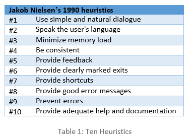
Usability is to measure the ease-of-use in user-centered interaction designs. I will discuss usability issues found on LinkedIn. These issues were discovered during heuristic evaluation following Jakob Nielsen’s heuristics (1990) [1]. Heuristic evaluation is a usability inspection method that helps in identifying usability issues in the user interface design. The aim of this inspection is to evaluate the website, to discuss the issues and propose the recommendations to improve the usability of user interface design. Below mentioned ten heuristics were used, focusing on the core functionality of LinkedIn. The following table highlights Nielsen’s ten heuristics:


Application and system configuration:
I performed heuristic evaluation on LinkedIn, a social networking website for professionals to connect and manage their network. Members of LinkedIn can look for jobs, search for new contacts and interact with each other using this reliable connection.  Windows 10 and Mozilla Firefox were used for this evaluation.
Usability Issues
  1. Inefficient color coding scheme
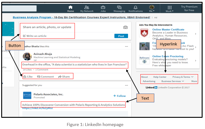
As demonstrated in Figure 1, the font colour of text, buttons, and hyperlinks provided throughout LinkedIn is light grey in colour which is very dull. Due to the light-colour text, the user has to strain their eyes, making it difficult to read long posts; for users with low vision, this problem is particularly evident. In addition, same font colour has been used throughout the website to display different content. Due to this, it is tough for users to identify the difference between normal text, action buttons, and hyperlinks. It doesn’t instinctively makes the user click the hyperlinks and buttons because it resembles just a normal readable text. This violates Heuristic #1 which states that simple and natural dialog should be used.   

Recommendation:
It is recommended that the important items should stand out such as the title of the articles, action buttons, and hyperlinks. The font colour should be darker shade so that users can read it without the strain on their eyes, headings should be large and bold.  The font used for the action buttons such as like, comment & share and hyperlinks should be assorted from the normal text so that users can easily differentiate between items and perform their actions accordingly.

  1. Comments cannot be edited
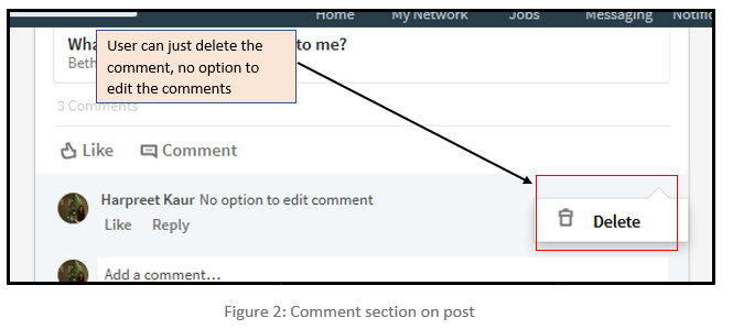
LinkedIn offers their users a functionality to add or share posts and on these posts, users can write their comments, but it does not provide an option to edit the posted comment. To correct the wrong posted comment a user has to follow a lengthy path of deleting the posted comment followed by reposting the correct comment. By just giving delete option on the comments it is not proving user the flexibility to undo their mistakes as demonstrated in Figure 2 below. This violates Heuristic #6, which states that clearly marked exits should be provided.
Recommendation:
It is suggested that LinkedIn should add functionality to edit the comment along with the delete functionality so that users can rectify their mistakes. This will enhance user’s experience and confidence in commenting on the posts. Also, it will keep away users to follow the long path of deleting the comment first and then reposting the correct.

  1. Withdraw the request to connect
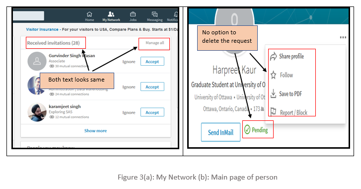
LinkedIn helps their members to build their professional network by sending and accepting invitations to connect. But, the process to delete any wrong sent invitation is very complicated, which is ambiguous to the users. The option to delete or withdraw the sent invitations is hard to find for users in LinkedIn which forces users to try several different options before reaching to the correct destination. There is a button titled ‘Manage all’ which is placed adjacent to the text field ‘Received invitation’ as shown in Figure 3, firstly the font colour for both button and text is same grey colour. Secondly, it is inside the received invitation panel which makes the user think that this button only manages received requests, however, ‘Manage all’ button is to manage all sent and received invitations.  Thus, the user never clicks this button in the first place.
Addition to this, there is no option to delete the request on the main page of the person whom user sent the request. There is just a text which shows that request is still pending from that person’s side.
This violates heuristic #1, #3 which states that a simple and natural dialogue should be used, and memory load should be minimized.


Recommendation:
Just like the Received invitations section, LinkedIn should provide another panel for sent invitations where users can view and manage all their sent invitations. Also, ’Manage all’ button should stand out so that users can identify it as the action button. Furthermore, an option to delete the sent invitation should appear on the homepage of the user to whom it is sent. This will provide users another option to quickly delete the request from that person’s main page whom they sent the invitation. This will save a lot of user’s time as unnecessary navigation trail is avoided and will provide them the straightforward way to perform their action.

  1. No Button to close the window
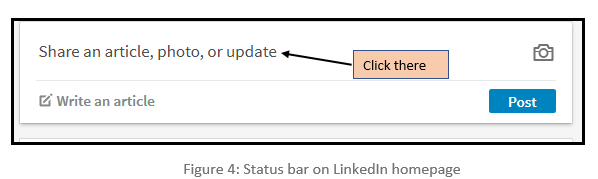
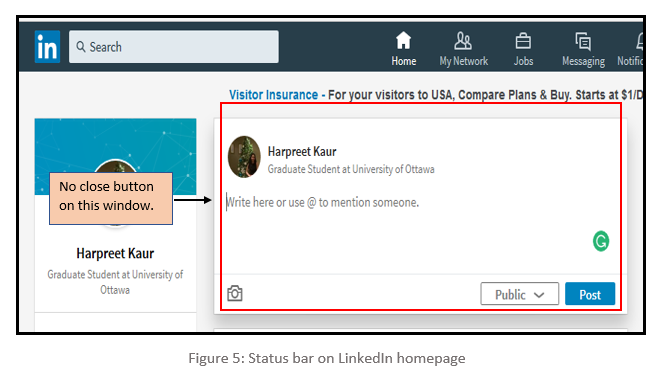
There is no option to close the sub-window which pops up when the user selects to write their post on the homepage. On the user’s homepage, there is a window with the text ‘Share an article, photo, or update’ as shown in Figure 4, when the user clicks on that, a sub-window pops up as shown in Figure 5, which let the user write or share in that provided space. But if the user needs to exit from that section without performing any task, then there is no cancel or close button. This violates Heuristic #6, which states provide clearly marked exits.

Recommendation:
LinkedIn has provided clearly marked exits as the close button throughout the website but failed to do so for post option. So, it is recommended that there should be cancel or close button on the sub-window which pops up when users try to post their content. It would help users to come out from that sub-window without performing any tasks and also support consistency.
  1. Error while adding new contacts using registered email address.
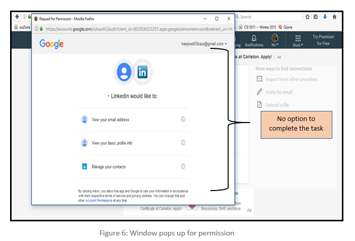
LinkedIn provides a functionality where users can use their stored contacts from their personal email account to connect with them. To do this, users have to import their address book with the provided email address and upon doing so, a new window pops up. This window has an option to allow or deny the permission which is imperative to complete the task. But those options are not visible and to make them visible, users need to maximize the window. Furthermost, there is no scroll bar to indicate more options down the page. This is not an instinctive action and often forces the users to try several options before reaching to the correct solution. Figure 6 highlights this error in the popped-up window. This is violating Heuristic #5 which states Provide feedback.


Recommendation:
There could be several options to rectify this glitch. One could be, to align the content in such a way that the permission buttons should be visible in the default window which pops up. Another recommendation is to provide a scrollbar so that users can easily scroll down and click on the desired options. Yet Another recommendation is to open the window in maximized size so that the options are visible by default.

Conclusion   

There is much functionality on the LinkedIn platform which aids us in achieving our tasks. But most of the content is disorganized and this pattern is reflected throughout the layout. Despite numerous changes and improvement, LinkedIn still needs improvement so that users can use the application more efficiently. We highlighted several usability issues in their User-Interface. The content of the website should be clear in terms, easy to navigate and important items should stand out. For experienced users, it would be relatively easy to perform their trivial tasks but the new users struggle due to complexities and usability issue in the interface design. The recommended changes could be helpful in removing the issues mentioned and could also make its user-interface more efficient, adaptable, and interactive. 

References

 
[1]     Nielsen, J. (n.d.). Ten Usability Heuristics. Accessed February 9, 2005,
              at https://www.nngroup.com/articles/ten-usability-heuristics/

[2]    Nielsen, J., and Molich, R. (1990). Heuristic evaluation of user interfaces,
at Proc. ACM CHI'90 Conf. (Seattle, WA, 1-5 April), 249-256

[3]    Lethbridge, Timothy. Studying user-interfaces, heuristics evaluations, task analysis,
at http://www.site.uottawa.ca/~tcl/csi5122/coursenotes/ 
[4]    Ali H. Al-Badi, Michelle, O. Okam, Roobaea Al Roobaea and Pam J. Mayhew (2013), "Improving Usability of Social Networking Systems: A Case Study of LinkedIn," Journal of Internet Social Networking & Virtual Communities, Vol. 2013 (2013), Article ID 889433, DOI: 10.5171/2013.889433

Sunday, February 21, 2016

Usability Issues With The University Of Ottawa's Blackboard Learn

By Borke Obada-Obieh


Blackboard is a company that develops learning management systems for institutions. They offer many software solutions and boasts of having a very large customer base. Based on their official website, 80% of the world’s academic institutions that were highly ranked by Times Higher Education, made use of their solutions as at 2014 [1]. They further explain that their solutions are being used in 1 of 3 US school districts and they currently have a subscriber base of 20 million students [1]. It is however unclear what exact solution is being utilized by such large amount of people. 

The University of Ottawa (uOttawa) makes use of a customized version of one of their software solutions, Blackboard Learn, for the school’s Student Portal. A user interface evaluation was carried out on uOttawa’s customised version of Blackboard Learn and a number of usability issues were discovered. However, it is unclear if these issues are peculiar to uOttawa’s Blackboard Learn or the generalised version. 

The participants involved in the evaluation were six students from another university who have previously never used Blackboard Learn. This blog post presents the major problems that were identified by participants in the user evaluation and also by the researcher. The problems identified have been grouped based on the usability principles described in Dr. Timothy C. Lethbridge class notes [2]. The post also illustrates instances of how these principles were violated, and possible solutions to the problems that were identified.

Sunday, March 4, 2012

uoZone usability issues

By: Hamoud Aljamaan
s
Portals were introduced for web users aiming at offering a single point of access to a number of services provided by different entities. uoZone is a portal for uOttawa students that gives them access to important information related to their studies. In this blog, I am criticizing the uoZone portal interface from a uOttawa graduate student perspective.

  • Layout design
One of most critical usability mistakes when designing a portal is enforcing a portal design template to be followed by portal users. In uoZone, users are stuck with a template of minimum 3 columns with preselected channels in them. Users can’t have less than 3 columns (i.e. delete any of the default columns), nor delete preselected channels in them.


uoZone portal users may add columns next to any of the default columns, and fill it with chosen channels. Moreover, channels may be added below preselected channels in default columns. However, adding more columns will the make interface more hideous, unorganized, and compacted with information. For example, try adding 1 more column with a weather forecast channel between column 1 and 2 and you will see the last column awkwardly move below the first column.


Lack of a channel rearrangement option is another usability flaw in portal design template.  Users can’t rearrange channels in default columns based on their priority.

  • Inappropriate icon images
In the top right section of uoZone portal, you will find four icons each representing different user functionality. First icon shows the representation of a calendar somehow. The second icon clearly represents email functionality. Third icon represents somehow layout organization functionality. However, if you take a look at the red circle, a wild guess might suggest that it’s an icon to shut down your system! But, it allows you to log out from portal.


Channels have two icons; one (left) for expanding the channel into a full webpage, and second (right) for minimizing window.


Using the minimizing option results in a usability defect. It hides the information inside the channel without giving any hint about the content; at least the channel headline should be shown. Minimizing all channels in a single column resulted in the following interface.


  • Different font sizes
In some channels, text is represented by different font sizes. This considered poor design and affects the readability of information inside these channels.


While in some other channels, text is formatted with many different formats (e.g. italic and underline), which makes reading annoying and distracting.


  • Conclusion
Most portals suffer from usability shortcomings. These shortcomings might seem trivial, however, they highly affect the overall user experience of these portals. Usability flaws might be due to usability being at the bottom of objectives when designing portals, or even worse usability is not part of the whole design.