By Reyhaneh Kalantari
Introduction
Ottawa Public Health (OPH) website presents various topics in public health programs and services for individuals and communities in Ottawa city. Accordingly, it provides a piece of comprehensive information about Covid-19, including the latest news, the symptoms of the disease, and the test centers. This website could be considered a source of information, and the actual booking appointments are managed by other portals, which their links are provided on the OPH Website.
This blog post investigates the user experience issues of the online appointment booking process for Covid-19 testing in Ottawa. This process starts from the OPH website and continues to different corresponding websites to complete the booking, which is “MyChart” in this report, therefore the article will discuss the problems in two parts regarding two websites.
A list of major usability issues identified by heuristic evaluation using Jakob Nielsen's 10 general principles, alongside related recommendations is presented. The homepage of the OPH website is shown in Figure 1.
 |
| Figure 1. OPH website homepage |
Usability Issues of OPH Website
In this section, usability problems of the OPH website are categorized and presented.
1. Overloading the webpage with information
There are too many elements, including text and images on the page with little whitespace, and there is not any appropriate hierarchy or categorization of information, making it too complicated and time-consuming for users to find their relevant information. Moreover, more than five different text sizes are used on the page, causing a distracting noisy page with low efficiency.
Evidence: These problems violate heuristic #8- Aesthetic and Minimalistic Design, #7 - Flexibility and efficiency of use
 |
| Figure 2. Overloaded information |
Recommendation: It is highly recommended to follow minimal design principles and present only necessary information on each page. One solution could be using “More info” to avoid long texts. Removing the news on the right side and providing a link for those interested are the other required actions. It is also suggested to use some filters for asking users about their age and location to recommend the nearest testing center, based on user data.
It is also recommended to use no more than three different text sizes for an interface design.
2. Inconsistency in the tooltips
Evidence: These problems violate heuristic #4 - Consistency and Standards
 |
| Figure 3. Tooltip in french |
Recommendation: Setting English tooltips for all the hyperlinks and maintaining consistency throughout the system is critical to improving the user experience.
3. Showing the wrong path to the user
Problem: Figure 4 shows the user navigation when they try to find Covid-19 testing centers. At first, the user hovers on the “Covid-19” category in the top menu, and then by clicking on “symptoms, testing, and vaccine,” the website shows the navigated path wrongly:
Home/Public Health Topics/Diseases/COVID-19 (Coronavirus)
Moreover, the website highlights the “Public Health Topics” category instead of the “Covid-19” category on the destination page.
Evidence: These problems violate heuristics #1 - Visibility of System Status
 |
| Figure 4. Presenting the wrong path |
Recommendation: It is essential to modify the shown path and highlighted category to avoid users’ confusion.
4. Not supporting Undo, Redo
Problem: Figure 5 shows that Undo or Redo are not supported by the website. It states that for canceling the appointment, the user needs to send an email.
Evidence: The problem in this section violates heuristic #3 - User Control and Freedom.
 |
| Figure 5. Not supporting undo action |
Usability Issues of CHEO Assessment Centre
This section describes the usability problems of the CHEO website, which is specifically children and youth over two months of age or under 18 years old.
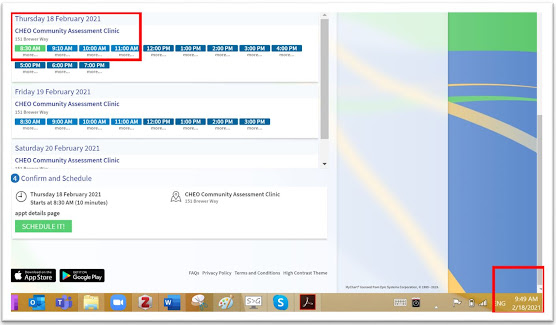
5. Not sufficient support for error prevention
Evidence: Identified problems in this section violate heuristic #5 - Error Prevention.
 |
| Figure 6. AM and PM colors |
Recommendation: It is recommended to apply colors with higher contrast to easily differentiate between AM and PM hours, for example, yellow for AM and blue for PM.
6. Allowing the user to book an appointment in the past
Evidence: Identified problems in this section violate heuristic #5 - Error Prevention.
 |
| Figure 7. Booking appointment in past |
Recommendation: It is essential to automatically disable times in the past to schedule or at least show an error message alarming about users' mistake for booking an appointment on the time in the past.
7. Presenting important information in a not noticeable way
 |
| Figure 8. Presenting important information by text |
Recommendation: It is suggested to use a bold font or a different size for highlighting and showing important information. Another solution could be offering help in context, instead of giving users a long guidance text.
8. Not existing tooltips or placeholders for fields
Some fields like “Mobile phone” and “Home phone” have placeholders, while others like “postal code” and “Email” fields do not; this could lead inexperienced users to errors.
Evidence: This problem violates heuristics #5 - Error Prevention, #10 - Help and Documentation
 |
| Figure 9. Not existing tooltips or placeholders |
Recommendation: It is recommended to set tooltips or placeholders for all fields. It is better to show all placeholders at first glance and before a user tries to fill them.
Format the users’ input as they type, especially for telephone numbers. This helps the user understand what characters they should type and does the work of reformatting, making it much easier for users to read and double-check their work.
9. Not useful error messages
Problem: As shown in Figure 10 and Figure 11, error messages are not meaningful and do not help users recover from errors.
Evidence: These problems violate heuristic #9 - Recognize, Diagnose, and Recover from Errors.
 |
| Figure 10. Vague error message |
 |
| Figure 11. Vague error message |
Recommendation: It is recommended to provide users with precise information about the errors. Error messages should precisely indicate the problem and constructively suggest a solution.
Conclusion
This report evaluated the online booking appointment for Covid-19 testing. Several challenges and issues were identified by heuristics evaluation, and specific recommendations were provided for each issue.
The result revealed that the significant part of OPH website issues relates to its visual design and information architecture, while issues in the “MyChart” website focus more on error-proneness forms and insufficient help.
No comments:
Post a Comment