By Durga Prasad Rangavajjala
Introduction
E-commerce, also known as electronic commerce or Internet commerce, is the business model of using the Internet to buy and sell goods or services and to transfer money and data for these transactions. E-commerce is commonly used to refer to the online sale of a real product, but it can also describe any type of products promoted over the Internet [1].
But the e-commerce model also has its own problems and one such problem which pulls back the user expectations and interests is the User Experience and Software Usability. “A bad user experience is like walking into a very messy and disorganized retail store” [2].
So, it’s very important to maintain standards in User Experience and Usability to make the model most used by the customers. In this blog, I will be analyzing and presenting software usability issues and user experience problems with one of the popularly used e-commerce websites called “Wish”.
A Brief Description about Wish Ecommerce
Wish [3] is an American online E-commerce platform founded by Piotr Szulczewski and Danny Zhang in the year 2007 to facilitate transactions between sellers and buyers. Rather than relying on a search box format, the platform uses search technology to visually personalize each customer's shopping. Sellers can list their products on "Wishes" and then sell them directly to consumers. Wish works with payment service providers to process payments and does not store products or manage returns on its own. Customers can search for different kinds of products, look for offers at that point of time, create a wish list, and add liked items, add to cart, and make a successful transaction. Wish has 100 million users with has 150 million items for sale and 1.8 million products are sold daily [4].
In this blog, I am evaluating wish application that is accessed with the world wide web using Neilson heuristics principles [5][6] and user evaluation [7]. Figure 1 shows the home page of the wish website.
 |
Figure 1: Wish Website Home Page |
User Experience problems encountered in Wish Website
1. No Anonymous customer is allowed, every user must signup/login before shopping or navigating to the home page.
Problem:
Every user needs to have credentials for login or create a new account before onboarding to the main page. A guest check-in option is not available for an anonymous user. The website does not even allow to search for a product without login/signup.
So, the first mandatory step for any wish users or a new user to shop is to undergo login or signup with available options as shown in Figure 2. This violates the third heuristics of the NN group i.e. “User Control and Freedom”. Wish website is restricting the freedom of a user with login/signup mandatory step. This may lead to the primary reason to opt for a similar e-commerce website with fast and flexible options to move as an anonymous user.
 |
| Figure 2: Landing Page of Wish Website |
Suggestions:
The suggestion to solve this problem is to have an option to shop as an anonymous user without asking for any personal information. In this busy and fast-growing world, the users may not be showing interest to create an account or log in every time due to time constraints and personal factors. So, the Wish website should provide the flexibility to shop as an anonymous user and the shopping must be tracked or edited based on the shopping id per transaction.
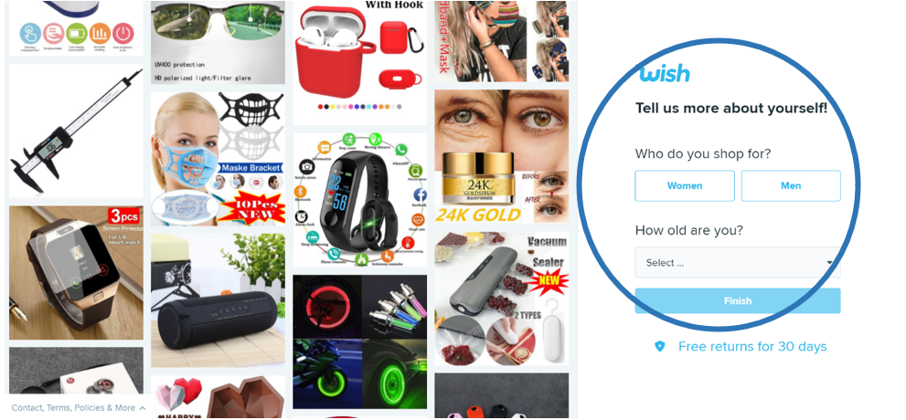
2. Extra information during signup with a new account.
Problem:
As a new customer, when trying to create an account on wish website using a Gmail id, password, or other options like Facebook, Google, and apple id, the wish website navigates to the next step to provide additional information. As shown in Figure 3, It includes gender, the age to complete a new user registration.
This information may not be important to create an account and start shopping. In this step, there is no option to go back to view or edit previous data. This mandatory step to provide additional information and the non-viewable stage is violating Heuristics 3 and 8 i.e. “User Control and Freedom” and “Aesthetic and minimalist design”.
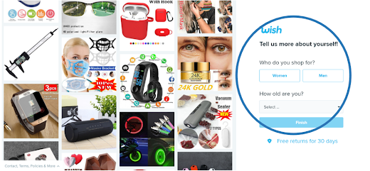 |
| Figure 3: Second Step in New User Registration |
Suggestions:
The 2 suggestions to solve this problem is to have a back button for navigating to previous information to review or modify and The additional information as in Figure 6, should also have a skip button to make the signup step faster with user-provided mandatory details in stage 1.
3. Inconsistent or different search bars components within Wish website (home and FAQ pages)
Problem:
The “search bar” option on the home page and FAQ are inconsistently used in the website as shown in Figures 4 and 5. The search bar is used to search all the available products based on given search keywords. This violates the 4th heuristic of the NN group “Consistency and Standards”. Heuristics 4 says to have consistent components and standards across all phases in software.
 |
| Figure 4: Search bar in Home Page |
 |
| Figure 5: Search bar on FAQ page |
Solution:
When components are not maintained standards and consistency, the users may feel inconvenience and frustration with different phases. This may seem like a small UI issue, but it can impact the comfort level of a user. The solution could be to use the same search option throughout the website where needed.
4. Wish logo at the starting of the page is acting as an option for the home page in many windows without any prompt.
Problem:
An option to navigate to the home page from other pages is not available and it can only be achieved by clicking the website logo that is situated in the top left corner of the page. This option is new and not mentioned anywhere.
This can affect user’s satisfaction level and interest to navigate to different pages or users need to remember that logo acts as a home button as no hint is provided. This violates heuristics mainly “Recognition rather than recall”, “Help users to recognize”. Figure 6 shows the wish logo acting as a home button and no other options to go back to the home page from the notifications page.
 |
| Figure 6: Wish logo acting as a home page |
Solution:
A button indicating home can be used to redirect to the home page from other pages whenever users wish to return without any confusion and remembrance. Or a toggle alert or a help note should be displayed as a return to home when the cursor is moved to the logo to help users to know. A step-by-step wizard can also be used to know the path user followed and the root or first step will always be a home link and this ensures users the system status and clearly understands the navigation with different options.
5. Ambiguous options while editing the Wishlist without appropriate prompt or help messages.
Problem:
One of the most used features in any e-commerce website is the wish list. The wish list feature enables users to add all his/her favorite items to the bag. We can save all our liked products or products that we want to buy later. On the Wish website, one of the confusing features in UI perspective is the Wishlist. Some of the key problems are, when we add a product in the Wishlist, it shows a red heart that means added to Wishlist, and after a product added to Wishlist, there is an option called Edit Wishlist. In the Edit Wishlist, there is no option to remove an item from the Wishlist, and no help is provided to remove a product from that page. After searching for a long time, I got to know, In Wishlist icon on top can be used to delete a product from Wishlist.
In the edit Wishlist, there is an option to create a new wish list to shift out products from one list to another and access them with the Wishlist name. Here as well there is no option to delete or edit a Wishlist folder. Users need to remember that, On the product page we need to add products and on the Wishlist page we need to edit them which is really a lengthy and confusing process. This ambiguous option while editing Wishlist violates many heuristics like “Visibility of System Status”, “User Control and Freedom”, “Recognition rather than recall”, “Help and documentation to help users”. Figure 7 shows different options upon clicking edit Wishlist with the facility to delete a product from Wishlist or delete complete Wishlist.
 |
| Figure 7: Edit Wishlist options |
Solution:
The methods to remove the product and delete the Wishlist options must be available from the product page and make it simple to perform create, edit and deletion operations with the Wishlist products. If not, then the user must be given a hint that deletion operations are performed at Wishlist page rather than product page so that the user will be redirected to the Wishlist page to delete or edit products and reduces remembering things to use Wishlist.
6. Profile, account, notifications, cart, Wishlist tabs are not available by any means from the checkout page.
Problem:
Some of the options in the website header like a search bar, profile, notifications, cart, and Wishlist options are not available in the cart section. There is no option for a user to change his details when he is on the cart page or the user may not be able to look for notifications, Wishlist, or profile details when the user is in the cart step. Figure 8,9 shows the presence and absence of header options on the home page and cart page. To perform those options users, need to remember to navigate to the home page first by leaving the cart and then use the page header options. This violates “User control and freedom”, “Consistency and standards”, “Recognition rather than recall” heuristics.
 |
| Figure 8: Headers in the Home page |
 |
| Figure 9: No header available on the checkout page |
Solution:
To provide user control and freedom to navigate to different options and maintain consistency like other parts of pages, it is important to include these headers with the search bar, profile, notifications, cart, and Wishlist and make accessible from cart page as well. Because users have a right to change their account details, see their Wishlist, and notifications at any point in time. This suggestion will maintain all violating heuristics that are discussed in the problem.
7. When correct options like sizes are not specified during add to cart, error messages are not shown clearly.
Problem:
Some of the products needs information like color, size information from the user to select them. When correct information or all requirements are not filled then upon proceeding must intimate user with the relevant error message. But it does not happen with the wish website. On the Wish website, if correct information is not specified regarding the product, it just highlights the fields with red color without informing with text error message or alert as shown in Figure 11. If a user with a color blindness disability uses this website, he may get confused at this step as he cannot identify errors as it is just a color change. Even for a normal user, it takes some time based on the user’s mood and interest to identify that error is due to lack of correct information. This clearly violates “Flexibility and efficiency of use”, “Help users recognize, diagnose, recover from errors”.
 |
| Figure 10: Information needed about the product |
 |
| Figure 11: Red color highlight for error message |
Solution:
The red color on insufficient information is creative and good looking but may not project the error sense to all kinds of users based on their disabilities, moods, and interests. To solve this problem, the wish website should also provide a text error for a clear understanding of the error case.
Conclusion
Wish is one of the famous and most used eCommerce companies which is very popular throughout the world for their services. Even though most of the sales are done with the help of a web interface, it still has many issues from the user experience point of view affecting software usability. I have tried to analyze some major issues concerning its usability and presented a brief description of them in this blog using NN group heuristic and performed user evaluation with 3 users. Many of the UI issues are discussed in the above sections with problems and suggestions which help the UI and usability teams in Wish Organization (company).
I strongly believe that these suggestions can be helpful to the UI developers at Wish to understand the issues faced by their customers and help them increase their customers and solve usability problems.
References
- Shopify.com. 2015. What is Ecommerce [ONLINE] Available at: https://www.shopify.com/encyclopedia/what-is-ecommerce [Accessed 28th Feb 2021].
- Bigcommerece.com. 2003, Charles Richard. Ecommerce UX: What it takes to create the best user experience for your online store [ONLINE] Available at: https://www.shopify.com/encyclopedia/what-is-ecommerce [Accessed 27th Feb 2021].
- https://www.wish.com/ [Accessed 25th Feb 2021].
- Wish.com. 2015. Welcome to Wish – one of the largest ecommerce marketplaces in the world. [ONLINE] Available at: https://www.wish.com/companyinfo?hide_login_modal=true [Accessed 28th Feb 2021].
- Nngroup.com. 2020, Jakob Nielsen. 10 Usability Heuristics for User Interface Design [ONLINE] Available at: https://www.nngroup.com/articles/ten-usability-heuristics/ [Accessed 27th Feb 2021].
- Nngroup.com. 1994, Jakob Nielsen. How to conduct Heuristic Evaluation [ONLINE] Available at: https://www.nngroup.com/articles/how-to-conduct-a-heuristic-evaluation/ [Accessed 28th Feb 2021].
- Lethbridge, Timothy. Studying user-interfaces, heuristics evaluations [ONLINE] Available at: http://www.site.uottawa.ca/~tcl/csi5122/coursenotes/ [Accessed 26th Feb 2021].
No comments:
Post a Comment