Wednesday, November 15, 2023

UX analysis of Zoom App

By Sai Swarna D.R.

Introduction

Zoom, a well-known video communication platform, was one of the fastest-growing apps during the pandemic, with a growth rate of 2,900% in the number of participants in the meeting and 300 million participants per day on average in April 2020. These numbers clearly show Zoom’s user base has increased significantly in recent years and it has distinguished itself from other apps on the market. Although this is true, the overall experience of the product also poses some important problems. This blog post highlights the usability problems in Zoom based on the results from the survey and interviews and also includes a competitive analysis of Zoom with its competitors.


User Research

User-survey

The survey was taken via Google Forms. There were 37 participants, out of which 54.1% were students and 43.2% were working professionals. The image below shows some of the problems mentioned by the users.


Personas

Based on information gathered during research, I created the user personas based off of my Qualitative research (user interviews). The primary user persona is a working professional and the secondary one is a student.


Competitive Analysis

In order to analyze and examine Zoom's usability aspects, the survey included a question to compare Zoom with its competitors - Microsoft Teams, Google Meet, Skype, and Cisco Webex. The bar graph below shows that more than half of the participants found it easier to use Google Meet than Zoom. Next is Microsoft Team, where about half of the participants find it easier to use than Zoom.


Usability Issues and Suggestions

After my research, I identified a few distinct UX design issues in the Zoom platform.

The message to everyone and the private message in the chat feature are combined within the same chat window.

Chat window includes both personal and private messages in a single chat window, as shown in Figure below. When there are many messages, it is easy to lose the tracking of messages. Users must navigate between chat with everyone and chatting with one person in chat boxes while sending a message every time. 


Recommendation

It is better to provide conversation threads, otherwise, it is difficult to follow the conversation context. One chat window for messages to everyone. Other chat windows to send direct messages to individual users. I have proposed a design solution for this problem with separate chat threads as shown in the image below. This way it is easier to maintain separate conversations, instead of scrolling through the same chat window to find a message.


The text shows “Your screen sharing is paused” even though a specific application screen is being shared.

When sharing a specific application's screen, the message appears "Your screen sharing is paused". This may confuse the person sharing the screen. Even though other participants in the meeting can still see the screen being shared, it shows paused which is an issue.


Recommendation

The text should be “You are sharing a specific application”. Even better if it mentions which application is being shared. Besides, the option “Resume share” should not be present. Only “Stop share” button is enough, users can simply click on Stop Share to stop sharing the screen (specific application).


Chat history lost in main meeting room and breakout room, when moved to breakout rooms from main meeting room and vice-versa.

When a user enters the main meeting room into the breakout room, the chat information is lost. Important messages may be lost. The images below are the screenshots of the chat window in the breakout room when the user first joined and after the user returned to the main meeting room.


Recommendation

Better to persist the chat data while navigating to and from the main meeting room and breakout room. The user should be able to see the history of chat even if they move from main room to breakout room, until they leave the entire meeting.

Conclusion

Zoom could do some UX lift-ups in its application if it intends to attract new users. In this blog, I have found some spots that could be improved in the app, like the chat box and screen sharing. Through these concerns, Zoom can maintain its competitive edge in the video conference market and continue to be a solution to the needs of remote communication. Imagine a Zoom app where everything just works smoothly. How do you think these changes would affect your virtual meetings? Any features you think need an upgrade? Let me know in the comments.

Usability Evaluation of Zara Website

by Lansu Dai

Introduction

Zara is a well-known fast-fashion brand noted for its trendy designs and affordable prices. Zara website is an example of an e-commerce website. A well-designed e-commerce website has a user-friendly interface that allows customers to easily explore products, search for items, and complete transactions. This leads to higher customer satisfaction and encourages repeat visits. However, the Zara website has frequently been criticized for its poor design and user experience. Complaints regarding poor usability, unconventional style, and accessibility issues have been raised against the Zara website. In this blog, In this blog, I examine the Zara website using Neilson’s Heuristic and provide suggestions for solving these problems.

User Experience Problem in Zara Website

1. Lack of User-friendly Product Categorization

Zara website has poor categorization on product categories, which makes it difficult for users to efficiently navigate between various product categories. The product category hierarchy on most e-commerce websites is well-designed. To meet users' expectations, user interface elements should behave consistently with other shopping websites. It is important to improve the category labels to make them more descriptive and to make sure that all product categories are easily accessible from the main page. This problem violates Neilson’s Heuristic 4 "Consistency and Standard".

Figure 1: Navigation menu on the Zara website, after clicking Woman 

Recommendation:
The product category hierarchy of Zara website should be redesigned so that it resembles the hierarchy style of other shopping websites. The website should clearly define the levels of category. For example, in the “Woman” section, a top-level category could be “TOPS” followed by its second-level categories, such as “All Tops”, “Hoodies”, “Sweaters”, “T-shirts”, and “Shirts”.


2. Lack of Breadcrumb Navigation System

The breadcrumb navigation system helps users to trace their navigation history and understand their position within the site. In Figure 2, it shows an example breadcrumb navigation system on the H&M website. Current Zara website lacks the breadcrumb navigation system, so that users cannot back more than one level and return to that location by one step. This problem violates Neilson’s Heuristic 1 "Visibility of System Status".

Figure 2: The yellow circled box shows the breadcrumb system in H&M website

Recommendation:
The breadcrumb system should be implemented at the top of the page, so users can easily see and navigate their path.


3. Limited Filtering and Sorting Options

When users select a category from the navigation menu, the Zara website directs them to the product listing page. Users struggle to find certain products on the product listing page due to insufficient filtering and sorting options. There are only three filtering options available on the website, which are color, size, and price. Besides, Zara website does not provide sorting options when browsing the products. Neilson's Heuristic 7 "Flexibility and Efficiency of Use" is violated by this problem. 
Figure 3: The left top under the Zara Logo is the filtering option provided by the Zara website

Recommendation: 
The filtering options can include more attributes, such as product type, fabric, and availability. Moreover, the website should provide users with sorting options to users in order to improve efficiency. Sorting options include popularity, low to high price, new arrival, and relevance.


4. Oversized Product Images Compared to Product Name

There is a noticeable design problem in the layout of the product listing page. The product name and price are too small compared to the product image. It is hard for users to read the product information and the oversized product images would attract users more attention. The functionality of the website must be guaranteed while it is being designed. This problem violates Neilson’s Heuristic 8 “Aesthetic and Minimalist Design”

Figure 4: A screenshot on the product listing page of the Zara website

Recommendation: 
My recommendation is to use a uniform grid system, in which the product images are large enough to be appealing while not dominating the entire screen and allowing multiple products to be viewed at the same time. Also standardize product listing layouts to ensure clear legibility of product names and prices by balancing the image and text size.


Conclusion

In this blog post, I have highlighted a number of user experience problems, including poor product categorization, lack of breadcrumb navigation, insufficient filtering and sorting options, and an imbalance between product images and text. If the issues are not resolved, they may continue to have an influence on the effectiveness and contentment of Zara's users. The company must constantly improve its online website all the time in order to meet user expectations in the dynamic e-commerce landscape.

Acknowledgement: 

I would like to acknowledge that I used Grammarly to improve my writing style, including sentence structure and grammar issues.

How to design better app icons from a UX perspective

By Jinzhi Cao

With the surge in mobile app usage, the role of icons within the mobile user interface has become increasingly significant. Think about it – that small graphic image on your mobile device is more than just a visual embellishment. It's a representative symbol with the ability to quickly impart information, making it easy for users to recognize and recall. Beyond aesthetics, these icons play multifaceted roles, from branding and designation purposes to capturing visual attention within the user interface. They're the unsung heroes of efficient space utilization, enabling quick recognition at a glance without the need for translation, all while adding a touch of visual appeal.

Multiple app icons

However, the power of an icon can backfire if its purpose isn't crystal clear to the user. In such cases, what should enhance user experience might instead lead to confusion, hindering individuals from completing tasks seamlessly. That's where the art of designing a stellar icon comes into play – a skill that can truly elevate the user experience of any software. 

In this blog post, we'll delve into the world of icon design, exploring the key factors that contribute to an icon's effectiveness. From the nuances of color and shape to the broader realm of aesthetics, we'll uncover the insights gleaned from various studies in the field. Let's unravel the secrets of crafting icons that not only captivate the eye but also enhance the overall usability of your favorite apps.


What factors matter?

When you design an icon, there are usually a whole host of design elements that need to be carefully considered. What factors are important? How can these factors be designed to make the user experience better? Here are some advice.

Recognizability

Recognizability is when things are easy to recognize in a computer program. Icons that use common images are usually easier for people to understand. When icons are easier to understand, search performance gets better too. When we simplify the style, use shapes with clear edges, and adapt realistic images, icons become even more recognizable. So, it's better to use recognizable icons when we want to make connections and get attention.

Color

Color is an attribute of an object that can produce distinct visual effects. The brightness and hue of an icon are related to the user's focus. When designing an icon, it is advisable for designers to adhere to the following guidelines
1. Use bold contrasting colors and vivid graphics to link clusters of events and essential actions.    
2. Choose colors for their impact, clarity, significance, narrative, and context. 
3. Attain a consistent layout with powerful icon sets via effective design practices, color schemes, and adaptability. 
4. Choose brand-appropriate background colors and refrain from using transparency.

Shape

Shape means the appearance of icons and showing the shape of an object helps people quickly understand and recognize the icon. The shape of the background also affects how easily users can search and how much they like the icon. It is shown that shapes with no borders make the icon easier to identify and like. 

Simplicity

Simple means clear and easy to understand. Simple icons are easier and faster to find than complex icons and they effectively communicate information. Use two-dimensional, simple graphics for icons and keep their design basic. Additionally, keep the background plain and avoid transparency.

Uniqueness

Uniqueness means having special or unusual qualities and creating creative app icons. Having unique colors on app icons helps find them easily among other icons on a single screen. When app icons are perceived as unique, they receive more clicks, downloads, and purchases.

Concreteness

Icons must be concrete and not abstract for improved concreteness. The more concrete an icon is, the more effective it is. The concreteness of an icon is crucial in defining user performance compared to complexity. Concrete icons perform better than abstract icons. Perception is more strongly associated with solid and concrete icons than with flat and abstract ones.

Are your users satisfied?

When your software is released, you need to know if users are happy with the icons and improve the icon design based on their experience. How to get real and objective user data to better improve the design? Here are some experimental approaches that can be taken.

Eye-tracking

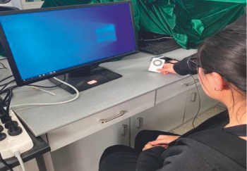
Eye-tracking is a valuable tool for assessing the efficiency of visual searches in terms of icons. In this experimental setup, participants wear specialized glasses that meticulously track their eye movements, providing a rich source of experimental data. The key metric, task completion time, quantifies the duration between presenting the task and successfully locating the target icon, while eye gaze indicates the act of resting one's eyes on a particular spot.

Experimental equipment for eye-tracking

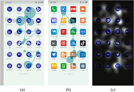
After collecting the raw gaze point data, you can obtain a series of data such as scan path, time to first fixation, first fixation duration, fixation count, average fixation duration, fixation sequences, etc., and visualize them as scan paths and focus maps. This data will be an indication of whether your icon design is appealing to your users.
The scan paths and focus maps

Questionnaire

Unlocking the secrets of an icon's user experience involves more than just objective eye-tracking data; it requires tapping into users' subjective feedback. What should be involved in a questionnaire? From a functional point of view, the purpose of an icon is to serve as an entry point to an application, so the recognizability of the icon,  which is an indicator of user evaluation, should absolutely be a part of a questionnaire. Additionally, as icon design continues to evolve, its structure now includes elements of art and design to provide a better aesthetic experience for the user. Therefore, the study also needed to know how users rated the aesthetic aspects of the icons.

After collecting data from the questionnaire, you need to analyze the relationship between icon design factors and user experience. One thing that should be noted is that the feelings users evoke about a product are often over described. To better solve this problem, researchers usually utilize Miryoku Engineering's qualitative EGM to construct respondents' abstract feelings into concrete and real ones and to represent the results in a hierarchical diagram of evaluation appeal factors. Here's how it works. 
The EGM hierarchical diagram of app icon preference

In this approach, the appeal and factors influencing appeal are segmented into upper, middle, and lower layers using a visual hierarchy technique. The upper layer includes abstract phrases that represent users' emotional attitudes. The middle layer comprises evaluation elements, which generally refer to the primary reasons why users enjoy a product, also known as the original evaluation items; these are the reasons why respondents express their preferences during interviews. The lower layer pertains to the design aspects of the product.

Your turn to design!

In the ever-evolving landscape of icon design, the pursuit of a better user experience continues, guided by the insights uncovered in this exploration. Here's to icons that not only catch the eye but also leave an indelible mark on the user's digital journey. And now, with adequate design theory, it is your turn to start on this journey!

Tuesday, November 14, 2023

Designing Better Error Message for Web Form

By Taige Gao

As users have higher expectations for the websites they use, user experience and website performance have become crucial for brands. A small mistake on the website will lead to user satisfaction and the loss of users. Imagine the frustration when a user submits a form on a website and an error pops up, but the user cannot find or understand the error message.

In this blog, we will first discuss where web page error messages should appear, what color they should be shown, and when they should appear. Finally, we will focus on improving the content of error messages. Our aim is to reduce user frustration and increase user satisfaction through effective error messages.


Position

Alton et al. and Linderman and Fried studied that error messages should be displayed above form fields to attract the user's immediate attention. In contrast, Alsalamen and Shahin showed that error messages are best placed directly beneath the error. Sackler et al. supported both views and suggested that the right side outperforms the left side if an error message appears on the wrong side. For example, as shown in Figure 1, the error message appears at the top of the form which is easy for users to find and correct. We suggest that the location of the error message should be next to where the error occurred and follow the habits of most users when browsing the page.


Figure 1: Position of Error Message (from Amazon)


Color

The color of error messages in web forms is critical to user interface design. Designers must ensure that these messages are prominent enough to immediately draw users' attention to errors. Research from Powells et al., Inal and Ozen-Cinar, Chapanis and Crawford indicates that bright colors, such as red and orange, are effective in highlighting error messages. Since error messages serve as a warning, creating a high contrast between them and the website's background will make it easier for users to spot and respond to these alerts. For example, as shown in Figure 2, the error message appears at the bottom of the form and the text is colored as bright red which can easily draw users’ attention. The content of error messages should be marked with bright colors to attract the user's attention.


Figure 2: Color of Error Message (from Netflix)


Timing of Appearance

Current research disputes the optimal timing for displaying error messages. The ISO-9241 standard recommends that error messages be displayed immediately, however, Bargas-Avila et al. found that displaying error messages immediately will cause a significant increase in the number of errors made by participants when filling out forms. Users tend to ignore or close error messages without reading them while filling out forms. The appearance of error messages can cause users to feel frustrated and upset, especially if they have not completed their current task. For counterexample, in the form for registering a new user on the SPC website in Figure 3, the website begins to display error messages to the user before the user completes and submits the form. Our recommendation is to provide error messages to users after they submit the form to prevent users from getting frustrated prematurely due to errors.


Figure 3: Timing of Appearance (from SPC)


Content

The purpose of error messages is to help users discover and solve current problems; therefore, the content of error messages is the most important part. The content of a usable error message should include using polite language, using simple language, and providing users with a clear description of the error and solutions.

    1. Polite Language

One of the most important factors in designing error messages is maintaining a positive tone and avoiding blaming users (Eberts). Cuff's research indicates that the use of polite language can enhance user satisfaction and success. Additionally, designers can add appropriate apology phrases such as "please" and "thank you" to improve the user experience (Nielsen). When designing error messages, we should avoid using unfriendly words as shown in Figure 4. Using polite and apologetic language in error messages can positively affect the user experience, whereas using accusatory language may leave users with a negative impression of the software they are using.


Figure 4: Avoid Using Impolite Error Message (Image Source)


    2. Simple Language

Simple language should be used in error message design to ensure that users can easily understand the cause of the error and how to resolve it (Harbach, Marian, et al, Linderman and Fried, and Shneiderman). Complex sentence structures and difficult compound words in error messages will confuse users and is hard for them to gather the necessary information. Therefore, it is essential to avoid complex grammar and sentence structures to enhance the readability of the message. Error message design should be considered not only for expert users but also for new users. Hence, designers should use simple language and avoid using technical words for error messages.

The example displayed in Figure 5 contains technical terms which are unfriendly to most users. Ordinary users cannot find the cause and solution of the error from such information. In contrast, the revised error message in Figure 6 enables users to identify the cause of the problem and find a solution more easily. While both messages convey the same meaning, the error message in Figure 6 is more accessible to both ordinary users and technicians. Therefore, using simple language in error messages is recommended because it can increase problem-solving efficiency and user satisfaction.


Figure 5: Error Message with Technical Content (Image Source)


Figure 6: Error Message with Simple Language Content (Image Source)


    3. Description and Solution

Effective error messages must provide users with a clear description of the current error and instructions to solve the problem. Users often become frustrated when encountering errors and will abandon the current task if a solution to the problem is not found in time (Linderman & Fried). While error messages should include a clear description of the error and its solution, they should avoid excessive details that could confuse users. Figure 7 shows an example of a Microsoft account sign-in error message. The message offers a brief explanation of the error's cause: 'You’ve tried to sign in too many times with an incorrect account or password.' It also outlines the potential risks associated with the error and provides two solutions: resetting the password and signing in with a different account.


Figure 7: Description and Solution Character (Image Source)


Conclusion

Displaying form error messages is a small part of a website, but it can significantly impact users, especially if they cannot understand their mistakes. This confusion can drive them away from the site. Designers must develop clear error messages to help users comprehend and rectify issues. The quicker the error messages guide users to a resolution, the less it will affect user satisfaction.

In this blog, we conclude that error messages must have the following characteristics: error messages should appear close to where the error occurs; use bright colors, such as red; appear after the user has completed the current task; use polite language; use simple language; avoid using technical terminology and provide specific explanations of the cause of the error and how to correct it to help users easily recover and complete their tasks.


Monday, November 13, 2023

Enhancing User Experience in Microsoft Teams

By Kevin Chemjor

Microsoft Teams, a comprehensive messaging and collaboration app, facilitates real-time communication, meetings, file sharing, and much more in one accessible workspace. However, my recent usability study has brought attention to certain usability problems in this digital landscapeThis dive into user interactions combines findings from expert heuristic assessments, shedding light on instances where usability principles are put to the test. Get ready to uncover the nuances that impact efficiency, control, and overall satisfaction in this user-centric evaluation of Microsoft Teams

No Message Forwarding Feature

In the daily hustle of work life, the routine act of sharing information, updates, or a quick chat reply is second nature. However, the absence of a message-forwarding feature in Microsoft Teams introduces a bottleneck in your routine, making your smooth workflow hit a speed bump. This suddenly turns the sharing of vital information into a struggle precisely when you need it.

A closer look, as depicted in the screenshot below, reveals the user experience challenge. Hovering over a message in MS Teams provides a glimpse of a modal (highlighted in red) when "more items" are clicked. Yet, there's no option for forwarding. Faced with this limitation, users resort to a manual workaround—copying and sharing the link—an inefficient and time-consuming process.


Heuristic Principle Violation: According to Nielsen Heuristics, the lack of a message-forwarding feature violates the Heuristic of User Control and Freedom. In the digital realm, users should wield control over their interactions. The absence of message forwarding, akin to being handed a toolbox with missing essentials, compromises this autonomy, leaving users searching for a solution.

Recommendation for Improvement: To navigate this issue, a practical recommendation emerges: implement a message-forwarding feature in Microsoft Teams. A user-friendly solution would involve introducing a forward message icon, visible when a user hovers over a message. This simple addition aims to restore control and efficiency, ensuring that the user experience aligns with the principles of seamless communication and collaboration.

Limited User Status Options

Imagine you're planning to take leave or some time off, and you want to update your status in Microsoft Teams to reflect your unavailability during those specific days. Here's the challenge: while you can use labels like 'back,' 'online,' and 'busy,' you can't precisely plan your status for the days you'll be away. Although the system allows a status reset, it lacks the flexibility to specify your unavailability from date X to date Y. This limitation affects your control over scheduling and freedom to communicate your availability effectively during specific periods."


Heuristic Principle Violation and Severity Assessment: According to the Nielsen Heuristics rulebook, the lack of flexibility in setting specific times or date ranges for status violates the Heuristic of User Control and Freedom. This principle emphasizes that users should have the freedom to control and customize their digital experiences, especially in managing their availability. The current limitation restricts this control, creating frustration for users.
This problem is a Major usability issue, assigning it a mean score of 4 on the Heuristic Severity Scale. The inability to set specific times or date ranges for availability violates Nielsen's Heuristic Principle of Flexibility and Efficiency of Use which emphasizes the importance of keeping users informed about what is happening in a system through appropriate feedback within a reasonable time.

Recommendations for Improvement: The solution? Broaden the status options. Enable users to specify exact times or date ranges when they'll be occupied or away. The proposed fix involves adding a new “start time” to the "custom status" feature. This enhancement empowers users with more control over their availability, promising a superior user experience. With this proposed upgrade, users can communicate their schedules with precision, fostering efficiency.

Ineffective Call Window Minimisation 

Imagine you're in the midst of a crucial virtual meeting using Microsoft Teams. The discussion is buzzing, and ideas are flowing, but suddenly, you realize you need to access something from behind the call window. You instinctively reach for the minimize button, expecting the call window to neatly tuck away, freeing up your workspace. However, to your frustration, the call window stubbornly refuses to budge, disrupting your view and impeding your ability to navigate shared content. This usability problem, uncovered in our evaluation, highlights how a simple function can significantly impact the seamless flow of your workspace. 

Here's a screenshot of a user trying to minimize the window:


Heuristic Principle Violation and Severity Assessment: The violation here is related to the heuristic principle of Visibility of System Status. Users expect the system to promptly and clearly communicate its current state, and the ineffective call window minimization in Microsoft Teams hinders this expectation by not visibly responding to user actions.
While not reaching critical status, this problem received a score of 3 on the Heuristic Severity Scale. Categorized as a Minor usability problem, it may not be a showstopper, but it's certainly noteworthy. Addressing this glitch, albeit with lower priority, is crucial to ensuring a smoother user experience and preventing potential frustrations.

Recommendation for Improvement: To overcome this glitch, a crucial recommendation emerges: fix the minimize button functionality. Users should have the capability to completely minimize call windows from the screen. Additionally, refine the modal by introducing the option to condense it into a small menu bar at the top right of the screen. This streamlined menu bar should exclusively feature essential controls such as mute, video, share screen, and leave buttons. These enhancements align with users' expectations of having control over the interface, enabling them to manage their workspace efficiently and focus on tasks without being hindered by non-functional features.

Inefficient Output Source Management

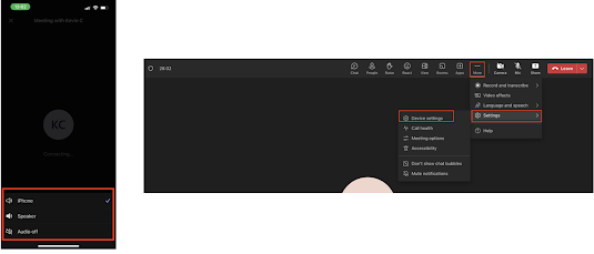
In a virtual meeting on Microsoft Teams, while switching between your desktop and mobile device, adjusting the audio output source becomes a puzzling challenge. On your desktop, it involves navigating through multiple steps, while on your mobile app, it's a straightforward process. This inconsistency in managing audio devices adds an unexpected layer of complexity, making it unclear whether the same action should require different efforts on different platforms. The screenshot highlights the disparity, showcasing a streamlined process on the mobile app compared to the intricate desktop counterpart.


Heuristic Principle Violation and Severity Assessment: This inconsistency violates Nielsen's Heuristic Principle of Consistency and Standards, which states that users should not have to wonder whether different words, situations, or actions mean the same thing. This introduces an additional layer of complexity between platforms.
Grading the Severity: Although not a critical concern, the heuristic evaluation deemed this problem a Minor usability issue, assigning it a mean score of 3.5 on our Heuristic Severity Scale.

Recommendation for Improvement: The path to a smoother user experience lies in standardizing the process for changing the output source in Microsoft Teams. The goal is clear: ensure uniformity and user-friendliness across both desktop and mobile versions. Specifically, introduce Hover Functionality on the desktop. This enhancement displays a quick access menu when users hover over the microphone or speaker icon, mirroring the mobile's straightforward approach. The menu should encompass options for changing the output source, allowing users to execute the action seamlessly with minimal clicks.

Conclusion

In summary, our evaluation of Microsoft Teams has pinpointed crucial usability challenges, ranging from the absence of message-forwarding functionality to limitations in setting specific times for user statuses. The ineffective call window minimization and the inconsistent process of managing audio output sources further emphasize the need for improvement. By aligning with Nielsen's Heuristics and implementing the recommendations—such as introducing message forwarding, expanding status options, refining call window minimization, and standardizing output source management—Microsoft Teams can significantly enhance its user experience. These refinements promise to boost user control, streamline interactions, and contribute to a more efficient and satisfying collaboration environment, reinforcing the platform's role in modern digital workspaces.

Acknowledgement

I would like to acknowledge the use of grammar-checking tools during the editing of this document. These tools were used to enhance language clarity, and sentence structure, and rectify spelling issues, contributing to the overall quality of this work.

How we did this

In this evaluation, a heuristic assessment of Microsoft Teams was conducted by me and two colleagues. The evaluation was guided by a structured methodology, heuristic evaluation and a severity assessment score.

Saturday, November 11, 2023

Navigating the Quirks of Air France's Website 🛫

By Li Tian


Why This Matters

Air France, ranked 8th in the World Airline Awards's top 100 airlines, serves millions of customers through its official website for purchasing and managing flight tickets. Identifying and addressing major problems is critical to prevent customer loss. After conducting cognitive walkthroughs and heuristic evaluations, several key issues and bugs were identified on the Air France website. This blog aims to highlight these key issues and offer suggestions for improvement.

Issues and Suggestions

The Case of the Mysterious Google Ad Link🕵️‍♂️

The first search result for "Air France" on Google is an advertisement leading to a different webpage than the official website. This discrepancy can confuse users and cast doubt on the authenticity of the sites. Below are screenshots of the homepages accessed via the advertisement link and the official website link, respectively.

Suggestion: The best practice for Air France is to replace the advertisement link with the official website link because the official website webpage does not lack any functions compared to the advertisement page. Unifying these links will eliminate user confusion and maintain consistency.


The Vanishing Menu Icon on the sidebar 🎩

Sidebar often refers to the top and bottom side function areas of the website. Consistent sidebar design is crucial for user recognition of a website’s important functions. For example, the menu icon next to the logo of the Air France website is on the top sidebar. However, when accessing the website via the advertisement link, the menu icon next to the logo was missing. This could be a bug or a design oversight, potentially reducing functionality. 

Suggestion: Standardize Standardize sidebar designs across the website. If this inconsistency is due to bugs, partial website maintenance should be conducted to address the issue.


The Eternal Wait... for Flight Searches ⌛

Despite a high-speed network connection, the website's average response time was 8 seconds when searching for international flights from Ottawa to Paris. This delay could be related to the server's geographical location or backend code issues  (Link to Search flights from Ottawa to Paris). Moreover, when loading the search page, there is a blank not indicating how long it would take.

SuggestionDevelopers should investigate whether server location or code structure is more impactful on response speed. While server relocation might be costly, optimizing code and algorithms could offer significant improvements. Besides, when loading the search page, a progress bar with percentages should be the better widget to inform users of the estimated remaining time for response. 


Resize and Surprise: Unpredictable Fashion of Login Page 🔍

In the Login Page, an issue arises when the browser window's length is less than 50% of the screen, resulting in a white background and disproportionate text boxes and buttons, compared to the usual scenic image background. 

SuggestionAdjust the background image and text boxes to scale proportionally with the window size, maintaining visual consistency.


Hidden Treasure: The Elusive Price Calendar 🗓️

Customers often seek the best price for flight tickets, which is easy to achieve with a price calendar (displaying the lowest price for each day of the month). Nevertheless, it is only visible when no specific date is selected, a scenario unlikely for most users. It was under an accidental situation where I did not have a particular date input that I eventually discovered the price calendar. The first image illustrates an empty date selection, while the second shows the price calendar of the Air France website.

SuggestionThe website should just provide some tips or hints to inform users that there does exist this feature! Price calendars are really helpful to help customers decide when they want to travel.

"Oops, Something Went Wrong..." – The Vague Error Message of Despair 🤷

If there are no tickets available in the selected date range, the webpage will prompt an error "Sorry, something went wrong... Please try again." This is a typical bad error message, indicating no useful information instructing users how to deal with the problem. Additionally, the website repeatedly redirects users to the previous page after a failed attempt, continuously presenting the same error message.

Suggestion: Redirect users to the search page with a clear message stating no flights are available for the chosen date.

In Conclusion

To summarize my little adventure on the Air France website, by employing cognitive walkthroughs and heuristic evaluations, I have identified six primary user experience problems on the Air France website.  These evaluations considered two user personas: tech-savvy and non-tech-savvy, allowing a comprehensive discovery of practical issues. 

What about you? Ever had a funny, frustrating, or fabulous experience booking flights online? Share your ideas in the comments!