by Gurpinder Kaur
Introduction


 Proposed Solution: Improved icons should be used which
denotes the action of the functionality. The icons should be aided with the
text to remove the ambiguity i.e. the labels can be included to the icons that
are most prone to confusion. Certain icons such as flash or camera switch can
go without labels as these icons already denotes their functionality.
Proposed Solution: Improved icons should be used which
denotes the action of the functionality. The icons should be aided with the
text to remove the ambiguity i.e. the labels can be included to the icons that
are most prone to confusion. Certain icons such as flash or camera switch can
go without labels as these icons already denotes their functionality.

Proposed Solution: There should be some visible options like an icon to
use the filters. A visual clue should be enough helpful for the users to let
them know the usage of filters. Users should be able to spot the filters by
themselves without any feedback or external help. In addition to this, once
discovered there can be two columns of filters on the both sides of the screen
so that user can directly choose the filter instead of scrolling through all
the filters. Apart from this, there should be proper error message along with
the reason of crashing.
Introduction
Snapchat is a multimedia messaging mobile application
created by Evan Speigel, Bobby Murphy, and Reggie Brown in September, 2011 and
developed by Snap Inc. The primary function of Snapchat is to send timed
pictures or short videos which are called “Snaps” to a specific or multiple
contacts or add a story which is meant for all the contact list and is visible
to the contacts for 24 hours. “Snaps” as the pictures or videos are shown for
the specified time to the contacts i.e. from 1 to 10 seconds depending upon the
time set by the user posting the Snap. After 24 hours, the snap is deleted from
the device as well from the Snapchat server. Apart from this, many other
features are supported in this application such as applying filters, drawing
sketches, adding texts etc.
Snapchat is a widely accepted application with 100
million downloads, but still it has some usability issues, which I present in
this post. This application mainly attracts users in a particular age group due
to some of the issues related to its usability These need to be fixed for the
better user experience. Nielsen's Usability Principles were
used to evaluate the application. This blog presents a few issues along with
the proposed solutions.
Problem Areas
Issue:
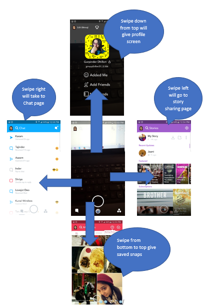
The Camera page.
The camera feature is where all the story creation is
happening. This is the page which connects to all the other pages of Snapchat.
Every way you swipe will take you to a different page. There is too much interaction between
camera and all the other pages increasing users’ memory load. This makes screen
very sensitive when users are interacting with the camera. There is no visual
evidence of navigating back and forth from the screens once the person enters
the functionality.s shown in figure below, if the user swipes left, it will redirect to story sharing
page where we can find our stories, article browsing, public stories etc. On
swiping right, the user can go to chat page where we can find the list of our
friends. Swiping in other two directions will leave the user on profile page or
saved snaps page. To get back to the camera page a person has to swipe in
opposite direction which the user does by himself without any clue from the
application. Navigation is tedious with poor feedback of the consequences.
Proposed Solution: In order to make it more user friendly, there should
be buttons or arrows in every direction that can guide or give a user an idea
about which screen is he landing in, if he/she goes in a particular direction. The user should not have to recall
instead he can just recognize after noticing the arrows or buttons thus minimizing the memory load on the
user.
Issue: Layout of story sharing page is not
consistent and is busy and cluttered.
The layout of storing sharing page was intended to
provide users information on the latest and most updated context. While it
looks visually nice, it does not provide balanced consistency, it also brings
in too much information to the user at once. This gallery layout is good for
photographic browsing but using this layout as an article browse increases
clutter. The information on story sharing page seems to be all over the place.
It’s organized within specific categories but laid out in different shapes. In
Snapchat, when we open the story sharing page, as shown below, the users can
view their story on the top of the page followed by the other stories posted by
other friends differentiated by very light margin. The article browsing is
displayed on the same page which makes the page too cluttered and different
shapes often leaves user confused.

Proposed Solution: For navigation to be clearer and concise, it would
be good practice to come up with a well-balanced browsing layout that matches the
listing as the user is scrolling through the context. Instead of gallery layout
with various different shapes, stick with one shape like a square to keep
consistency. Lay two shapes for each row so that when the user scrolls through
the articles it’ll be easier for them not to get overwhelmed by so much
information.
Issue: Ambiguous icons do not have clear
predictability.
Aside from the
tutorial in the beginning, the users (mainly new ones) are not able to predict
the functionality of the ambiguous. The icons do not define the clear purpose
of the action unless user himself can associate each icon with a particular
function based on previous experience or by tapping on them. A very low
predictability is provided to the user to be able to oversee the outcome. This
is a severe issue for the users who are not tech-savy as they might be
inundated by the many icons presented. There is no clear indication of the
function of icons. There is no visual clue why the icons change the color? In the
figures below, we can notice the change of color of icons without any
information of the reason. The icon used
for capturing the snap or recording a video is used to see the stories continuously
as well. This leaves the user confused as single icon is being used for
different purposes.
 Proposed Solution: Improved icons should be used which
denotes the action of the functionality. The icons should be aided with the
text to remove the ambiguity i.e. the labels can be included to the icons that
are most prone to confusion. Certain icons such as flash or camera switch can
go without labels as these icons already denotes their functionality.
Proposed Solution: Improved icons should be used which
denotes the action of the functionality. The icons should be aided with the
text to remove the ambiguity i.e. the labels can be included to the icons that
are most prone to confusion. Certain icons such as flash or camera switch can
go without labels as these icons already denotes their functionality.
Issue: Hard time using the filters
Since filters are the most important
feature of Snapchat as they are the reason to attract users to use the
application, they need to be easily discoverable. But this is not the case and
thus this is one of the most severe usability issue with Snapchat. Users have
hard time finding the filters as there is no clue of discovering them. Accessing
filters and editing pictures is hard to start with. Since there is no
visibility of the filters, users are unaware of the functionality if it exists
as there is no proper feedback. There are no shortcuts to use the particular
filter. You have to swipe all the way to use the last filter in a row. While
using the filters, sometimes the application gets hanged and crashes suddenly
without providing any error message. The user requires the investment of their
time to learn and utilize the capabilities of the feature. As we can see in the
fig. below, there isn’t any icon available to reach for the filters. There is
no proper feedback to show “how to use the filters?”. A user must long press on
his face to get the filters. When it recognizes the face, the user can see a
row of filters as shown in fig. In order to go to the particular filter, the
user has to scroll through the list.

Summary
The key problems
and issues were found during the evaluation of Snapchat. The issues found are
severe ones especially for the naïve users. Many issues related to navigation,
consistency, feedback, user control etc. were found during the evaluation. If
these issues are resolved, Snapchat will provide its user a good user friendly
interface.
This article provided invaluable insights and practical tips that have truly enhanced my snapchat experience
ReplyDelete. Thank you for sharing such useful and well-explained advice!
Snapchat is a fun app, but usability improvements could make it even better! Excited to see your insights on this!
ReplyDeleteDiscover how to enhance your Android experience with maximizing functionality with snaptroid as your go-to anchor text for exploring smarter tools, improved performance, and seamless customization. This guide highlights the key benefits, practical tips, and innovative features that help you get the most out of Snaptroid, ensuring your device runs efficiently, securely, and exactly the way you want.
ReplyDelete