
Blackboard is a company that develops learning management systems
for institutions. They offer many software solutions and boasts of having a
very large customer base. Based on their official website, 80% of the world’s
academic institutions that were highly ranked by Times Higher Education, made
use of their solutions as at 2014 [1]. They further explain that their
solutions are being used in 1 of 3 US school districts and they currently have
a subscriber base of 20 million students [1]. It is however unclear what exact
solution is being utilized by such large amount of people.
The University of Ottawa (uOttawa) makes use of a customized
version of one of their software solutions, Blackboard Learn, for the school’s
Student Portal. A user interface evaluation was carried out on uOttawa’s
customised version of Blackboard Learn and a number of usability issues were discovered.
However, it is unclear if these issues are peculiar to uOttawa’s Blackboard
Learn or the generalised version.
The participants involved in the evaluation were six students from another university who have previously never used Blackboard Learn. This blog post presents the major problems that were identified by participants in the user evaluation and also by the researcher. The problems identified have been grouped based on the usability principles described in Dr. Timothy C. Lethbridge class notes [2]. The post also illustrates instances of how these principles were violated, and possible solutions to the problems that were identified.
The participants involved in the evaluation were six students from another university who have previously never used Blackboard Learn. This blog post presents the major problems that were identified by participants in the user evaluation and also by the researcher. The problems identified have been grouped based on the usability principles described in Dr. Timothy C. Lethbridge class notes [2]. The post also illustrates instances of how these principles were violated, and possible solutions to the problems that were identified.
USABILITY PRINCIPLE 1: Ensure that the sequences of actions
to achieve a task are as simple as possible.
- Reduce the amount of reading and manipulation the user has to do.
- Ensure the user does not have to navigate anywhere to do subsequent steps of a task [2].
PRINCIPLE VIOLATION
INSTANCE
The default language of uOttawa’s Blackboard Learn is French. All participants surveyed had great difficulty in changing the language from the default to English as there is no visible option available to carry this out.
At the top right-hand corner of the interface, there is a ‘ball’ symbol as shown in Figure 1 below,

Figure
1: Snapshot showing the 'Ball' symbol on the login page of the interface
Some participants assumed the symbol represented a 'Change
Language' option. However, when the symbol is clicked it only changes the login
page to the requested language. But once the user logs in, it changes back to
the default language.
To effectively change the language of the system, users are
made to go through an excessively long series of steps:
Settings->Personal Information->Change Personal Settings->Select
Language Pack.
Why these series of steps are hard to remember, it’s even
harder to carry out when the entire interface is in a language completely
foreign to the user.
The twist to this though is that the University’s Blackboard
Learn does have a 'Change display
language' link option at the login page, but users have to scroll down to see
it. Most login pages do not have scroll down options, or at least don’t require
scrolling down to see essential features. As a result of this, none of the
participants scrolled down, hence none of them were able to see the option for changing
the language.

Figure 2: Snapshot showing the 'Change Language' option available after scrolling down
SUGGESTED MODIFICATION
i. A ‘Change Language’ link should be kept at the top of the page in both languages. This link should change the content of the entire site to the requested language.
ii. Based on the usability principle above, we also suggests that the color of the link be red so that users can quickly identify the alternative option available to them.
iii. There should also be a pop up text that says, ‘Change language for all future use of Blackboard Learn’. This ensures that users don’t have to change the language each time they attempt to login. It also gives users the opportunity of setting their preferred language as the interface’s default language.
iv. The 'ball' symbol that changes just the language at the point of login, should be removed as most participants couldn't identify what the symbol meant.
The new suggested layout would look something like Figure 3 below,
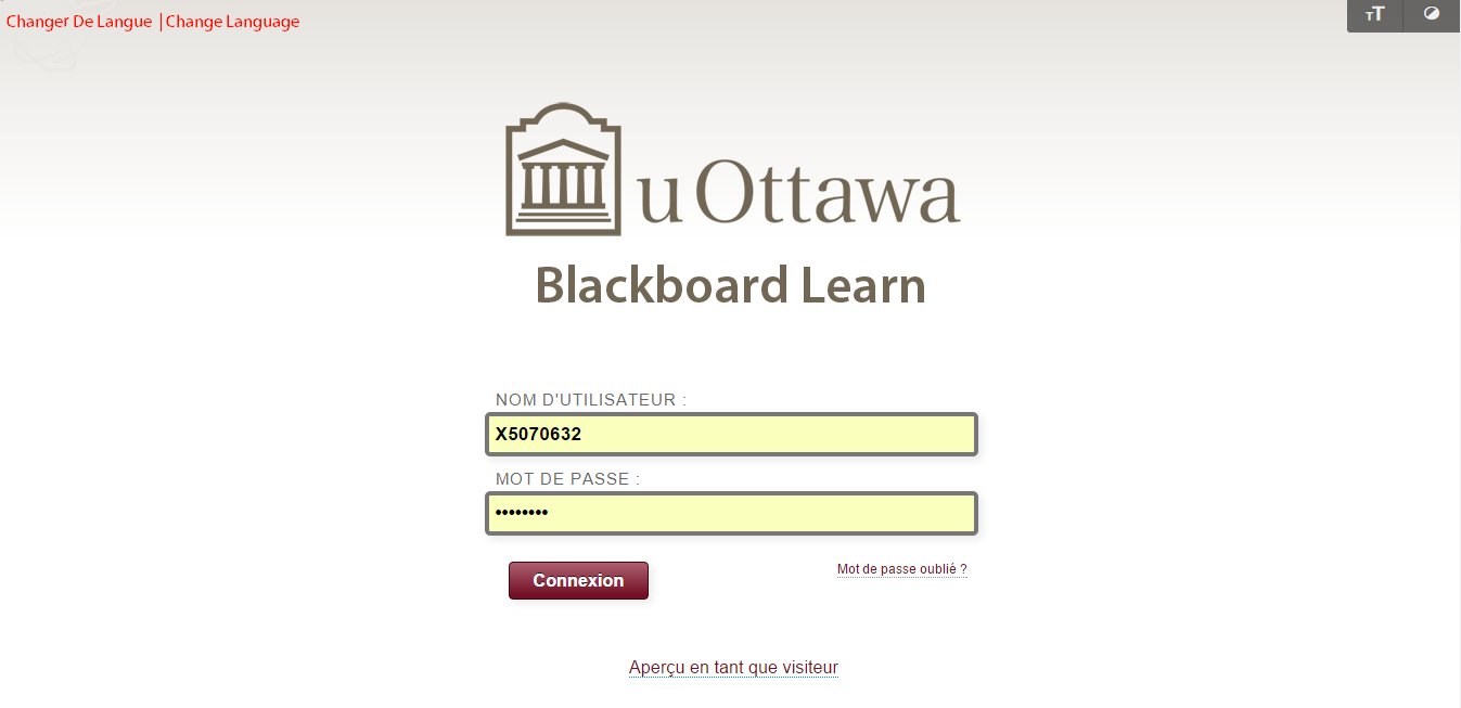
Figure 3: Snapshot showing the new red ‘Change Language’ link in both French and English at the top of the login page
v. The information displayed by the new ‘Change Language’ link should be in both English and French.
------------------------------------------------------------------------------------------------------------------------vi. Unlike the previous arrangement, if the language being displayed at the login page is English, once the user clicks on the ‘Change Language’ link, the information behind the link should first display French at the top of the page and English at the bottom and vice versa. This is to ensure that the user can read and understand the help being provided by the interface.
USABILITY PRINCIPLE 2: Ensure that the user always knows
what he or she can and should do next.
- Ensure that the user can figure out the accordance (what commands are available and are not available).
- Make the most important commands stand out [2].
PRINCIPLE VIOLATION INSTANCE
A. As mentioned earlier there was a “How do I change the interface language?” link, but none of the participants saw it as it wasn't visible enough.
B. In the same vein the “Can’t Login in the System” link is displayed after a user scrolls down the page. However no participant realised they could scroll down at the login page, as such they were not able to see the other option. Therefore the users are not aware that this option exists or is available to them.

Figure 4: Snapshot showing the options available when a user scrolls down at the login page
SUGGESTED MODIFICATION
i. The information behind the “How do I Change Interface Language” link should be merged with the new “Change Language” link that was suggested earlier.
ii. As the usability principle states, the most important commands should be prominent. Since the “Can’t login in the system” link is on the login page, then it is very important for it to be one of the first option a user sees while logging in. The link should therefore be placed higher up on the page, so that the instruction stands out as shown in Figure 5 below.
iii. The scrolling option at the login page should be removed.
The suggested layout would look something like this,

Figure 5: Snapshot showing the new placement of the “Can’t login in the system” link
--------------------------------------------------------------------------------------------------------------------------
USABILITY PRINCIPLE 3: Consider the needs of different groups of users.
- Ensure that the system is usable by both beginners and experts. [2]
PRINCIPLE VIOLATION INSTANCE
A. All the participants tested were beginners and none of them found the system completely usable.
B. The system was also not usable by both French and English speaking students. Some participants explained that even when they chose English as their preferred language, some parts of the interface still interacted with them in French. See Figure 6 below,

Figure 6: Snapshot showing the interface displaying in English and French
after the user had requested for the English language option
The inconsistencies in the language display made the participants more confused.
SUGGESTED MODIFICATION
i. If a user has chosen to interact with the interface using a particular language then the entire system should be displayed in the chosen language.
-----------------------------------------------------------------------------------------------------------------------
USABILITY PRINCIPLE 4: Provide all necessary help.
- Organize help well.
A. A participant clicked on the ‘?’ symbol which symbolises the help function. However, the participant concluded the content on the help page was too much and would rather not read it.SUGGESTED MODIFICATION
i. Personally, I think the “Help” section of the site has been organised well. However, if some participants still had problem with the information placed there then maybe more summarization of the information in the help section is needed. Users should also be offered the option of “Read More” if they require to read other details of the information being shared.--------------------------------------------------------------------------------------------------------------------------
USABILITY PRINCIPLE 5: Use understandable encoding techniques.
- Choose encoding techniques with care.
- Use labels to ensure all encoding techniques are fully understood by users [2].
PRINCIPLE VIOLATION INSTANCE
A. Some participants didn’t understand what the ‘ball’ symbol in Figure 1 meant. The encoding technique used was poor.
B. When asked to go back to the home page, all participants kept clicking on the “Blackboard logo” and “uOttawa logo”. They felt this was supposed to redirect them to the home page. However these logos redirects to the main campus website, see logos below,

Figure 7: Snapshot showing uOttawa logo, Blackboard logo and Campus link
Ironically, the “Campus” link redirects to the home page instead of the Campus website. And the logos redirects to the Campus website instead of the home page. This completely fails to use proper labels and encoding.
C. Another issue with the interface design is that the “Campus” link that redirects users to the home page, wasn’t on display all the time. For example, if users go to their profile page, there is no Campus link option to go back to the home page. See Figure 8 below,
 Figure 8: Snapshot showing the absence of the ‘Campus’ link option to return to Home page
D. The ‘Select Language Pack’ option of the interface provides three alternatives to users, English, French and System Default. However both French and System Default resorts to the interface language changing to French. Hence there is no need for System Default to be an option.

Figure 9: Snapshot showing the available language options
SUGGESTED MODIFICATION
i. The uOttawa and Blackboard logos should be changed to redirect a user to the Home page and it should be made available on all pages.
ii. The Campus link should be changed to redirect users to the Campus Website.
iii. The ‘System Default’ language option should be removed.
USABILITY PRINCIPLE 6: Ensure that the UI’s appearance is uncluttered.
- Avoid displaying too much information.
- Organize the information effectively.
PRINCIPLE VIOLATION INSTANCE
A. There is a lot happening on the home page. Most participants complained about this calling it ‘Information Overload’. One participant explained that he will most likely never use most of the links on display.SUGGESTED MODIFICATION
i. A simple list of necessary links should be displayed on the home page. Removal of all the border boxes holding information on the home page could also help to ensure the page does not look cluttered.
ii. Instead of ‘Campus’ written as shown in the Figure 10, ‘My Blackboard Home’ should be written so as not to misguide students.
 Figure 10: Snapshot showing ‘Campus’ should be changed to ‘My Blackboard Home’
ii. Stick to the chosen language and avoid putting other languages by the side as seen in Figure 11. This would prevent the page from looking very cluttered and filled with too much information.

Figure 9: Snapshot showing both French and English versions of text written on the Home Page
iii. There should be a clear demarcation between courses taken in previous semesters and the current semester. This would narrow down users' view and prevent the page from looking too filled up.-----------------------------------------------------------------------------------------------------------------------
In Conclusion
I have discussed above the major usability problems identified on the University of Ottawa’s Blackboard Learn, when testing with a group of students who were being introduced to the site. I hope the suggested amendments will be implemented so as to improve users’ experience on the portal.
References
[1] Blackboard.com. “About Us” page. http://www.blackboard.com/about-us/who-we-are.aspx
[2] Dr. Timothy C. Lethbridge. Class Notes titled “Core Usability Engineering Concepts”
No comments:
Post a Comment