Monday, November 20, 2023

Usability Evaluation of the AliExpress Website


By Samee Mohammad Sayeed


Introduction


E-commerce has completely changed the way we shop for by enabling us to make purchases whenever and wherever we choose. One of the biggest names in this online industry is AliExpress, a globally recognized platform that has redefined the landscape of online shopping.

The website offers a wide range of products, including electronics, apparel, and household goods, as well as buyer protection rules and options for worldwide shipping. This piece on the blog explores the user experience of AliExpress's e-commerce platform, which has become immensely popular globally due to its broad choice of products and effective cross-border trading. To gain deeper insights, we conducted a comprehensive Heuristic evaluation of the software, using both Jakob Nielsen's "10 Usability Heuristics for User Interface Design'' [1] and Nielsen Norman Group's (NN/g) heuristics [2] for e-commerce websites as our guiding principles. The evaluation provided us with valuable findings regarding the usability and user interface design of AliExpress's application. In the following section, we will discuss these findings in detail, offering targeted suggestions and recommendations, all aimed at improving the worldwide shopping experience for users.


Usability Issues and Recommendations 


  1. Inconsistent Price Sorting Functionality

Fig1. Demonstration of the sort by price feature 


As depicted in Fig1., the price sorting feature in the application appears to be misleading.  An upward arrow indicates that products will be arranged from the lowest price to the highest price when customers use the price sorting feature, and vice versa. However, this is not the case for the men’s clothing category, where items are not listed according to this expectation. Users who are seeking to find products within a specified price range or who are looking for the lowest options may find this inconsistency to be problematic. This violates the Match between System and the Real World heuristic and the Nielsen Norman Group’s Effective and Efficient Search Functionality. The results of the price sort do not provide the user's natural understanding of how prices are sorted since a unique, undisclosed algorithm is used instead of the conventional sorting algorithm.


The impact of this issue is considered moderate. While it may lead to confusion and inconvenience for the user, it does not completely hinder them from fulfilling their primary objective on the platform.


Recommendation 


It is recommended to adopt a standard sorting algorithm where the upward arrow sorts items by ascending prices and the downward arrow does the opposite. This change would better meet user expectations regarding price sorting.


  1. Single-Entry Password Risk in Registration Process


Fig2. Demonstration of the Registration Process


The registration process is notably streamlined and user-friendly, minimizing the number of required fields to avoid discouraging new users, as illustrated in Fig2. Validating the email address format is a crucial step in this procedure. But there might be a problem during the password-setting stage. Users are only asked to input their password once, which raises the risk of them mistakenly entering an incorrect password and facing login difficulties later. Although there is an option to display the password for verification, this is not advisable in public settings due to security concerns. This violates the Error Prevention heuristic and the Nielsen Norman Group’s Error Handling and Recovery heuristic. It does not validate the user input, making it very possible for the user here to set an incorrect password and later cause an error. 


The impact of this issue is considered low. It does not hinder the registration process in its entirety, although it presents a risk of users inadvertently setting unintended passwords. Additionally, users still have the choice to reset their passwords by email if necessary.


Recommendation


To mitigate this risk, the introduction of a 'Confirm Password' field is advised. The likelihood of inadvertent password errors is greatly decreased by requiring users to input their password twice for verification. Additionally, this change would reduce the need for password resets in the future because of incorrect entry the first time.


  1. Disorganized Category Structure in Navigation
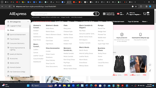

Fig3. Categories not listed in alphabetical order


As highlighted in Figure 3, the arrangement of categories, subcategories, and sub-subcategories on the platform lacks a clear and logical order. This disorganization can make it very difficult for users to find the precise goods they're looking for, which could cause annoyance and make their searches take longer. Users must currently sort through a list of categories that is arranged randomly, which can be time-consuming and inefficient. This violates the Aesthetic and Minimalist Design heuristic. The category information is not provided in a clean and minimalist manner, thus violating the specified heuristic. 


The lack of product titles on the website is a serious concern, with a high level of severity. It poses substantial difficulties for users who are visually impaired. This oversight can make the site difficult to navigate and use for these groups, potentially causing them to abandon the website.


Recommendation


To enhance user navigation and efficiency, it is recommended to organize the categories, along with their respective subcategories and sub-subcategories, in alphabetical order. This orderly setup will make it easier to find requested things quickly and intuitively, which will enhance the platform's user experience overall.


  1. Lack of Product Titles in Featured Listings


Fig4. Screenshot of the AliExpress website’s homepage


The homepage of the website displays a section called SuperDeals, where products are featured with their images and prices but lack titles. Customers who are unable to distinguish products only by their visual representation may become confused as a result of this lack of titles. People who are color blind or have other visual impairments may find it difficult to identify objects without textual descriptions, making this a particularly problematic issue for them. This violates the Recognition Rather Than Recall heuristic since relevant information such as product names is not visible. Generally, visitors to this site are looking to either buy specific items or explore various options, making it vital for product titles to be distinctly visible. The website should not assume that users can identify products solely from their images.


This issue's impact is rated as medium. While this lack of organization may lead to increased search times and potential user frustration, it is unlikely to completely prevent users from eventually finding the desired category. Still, there is no denying that this problem seriously impairs the user experience.


Recommendation


This can be fixed by including clear, concise titles or labels for each product in the featured rows, together with their prices and pictures. These titles should briefly describe the product, aiding users in understanding what they are viewing.


  1. Complex and Long Product Titles 


Fig5. Screenshot of the AliExpress website showing a particular product page


The website's product titles, as seen in Fig.5, are excessively long and filled with unnecessary information, making it more difficult for users to navigate the product page and locate particular items. This situation is a breach of the Aesthetic and Minimalist Design principle, as the product names are not concise or elegantly presented, being cluttered with redundant wording that detracts from the core product information.


This problem is regarded as having a low severity level. Although the long titles may be an inconvenience, users can usually adjust by quickly reading or ignoring the unnecessary portions of the titles. Even though this might not offer the best user experience, users can still utilize the website to achieve their goals.


Recommendation


This can be fixed by ensuring the product titles are clear and easy to read by reviewing and editing them. This can be done by rewriting the titles to remove unnecessary material and concentrate on delivering the essential details required for product identification. The revised, shorter titles should incorporate precise, descriptive keywords that succinctly summarize the most important features of the product, aiding users in quickly grasping the essence of the product.


Conclusion 


After completing the heuristic analysis of AliExpress, it is clear that although the website provides a wide variety of products, there are certain important areas where the user experience may be improved. Throughout this evaluation, we've identified several key issues, which hinder usability and accessibility. Looking forward, it’s clear that continuous heuristic assessments are essential for evolving digital platforms like AliExpress. UX design methodologies need to adapt as user needs and technology environments do.  By regularly assessing and updating its user interface, AliExpress can stay ahead of the curve, ensuring that it not only meets but exceeds user expectations in an increasingly competitive e-commerce world.


References

  • [1] Nielsen, J. (10). Usability heuristics for user interface design. 
  • [2] Nielsen, J., & Molich, R. (1990, March). Heuristic evaluation of user interfaces. In Proceedings of the SIGCHI conference on Human factors in computing systems (pp. 249-256).




Evaluating User Experience: A Heuristic Assessment of the IRCC Study Permit Application Website

By Preyank Kumar


Introduction

The IRCC Study Permit Application website is a pivotal gateway for international students aspiring to engage in Canada's dynamic academic landscape. This meticulously curated digital platform, overseen by Canadian immigration authorities, plays a crucial role in simplifying and expediting the intricate process of securing a study permit.


In an era marked by increasing global interconnectedness, the significance of the digital interface in immigration procedures becomes even more pronounced. The IRCC Study Permit Application website stands as a guiding light, deftly leading students through the complex immigration landscape and unlocking pathways to educational opportunities in Canada.


In this blog post, I have conducted a comprehensive evaluation of the IRCC website, exploring challenges associated with key areas such as session management, document uploads, application status tracking, authentication procedures, and feedback clarity. Anchored in Nielsen's Usability Heuristics, the analysis aims to provide a thorough understanding of these issues and offer practical recommendations for improvement, ensuring a more seamless and user-friendly experience for applicants.


User Experience Problems and Recommendations


1. Session Timeout Exception:

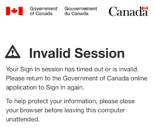
If a user's active session expires, they encounter an "Invalid Session" error message without a direct link to the login page, as depicted in Screenshot 1. 


 Screenshot 1: Invalid Session Page


Recommendation:

To address the Session Timeout Exception, it is recommended to implement an automatic redirection to the login page when a session expires. This proactive approach eliminates the need for the error message, directly resolving the issue and significantly improving the overall user experience. 


This contravenes Nielsen's Heuristic 1, which underscores the significance of furnishing users with feedback to keep them apprised of ongoing events and expectations. To enhance the user's understanding of the situation and foster an improved user experience, providing a clear system status and an automatic redirection to the login page in such instances would be beneficial.


2. Unable to Preview Uploaded Documents:


When a user endeavors to upload a document and subsequently finds no option to preview it, the process becomes challenging as there's no way to verify the accuracy of the submitted document.


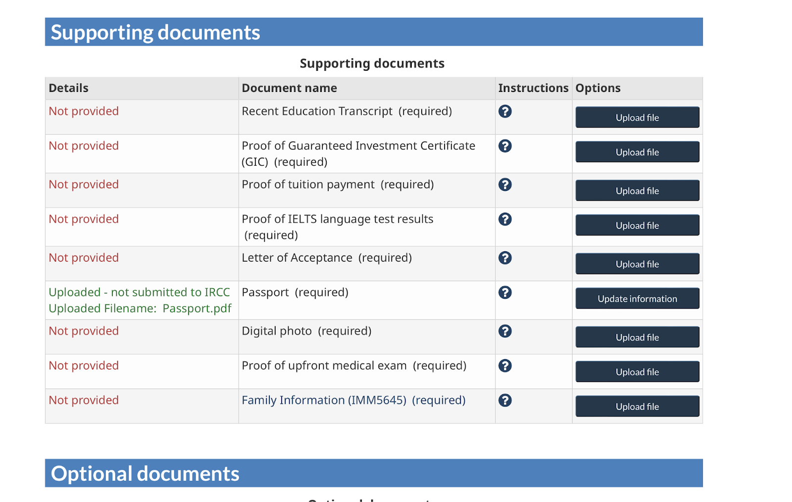
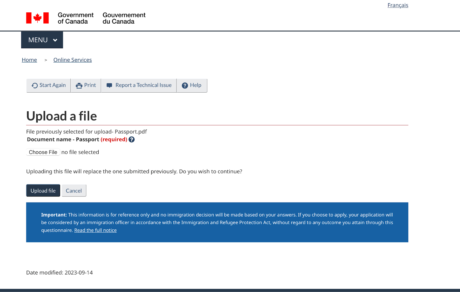
As evident in Screenshots 2 and 3, after the successful upload, the document is displayed as uploaded. However, a critical missing feature is the absence of a document preview. Subsequently, when the user clicks the "update information" button, replacing the "upload file" button, a new document upload option appears. This new option signals that uploading this file will replace the previously submitted document.


Recommendation:

Introducing a hyperlink or a method for users to view the previously uploaded document would be beneficial in this scenario. It would empower users to review the document before making any replacements or updates, significantly improving the overall user experience.


The lack of a document preview for uploaded documents can potentially lead to errors or issues for the user, as they have no means to review the document they've uploaded. This absence of a preview feature obstructs user recognition and may result in recall errors, contradicting Nielsen's Heuristic 6, which advises providing menus and comparison tables to indicate users' paths and offering in-context help.


Screenshot 2: Supporting documents Uploading Page 


Screenshot 3: Uploading File Page


3. Confusing Table:

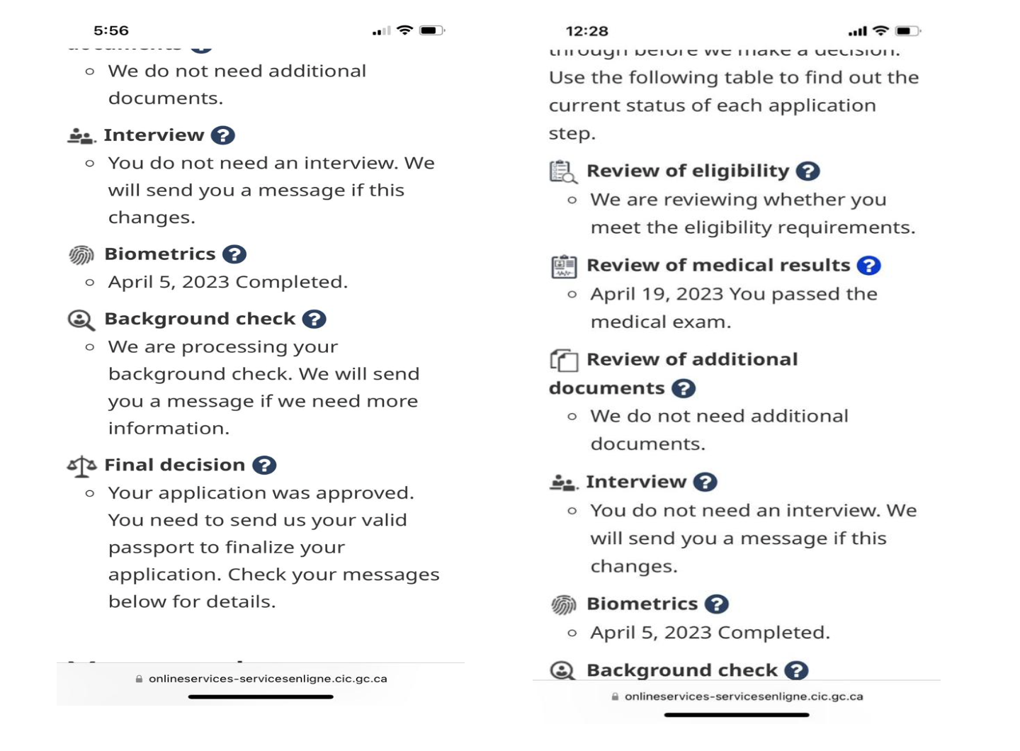
Users are encountering a discrepancy in the table that displays the application status, leading to confusion. While the final decision may have been made, certain steps are inaccurately labeled as "in progress," as illustrated in screenshot 4. The current feedback on application status lacks reliability and clarity, presenting an opportunity for improvement. Aligning the feedback with the actual application progression is crucial, even for applications that have already been approved and reached a final decision.


Recommendation:

To enhance user-friendliness, establish a logical and sequential order within the table. Accurately label steps such as "Review of Eligibility," "Review of Medical Results," "Review of Additional Documents," "Interview," "Biometrics," "Background Check," and "Final Decision," with completed steps clearly marked as "in progress." Introduce date highlights within the "Final Decision" section to improve transparency and clarity in the process.


From a usability standpoint, this issue is closely connected to Nielsen's Heuristic 1: Visibility of System Status, emphasizing the importance of keeping users informed and providing accurate feedback on the system's status. It also aligns with Heuristic 4: Consistency and Standards, stressing the need for a consistent and standard approach in presenting application status


Screenshot 4: User Feedback Table Snapshot


4. Multiple User Session Login Attempt:

When a user attempts to log in, they may encounter difficulties if another session is already active, and the feedback provided in such situations can be inadequate. In the specific instance captured in screenshot 5, the user is confronted with an "invalid session" error, which lacks the necessary clarity to explain the root cause of the login failure. This absence of informative feedback could lead to user confusion and misdirection.


Recommendation:  

Automatically close the previous user sessions and let the user log in.

This usability concern aligns with Nielsen's Heuristic 1: Visibility of System Status, which emphasizes the significance of keeping users well-informed by providing clear and informative feedback about system events. In this particular case, the "invalid session" error message falls short in offering users the necessary understanding of why their login attempt failed. As a result, it violates Heuristic 1 by not providing a visible system status or effective communication.


Screenshot 5: Invalid Session Page on login attempt

Conclusion:


In conclusion, the IRCC Study Permit Application website is crucial for international students aspiring to study in Canada, but it faces notInable user experience challenges. This blog post highlighted key issues identified through heuristic evaluation out of a total of 9 problems found on the website. Grounded in Nielsen's Usability Heuristics, our assessment focused on session management, document uploads, application status tracking, and feedback clarity.


Addressing these concerns through website enhancement aligns the platform with established usability principles, crucial for providing a seamless, transparent, and efficient pathway for international students. In an era where the digital landscape shapes immigration procedures, prioritizing a user-centric approach is essential. These proposed improvements are integral to the platform's evolution, enhancing its role in facilitating educational opportunities for aspiring international students in Canada.


Exploring User Experience: Evaluation of IRCTC Website And Application

By Sahil Rajpal


Introduction

IRCTC, short for the Indian Railway Catering and Tourism Corporation, serves as a widely utilized online platform for ticket bookings in India. This platform has significantly streamlined the ticket booking process, saving users the hassle of visiting railway stations. The online reservation system allows users to check train availability, book tickets, and even cancel or modify bookings. IRCTC, provides operations in tourism, railway, and catering, plays a crucial role in the Indian community. Its website and mobile application offer users a convenient means to access of these services. I have assessed the IRCTC website and app using Nielsen's heuristics. I will uncover major issues that are based on Nilsen’s criteria that will provide the valuable insights to improve the user interface and overall usability. This analysis will enable us to identify the areas that need enhancement that will make IRCTC website and application more efficient and user-friendly. This blog post will highlight the issues of utmost severity that are violating heuristics and offer recommendations to address these problems.

Details of Software Used

IRCTC provides all the facilities of ticket booking on both mobile and website. These include cancellation of tickets, catering and food services, check PNR status and even one can book the retiring room as well as travel insurance which can be done through various online payment options.                          

Fig 1.Shows Homepage of IRCTC


Usability Issues & Improvements


I. Insufficient Details Provided!

Issue: Incomplete information for waitlisted categories poses challenges for new and regular users, requiring them to rely to third-party websites for access to complete booking. This reliance on external sources can result in confusion. Some of the short forms used by IRCTC include GNWL (General Waiting List), RLWL (Remote Location Waiting List), PQWL (Pooled Quota Waiting List), RAC (Reservation Against Cancellation), RLGN (Remote Location General Waiting List), RSWL (Roadside Station Waiting List), RQWL (Request Waiting List), and CKWL or Tatkal waiting list.


Fig 2. Depicts Insufficient Details

Heuristics Violated & Severity: According to Nielsen Heuristics, the incomplete information about waitlisted categories presented in short forms violates the principle of Help and Documentation. This heuristic emphasizes the importance of providing users with proper help that is task-focused and time-efficient. It will help new user’s as well as returning users.

This is the major problem which needs to be addressed as soon as possible so I will assign it mean score of 3 on Heuristics Severity scale as there is incomplete information for waitlisted categories which hampers the users and reduces their efficiency.

Suggested Improvements: IRCTC should provide help and documentation for various categories as this will make the task for ticket much more convenient for the user or link can be provided to access information about the short forms on new page. This method will make it easier for users to understand different waitlisted categories and improve their user experience of booking ticket which will also broaden the base for returning users who might prefer offline booking because of incomplete information.

II. Last Transaction Detail Lacks Consistency! (No Print and Email Option)

Issue: The absence of options to email or print a ticket when accessed from the last transaction on the homepage is major wastage of time. The user is required to take additional steps by navigating to the "Booking History" within the "My Account" section to send or print a ticket. This extra process diminishes user efficiency and introduces inconsistency in the system.


Fig 3. Lacks consistency in Last Transactions.


Heuristics Violated & Severity: According to Nielsen Heuristics, the heuristic which violated here is related to Maintain Consistency and Adhere to Standards. Consistency across each page is emphasized to minimize user frustration and confusion.

This is problem of high priority so I will assign it the mean score of 3 based on Heuristic Severity scale as there is inconsistency on last transaction detail which reduces the user experience.

Suggested Improvements: This issue can be addressed by integrating all the features available in the booked ticket history into the last transaction details. This new feature would establish a consistent user experience, enabling users to access essential functions without the requirement to switch to the "My Account" section.

III. Crucial Information is Positioned at the Bottom and Appears too Small.

Issue: The highlighted issue in the figure below refers to the small size of the text located at the bottom of the page, which can easily be overlooked by the user. Additionally, there is limited information provided for the text which restricts the user to interact with it effectively.


Fig 4 . Shows small text in bottom of page.

Heuristics Violated & Severity: According to Nielsen Heuristics, the violation pertains to the principles of User Control and Freedom, as well as Visibility of System Status. Users wants the information in a more prominent size and visible area. They should also have the freedom to interact with the text to access a more detailed version. The absence of additional link on text restricts user control and freedom.

This problem can be barrier for some users as it may lead to misinformation which results in poor user experience. Therefore, I will assign this problem the mean score of 4 based on Heuristic Severity scale as it could have adverse consequences if information is missed by potential users.

Suggested Improvements: To resolve this issue, make information readily available in easily accessible areas of the website. Increase the text size for improved readability and include hyperlinks within the content to provide additional information when needed.

IV. Complicated Layout and Navigation Problem.

Issue: The page currently has three navigation bars, causing confusion and making it difficult for users to interact. To streamline and improve user-friendliness, consider eliminating one of the bars, as both the upper and left bars can effectively handle functions like moving to the next or previous day and sorting trains. This change will result in a less cluttered design and a more straightforward user experience.


Fig 5. Shows Complex Layout

Heuristics Violated & Severity: According to Nielsen Heuristics, the violation pertains to the principles of Visibility of System status and Aesthetic and Minimalistic Design.

Three navigation panes on a single page can cause user confusion, leading to wasted time as users navigate between them. Therefore, I assign it a mean score of 3 based on Heuristic Severity Scale, indicating the urgency to address this issue promptly.

Suggested Improvements: Improving website user-friendliness involves simplifying choices for users. Consider removing one of the top second navigation bars, as it duplicates information from the upper and left navigation bars. This adjustment can enhance accessibility and reduce clutter on the website.

V. IRCTC Application Lacks the Option to Rebook Ticket from Failed Transactions!

Issue: The problem depicted in the figure below concerns the failed transactions history, where there is no option to rebook a ticket due to which, users are compelled to repeat all the steps from the beginning.


Fig 6. No option for rebook or delete.

Heuristics Violated & Severity: This violates the principle of User Control and Freedom, impacting user flexibility and the ability to navigate as the user desires. It restricts the freedom of user by not providing the option of booking again from failed transactions.

This is severe problem which require immediate attention as providing greater control to delete and rebook ticket enhances user efficiency and experience so I will give this problem the mean score of 4 based on Heuristic Severity Scale.

Suggested Improvements: Users should have the flexibility to either rebook or delete a ticket from their failed booking history. This empowers them to efficiently rebook a ticket with the same details or clear the history, contributing to a more user-friendly experience.

VI. IRCTC Application Home Page filled with different Colors and varying Text Width!

Issue: The issue in IRCTC mobile application home page is due to color usage as well as lack consistent color balance and because of varying text width of icons can be distracting which displays the homepage confusing and inconsistent.


Fig 7. Shows varying text width and different colors.

Heuristics Violated & Severity: It violates Aesthetic and Minimalistic Design which make it more convenient for user to access the information and visually all icons should be easily accessible by the users.

Mobile responsiveness issues arise, especially on smaller screens, leading to cluttered icons that may cause users to click on the wrong ones unintentionally. This results in frustration, so I will rate this issue the mean score of 3 based on Heuristic Severity Scale.

Suggested Improvements: Balancing color choices with text is crucial for improving the visual appeal of the application and achieving a polished appearance.

Conclusions

The heuristic evaluation that I conducted highlighted critical issues that require immediate attention to enhance user engagement on the IRCTC website and application. Major problems, such as missing information and cluttered navigation, were identified. Implementing features like help, maintaining uniform text formatting, and using larger, noticeable text are crucial steps. Given that IRCTC is the official website for booking railway tickets in India, addressing these issues promptly is essential. Thorough usability investigations and user-centric solutions can prioritize and resolve the most critical issues, ultimately making the platform more user-friendly and effective.

Acknowledgements

Grammarly was used to correct grammar, ensuring accuracy and clarity in describing usability issues on the IRCTC website. The collaborative effort between the author and Grammarly aimed to enhance the overall quality of the content and address potential language-related concerns.

References

[1] 10 Usability Heuristics for User Interface Design, https://www.nngroup.com/articles/ten-usability-heuristics/

[2] IRCTC website at https://www.irctc.co.in/nget/train-search

[3] Heuristic Severity Scale, https://www.nngroup.com/articles/how-to-rate-the-severity-of-usability-problems/

[4] Improved English with the help of Grammarly, https://www.grammarly.com/grammar-check