By Sania Hamid
Introduction
CuLearn is Carleton’s collaboration and online learning system. It offers support to instructors, teaching assistants and students. It has features like assignment submission, discussion forums, grades upload, course announcements etc. [1]. It is based on Moodle which is an open source learning management system, distributed under the GNU license [2].
Despite the advantages of using this online system, it suffers from many usability issues. This blog lists few of the usability issues faced by a teaching assistant while using CuLearn and provides recommendations to tackle those problems. These issues, if fixed will provide a better user experience.
Usability Issues
1. Problems while adding recipients to an email
The interface for adding recipients to an email is shown in Figure 1. There is no search option to look for a particular user. Multiple recipients cannot be added at a time. The email address of the recipients is not provided.

Figure 1: Interface for adding recipients to an email
Recommendation
The interface should be made condensed with an option to search for a particular recipient. Checkboxes should be provided to add multiple recipients and. The email address of the recipients should be made available.
2. Problems while signature to an email
Figure 2 shows the interface for composing an email. To add a signature while composing an email the user must select the signature which was previously saved under a certain title. Even after selecting the signature, its contents are not visible. To create a new signature the user has to go to a different webpage as shown in figure 3 and save it under a title. This option is not available on the compose email webpage.

Figure 2: Interface for composing an email

Figure 3: Interface for creating a signature
Recommendation
There should be a “Create Signature” button available while composing an email. The signature should be displayed when it is selected to add to an email.
Figure 4 shows the interface which lists the history of the previously sent emails. It provides a short summary with date, subject, attachment(s) and status. It also provides two actions which are open and delete. The problem faced is that, if the user is looking for the content in a particular email then he has to open each and every email to find it. There is no option for him to search through all the emails at once. The emails do not open when the subject is clicked. The magnifying glass icon under the Action column is misleading because on clicking it opens the email instead of providing an option to search.

Recommendation
There should be a search option, to search through the contents of the previously sent emails. Subject names should be made as active links. The magnifying glass icon should be removed as it is misleading.
4. Feedbacks while marking assignments
Figure 5 shows the interface were teaching assistants can upload or change grades and add feedback comments while marking assignments. Two incorrect feedbacks are encountered while marking assignments. The first one is shown in figure 6. This modal dialogue shows up when users make changes either to the grades or the feedback comments and does not clearly specifies where exactly the changes are made. After saving all the changes made, when users try to exit the pages a pop-up message shows up as shown in figure 7. This message is completely wrong as the users saved all the changes.

Figure 5: Interface for marking assignments
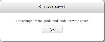
Figure 6: Feedback after saving grades or feedback comments

Figure 7: Feedback while exiting the page
Recommendation
The first feedback should only indicate the changes which were saved so that the users are not confused. Another change can be by simply highlighting the changed and saved fields with a different color like green, this will help in indicating that the changes were saved and the modal dialogue can be avoided. The second feedback should be removed as it is completely wrong and unnecessary.
5. Issues with marking attendance
The interface where users can start marking attendance is shown in Figure 8. The first option shown in the table needs to be selected to start marking. The green icon in the Actions column should be clicked to start marking. The icon is not representative of what it indicates. For the first-time users, it seems like an indication that the class is in session but that is not true. It is a button which takes the users to a new webpage where they can mark attendance.

Figure 8: Interface for marking attendance
Recommendation
Since the green icon confuses the first time users, it should be replaced by a button that says “Mark Attendance”.
References
[1] CuLearn Support, URL: http://carleton.ca/culearnsupport/about-culearn/
[2] Moodle, URL: https://moodle.org/
No comments:
Post a Comment