Heuristic Evaluation on Quora
By: Damanpreet Singh
Introduction
Quora (www.quora.com) is a knowledge sharing website where users can ask as well as answer questions related to the field in which they either have experience or have academic understanding. Also, it allows users to have blogs and live question and answer sessions which attract and interest a lot of users. Overall, Quora boasts a very neat design and functions with very high speed due to which it receives 100 million new visitors per month with people from various age groups and regions across the globe [5]. But there are few usability issues with its interface which diminish its overall performance and attractiveness.
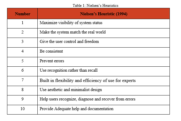
In this blog post, I am highlighting the results of heuristic evaluation performed on the user interface of Quora.com. The evaluation is performed using the heuristic usability inspection method, based on Jakob Nielsen’s Ten Heuristics of User Interface design (1994 version).[1, 2]. It consists of 10 critique criteria based on which the User Interface of a website or an application is evaluated while a system completes a task it intends to perform. They are outlined in the table below:
Usability Issues
- Scrolling through Quora Homepage:
While browsing through several questions and answers through quora, I noticed this vital error which irritates the user to such an extent that they prefer to use mobile application of quora rather than using its website.
To read an answer the user is interested in, they click on the answer and a new sub-window pops up with the complete answer which is often scroll-able as many answers are long. As soon as the user reaches the end of the answer, they can keep on scrolling so that the sub-window closes and they go back to its previous window, but upon doing so, the sub-window closes and the page in the previous window is also scrolled and the user loses track.
This error violates Heuristic #3 which states that user should be given control of his actions. In this case, an action is being performed on behalf of the user without his consent. This is classified as major usability error as this error occurs very frequently and is bothersome to, especially but not limited to, expert users who spent a long time on quora and scroll down to great depths of a page and when this happens, it becomes difficult to find the last answer they were reading to continue their trail.
To read the answer highlighted by light gray color as shown in Figure 1, I click on the ‘more’ option at the end and it opens a new sub-window as shown in Figure 2.
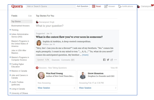
Figure 1
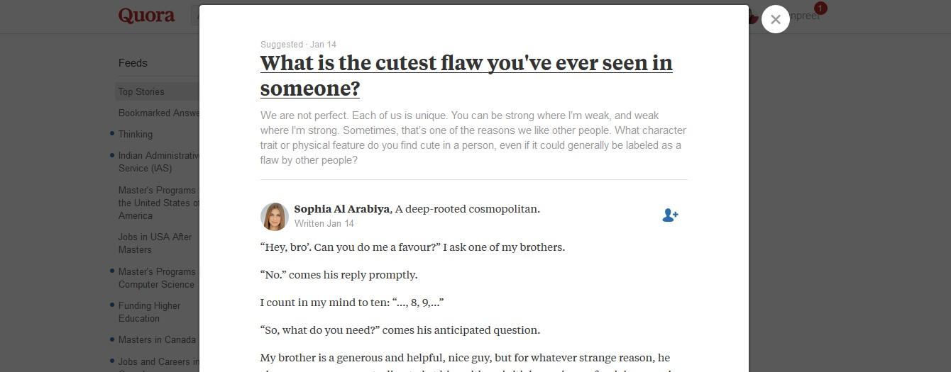
Figure 2
This newly opened sub-window is also scroll able. As soon as I reach the end of the answer, I should keep on scrolling to reach the window in the background as shown in Figure 3.
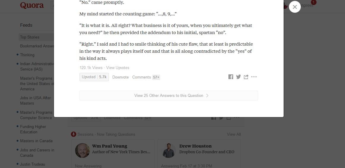 Figure 3
But upon doing so, even the window at the background is scrolled down.
Recommendation:
The solution to this problem is to develop an event handler which ensures to kill the action of scrolling as soon the sub-window is closed, and should not be executed until it is scrolled again which means that the user really wants to scroll. Another alternative would be to not pop up the answer in the first place. Yet another alternative would be to not close the pop-up without the user taking some action like hitting escape
- Limited visibility of link to register via email:
The Figure 4 below demonstrates the user concerns and validates it. The link to register via an email account, which is highlighted by a red rectangle, is concealed among other options. Moreover, its size is very small and even the color coding is such that it requires users to properly scan the web page.
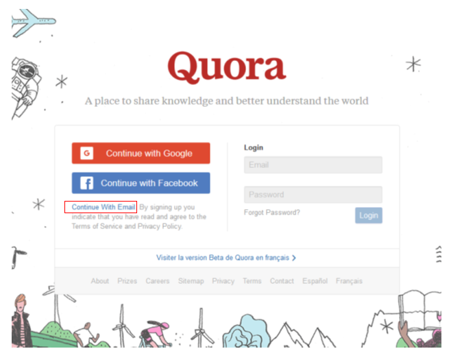
Figure 4
Recommendation:
Though the page is not flooded with redundant details or flashy images, it still is unable to guide the users in the right direction. I would recommend to make this link stand out from the other options and be highlighted using proper color coding in the future versions.
Placement of advertisements at improper places :
The web page of quora could be divided into here parts, the left pane, right pane and the center pane. Essentially, all the content is in center pane and others have just void area. As the user browses through his content, he gets advertisements on the center in between the question and the answer. This issue violates Heuristic #8 which states that aesthetic and minimalist design should be used and irrelevant information should not be made visible in between the digestible content. This is a major usability problem because it distracts the user from the actual question and it leads to many users dropping out from the website or use an ad-blocker.
Though there are not plenty of advertisements in quora, users will be irked if they pop up in between their answers. Figure 5 below captures one such advertisements.
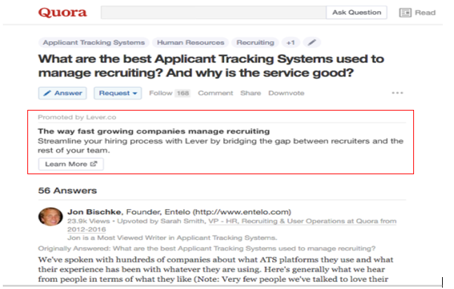
Figure 5
Recommendation:
Though it is overall a neat layout, I would still recommend that the right pane or left pane of the web page should be used for advertisements. It should be done not to fill the empty void, but to eliminate the annoyance generated when the adverts are flashed in between the question and answer, or in between the trail of answers. Another possible recommendation could be to display the advertisements at the end of the answer trail.
Content deleting is not allowed:
This violates Heuristic #3 which states that user should be given freedom for the content he wishes to be generated.
Figure 6 below shows a question which I asked over a year ago, and I can no longer delete this question.
Figure 6
As you can see, there is no option to delete the question. This feature is useless as often user might ask some question which they don’t want to be featured in their profile anymore.
Recommendation:
User should be allowed to delete something which is reflected in his profile. In the 21st century, where social structure is of utmost importance, any sensitive content or detail about user can degrade his image and can might prompt him to either create a new account and start over again or stop using the website at all. The system should match the real world in its usability.
- Difficulty in Adding Additional Details while asking Questions:
The option to add additional details while posting a question is not as obvious as the Design team of quora thought it to be. To a new user, it could be difficult to figure out how to add details even after exploring several options and spending significant amount of time. This once gain Heuristic #8 which states to use simple and minimalistic design. In this case, to ensure a neat layout, extra information, which should be on a button, is ignored.
Figure 7 below highlights the problem user faced while adding details to the question. The option to add a question is properly highlighted, but additional details can only be added through a small arrow pointing downwards. This option is neither properly highlighted nor it reflects an obvious instinct that this button is intended for additional details. The button to perform this task is highlighted with red square.
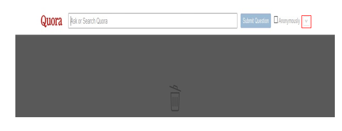
Figure 7
Recommendation:
I would recommend that the option to add additional details to the question should be highlighted properly using a different color coding such that there shouldn’t be any ambiguity over the intended function of the button. Moreover, this button should be labelled and placed at such a location where a new user can impulsively know that this for adding additional details.
I would recommend that the option to add additional details to the question should be highlighted properly using a different color coding such that there shouldn’t be any ambiguity over the intended function of the button. Moreover, this button should be labelled and placed at such a location where a new user can impulsively know that this for adding additional details.
CONCLUSIONS
While Quora is a very easy-to-use website, with limited scope of improvement, a detailed heuristic evaluation based on Nielsen’s criteria surfaced several usability issues.
Generally, experienced users are easily able to perform the trivial tasks on this platform but new or novice users are likely to struggle to achieve the completion status of these tasks. This indicates that its user interface needs a few modifications. These modifications could be essential in increasing the overall efficiency of the existing users and attract other users to the platform.
By investigating these usability issues in more depth and implementing user-centered solutions, Quora designers will be able to make an already well-designed website even easier to use.
REFERENCES
[1] Nielsen, J (1994), Nielsen Norman Group, ‘Nielsen’s Heuristics 1994’,
at https://www.nngroup.com/articles/ten-usability-heuristics/
at https://www.nngroup.com/articles/ten-usability-heuristics/
[2] Nielsen, J. (n.d.). Ten Usability Heuristics. Accessed February 9, 2005,
at http://www.useit.com/papers/heuristic/heuristic_list.html
at http://www.useit.com/papers/heuristic/heuristic_list.html
[3] Lethbridge, Timothy. Studying user-interfaces, heuristics evaluations,
at http://www.site.uottawa.ca/~tcl/csi5122/coursenotes/
at http://www.site.uottawa.ca/~tcl/csi5122/coursenotes/
[4] Wikipedia, ‘Heuristic Evaluation’,
at https://en.wikipedia.org/wiki/Heuristic_evaluation
at https://en.wikipedia.org/wiki/Heuristic_evaluation
No comments:
Post a Comment