Tuesday, February 21, 2012

Usability of New Gmail Design - Enhanced or Deteriorated


By Shruti Sharma

The new design of Gmail has not only introduced many new themes, but has also deteriorated the genuine usability of Gmail. Gmail is trying to expand its dimensions, not restricting itself for reading and/or writing emails, but also providing functionality to its users which will allow them to socially connect with the world.
  •         ‘Cleaner, More Modern’ Look
Google says that it has extended its Gmail’s usability with cleaner and more modern look. However, I observe that Google’s User Interface Designers (UID) has tried their level hard to modernize the look, but in particular, I feel that they have just tried to add some modern art rather than some modern features. ‘Modern art’ and ‘Modern’ are two different concepts having their own perspectives.  Moreover, the UID has also tried to make Gmail a little cleaner. UID has strived to make Gmail’s interface quite appealing, yet it’s not much effective.

  •        Confusing Layout Design
I have observed that many Gmail users often struggle to understand this new design. Many adjustments show that Gmail has gone the wrong way round. There are many glitches with this new design, such as inability to differentiate the boundary of email and layout as shown in figure 1 below.


The above figure clearly shows that there are no clear boundaries and only white spaces on both sides of the mail box. The right side of the mail box shows many advertisements which even make it more untidy.
  •  Iconic Representation
The basic difference between classic design and new design is that new design has full iconic toolbar. It has fully reduced its elements to images making difficult for the users to read certain icons. Moreover, it accumulates more space than the classic design text-based toolbar (See figure below).


As we observe from the figure, the new iconic toolbar makes the interface less usable, for example, the ‘octagon with an exclamation sign’ doesn’t sound that it its represents ‘spam’.

It takes a while for the users to understand these icons and thus, creating confusion until they become familiar with them over time. Google predicts that its users are very comfortable with the new icons and thus, doesn’t even provide the switch between the text-based and the iconic-based toolbar.

  •     Representation of Email Content
When I heard that Gmail is coming with a redesign, I was quite confident that Gmail will improve its cluttered representation of emails which makes it hard for the users to read. Google tried to improve this usability feature but not up to an extent, which I was looking for. Gmail is fast and reliable service but I don’t like the fact that emails in Google are not separate but linkable and mixed.


  •             Other Related Issues
Gmail amends its typical user actions by ‘adding some more steps’ which are hardly being taken as ‘improvement’. For example, there is a list of mail, contacts and task in the classic design, while a drop down button in new design as depicted in Figure 4. This arises to two new problems – firstly, users misunderstand drop down ‘Gmail’ button as a simple text and secondly, users have one extra click on contacts and tasks.


Also, the new design has removed bottom toolbar forcing users to move to the top of the page every time when they want to archive, spam, delete and so forth.
Conclusion

Although Gmail has tried to give a trendier look to its users, however, I feel that it has completely overlooked the paramount importance of usability. I think that the new design is a step backwards rather than a forward one. It does cause interruption to those users who handle bulky emails. To conclude I feel that Google UID should work harder to improve Gmail and its usability.

Sunday, February 5, 2012

Let the maps win: Google Map (“GM”) or Bing Map (“BM”)


After a lot of popularity gained by BM, I was intrigued to use BM and compare how BM can compete with GM. GM has always been my preferred choice, however, it would be remiss on my part not to analyze both of these maps in terms of better usability. I have tested comparatively the usability of both GM and BM as follows:
1.       Search places
Let us see which of the two maps offers the best basic mapping, for example, let us search for University of Ottawa, Canada. From the two snapshots below, we observe that GM is easily understandable than BM. GM seems to be more relaxing to eyes and visually attractive, for example, the roads (major and minor), airports etc. are very well highlighted than BM.
GM Snapshot 1:


 BM Snapshot 1:


2.       Directions
Both GM and BM are quite similar while looking for directions. Therefore, there is not much difference amongst these two maps in this regard.
GM Snapshot 2:


BM Snapshot 2:


3.       Business Listings
Let us look for restaurants near University of Ottawa. GM gives a comprehensive list of restaurants near the University, whereas BM shows no results as shown below.
GM Snapshot 3:


 BM Snapshot 3:


4.       Imagery
This is the only section where I feel that BM clearly beats GM. The BM's Bird's eye view provides a much clear view than the satellite view of GM which often gets blurred as one zooms in. BM automatically shifts to 45-degree imagery, which can be rotated at different angles as compared to merely a vertical satellite view provided by GM.
BM Snapshot 4:


BM Snapshot 4 (Different angle view):


GM Snapshot 4 (Satellite view):


5.       Street view
BM, like GM also offers interactive street view, however, it is restricted to certain roadsides only. GM has a much wider coverage area providing great comfort to the users in identifying their desired locations and landmarks. GM offers a much enhanced feel than BM to the users about familiarity with new places.
GM Snapshot 5:


BM Snapshot 5:


Conclusion
In my overall opinion, GM is a clear winner in all aspects other than the imagery feature.It is more user-friendly than BM. However, the 45-degree imagery feature of BM offers very interesting and useful browsing experience. However, I feel that BM is miles away from GM unless it would enhance usability by improving its features such as basic mapping attractiveness, search for commercial listings and streetside view. 

Thursday, February 2, 2012

VS2010 Auto-complete Usability

Usability Issue: Visual Studio 2010 Auto-complete feature


What makes using a development editor easier is the content assist menu that gives us more hints or information about what we can do. Specially, when you are using new APIs or would like to make your coding faster and less error-prone. The content assist feature in Visual Studio is improved and provides several handy suggestions to use. However, the way it pops up and disappears makes its use a bit clumsy.

When you type a character in a new line, the content assist menu will show up right away to give you suggestion on the auto complete, which makes it a bit surprising especially when you would like to type in something more as a comment, variable declaration, or loops, etc.


If you hit ESC on your keyboard, the popup will disappear which is fine, but as soon as you continue writing, it will show up again. Hit ESC unless we go to a new line, or finish writing the statement. Otherwise, you will keep pressing the ESC button if the auto complete menu is annoying you. It would be better to limit auto complete from showing up when we have short list of choices by clicking CTRL + Space.

Move Up/Down use:
Suppose that you would like to define a new variable typed by sbyte. As soon as you type the character “s”, the auto complete menu will show up right away, and by default the type sbyte is the selected one given that it is first entry for variable types start with the character “s”. If you hit enter, surprisingly, you will go to the next line, and only the character “s” is what was left typed in the previous line. The question will come into your mind, “Why did just this happen?” The issue here is the “auto complete” is not auto focused when the item of interest is the default one. You will still need to dummy move up and down to get it focused. Sometimes you may need to use your mouse to choose a selection. This behavior has been resolved in Visual Studio 2010.

The suggestion for better auto complete use is to only show the auto complete when using hot key (such as control+ space), or when using “.” to find out methods in APIs, classes, or the same class.

Auto-complete templates behavior:
Auto complete is supposed to make Visual’s use better without any typing tweaks. One of the most annoying things I always face all the time is the input box. When I type mbox, it shows up which is good:


However, when I hit enter, it will only type in “mbox,” which is a syntactical error unless you complete the statement. One of the hot keys I have to use in that case is “tab” – which is completely vague for new users – in order to show the complete line use:

Even with this hot key, we still have a problem with missing imports on System.Windows.Forms.
You will need to manually add this missing import. From usability perspective, we should have these imports filled in. And even if there are items in the auto complete that are going to cause errors, they should be filtered out in order to avoid confusion. For instance, with that behavior there is a possibility to find an item and after we add it, it turns out we cannot add the item as import. So, it is better to filter out problematic items from the auto complete menu.

Open body statement auto-complete
One of the problems I always face and annoys me is that the code editor does not close my open body statement. For instance, when I type “{” and hit enter, I am expecting to go to the next line, and find the editor added the ending statement “}” in the next line. However, what happens is I go to the next line, with more indents which is fine, but then manually I will need to go to the next line to add the body close brace, and then return up again:

Now, even when I add this missing brace statement, the auto complete shows up right away. Logically, whatever I chose from the auto complete menu will result in syntax errors as it means I am going to append some code right after “}”. Not sure why it even shows up it this point.

So, the user experience with this usability issue will be as following:
-          Type “{“
-          Hit enter to go to the next line
-          Go to the next line.
-          Add “}” to close your body.
-          Hit ESC to close the auto complete that will show up
-          Go up and start writing your code

Environment details:
Operating System: Windows 7 Ultimate.
Visual Studio Edition: VS 2010 Express C#


References:
Microsoft Visual Studio 2010 Editions

VS2010 Missing Import Quick Fix Usability

Usability Issue: Microsoft Visual Studio 2010 Missing Import Quick Fix

For a beginner, it would be difficult to quickly get used to working on Microsoft Visual Studio. Most of the concerns are related to the textual editing of the codes. Some of these issues, such as where to references, were resolved in VS 2010, but the rest are still around.

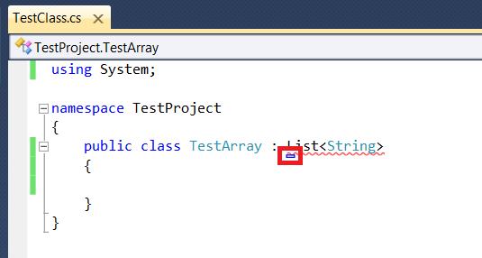
One of the noticeable issues that I have faced many times is the missing import quick fix button. The behavior of the quick fix button is annoying and unpredictable. The missing import icon does not show up all the time; you have to keep moving the mouse cursor or hitting some keys to make it show up.

The behavior seems unpredictable, and when it happens – maybe many times – it causes you to consume more time than you would if you simply added the missing assembly on your own.

To find out that issue, do as follow:
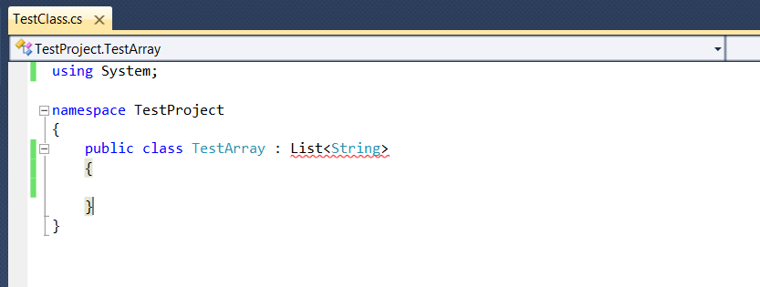
1- Create a new C# class, and name it for instance: TestClass.
a.     Make it extend a type of List String, and intentionally, do not add the import for that List String, given that you are going to use Microsoft quick fix support.

2- The resolve import icon is not shown, and it could confuse you with the shown help message.

3- Re-hover back by moving the cursor around until the icon shows up. The cursor would stay forever unless you focus on something else.

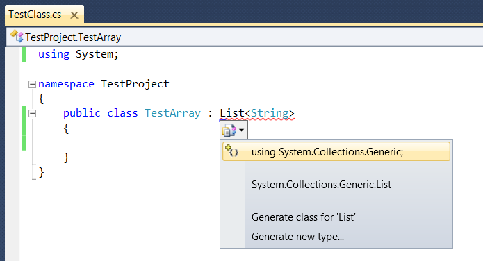
4- Finally, we have the resolve import button.


I could say that “resolving imports” is an important feature that improved the user experience of VS, and it is also a rare feature that provides a quick-fix resolution for errors. It was recently introduced by VS to make the assembly referencing better. But, I think that they rushed into its implementation, as this issue appears many times and causes the feature behavior to operate unexpectedly.
Also, when you are heavily using the editor, this issue is going to show up periodically, and make you prefer manually importing and adding assemblies...

Recommended resolution
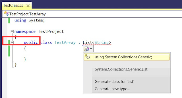
One more thing, the quick fix only works when you hover over the error statement. It would be better to get quick fix icon displayed on the left gutter as well.


This step is more indictable for users who need to perform a quick fix in one place. In addition, when you have too many errors in your class, you will simply go through the left gutter to pick fixes for each piece of code.

Environment details:
Operating System: Windows 7 Ultimate.
Visual Studio Edition: VS 2010 Express C#


References:
Microsoft Visual Studio 2010 Editions

Welcome to the CSI5122 Blog

Welcome to the CSI5122 blog. Students in my graduate course on software usability are asked, as part of course credit to post here and comment on each others' posts.