Thursday, March 23, 2017

Usability Issues with Tinder


By: Sunjot Kohli


Introduction

Tinder(https://www.gotinder.com/) is location-based social dating website that allows you to login through Facebook only and facilitates communication between people with mutual interests, thereby, allowing matched users to chat. The app was launched in 2012 and it was registering one billion "swipes" approximately per day.
Tinder uses a person’s Facebook profile to create a user profile on its platform. It takes the photos already uploaded on Facebook and uses those to set up pictures to its profile. Tinder gathers the user’s information from Facebook and analyses the social graph of that user. Then, it gets the potential matches for the user based on common interests, geographic location, and number of mutual friends. It allows the users to anonymously like/ reject another user, thereby, allowing the users who “Liked” each other to chat within the app.
Tinder allows the users to use swiping actions to "Like", "Super Like" or "Reject" the profile of a potential match. It also provides some other features such as "Rewind" (Undo) the last "Swipe", mock-location based search, group-based matching (Tinder Social), etc.
To "Like" a person's profile, one must "Swipe Right", to "Super Like" a person's profile, one must "Swipe Top" and to dislike (or reject) the profile, one must "Swipe Left".
Basically, Tinder provides a chance for the strangers, sharing mutual interests, to meet or communicate with each other.
Despite being the most famous social dating app, it faces a lot of usability issues, just as the other apps do. I am going to present some of the major usability issues that I found in this app, while performing the Usability Evaluation with Users. The participants were asked to perform sequential tasks in sessions that were recorded and analyzed to identify potential areas of improvement in the app. Task scenario subjective measures included:

  • Easiness of performing an activity.
  • Ability to find the information on the app easily.
  • Accuracy of predicting which part of the app contained specific information.
The testing was performed on iPhones and Android smartphones.

Product and technical information
Software version: 6.8.2
Operating system: iOS and Android.

Usability Issues

1.       Unable to check all whom one liked or super-liked.

There’s no way to check all whom a user liked or super-liked. The user gets a lot of potential matches, which he/she may “Like” or “Super Like”, but can’t keep a track of whom he/she did that. There might be an incident when a person might encounter the same person he/she found on Tinder in real life, but keeps on reminiscing where he/she saw that person. The user might have to memorize all those in mind. Tinder doesn’t provide such feature.

Figure 1.1

Recommendation:

Tinder should provide a way to check whom all a user liked or super-liked. This could be done by providing a different section/page/window in the app such as before Profile page (“Human” icon), in between Profile page (“Human” icon) and Potential Matches page (“Fire” [Tinder] icon), between Tinder Social page (“Multiple Humans” icon) and Message/Matches page, or after Message/Matches page as can be seen in the screenshot below. In that page, the user ought to be able to view all the users whom he/she liked or super-liked. It may be that this is not being done for some sort of privacy reason; but currently the user could manually or mentally keep track of such a list, so there should be no privacy issue.

Figure 1.2

Figure 1.3

Figure 1.4

The icon to facilitate the users to check all whom he/she liked and super-liked can be placed at any of the positions specified in Figure 1.2.
Figure 1.3 shows an example where that icon is placed after the “Message” icon.
Figure 1.4 displays the list of potential matches that the user “Liked” and “Super-Liked”.


2.       Issues with Tinder Social.

a.       Unable to join multiple groups on Tinder Social.

Tinder doesn’t allow the users to join/be a part of multiple groups on Tinder. This is one of the
major issues related to any social app. The users can join multiple groups on many other social apps, but not on Tinder. A user can’t add another user who is already a part of one group (Figure 2.a.1). While adding people to a group, all the friends, who are available on Tinder Social, can be searched for (Figure 2.a.1). When a user is already in a group, he/she gets the profile screen as can be seen in Figure 2.a.2. Thus, Tinder allows the user to be a part of one group only. What if a user wants to create different groups with different friend circles? How will the user be able to do that? It’s currently not possible in Tinder.

Figure 2.a.1

Figure 2.a.2

b.       Unable to edit (add/remove a person to/from) a group.

There isn’t any existing way to edit a group, i.e., add a new person to an existing group, or remove an existing person from the group. The user must dissolve (delete) the existing group, and then re-create the new group with the desired members. Steps to do so:

I. Leave Group.

Figure 2.b.1

II. Create Your Group.

Figure 2.b.2

       III. Add Friends.

Figure 2.b.3

       IV. You are in a Group.

Figure 2.b.4


Recommendation for 2.a & 2.b:

        A user must be allowed to join different groups. There must be a methodology to handle multiple groups of a user. Suppose, a user wants to have different groups with his/her roommate(s), and with his/her friends in each course or fields, but the user won’t be able to do so. The main aim of “SOCIAL” is that a user can interact with different users regardless of their interests. Though, Tinder matches based on the interests as well, even if there are no common matches within a user group, the interests of all the users can be considered to find potential group matches. Thus, a user must be able to be a member of different groups and get a chance to get “SOCIAL” with multiple groups. The option to manage all the groups can be displayed between any two icons in the header of the page (Figure 2.3).

Figure 2.3

        Moreover, the users must be able to add a new member to an existing group or remove an existing member from the group, without having the need to dissolve the group. The users must have an option such as “Edit Group” adjacent to each group they are in, to edit the group by adding/removing group members. Or, at-least the user, who created the group, must have administrative rights to add/remove a person to/from the group, thus providing the ease with which a user can edit the group without having to delete it. Even if a user (creator of group) wants to delete a group, the user must click on “Delete Group” and thus, the group must get deleted. Thus, for the overall ease of all the users (normal as well as administrators), any member of a group must be able to add a new person or remove an existing person (except the administrator) from the group, whereas, the administrator can additionally delete the group. Also, a count of number of groups, a user is a member of, can be displayed alongside the group icon. Example:

Figure 2.4

        In the above screenshot (Figure 2.4), the user is a part of 6 groups (number 6 is displayed adjacent to the “Groups” icon displayed in black foreground color). And, there’s an option for the user to “Edit Group” and “Delete Group”. An administrator (one who created the group) must get both these options, but a normal group member must get only “Edit Group” wherein he/she can add a new person to the group or remove an existing group member (except the administrator). Moreover, whenever the group count exceeds a particular number (here, 4), a scrollbar is displayed at the right side, allowing the user to scroll down to view/edit the subsequent groups he/she is a member of.


c.       Getting the previously “Liked” potential “group matches” in Tinder Social again.

In Tinder Social, when a user (in a group) “Swipes Right”/” Swipes Top” or “Likes”/” Super Likes” the other groups and switches to other page such as the “Profile” page or “Messages/Matches” page, and returns to the “Potential Group Matches” page after a few seconds, he/she encounters the previously “Liked”/” Super Liked” potential groups. It is a serious bug for this kind of application, and must be resolved. The following screenshots explain the problem. The time has been highlighted, indicating that once the same group has been liked at a particular time, it was again visible in the potential “Group Matches” page. Examples:

Figure 2.c.1

Figure 2.c.2

Figure 2.c.3

Figure 2.c.4

Figure 2.c.5

Figure 2.c.6

Figure 2.c.7

Figure 2.c.8

Recommendation:

This issue must be resolved. Once a user of a group “Likes”/ “Rejects” / “Super Likes” another group, it shouldn’t appear again, even after switching between different pages on the app.


3.       Logging-out of the app or Deleting Tinder account.

The “Logout” and “Delete Account” features are related to a user’s profile and must be available in the Profile page. However, both the options were in Settings page, and that too, after scrolling down to the bottom of the page (as can be seen in Figure 3.1, Figure 3.2, and Figure 3.3).

I. Go to Profile and click on "SETTINGS".

Figure 3.1

II. On Settings page, scroll to the bottom.

Figure 3.2

III. You get to see Logout and Delete Account as the last two options.

Figure 3.3

Recommendation:

        The Logout & Delete Account options should come in the Profile or the Edit Profile page. Moreover, it should be easily visible.
        Let’s say, it should be placed close to the profile picture, on the “Profile” page, such that it is easily visible to the users. Example:

Figure 3.4

Conclusion:

        The Tinder app is extremely visually appealing, clean, and uncluttered, and somewhat easy to use, but it lags behind in terms of stability and organization of the content. However, implementing the recommendations and continuing working with many ordinary users will result in a more user-centered application.


Evaluation of Privacy Permissions Usability in Windows Phone, Android and Apple iOS

By Saeed Alharthi

Every modern mobile system nowadays provides the user with a level of privacy permission control to limit what information about the user an application can have access to or gather. It is very important for users to know which information about them is shared with an application on their phone. Users should always be in control of what the application can know about them and what information does the application have access to.

For that, we have examined the privacy permission settings for applications in three mobile operating systems (Windows Phone, Android and iOS) to evaluate them from the user usability perspective. We focused on what options are not clear to the user and which options are not available. We highlighted the best practices we found from the three operating systems and suggested some solutions to issues found by eight test users.

Issues Found

  1. Privacy permissions section is not visible on installation of a new application
C:\Users\ss\AppData\Local\Microsoft\Windows\INetCacheContent.Word\wp_ss_20170306_0004.png
C:\Users\Ss\AppData\Local\Microsoft\Windows\INetCache\Content.Word\IMG-20170309-WA0004.jpg
C:\Users\ss\AppData\Local\Microsoft\Windows\INetCache\Content.Word\1.png
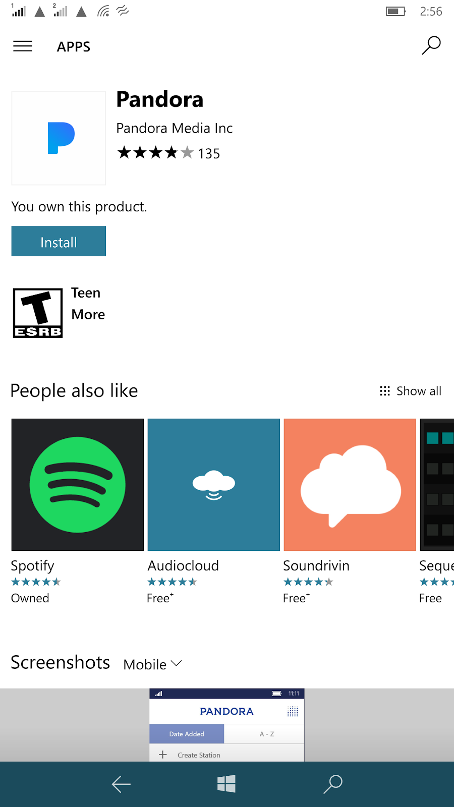
Figure 1: In Windows Phone, no privacy permissions section appears on the top of the page, it is found at the bottom of the page under "This app can"
C:\Users\ss\AppData\Local\Microsoft\Windows\INetCache\Content.Word\2.png
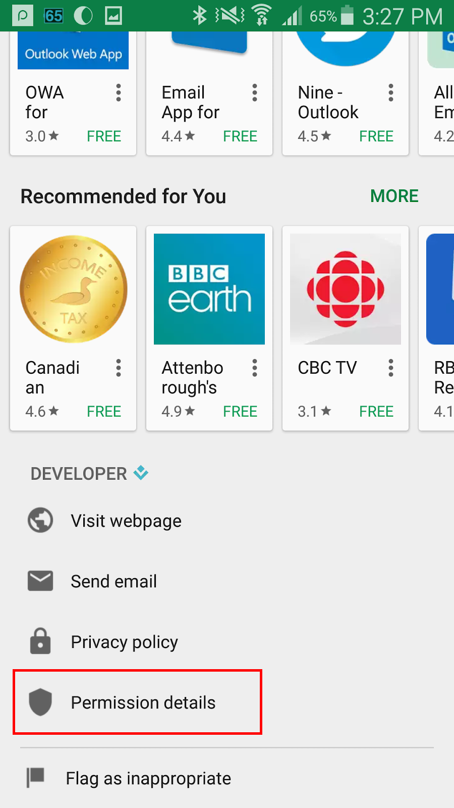
Figure 2:  In Android, privacy permissions section doesn’t appear on the top of the page, it is found at the bottom of page under "Permission details"
C:\Users\Ss\AppData\Local\Microsoft\Windows\INetCache\Content.Word\IMG-20170309-WA0006.jpg
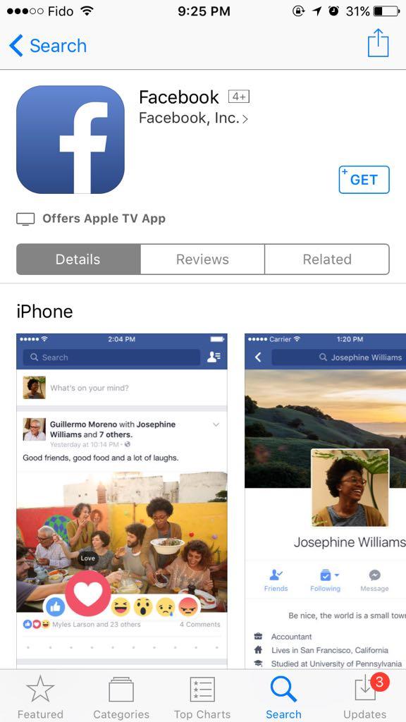
Figure 3:  In Apple iOS, privacy permissions section doesn’t appear on the top of the page nor can it be found at the bottom of page
Two of the Windows Phone users didn’t think the information was available in the page. This was due to the location of the permission info at the bottom of the page and how the page was filled with many textual information that the user must read through to find the permission info (Figure 1). Android users didn’t have difficulties locating the option at the bottom of page, this is due to the large size font used and the clear icon (Figure 2). iOS however doesn’t have an option to show what permission an app may use so none of the test users could complete the task (Figure 3).

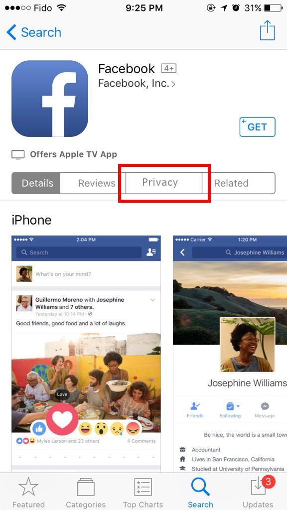
Solution suggested: A section for privacy permissions should be added near the top of the page. In Figure 4, 5 and 6, we show an example of how the option for the privacy permissions can be added in each system.

C:\Users\ss\AppData\Local\Microsoft\Windows\INetCache\Content.Word\3.png
Figure 4: The "Permission info" can be moved under the application rating section in Windows Phone
C:\Users\ss\AppData\Local\Microsoft\Windows\INetCache\Content.Word\4.png
Figure 5: The "permission details" link can be added beside the install button in Android
C:\Users\ss\AppData\Local\Microsoft\Windows\INetCache\Content.Word\5.jpg
Figure 6: A "Privacy" tab can be added to the links on top of the page

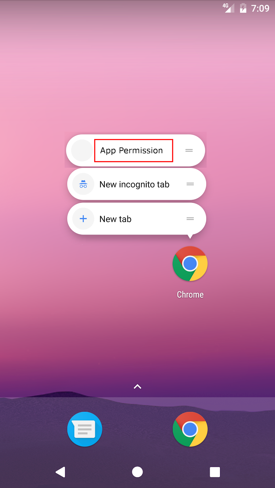
  1. No option to access the application permission from the app menu (shortcuts when holding the app icon)
When asked to perform the second task, one tester reported that Windows Phone, Android and Apple iOS do not provide a shortcut option to access the app privacy permission from application icon. On the other hand, some android third party launchers do have this shortcut option and its more convenient method to find the privacy permissions for an application as the tester suggested.

Solution suggested: An entry can be added to the application shortcuts menu that link to the system privacy permission page (or perhaps even to the complete settings menu) for the application as suggested in the figures below.

C:\Users\ss\AppData\Local\Microsoft\Windows\INetCache\Content.Word\6.png
C:\Users\ss\AppData\Local\Microsoft\Windows\INetCache\Content.Word\7.png
C:\Users\ss\AppData\Local\Microsoft\Windows\INetCache\Content.Word\8.jpg

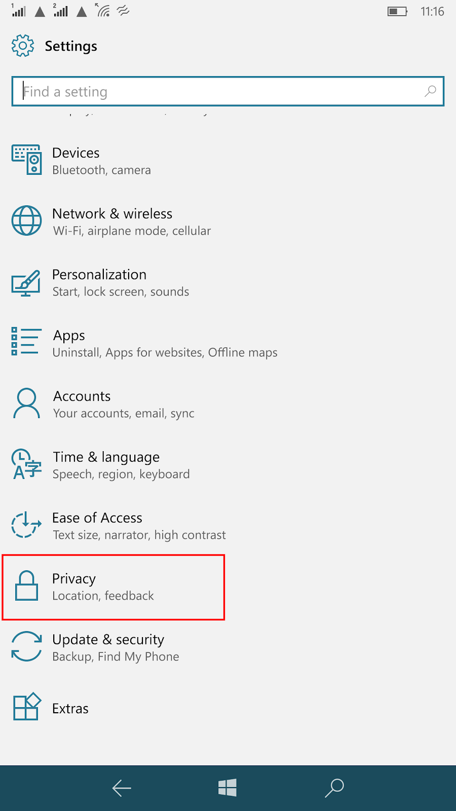
  1. No settings menu for a specific application’s permissions in Windows Phone. Only by permissions category.
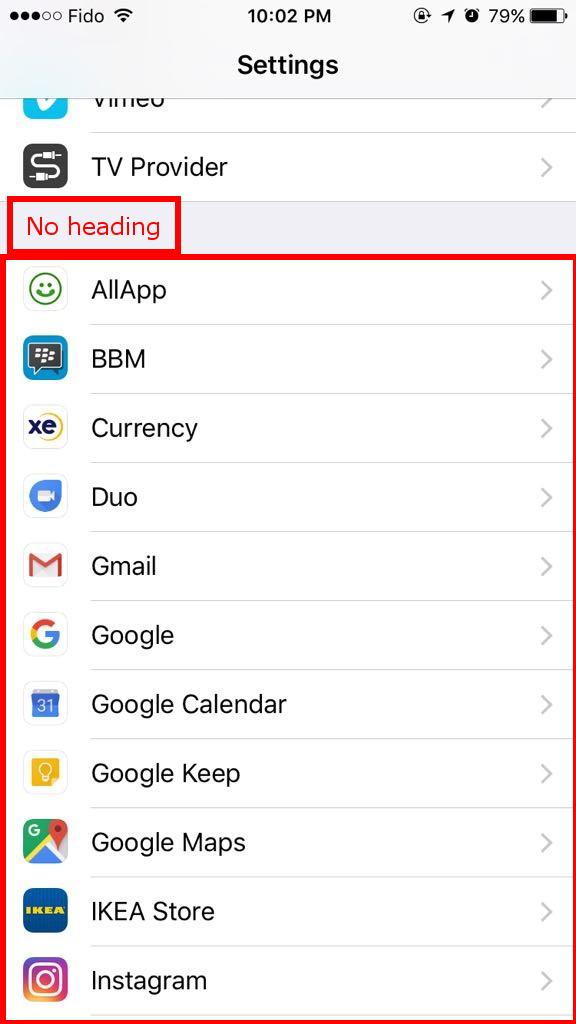
Users were asked to find which permissions an application is granted. For apple iOS users, this was relatively easy since each application’s privacy permission page was accessible from the main settings menu. Even though there is no heading to point out that the privacy permissions were accessible from the application list. Similarly, for Android users the app permission is accessible through the apps section in the settings menu. However, for Windows Phone, the option was not available even after digging through the different sections of the settings menu. The only method to locate the privacy permissions in the settings was in a categorized list under the privacy option in the settings menu.

Solution suggested: A clear section for the privacy permission should be added to the setting menu in Windows Phone. For iOS, a heading needs to be added on top of the application list.

C:\Users\ss\AppData\Local\Microsoft\Windows\INetCache\Content.Word\9.png
C:\Users\Ss\AppData\Local\Microsoft\Windows\INetCache\Content.Word\Screenshot_1489377365.png
C:\Users\ss\AppData\Local\Microsoft\Windows\INetCache\Content.Word\10.jpg
C:\Users\Ss\AppData\Local\Microsoft\Windows\INetCache\Content.Word\wp_ss_20170312_0003.png
Figure 7: In Windows Phone, there is no option for permission list by application
C:\Users\Ss\AppData\Local\Microsoft\Windows\INetCache\Content.Word\Screenshot_1489377396.png
Figure 8: Application permission is found under the "Apps" section in Android
C:\Users\Ss\AppData\Local\Microsoft\Windows\INetCache\Content.Word\IMG-20170312-WA0004.jpg
Figure 9: Application permissions is found at the bottom of the settings menu without heading
  1. No option in Android and iOS to disable a permission category for all apps at once.
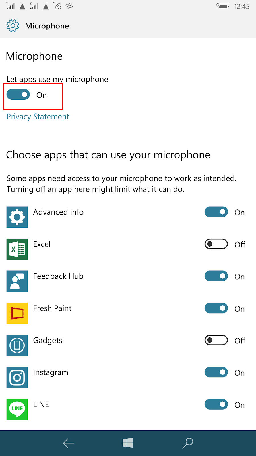
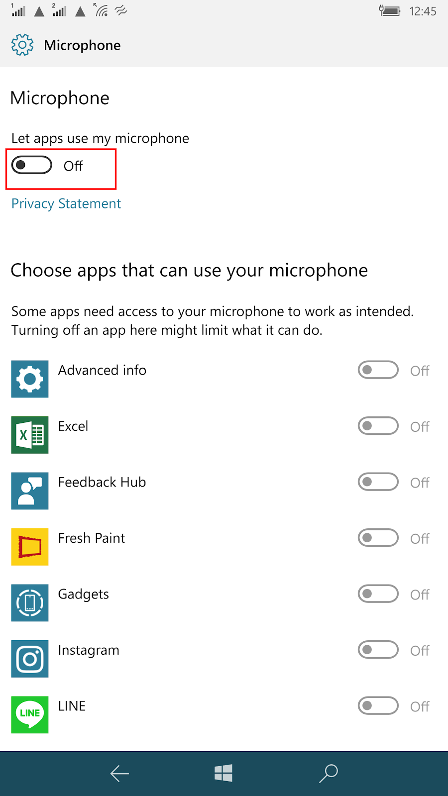
In Windows Phone, a feature that was noted by the test users was the option to disable a permission category with one toggle switch instead of having to disable each app’s access separately (Figure 10). A user noted that this is convenient because it works like an undo button when they re-enable a category (location for example), only the applications that have been granted the access previously will be re-enabled rather than having to go through the list and re-select which apps to grant the access to and which not.
This option is not available in Android and iOS however and based on the user feedback it will be a good feature to add in the future.

C:\Users\ss\AppData\Local\Microsoft\Windows\INetCache\Content.Word\11.png
C:\Users\ss\AppData\Local\Microsoft\Windows\INetCache\Content.Word\12.png
Figure 10: a single switch toggle to enable or disable access for all the apps to select permission
  1. Applications not working or crashing without a notification message of unauthorized access attempt in Windows Phone and Android
In Android: many applications do not detect the denied permission sitting and don’t give informative message to the user. For example, the camera in android will give the message “Can’t connect to the camera” which may suggest to the user that the issue might be in the camera hardware (Figure 12).
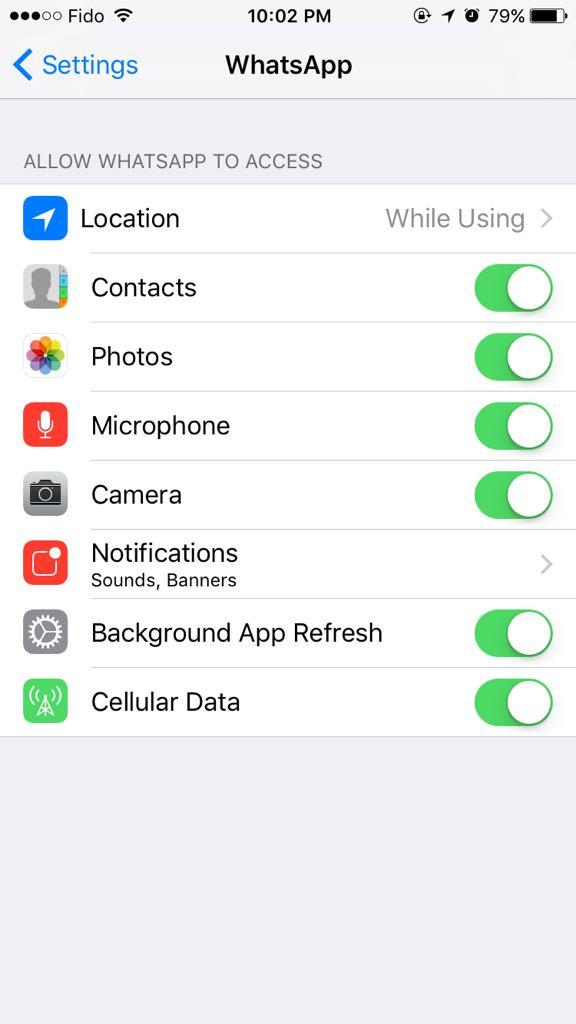
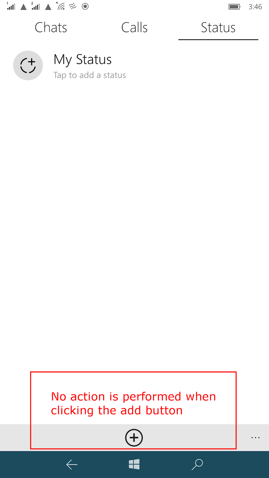
Similarly, in Windows Phone, it’s up to the developer to implement the privacy setting detection and notify the user which some developer may not pay attention to. For example, the camera application will display a warning message and ask the user to change the privacy setting where WhatsApp will simply ignore the user request with no feedback to the user (Figure 13).  

Solution suggested: To avoid such confusion between the apps and the operations system, a notification message should appear to the users notifying them of a denied access request from an application.

C:\Users\ss\AppData\Local\Microsoft\Windows\INetCacheContent.Word\Screenshot_1488487776.png
C:\Users\Ss\AppData\Local\Microsoft\Windows\INetCache\Content.Word\wp_ss_20170313_0007.png
C:\Users\ss\AppData\Local\Microsoft\Windows\INetCache\Content.Word\13.png
Figure 12: in Android, the camera app will not accurately identify the denied permissions
Figure 13: In Windows Phone, While the camera app will notify the user of denied permission, WhatsApp will simple ignore the user actions without feedback

Conclusion:

The results we have from this evaluation show that each operating system approach has its advantages and disadvantages. The main flow in all three system is that they make it harder to access the privacy permission settings when it should be very easy. We pointed out where the design of the UI can be improved based on our testers feedback as well as some major issue with how applications are handling the denied permission errors.

Wednesday, March 22, 2017

Evaluation of Facebook's Fan page Creator module (with independent users)

 By Tolu Olufowobi

           A typical Facebook user is connected to about 88 pages according to a 2016 statistical infographic found on Blog Herald. That is to say, fan-pages have become commonplace on Facebook. With Facebook expanding its repertoire to accommodate businesses, bloggers, and smaller website owners, the Fan-page can be regarded as a crucial avenue for brand and business promotion within Facebook. It provides opportunities for organizations to establish a direct connection between the products and services they offer and users on Facebook. Therefore, it can be regarding as a critical part of Facebook's working model even though many regard it as an auxiliary feature.
For this reason, I conducted an evaluation of Facebook's Page creator module- the set of pages from which users can create and manage pages. I involved 4 independent users who have no stake in Facebook. The essence of the evaluation was to identify any usability problems that may have been missed by testers and developers at Facebook. 
          Over the course of the sessions, the users were able to identify a total of nine problems. The problems were categorized according to how they violate the set of guidelines proposed by Jakob Nielsen in 1994. 
Here are the issues pointed out by users along with accompanying categorizations (for usability enthusiasts and experts):

What was reported

      Problem I.  Obscure link to the Fan-page Creator link

          The “Page” link at the bottom of the sidebar is obscure to the untrained eye. Facebook has provided 2 alternative ways to navigate to the fan-page creator start page- one, through the “Pages” link in the same sidebar, and the other in the drop-down arrow on the search and menu bar. However, only the “Pages” sidebar link seems like an apparent  way to navigate to the page creator start page. The other, because it has been embedded in the drop down list, isn’t easy to find either. In addition, the term “Page”, on a social networking website that made up of a plethora of pages, can be quite vague. 
A gif showing a user's almost futile effort to navigate to the Fan page creator page.

Violated guideline(s): 
  • Guideline 4 (Consistency and Standards): “Users should not have to wonder whether different words, situations, or actions mean the same thing.”
  • Guideline 6 (Recognition rather than recall): “Minimize the user’s memory load by making objects, actions and options visible.”

Recommendation:
  1. Change the font size of the links at the bottom of the sidebar to make them more noticeable.
  2. Adopt a different icon for representing extended menu items, or drop-down lists e.g. “…” or the “hamburger” menu icon – the icon with 3 horizontal bars.
  3. Use a tooltip to inform users of the use of the drop-down arrow, if it must stay.

    Problem II. Unclear distinction between the User account and Fan-page album

          Although the links exist on two separate pages, users, especially, first-time users, may assume that the “Photos” link in the Fan-page dashboard links to photos in their personal profile. One potential mistake that can arise from this, is unintentional posts meant for private use ending up on the fan-page. It goes without saying that anyone who runs into a problem like this might refrain from using fan-pages on Facebook in the future.

The pictures above show that the same label is used for photos in the user's homepage and their fanpage... potentially leading to confusion. 


Violated guideline(s):
  • Guideline 5 (Error Prevention): User errors, like the example given in the description above, haven’t been prevented, given the current adopted U.I.


Recommendation: 
  1. The “Photos” link display text in the fan-page could be changed to “Fan-page photos” or just simply “Page photos”.
  2. Photo uploads to user accounts and the fan-page could be designed with the possibility of getting them done in the same palace. This way, the user is immediately aware that the posts can be made to either of the two, leading them to choose appropriately.


 Problem III. No User Account – Fan-page media transfer options available

          It is impossible for users to move or copy pictures from their profile to fan-pages they manage. The closest thing to this is sharing pictures on the page itself. However, sharing only makes pictures available on the fan-page’s timeline. 

The user looks for a way to move pictures from their account to the fanpage , to no avail.

Violated guideline(s):
  • Guideline 7 (Flexibility and efficiency of use): The module, and by extension, the website, has failed to provide a way for users, in particular, perpetual Fan page admin users, to move pictures freely between their account and pages.


Recommendation: 
  1.  Add a feature that allows fan-page owners or administrators to perform user account to fan-page media transfer.


Problem IV. Profanity label is ambiguous

          At a time when internet trolling and cyber bullying are rampant, this setting is ever so important. With two clicks, users can use Facebook’s vulgar language blacklist to block offensive comments from being posted on the page. However, from the evaluation sessions conducted, only one of the users was able to identify the setting when asked to block offensive posts on the fan-page they were asked to manage. The others users either required some form hint or failed to understand the setting altogether.
After initially missing the setting, the user employs the information icon to learn more about the setting.

Violated guideline(s): 
  • Guideline 2 (Match between the system and real world): The 2nd Nielsen heuristic guideline states that “the system should speak the users’ language, with the words phrases and concepts familiar to the user…”. The term “profanity”, while clearly describing the setting it represents, is not a familiar word to most users.


Recommendation: 
  1. Change the choice of word used to identify the setting.
  2. Provide adequate description for the setting.


  Problem V. Illegible verbose text

          All the participants from the evaluations sessions indicated that, when viewed at a glance, the descriptions text for the settings in the “Settings” page are difficult to read. The small, close to fine print text, discouraged them from trying to spend much time understanding what it did. They mostly relied on the title of settings, to identify which ones they wanted to use. In addition to these, users who went ahead to seek assistance from the help search box, weren’t satisfied with the suggestions provided as they found them misleading.          
The text in the circled area was illegible according to the evaluation participants.

Violated guideline(s): 
  • Guideline 8 (Aesthetic and minimalist design): “Dialogues should not contain information which is irrelevant or rarely needed”- the descriptions given for some of the settings haven’t been constructed in a concise manner


Recommendation: 
  1. Make the descriptions legible.
  2. Adopt concise descriptions all around to encourage their reading.


Problem VI. Scheduling event posts

          The inclusion of an extra modal dialogue form, which can only be accessed by selecting “Schedule from the drop-down list next to the “Post” button,  to set the scheduled date for posts seems unnecessary. More so, as was the case in 2 evaluation sessions, users may set an invalid scheduled moment to make the post. Now, an invalid moment can be regarded as one whose date or time comes after the actual date or time of the event. 
 
Users should be prevented from making wrong data entries like the one shown above

Violated guideline(s): 
  • Guideline 5 (Error Prevention): The event post scheduling dialogue form prevents users from setting an invalid scheduled post date.
  • Guideline 6 (Recognition rather than recall): the positioning of the “Schedule” link violates this guideline.


Recommendation: 
  1. Post scheduling can be done on the same page by employing some extra controls -scheduled time and date field, and a checkbox- and some Ajax code or any technology that modifies page content asynchronously. 
  2. Although Facebook uses form validation to ensure that no invalid date or time can be selected, it may be more convenient to the user, if such values are not selectable in the first place.


Problem VII. Clutter around the post creation area

          The timeline posting feature on Facebook has been around almost since the beginning of Facebook itself and has undergone a series of changes over the years. Most recently, it contains new features that allow users to share new types of content such as videos, pictures, events, to name a few, as timeline posts. However, the layout adopted to display the features, shadows the textbox originally used to make posts. It’s hard to establish if this is by design, but one thing is for certain, some users will not be able to make simple text posts because of this. To compound the issue, Facebook has modified the “post” button within the fan-page home page, making it a thumbnail of the users or fan-page’s display picture. 
User fails to sight the post creation textbox.


Violated guideline(s):
  • Guideline 8 (Aesthetic and minimalist design): The clutter of features around the post entry text field violates contradicts this guideline.


Recommendation: 
  1. Provide a clear demarcation between the post entry field and the additional features available for posting.
  2. Replace the picture with the post button. The author of the post can be setting using radio buttons or a toggle control.


Problem VIII. Misinterpreted page deletion prompt

          The prompt displayed when a user attempts to delete a page from its settings, can be mistook for a feedback message. 
 
The user leaves the page before responding to the prompt.

Violated guideline(s):
  • Guideline 4 (Consistency and Standards): Links aren’t standard way to prompt users for a response.
  • Guideline 5 (Error prevention): User errors are bound to occur if the prompt message looks like a feedback message.


Recommendation: 
  1. Replace it with two buttons and a prompt message so users can easily identify that they are being prompted for a response.


Problem IX. Buttons that don’t do anything

          The “edit” buttons next to owned pages in the “Manage Pages” page don’t do anything other than become invisible when they are clicked. Furthermore, the icons used don’t agree with convention as they are different from the edit icons used on Facebook. 

Notice the buttons become invisible with the user remaining on the same page when the buttons are clicked


Violated guideline(s):
  • Guideline 4 (Consistency and Standards): The use of different edit icons in the Page creator is in violation of guideline 4.
  • Guideline 5 (Error prevention): The existence of the buttons is in itself of a violation of Nielsen’s heuristics guideline 5.


Recommendation: 
  1. The page can be taken out since any editing that can be done on a Fan-pages can be done from within its dashboard.
  2. If the buttons aren’t responsive because a condition hasn’t been satisfied, then the link to be shouldn’t be available until after the condition has been satisfied. Also, stick to the icons already associated with editing on facebook.

Caveat

          It appears that much of the problems identified by the users arose from Facebook’s adoption of a minimalistic and aesthetic design. Furthermore, the argument can be made that design or performance related justifications are behind some of the decisions Facebook has taken for it user interface design. Conclusively, none of the recommendations provided are absolute, neither have they been tested. They are simply suggestions that may provide a starting point for the development of a concrete user-centric U.I.s.

________________________________________