Friday, March 22, 2019

Usability Evaluation of µTorrent 2.0.4

By Yang Xiao

Introduction

    μTorrent is a BitTorrent(BT) client software that is small, powerful, full-featured and is free for Windows, Mac OS X and GNU/Linux platforms. It supports UPnP and popular BT extension protocol, Magnetic Links, IPv6, DHT and UTP, and RSS downloader. Some HD video stations such as ChinaHDTV have blocked the use of Thunder and many other download tools from downloading resources, and it is recommended to use μTorrent for download. However, some usability issues still could be found from user experience and heuristics evaluation. For this report, all functions of μTorrent 2.0.4 are evaluated by using Nielsen’s 1994 heuristics. Figure 1 shows the main UI of µTorrent 2.0.4. 

Figure 1. Main UI of µTorrent 2.0.4

Usability Issues

1. No New User Setup Guidance

Description of Issue:
Users who download using µTorrent 2.0.4 can be divided into different groups, and it is mainly divided into Public Tracker users and Private Tracker users. For different user groups, the software setting requirements are different. For example, Private Tracker users will perform a large number of uploading activities in order to keep their seeds alive, and Public Tracker users prefer to perform only download activities. What's more, the default setting is not good enough for certain group of users. As figure2 shows, the default setting of maximum number of active torrents is 100, and the maximum number of downloads is 15. For private tracker user, upload more than 100 even 500 torrents at the same time is normal, like the author’s number of upload torrents is 104, which means the default setting is not "enough". However, µTorrent 2.0.4 does not have new user setup guidance, which makes it difficult for different groups of users to start using the software.

Figure 2. Default Queueing Setting of µTorrent 2.0.4

Potential Improvements:
Provide new user setup guidance when the software is initialized by asking the user whether he or she is a private tracker user or a public tracker user and then set default configuration automatically.
Of course, it is still needed to provide options for custom settings at the same time. That’s because some group of users have specific requirement, and to summarize, there options should be provided when the software is initialized:
1. Public tracker user (Default). In this option, setting is initialized for general users like maximum number of active torrents is 100.
2. Private tracker user. In this option, setting is initialized for private tracker users like maximum number of active torrents is 500.
3. Custom settings. In this option user can set all configuration different from default setting.


2. Inadequate User Instruction

Description of Issue:
The download procedure using existed torrent is easy but creating new torrent from local path can be hard for general users. First, µTorrent supports drag files to create torrent files, but there are no hints for users to do this, so users will still choose to do file path. Second, when creating a torrent file, users need to input tracker, but new users often do not know what tracker is. Figure 3 and 4 is the UI of creating new torrent file.
Figure 3. UI of creating new torrent file (1)

Figure 4. UI of creating new torrent file (2)

Potential Improvements:
First, add text "drag and drop a file or folder to the field below", or add a hover that says this.
Second, provide HELP function button near the tracker, or in the input box (the right circle of figure 4) of tracker provide default example and instruction of tracker like: “https://yourwebsitetracker.xxx/announce.php?passkey=xxx, if you are a public tracker user, you do not need to input passkey. You can find your tracker on other torrent files of the same website.”

3. Misunderstanding of Toolbar Button

Description of Issue:
    In the toolbar, the icon is just not easy to understand. Figure 5 shows the tool bar, and for example, the icon in the red circle means “create new torrent file”. It’s uneasy for user to guess what it means, and they need to click and have a try if they want to know what the function of this icon is.
Figure 5. Tool Bar of µTorrent 2.0.4

Potential Improvements:

Design more understandable icons or give hints like “create new torrent file” on the top of tool bar.

4. Inconvenience of Speed Limit Setting

Description of Issue (1):
    The initial options for speed limits are very narrow, with ranging from 25kb/s to 1000kb/s. If the user wants to limit the download speed to 5000kb/s, he must first limit the speed to 1000kb/s, then µTorrent will display the new speed limit options, from 200kb/s to 5000kb/s. Setting a speed limit requires two iterations, which is very inconvenient. Figure 6 shows the speed limit options of beginning, and figure 7 shows the speed limit options after user select limit of 1000kb/s.
Figure 6. Speed limit options of beginning

Figure 7. Speed limit options after selecting limit

Potential Improvements (1):
    Give more wide options of speed limits at beginning. For example, the options could be “25kb/s, 200kb/s, 500kb/s, 1000kb/s, 2000kb/s, 5000kb/s, 10000kb/s, 30000kb/s”. If a user wants to set more specific speed limit like 1100 kb/s, then he can choose 1000kb/s and then µTorrent will display new speed limit options. This improvement considers that most users just want to limit the speed to a rough range of the net’s bandwidth, like 4000 or 5000kb/s, and don't want a specific value like 5555kb/s. So, it is reasonable to offer a wider range of options at the beginning. Of course, the maximum speed should not exceed the load of a normal Hard Disk Drive, because nowadays there are still many computers that don't use Solid State Drives.


Description of Issue (2):
    Setting speed limit when start download can prevent download tools from using all bandwidth, and without speed limit of µTorrent 2.0.4, other software that uses the network will be difficult to work. However, if a user wants to set speed limit before uTorrent start the task, he needs to do it when opening torrent file, and the bandwidth setting is in “advanced setting” of adding new torrent UI as figure 8 indicates. For one thing, there is no hints told user how to limit speed, and for another thing, such common and frequently used function should in the front UI.
Figure 8. UI of adding new torrent
Potential Improvements (2):
In the main UI of adding new torrent, add bandwidth setting function, like providing input bar or drop-down menu.

5. Security Issues of Unable to Protect the Passkey 

Description of Issue:
    For private tracker users, the passkey needs to be kept secret. Its importance and confidentiality even exceed the user's password’s. In a private tracker, the passkey is included in the tracker's connection. Figure 9 shows how µTorrent 2.0.4 display the tracker and passkey information, it’s so easy to find user’s passkey that one just need to check a torrent file’s prosperities. Once the passkey is known by others, they can access all the seeds of the user. This can lead to abuse of user private accounts and privacy leaks.
Figure 9. µTorrent 2.0.4 tracker display box


Potential Improvements:

Hide the passkey automatically in torrent properties, like: https://tracker.xxxxx.net/announce.php?passkey=***************************.
    It is also a very good way to transfer all information access permission about the tracker to uTorrent internal management after the download is complete. In other words, users will be blocked from information of tracker and passkey, but they can control download or upload behavior.

6. No Notification Shutdown Function

Description of Issue:
    µTorrent 2.0.4 will have information and sound notifications after completing the download task, which is a very useful feature. However, there are many users who don't want to be disturbed while working or playing. In this case they don't care about the download progress but prefer not to be disturbed. Unfortunately, µTorrent 2.0.4 does not  support to turn off notifications, and there is even no options for any setting of notifications just as figure 10 shows.
Figure 10. Setting panel of µTorrent 2.0.4

Potential Improvements:
    Add notification shutdown function or do not disturb mode function. If the software wants to do better, it can provide more detailed setting options, such as "not to notify users when watching videos and processing office documents."

7. No Support for Multiple Labels

Description of Issue:
    It is normal for user to add files they have downloaded to multiple categories. For example, when a user downloads a Software Usability learning video, he may want to add this file to both <Computer Science> and <Video> Label. Or, add it into a sublabel <video> under label <Computer Science>. Unfortunately, µTorrent 2.0.4 can only set one label for each torrent file and does not support sublabel function.
Figure 11. µTorrent 2.0.4 tracker display box

Potential Improvements:
Provide new function to support multiple labels, for example, be able to select label of <Study> and <Video> together or be able to create sublabel for existed label like figure 12 shows.
Figure 12. Example of potential improvements of sublabel function


Conclusion


As a popular BitTorrent software in many parts of the world, µTorrent 2.0.4’s features are undoubtedly very powerful. This software is very streamlined and has no extra features, but it is because of this, it lacks some features that improve the user experience, and there are some security issues. Some of the more updated versions of µTorrent are banded by most of private tracker sites because the new versions are not stable enough, as a result of which this version is much more welcome.

However, just as user A said after he finished all the task, “In your report, you can just write that this software cannot be used at all”, there is almost no user instruction and hints for a new user to continue his work. So, in fact, it is possible that this software will be finally replaced by other download tools which are much more user friendly compared to µTorrent 2.0.4. And admittedly, there are many download software that integrates BitTorrent functions, but most of them consume a lot of system resources, and have charging functions and too much advertisements.

In conclusion, if people want a convenient, fast and stable BitTorrent software, it is a good choice to improve the software usability based on the µTorrent 2.0 series. There is no perfect software, but it can be achieved that try to improve a software from user’s perspective as much as possible.

Thursday, March 21, 2019

Heuristic Evaluation on Course Hero Website

By Qi Guo


Introduction


Course Hero ( https://www.coursehero.com/ ) is an online learning platform where users can access over 25 million course-specific study resources contributed by a community of students and educators. Users could find practice problems, study guides, class notes, and step-by-step explanations for every subject they're studying. 


I evaluated Course Hero using heuristic evaluation. By using the Nielsen's 1990 heuristics, some usability issues have been found. I analyzed each issue and proposed effective solutions. 

Usability issues


1. Bad unlocking for new users

Users can choose to recharge their accounts to view and download files. New users tend not to top up directly, but to experience whether the site is worth using.

Fig. 1. The interface of previewing the document.
In figure 1, users find a document they need and find that they can only preview two pages of the document.

Fig. 2. The button for viewing full content.
So they click the "Subscribe to Unlock" button in figure 2.

Fig. 3. The interface after pressing the “Subscribe to Unlock” button.
The new interface is shown in figure 3. Users realize that if they want to see the full document for free, they must upload a learning resource of their own. So they clicked the "Upload Now" button.


Fig. 4. The interface of uploading documents .
The new interface is shown in figure 4. Users find that they have to upload at least 10 documents to get 5 unlocks. They don't have any way to get just 1 unlock. In addition, after uploading the file, users need to wait at least one hour to get unlocks.

It breaks the heuristic of "Provide feedback"and "Prevent errors". Poor feedback causes these error. These happen to every new user. This setting let users with no motivation or patience to continue using the site. User are not informed until the final upload page appears. If the user gets this information in the first place, they will have more options.

For most new users, they want the opportunity to try out the site's features. If the feature is attractive, they are willing to recharge accounts. Although this setting allows users to get unlocks for free. But the process is too complex and time-consuming. For new users, they may choose to leave the site at this step and search for other resources on the Internet.

Suggested improvements to resolve issue

1. Maintain this setting. There are several solutions:
a. Inform the user how to get free unlocks when the new user completes the first registration and enters the home page.
b. Set up an information bar on user's home page to mark relevant content.
c. On the document page, there will be relevant information about the unlocks near the unlock button .
2. Change this setting. Give new users several free unlock opportunities. And when the new user unlocks for the first time, the user will be prompted with information such as the total number of free unlocks and the number of free unlocks left.

2. Cannot change and delete rating and comment

Fig. 5. The interface of rating.
As shown in figure 5, users can choose "Helpful" or "Unhelpful" to rate a document.

Fig. 6. The interface after rating.
 After the rating, the interface is shown in figure 6.


At this point, users have a problem. They can only rate once and they cannot change or delete their rating.

The same problem occurs in user comments.

Fig. 7. The interface of comments.
The comment interface is shown in figure 7. User kkerris7 comments the current document. There are no buttons for the user to change or delete his comments.

It breaks the heuristic of "Provide clearly marked exits". Functionality defect causes this error. This happens to every user. In daily use, users may inadvertently press the wrong button or change their minds after viewing the entire document. Users have the right to change ratings or comments. This ensures that the rating or comment of the document is credible and helps other users to choose whether or not to use this document.

Suggested improvements to resolve issue

1. After user rating, the rating buttons will not disappear. The users can change the button they selected. When the user presses the selected button, the user cancels the rating.
2. About user rating, except button option, the scoring mechanism can be added. User ratings range from 0 to 5. 0 is very useless, 5 is very useful. Display the average score next to the name of the document.
3. About the user comments, set two options. The user can edit comment by "Edit"  option and delete comment by "Delete" option.
4. A "Like" option can be set beside the user's comments. If a user supports another user's opinion, he can click on the "Like" option. This will avoid repeating too many comments.

3. Ambiguous file name 

Fig. 8. The interface after downloading the document.
As shown in figure 8, when the user downloads the document, the default document name is "docx.docx".

It breaks the heuristic of "Minimize memory load". Functionality defect causes this error. This happens to every user. At this point the user needs to remember the general content of the document they downloaded. If a user downloads many documents, multiple document names that are similar without any hint of content can confuse the user. Users spend a lot of time distinguishing between documents they download which adds a lot of unnecessary work.

Suggested improvements to resolve issue

When a document is downloaded, setting the default document name as the document title name.

4. Violation of general operation

Fig. 9. The interface when returning to homepage.
As shown in figure 9, When the user needed to return to his home page, he unconsciously clicked on the avatar. Because in most web design, users can click on the avatar to access the personal homepage. The user found that there was no homepage option in the avatar picture bar and clicked the icon of "Course Hero" to return to the homepage successfully. 

This issue breaks the heuristic of "Be consistent". Inability to recognition causes this error. This happens to some users. Although this problem won't make much difference, improving the design can better serve users.

Suggested improvements to resolve issue

When the user clicks on the avatar, the drop-down menu appears. Add a "Homepage" option.

5. Disappearance of the original content 

Fig. 10. The interface after viewing the question in homepage.
When users viewed the questions they asked on their personal home page, the interface looks like figure 10. Users could see the problem content. There was a "Edit" button. Users wanted to use this button to edit their problems. 

Fig. 11. The interface after pressing the “Edit” button.
After clicking the button, the interface is shown in figure 11. There was nothing in the input box. That is to say, users cannot modify their problems based on the original ones.

If the user asks a long question and wants to change only one sentence, he needs to copy his question in the interface shown in figure 10 and paste it in the interface shown in figure 11. This operation is time consuming. If the user does not notice information about the problematic content in the interface in figure 10, he will need to re-enter his question in the interface in figure 11. This requires the user to either keep the question in mind or keep a backup copy in the local. It breaks the heuristic of "Minimize memory load". Functionality defect causes this error. This happens to every user.

Suggested improvements to resolve issue

When users modify their problems, the original problems' contents will be left in the input box.

Conclusion


I evaluated Course Hero using heuristic evaluation. Course Hero provides rich learning resources that attracts a large number of students to use it. At the same time, it has many usability problems. Improving these issues will help improve the site's service to users.

Wednesday, March 20, 2019

Heuristic Evaluation of uOttawa's Co-op Navigator

By Wei Wei


Introduction

In this article, the University of Ottawa's Co-op Navigator is selected as the evaluated software. By using Nielsen's 1990 heuristics, all of the web pages related to the job searching feature in the Co-op Navigator are evaluated.

During the evaluation, we found that Various heuristics such as "Provide shortcuts", "User simple and natural dialog" and "Be consistent" are violated. All the issues related to the job searching feature are carefully discussed and analyzed, and a conclusion for this evaluation is conducted in the end.

Description of the software evaluated

The University of Ottawa's Co-op Navigator is the most important website for uOttawas' Co-op students.

Figure 1: Co-op Navigator’s Front Page

In this web application, students can do various operations, such as receiving Co-op admission, checking personal profile, building and viewing personal Co-op resume, searching Co-op jobs and ranking interviewed Co-op jobs.

In this evaluation, only those functions related to Co-op job searching are evaluated and discussed.

Usability Issues


1. Setting job searching conditions is difficult for users

By clicking the "Jobs - Job Postings" on the Co-op Navigator's navigation bar, users can enter the job searching page.

Figure2: Co-op Navigator Job Searching Page

In the job searching page, some search criteria such as "Job Number," "Job Title," "Creation Date" are not only redundant for student users but also make first-time users feel confused. Obviously, “Use simple and natural dialogue" is not being followed.

Figure 3: Redundant Searching Criteria in the Job Detail Page

What's more, the most important searching condition, "Program of studies" is put in a tiny text box, which makes students extremely hard to find their programs, because students have to scroll up and down in this tiny textbox to find their programs.    

Figure 4: Tiny textbox in the Job Detail Page

Additionally, the searching conditions in "Select Columns" are also confusing: In default, all the conditions except for "Job Title" are marked with a check mark (✔). For first-time users, the searching results would be utterly confusing with the job posting information without job titles.


Figure 5: Select Columns in the Job Detail Page
Figure 6: "Job Title" in the Select Columns (default setting)

Suggested improvements to resolve the issue
1. Remove redundant job searching options.
2. Convert the text box of "Program of studies" to drop down bar or some other front-end components which could improve the user experience.
3. Set the "Job Title" in "Select Columns" marked with a check mark (✔) in default.


2. Job searching options have to be set every time

In the Job Searching Page. The Co-op Navigator does not save users’ previous searching conditions as default, and as a result, users have to do the cumbersome selecting searching conditions operations every time. “Provide shortcuts” is not being followed in the job searching page.

Suggested improvements to resolve the issue

1. Save users' previous searching conditions as default search criteria.

3. No visible notification for how to check job details in the job list page

After clicking the "Search" button at the bottom of the job searching page, the system will redirect to the job list page.

Figure 7: Job List Page
In this page, students may not know that by clicking the hyperlinks of job number or job title in each row could redirect into the job details page. "Provide feedback" is not being followed.

Figure 8: Clickable hyperlinks in the job list

Suggested improvements to resolve the issue

1. Make a visible notification for users: "Click the job number or the job title in each row for job details information."
2. Add a button “Details” at the end of each row in the job list.

4. No visible notification for how to sort the job list

In the job list page, users have no idea about how to use the sorting feature in the job list page. Only when they were told to click the various titles at the top of the job list, such as “Job No. ”,  “City," "Organization" to sort the whole list did they realize the sorting feature does exist.

Figure 9: Clickable titles in the job list

Suggested improvements to resolve the issue

1. Make a public notification for users: "Click the job list’s titles to sort the list by different options.”
2. Add an independent soring feature (for example, a drop-down bar with different sorting options) at the top of the job list.

5. Inconsistent front-end display in the job details page

By clicking the job number or job title, the system will redirect into the job details page.

Figure 10: Job Details Page

The front-end display of job details information in the job details page varied greatly between different information. For instance, "Job Number," "Job Title," "Organization" are displayed as pure text format, while "Job Status," "Number of positions," "Durations" are displayed in non-editable text inputs, and Job description is displayed in a text box." “Be consistent” is not being followed in the job details page.

Figure 11: Inconsistent display (1)
Figure 12: Inconsistent display (2)
Figure 13: Inconsistent display (3)
Figure 14: Inconsistent display (4)

Additionally, unlike the previous page such as the job searching page, there is no “Apply” button at the bottom of the job details page, which also makes users confused.

What’s more, the company address information is not in the “Basic info” sub-page but displayed in another independent sub-page called "Address." As a result, users do not know where the address information is.

Figure 15: Address Information

Suggested improvements to resolve the issue

1. Convert the front-end display of job information from different formats to a unified format, such as pure text.
2. An "Apply" button should be added at the bottom of the page to keep consistency with the other parts of the system
3. Merge the address information into “Basic Info” and removing “Address” section.

6. No multiple-apply feature is provided for users

According to the University of Ottawa's Co-op Office, to make sure getting a Co-op job before the work term, a student should “apply for at least 50 or more jobs”. In the job list page, there is no multiple-apply feature, such as a checkbox at every row in the job list, so that student have to go into the job details page to apply for a single job. This defect greatly reduces the efficiency of the application work. Obviously, “Providing shortcuts” is not being followed in the job list page.

Suggested improvements to resolve the issue

1. Convert the front-end display of job information from different formats to a unified format, such as pure text.
2. An "Apply" button should be added at the bottom of the page to keep consistency with the other parts of the system
3. Merge the address information into “Basic Info” and removing “Address” section.

Conclusion

As the most critical web site for Co-op students at the University of Ottawa, the Co-op Navigator plays an essential role for students to find their Co-op jobs. However, those usability problems on the website inevitably reduce the user experience.

Compared with those public commercial job-posting websites such as Indeed or Glassdoor, the Co-op Navigator is out-dated or even could be called a "legacy system." To improve the usability and user experience, designers could refer to the issues found in this report and those public job-posting websites to redesign the front-end of the Co-op Navigator.

Tuesday, March 19, 2019

Heuristic Evaluation of Penny Juice Website


By: Weihan Zhang


Introduction


       The website of Penny Juice, (https://www.pennyjuice.com) is selling the pure juice for children in the US, which is using to support the children's health and growth. It allows customers to buy fruit juice online with free delivery nationwide. Penny Juice is a family-owned business and has been in the beverage industry for more than 40 years. But there are still some usability issues which affect user experience and need to be solved. In this post, all pages on this website are evaluated by using Nielsen’s 1994 heuristics. I will present some major issues that I found on it and performed the evaluation with users.


Usability issues and recommendations

1. The user has to enter too much information to fill in the order page


       We can see from Fig. 1. that the user has to enter too much information to fill in the order page. To consider Nielsen’s1994 heuristics, this violates the rule of user recognition rather than recall. It is essential to minimize the user's memory burden and help the user to recognize the product item. The product should give the user an option to allow the user to choose and select directly, rather than instead of typing it themselves. There are too many quantity information need to fill, which makes users feel impatient. 

Fig. 1. Order page

Recommendation:


       There are multiple ways to change this problem, and the best way is using the item image, description, quantity and price on this page. It would be more comfortable for the user to be able to select from a list of products. Each product would have an image and price, as well as the ability to select options. This might look like what is shown in Fig 2.

Fig. 2. Product page


2. The information check is not comprehensive


       Fig. 1. shows that users should type all information to submit the order. But we find that only contact name and e-mail address fields are required. Other fields such as phone number, street address and different flavors don’t affect the submission of orders. Besides, the check rule of an e-mail address is incomplete, which doesn’t identify a real e-mail address. To consider Nielsen’s 1994 heuristics, these violate the rules of preventing errors and helping users recognize from errors. For example, When users type the e-mail address without @ before submitting the order, it doesn’t remind users about it. Another example, if users type 1@1 and submit the order, the website just circles this field with red without providing any error messages. This causes that users don’t know how to correct the e-mail information.

Fig. 3. Information check

Recommendation:


       The order section should mark some fields as required by using * to represent it so that users will know which information is optional. For entering different flavor quantity, because I find these fields can be entered in any characters, it should be checked by required and numbers only to prevent errors. The e-mail address should be checked by using more complete rules to guarantee that it should be a real address. It should alert users while they are typing the information before submitting.


3. The footer contains too many unnecessary details


       We can see from Fig. 4. that it is essential to minimize the contents in the footer section. To include the unrelated or low-frequency information will directly affect the usability. All the extra information in the web page will reduce the relative visibility of the primary content. The footer section of Penny Juice has too many unnecessary details, which makes the customer confuse the details and fundamental information about the footer. This issue violates the rule of using aesthetic and minimalist design.

Fig. 4. Footer section

Recommendation: 


       To minimize unnecessary information and content, which is very important to improve the user experience. Therefore, the best way is making the footer as simple as possible. We can divide the footer section into 3 parts, which are social media, contact us and payment method. We can keep the payment method part, but for social media part we should minimize them as shown in Fig 5 or Tweets could be shown in the right margin on the main webpage.
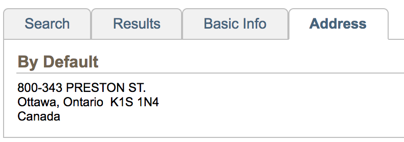
Fig. 5. Social media


       For the contact us part, we can only show “Contact Us” in the footer section. The detail information including address, phone, email, and fax should be displayed on another page for contacting the company. Too much detail information in the footer section will distract the user’s attention to the primary content page so we can simplify them by redesigning it with this improvement.

4. The payment page is not clear for the user to view their purchased details


       The payment page only has the "CASE" as a description, which is not clear for the user to overview their purchased product. Users need to see the detail descriptions about this product rather than a single word. This violates the rule of making the system match the real world. The website should use the language and words that users can understand.

Fig. 6. Payment page

Recommendation: 


       The payment page can be redesigned. It is imperative to illustrate the product details and information clearly. Therefore, the payment details must be pointed out the product name, price, item description, delivery option and so on. For the description part, it should show a picture of this product. This picture can be hyperlinked to another page for showing detail product information. It will directly improve the usability and user experience.

5. The website lacks user control and freedom


       If users submit the order by mistake, there is no checking on users about that. Users only click the button for submitting. If they want to edit information after the order is submitted or view the submitted order, there is no way to do that on this website. This violates the rule of user control and freedom. Users can’t undo any accidental actions. 
Recommendation: 

       For solving this issue, users should be taken to a confirmation page to confirm whether to submit the order or edit some order information. If users confirm to submit the order, the website should provide functionalities to view the order information and edit their information if they want. If users want to edit the order information, the website should allow them to change it and give feedback to users, telling them that the information has been updated. These improvements increase the ability of user control and give users the freedom to undo any accidental changes.


6. No “help” option on the website


       There is no “help” option on this website. If users encounter some problems and want to ask questions, it will be very inconvenient. The website has an address, email, phone, and fax contact information. But I think they are not the fastest ways to get help. Users can’t find any help documentation on the website. This violates the rule of providing adequate help and documentation.

Fig. 7. Contact information

Recommendation: 

  1. The website should provide a help page that shows documentation for frequently asked queries so that users can read and solve problems themselves. 
  2. Another suggestion is to offer a 24-hour online chatting service to answer user questions.
       These solutions will improve the user experience for the website.

Conclusion


       To sum up, it is important to consider the existing issues based on the heuristic evaluation. Developers should consider these problems and improvements to improve the existing website, which can attract more customers. It is also significant to redesign the website, such as navigation bar, footer and so on. These improvements will directly increase the usability and also improve the user experience for the website.
