Tuesday, April 3, 2012

Why Modal Dialogs should be used with extreme caution ?

By Renaud Bougueng


Modal dialogs have been extensively discussed in class[1]: what they are, how should they be used, etc. I personally thought I had a fairly good understanding of it until I stumble onto the situation I am about to share here.
Just as background information, a modal window, by definition, is 

"a child window that requires users to interact with it before they can return to operating the parent application, thus preventing the workflow of the application main window"[2].

It is important to keep that definition in mind in order to understand the trickiness in the story I am about to tell.

Now, this story specifically concerns modal pop-ups in Google Chrome browser application. It also involves the uOttawa virtual campus, and the Skype toolbar plug-in. But you will note that it could have been any other applications inside a given browser.

About the uOttawa virtual campus (WebCT) system: it is a really important web portal used by a major community of students and staff at the university of Ottawa. It is used per course, to post course materials, assignments, manage group discussion, submit and automatically grade students.


Now, here is the story:
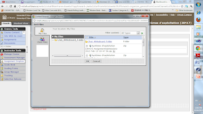
  1. I was using the WebCT to attach some files from my local file system to a post I made in WebCT. The app to attach files in WebCT is a non-modal pop-up (which means it does not block possible interaction with its parent window) in which you can select the original location of your files. You can select files:
    • From WebCT local user repository ("My Files" icon on the picture below),

    • From the Class repository (in this case, it was "CSI3531" files), 

    • From your local file system. For the later, it is a file browser that is deployed as a java applet in which you can browse local folders and select your computer files.  

  2. Now, in order to open the file browser, I had to click on the third icon normally listed in the window with the name "My Computer". But I could not see it, instead there was a blank box. The icon had not been loaded.

  3. Then I realized there was an indication on the window (I could not capture it on time on the above screenshot) telling me that to access that functionality, I had to update my browser java plug-in to a later version. So, I went on the java website, downloaded and installed the new java version.

    I then had to restart my browser.

  4. Now, when I accessed the WebCT again and tried to open the upload window. I got a Security Warning pop-up saying that "Java has discovered application components that could indicate a security concern". By the time, I had switched to my uOttawa Webmail, but the dialog stayed on top of everything. It was persistent on my screen.


    Note that it was obviously not a useful warning since it was referring to the WebCT java applet for file upload which was not harmful. Also note that the pop-up was a modal dialog.

  5. Now, when I clicked on the "No" button from the Security Warning dialog to prevent the WebCT java applet from being blocked, it did not work. The button did not respond. Actually, any button was responding (Neither the "No" nor "Yes" buttons). Something was preventing me from interacting with this dialog at all.

    While trying to find out the cause of that behaviour, I realized that there was another pop-up hidden by the Security Warning one.

    In fact, what was happening is that, for unknown reason, a script error had occurred in the "Skype Toolbars" plug-in installed on my browser. So, another modal pop-up was created almost at the same time than the Security Warning one did. But because of its little size, it was hidden by the Warning security pop-up.

  6. The "Skype Toolbars" related pop-up was the second modal popup (child of the main browser window) and thus needed to be completed first in order to then complete the Security warning popup and get access back to the main browser window. But since it was hidden by the Security warning popup which is modal as well, I could not get to it. I could not complete the Security warning popup neither because the "Skype Toolbars" error pop-up window was preventing me from interacting with it.

    So in short, the Skype plug-in error modal dialog was hidden while the Java applet Security warning popup was “disabled” for interaction.


    I was thus stuck in a deadlock situation. I had to manually kill my browser, losing all state information.

  7. To kill my chrome application, I used the Windows Task Manager pop-up which is a good counter-example since it is non-modal dialog, thus allowing me to be able to interact with other windows.

  8. Hopefully, today browsers are smart enough to recover from crashes and recall their last safe state.

Nevertheless, this is a very interesting example of a situation we would not have thought of. And although, it might occur rarely, it is still a clear demonstration of why modal dialogs should be well thought before being used. Now, we can imagine if such an issue had happened during some critical browser activities (online order processing, banking transaction, online database critical transactions, etc), this would have been unacceptable. This is why modal dialogs should be used with extreme caution.
References

Monday, April 2, 2012

Chrome Browser restore option is not usable

By Mahmoud M.Orabi

When using a browser for a long time, you are going to have multiple tabs opened at the same time. You even become unaware if you already opened some websites, which means that you can have a lot of duplicate tabs that take from the computer memory for nothing. In addition, it becomes more required for you to feel safe that your tabs will be restored in case of unexpected issues. Chrome has a lot of usability issues when it comes to the session restore handling such as the non-existence of conformation dialog, difficult-to-understand sessions restore, and unclear error clarification.

1. Requirement:

I experienced these issues when using Chrome 18.0.1025.142 m

2. Confirmation when closing browser

When you have many tabs on chrome, and it happened that you accidently clicked on the close button for whatever reason, this will close the chrome browser right away without any confirmation. This is too bad as this will cause you to lose your login sessions at different websites, or current activity. For example, if you are playing an on-line game, this means that you are going to lose your current session because you accidently closed the browser instead of maximizing it. For now, Chrome is able to provide a confirmation dialog if there is a download in process which is good, however, not sufficient. We still need to have confirmation dialog in all cases when closing the browser.

2.1 Suggestions

Regardless the number of tabs or the current download status, the users must be prompted if they want to close the browser or not. And if there are some users prefer having different behavior. Then, this can be provided as a preference. And it can include some variables such as the tabs count and download status.

2. Restore session in reusable

When a user closes the browser, they expect that they will be able to restore their previous sessions. Chrome provides this feature, however it is too unusable that people do not even know that exist. First the restore option is placed at the right corner in a very small font:
From a personal experience, I had not known about that option before I searched for it. And also, I asked 5 people if they know if chrome provides a restore option, but they mentioned to me that this is something that they totally hate about chrome. This means that this option place is not usable at all.

2.1 Suggestions

There are several suggestions regarding getting a solution for this usability issue such as:

1-      Session restore option must be presented very clear and must be shown at the top or center of the welcome page, and also its font must be big enough to be detected.
2-      Another suggestion is to have the restore session option as it is, but show a popup dialog coming from its place to mention to the users that this is where they restore the session. It must be large enough that the eyes will catch it very quickly.
3-      One more suggestion is by having a “Do you know” tip that will make that session restore as a first tip when the user is using the browser for the first time.

As personal preference, I would prefer the second suggestion, but we can make it more usable by having a “Do not show this next times” checkbox, so the users will not need to see it every time.

3. No way to help the users to reduce the number of tabs

When using the browser for a long time, you may end up with many tabs opened that can be even more 20 tabs. At some point, you become not able to remember what websites you opened, and if you would like to open a website, you will need to know which tab to go for, and thus you just decide to enter this url directly in a new tab regardless it is a duplicate or not.  

3.1 Suggestions

When you enter a URL and it happened to exist in your browser, the browser should just simply take you to that URL directly.
Important to mention that having this nice usability enhancement can lead us to a functionality issue For instance, a user wants to open the same URL in two different tabs in case they want to do different activities. Running two asynchronous operations at the same time for the same website is an example. Thus, we have to make sure that there is a preference for that in order to make sure to avoid this issue.

4. He's Dead, Jim!

When unexpected error happens, we get the following error message in Chrome
This error handling causes us to lose the current tab or restarting the browser, and if we did, we will face the other restore handling issue. In addition, the error message will be more challenging for the translation process. The statement “He’s Dead, Jim!” is the catchphrase of “Leonard McCoy” character in Star Trek (Vaughan, 2001). I do not mind using it in that context, but it will lead to difficulties on the translation process to make sure that it will convey the same influence.

5. Conclusion

Chrome is a fast web browser and has its fans, and I am one of them. However, the session restore is a major usability issue in the browser, and they must work on fixing all of its related issues in order to make sure that it meets all end-to-end users’ scenarios in term of usability.

6. References

Vaughan, T. A. (2001). Star Trek and Sacred Ground: Explorations of Star Trek, Religion, and American Culture (review). Journal of American Folklore, 114(454), 511-512. doi:10.1353/jaf.2001.0044

Firebug CSS handling Usability Issues


 By Ahmed M.Orabi

Using Firebug for web development provides a lot of handy and usable solutions, as it provides very efficient debugging tools, and real HTML and CSS editing. It saves the development time and also helps web developers to validate CSS contents directly. However, there are some enhancements still to be applied in order to make the CSS handling much better, faster and easier in firebug, such as filter-based search support, content assist menu, multiple editing solution, etc.  

1. Requirement:

I was using Firebug 1.7.3 and Firefox 3.6 during my tests. And it was applied on MSN website.

2. Support CSS Filter Search

The way we search for CSS contents in firebug is by just using the quick search box control:
This way will only help us to locate search criteria entries as an entry per time. This means that you will get the first entry appearance and then you will need to search again to get the next entry and so on.
This becomes very difficult in case you are looking for the CSS uses for a given HTML element (such as DIV), as you will find yourself having to locate each DIV occurrence in the selected file. And then, you will select another CSS file to continue searching which will consume a lot of time. In addition, if you are looking for specific CSS attribute occurrences (such as padding) this becomes even more difficult as it occurrences number is more.

2.1 Suggestions

We should have a filter-based search with advanced search options. This search filter will filter the CSS contents based on the set filter search criteria. For instance, it can have some boxes such as:
-          List Box to specify HTML element types. It allows us to select one or more of the HTML elements to be listed. It should have check/deselect all options.
-          List Box to specify the CSS attributes to filter. For example, we can have padding, margin, etc
-          Input control to specify the CSS root values.
-          List Box to specify what CSS files to filter on. And it has options such as check/deselect all files.
Thus, a user becomes able to locate all CSS for specific HTML elements, and under given filter criteria, and this will reduce the time to investigate CSS issues. In addition, it will help us to work on the globally set CSS for certain elements. This will help us to quickly investigate what can cause the whole page to have suspicious behavior.

3. Must be able to select/deselect multiple CSS attributes

When working on CSS issues, one of the ways to determine id to use the narrow-down approach by disabling certain sets of CSSs till you locate the problematic ones. With such way you are going to need to disable a list of CSS attributes to do that. For instance, when you go to MSN website, you can get a list like that:

The list is too long which means that if you are going to disable all attributes you are going to spend too much time to do that, and eventually you will decide to avoid following that approach with a smarter way. The workaround to do that by using the css edit editor directly and just cut the CSS that you do not want
This will help you to edit/add/remove bulk of CSS changes at once. However, you are going to lose the nice representation way for your CSSs. In addition, you are not actually disabling the CSSs, you are just removing them, which means that you will need at some point to refresh the page to make sure that you returned back all CSS attributes the way they were.

3.1 Suggestions

We must have a column checkbox to enable us to select/deselect all CSS attributes in the opened CSS file. In addition, we must have keyboard accessibility features such as using Control+ A to select all attributes, and then using “Delete” button (or any other combination) to disable all attributes together. Or alternatively, we can have an option like disable all or enable all CSS attributes. That way will help the developer to iterate the CSS in an easy way.

4. No Options to get a list of the disabled CSS attributes

 Firebug provides a neat feature to disable (but not delete) certain CSS attributes which is good since you are experimenting to see the effect of having that CSS removed, and then you can re-enable it. However, by the time while you are disabling a large set of CSS attributes, you become unaware of what you already did disable. And eventually, if you did not manage to remember what you did change, you will be forced to refresh the web page and start all from the beginning. This will make you too cautious when disabling CSS attributes in order to make sure that you will be able to remember your changes, and it becomes even more complicated when you are going to work on different CSS files.

4.1 Suggestions

We must have a tab (let’s call it “Disabled” CSSs). This tab will contain a list of the CSSs that we disabled. The way it works will be similar to the script/breakpoint tab that shows the list of breakpoints in the code, but instead, it will be something similar to the CSS changed attributes.
This can also be more enhanced by providing a way to track the changes that we did on specific attributes, so while doing some manual changes on some CSS files, and we did reach a good shape, we will just become able to go to that tab and know what CSS attributes we changed, and this will be a very valuable CSS user experience in term of just being able to change, and then get a summary of what we did.
In addition, we can have an option like “Revert all CSS changes” in order to revert all CSS changes that we made.
Also, we can have an option to export the list of changed CSS attributes, so we can use it as a patch to fix the CSS issues in the development environment.

5. Conclusion

Firebug is a very reliable tool for web development and makes the development time less with its usable components. There are still some improvements that we can apply on its CSS handling in order to make it more usable in term of editing the CSS styles, and the way we can investigate CSS issues.  

Sunday, April 1, 2012

Usability Issues of University webmail (SquirrelMail)


By Pratik Parikh


The university webmail is a PHP based webmail package called SquirrelMail. I have never had any previous experience of PHP based webmail. I have been using it since January 2012. The webmail has all the functionality of email client. It provides a consistent experience across Internet Explorer, Mozilla FireFox and Chrome. The interface is simple but there are some usability issues. Let’s have a look at these usability issues.

1.       Inappropriate position of label

Figure 1 : Folders label
As shown in figure 1, the home page of the webmail contains label ‘Folders’ on the left pane. The Folders label is actually a list heading for list of folder items such as Inbox, Drafts, Sent, Trash and Junk E-mail. But it is not positioned properly. After Folders label, user would expect a list of folder names. But in this case, it shows Last Refresh and a link for check mail bellow Folders.
A possible solution to this issue is, placing Folders label above list items.

2.       Redundant options

‘Check mail’ is the most frequently used option. On the home page of webmail, you will find check mail link bellow Folders and then right below it, you will find ‘Inbox’ option. Both these features accomplish the same task (i.e. displaying inbox). All new emails appear in inbox, so having two different options for this task introduces redundancy.


 Figure 2 : Check mail
One potential solution is to remove the ‘Check mail’ link. Inbox will serve the purpose of checking mail.

3.       Compose option not clearly visible

Compose option, which is the most important option in web mail is not clearly visible.  A link for compose option is provided on top of the interface, as shown in figure bellow. Important features of the software should be prominent.


 Figure 3 : Compose mail
The most viable solution for this issue is providing a link to compose with large text above Folders label. This will make it prominent. Most web mails provide compose mail option in larger text than other options. This makes it easily visible for users.

4.       No notification on mail sent and address added to address book

The interface does not provide any notification after sending email.  When user composes a mail and clicks on send button, he will be directed to inbox. The user is not notified whether mail is sent successfully or not. This according to me is serious usability issue. In another case, user wants to add another entry to address book. User fills in all the details and clicks on add to address book, same page reloads. The user has to search recently added address in the address book to make sure that the address was successfully added.


                                   Figure 4 : No notification on adding entry to address book
One probable solution to this is providing a notification, Address successfully added.

Conclusion: - Though the webmail package serves the purpose, there are certain common usability issues that need to be addressed. 

VS2010: Objects Navigation Usability Issues


By Mahmoud M.Orabi
 
When working on visual studio or any development IDE, you are going to need to navigate to different objects declaration which means that this feature must be too usable; otherwise, this will slow down your performance at work. Visual studio view object definition way is not that usable especially when you navigate to system resources. In addition, the object viewer seems detached from the source editors which makes it more difficult for the developer to use.

Requirements:

Download and Install Microsoft Visual Studio C# 2010 Express

Description

Start a new “Windows Form Application”. So you will have a default form class created and its associated resources set.
Open the Form.cs file, and drag a button to your form. 

Double click on the dragged button, and make a call to show message box. For example:
private void onMyButtonClick(object sender, EventArgs e) {
            MessageBox.Show("Show Something");
}

While working, assume that you would like to go to MessageBox declaration. In that case you can highlight or put the keyboard cursor at MessageBox, and right click and select “Go to Definition” or just simply press F12. This will take you to the definition of that class. But it will be abstract definition with no implementation. This is not an issue as that class doesn't not have attached source files.
The opened editor will show the namespace details for the opened editor and its operations (which is good):
Now, we know that the namespace is “System.Windows.Forms”. Assume that you would like to know what else is in that namespace. Will you be able to do that directly from that editor? The answer is no. Even, you are not able to do so using the Solution Explorer that is shown by default and you will find that it does not refer to this object.
In order to do that, you will need to use the “Object Browser”. You can bring it by using “control+ W+ J”, or by clicking on the object browser button action:

From the “Browse” selection, choose “My Solution” so this will bring the current objects in your active project:

Well, this is not usable as it seems that you are trying to locate the definitions manually, and you are doing that away from the code editors. Even the browser does not provide a way to filter the displayed items in the explorer. This means that you will need to scroll down and locate the items yourself. The namespace that we are looking for is “System.Windows.Forms” so you will need to scroll down to expand it:

Assume that you would like to open the definition of “ComboBox”. You will be able to see its methods and main operations which are usable to help you to understand how to use it:

However, there is no feasible way to show this object in the document editor. This only works for the user’s created object. For instance, “Form.cs” can be opened in the code editor using the option “Go to Definition”:
This option does not work for the system objects. Although it is not that big deal since we are able to see the definition from the browser tool directly, it is still missing usability support that we are not able to see it in the code editor.
In addition, it does not provide a way to filter items in the tree so it will be more complicated for large projects.
One more thing, the Object Browser is totally separated from the code editors which makes it totally difficult for someone to sync between they want to browser, and what they have opened.
This becomes even worse if you would like to take a quick look at different code definitions on classes that have their code visible in your solution. For instance, you can have a number of 20 classes in a given namespace. You would like to navigate all of them in the code editor. This means that you will need to go though this process 20 times which will lead you to massive number of clicks for something you should expect 20 clicks or barely more.

Suggestions

The “Object Browser” must be associated with the current opened code editors. For instance, when I select a class “Class1” it should be selected as well in the Object Browser window. The same would be in Object Browser, that when select “Class1” this will bring its code editor into focus.
We must also have a tree explorer view that will help us to quickly navigate to the classes directly without needing to switch between different views. The way it works is by focusing on the current namespace and shows it as a parent node on that explorer, and you can simply see the list of classes under that namespace, and you double click each class to open its code editor directly. This will reduce the number of clicks while investigating some code. Moreover, it would be nice to have the capability to filter tree nodes will make it more usable especially for the large projects cases.

Conclusion

We must be able to quickly go to different objects code editors without needing to have many steps in order to do that. This is very important when you are reading codes that have some associated binary assemblies with less documentation , which is unusable the way that we have with the “Object Browser” in visual studio.

IE Developer Tools Usability Issues

By Ahmed M.Orabi

The most common way that we use to debug JavaScript code in Internet Explorer is using Developer Tool that comes with the IE browser to provide the required functionalities to debug the code and all other necessary HTML and CSS files. However, when the js code is referenced/compressed/obfuscated /evaluated it becomes not displayable. Also the CSS files will be placed at random selections, and you will not be able to search for styles in one search action. In addition, there is no quick way to search for specific JavaScript content in all JavaScript files. 

1. Requirements:

Internet Explorer must be installed and Developer Tool is configured.
We will use some open source code examples from:

2. Code navigation is not keyboard accessible and provides redundant entries

When start debugging a website, you will get a list of JavaScript files that exist in that website. The list can be too large for the large projects and especially if the code is not obfuscated. Moreover, when the code is not obfuscated as in the debug mode, the list of displayed js files could be more. So, it is important to avoid having redundant entries and support keyboard accessibility.

Let us try with a simple example on the website:
http://www.fabulant.com/downloadcenter/eyeq/eyeq.html

Open your developer tool from the tools menu:

And then select “Start Debugging”. You will find a list of files as follows:


First, you will notice that there are redundant entries. This is because the code is evaluated or queried more than once and thus the tool will list a new entry for the same code file and this ends up with having these duplicate entries. If you open the entries for a file like “render_ads.js”, you will find that their contents are identical. Which means that are duplicate and they are also the same.
Now, try to use the keyboard to navigate to “ey”. You will type “e” and then “y”. What will happen is that the tool will stop at the first “e” entry in our menu. The reason is that the developer tool does not provide a way for sequenced keyboard accessibility.
In addition, items are not alphabetically ordered. They are ordered based on their file parents. Thus, even if we decided to get to the items that start with “e”, we will need to finish this set of items that start with “e”, and if we could not find our item, then we will need to go to the other set of items, and so on.
This example is a simple one as we are able to see all items in the list. But for the development case, you are going to find a list of hundred of times, and this will make it complicated to use as move up and move down navigation is not supported.
In addition, the other accessibility keys such as page up, page down, home, and end keys do not work in that menu which makes it even worse as you will need to use page down/up for quick navigation given that your only option here is to manually locate the file.

2.1 Suggestions

We must eliminate the duplicate entries especially when they have the same contents. If there are different versions of the same file, then we have to make sure to eliminate the obsolete versions that they are unused in the current context. If they are all necessary, then make sure to eliminate the versions that have the same content.
We must be able to have sequenced key access to the entries in the list, so we can locate items directly by entering the required key sequence.
Entries in the list must be listed in an alphabetical order so it will be easier to locate. Or make it as a preference if someone prefers that order way.
We also must have an option to search for specific script file name. At the moment, we can only search for specific content for the current selected file, which is not that helpful for that scenario.

3. Evaluated Code is not reachable

The code that can be displayed in the developer tool must be the code from the current files in the website. If there is code that was created using “eval” call, this code will be anonymous, and the developer tool unfortunately will not be able to set a name for it or to categorize it properly, and we will be a get a set of entries with the label “anonymous code”:
The way that these anonymous classes are displayed is useless as realistically we will not be able to go through each eval class to find out which one we are looking for. This is a major usability issue as there can be a lot of places that were created using eval calls which means that at this point, we will not be able to debug them unless we locate them manually in the same manner or find out a way to program them in a different way other than the anonymous creation.

3.1 Suggestions

Anonymous classes must be placed with proper labels. A way is by finding out the main label for an anonymous class definition. If there is no unique name, then we must provide a way to have an id for each eval code, and must have any way to make it unique so the user will relate that name to their class that they are looking for. Still not too usable way, but at least will save the time for next tries once the user knows how the tool lists this class.
In addition, under any circumstance, the code must be displayed for any selected entry regardless it is anonymous or not, as the developer tool for many cases shows empty code contents if the classes are anonymous and created after the first loading time.
The best usability experience here would be providing a way to search for code contents at different classes so we can just simply search for the code, and locate the anonymous classes.

4. CSS Search is for the selected entry only

 When we go to the CSS tab in the developer tool, we get a list of the CSS files for the current website that we are debugging. We select one CSS at a time in order to get its list of CSS entries:


This means that we will not be able to display all CSS contents at once. We have to select an item each time. At some cases, when you would like to locate a guilty CSS class that is causing a CSS issue, we will need to disable CSS incrementally till we locate that CSS entry. With the current approach, we will need to do that for each selection, which is an usable.
In addition, CSS has the same issue as the script tab with displaying redundant entries

And here is the main issue, “mostly”, there is only one entry that will have effect on the website. Thus, you may find yourself trying to edit CSS for a useless CSS entry.
In addition, the CSS search here only search for CSS contents in the current selected CSS entry.

4.1 Suggestionss

We must be able to display CSS contents for a list of entries not a single entry only. This can be by providing a checkbox for each entry, and when we check that entry, its list of CSS will be displayed.
The CSS search must search for CSS in all files, not only in the selected entries or at least provide an option to enable search in all places.
Also, the developer tool must not display obsolete CSS files that do not have effects on the website. For instance, old versions of the CSS file will not leave any effect so having them displayed will only bother the users and cause them to spend more time.

5. Conclusion

Developer tool is the main way to debug JavaScript contents in Internet Explorer. However, it has a lot of usability issues that cause the developers to have hard times investigating JavaScript issues. Some of the major usability issues are related to the difficulty to navigate and search for JavaScript files and contents. In addition, it becomes even worse with the evaluated codes that are displayed with untitled labels, and sometimes with empty contents. In addition, the CSS tab displays unnecessary CSS files, and do not leave us a way to investigate CSS in all files at once, which makes it more difficult to detect and resolve CSS issues.

Skype Audio/Video Conversations Usability Issues

By Mahmoud M.Orabi
Skype provides a high quality video/audio conversations and it is preferred for use by many users around the world for its high speed and quality conversations support. However, it has some usability issues such as video conference confirmation, status-specific sound settings, and pc-to-telephone customization.

Requirements

Download Skype software from www.skype.com/
You must have some accounts added to your list.
This article assumes that you already have previous experience with using Skype

1. Video camera or sound conversations can be started without confirmation

When someone gives you a call you get the following dialog:

When you get this dialog, you can accidently click on “Answer Width Video”. And this means that the camera will be turned on right away. From a personal experience, this happened to me three times, and happened to many of my friends as well. And the reason is that you can just simply click on the button on the middle directly.
In addition, when I am doing something at any place, I get this dialog on my way, and it is placed on the middle of the screen. The possibility of accidently accepting these calls is too high, and can happen to anyone especially when they are doing certain tasks require a lot of mouse interaction.

1.1 Suggestions

Accepting incoming calls must consist of two steps in order to avoid accidental incoming call accepting. For instance, after accepting a call a confirmation dialog must show up to ask if you are sure about your previous action.
In addition, the incoming call dialog must be placed at the right corner of the screen near to the system tray. Thus, this will reduce the possibilities of accidently accepting calls. 

2. Sounds settings and incoming calls must be changed based on the current status


If my current status is “Don’t disturb Me”, then this means that I am busy and do not want to get distracted. However, regardless my current status, I am still getting the incoming calls, and with its sounds notification which makes it even more embarrassing if someone is in the middle of presenting something on a video conference call.
The incoming calls dialog still shows up and you have to hide it or wait for it till it finishes.
In addition, the sounds notification is still active. For instance, when someone types something for you, this makes a sound. Given that my status is “Don’t disturb Me”, this means that I do not want to get distracted by these sounds as they are mainly to alert the users that they have incoming conversation, which is not the case for the current status. Even the Skype preference does not provide an option to configure sounds based on the current status
So, if a user is on that status and still want to use the Skype and enable the sound for a different video call, they will be forced to disable all of the existing sound events. And after they are done, they will need to return it back. Well, this is an annoying issue.

2.1 Suggestions

We must have sounds configuration based on the user status. So, we can set sounds setting for a specific status. For instance, a user in a “Don’t disturb Me” will disable all sound events, and apply default settings for other statuses.
With this preferences enhancement, we must disable all sound events by default for the busy status. Thus, the users will be able to have Skype conversations and make sure to avoid hearing any other sounds notifications that can distract them.


3. There is no redial support

Skype provides a good feature with auto redial for the active calls. This means that if you have audio/video conversation with someone and the connection dropped for whatever reason, it will place an auto redial with certain times of tries, which is a very good usability. However, when placing a call for the first time for someone and they did not reply, this will be the end of your try, and you will need to manually place a new call. So, in the pre-mentioned scenario, assume that the redial failed due to exceeding the set threshold of redial tries, you will not be able to have an auto-redial, and you will need to place it manually yourself.

3.1 Suggestions

We should have a preference to determine a number of redials when placing a call. There must be a maximum number of redials in order to avoid putting an overhead over the network and avoid Spam. So, when placing a call for someone, and they did not reply, then we will be prompted if we would like to set an auto redial for them with a mention to the number of redial tried left. 
On the other side, assume that this user does not want to reply, so if they rejected, the Skype will ask them if they would like to reject the next incoming redial tries in order to avoid getting it too annoying if someone if not ready to take this call.


4. Conclusion

Skype video and audio conversations have very high quality and it is used by many users as their first choice to have video conferences. Even, it is used for business (www.skype.com/intl/en-us/business/). However, Skype does not have reusable sounds configurations based on the current users’ status which makes it very annoying if someone is busy on another Skype call, or doing other tasks and accidently accept incoming calls.