By Shruti Bahl
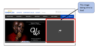

 Fig1 . State of home page getting loaded


Introduction
Cineplex is a popular
movie ticket booking website which is owned by Cineplex
Entertainment company headquartered at Toronto, Canada with official website as Cineplex.com. The company owns various theatres namely - Cineplex
Cinemas, Cineplex Odeon, SilverCity, Galaxy Cinemas, Cinema City, Famous
Players, Scotiabank Theatres and Cineplex VIP Cinemas. It also owns lot of restaurants
such as Poptopia, Outtakes and is a
joint partner with Scotiabank with respect to a loyalty program - Scene. Scene points are earned through different transactions (via debit or credit card). Cineplex provides lot of benefits to the customers, few among them are:
- Giving users the flexibility to book movie tickets through different payment modes (credit card, debit card, Scene points, etc.),
- Scene points accumulated could be used for booking movies, dining at Cineplex-owned restaurants at reasonable rates (either discounted or more often at free).
However, there are some
usability issues being observed in the website which could hamper the usability
by lot of customers. All these issues have been uncovered using either Heuristic
Evaluation (via Jakob
Neilson’s heuristics (1994) or Think Aloud usability testing.
Usability Issues & Improvements
1. Time taken while loading Home page is more than usual
Description
Whenever first
time users attempt to open the website: https://www.cineplex.com,
the home page

Suggested Improvements
- Lighter version of the site should be available with some basic options like “Quick Booking”
- The UI should be made in such a way that even a low internet bandwidth user can also book a ticket quickly
2. Users had to enter fields manually – location, movie, date
Description
While viewing show timing for movie “Captain Marvel” at particular date, users need to enter location (in “Enter a location” field) manually. Also, users are not able to enter or select movie in “All Movies” field. Even for the date, neither an option to enter manually or any sort of calendar shows up when users try entering date at which to view the movie timings. This issue violates heuristic #3 (Minimize memory load) and #2 (speak user’s language) as this way of entering the data (location, movie) is putting load on a user’s memory and he needs to memorize what values to enter. Even after typing the place, the suggestions are not getting displayed (figure 2).
 Fig 2. User entering values in fields in order to find
Showtimes
Fig 2. User entering values in fields in order to find
Showtimes
Suggested Improvements
While viewing show timing for movie “Captain Marvel” at particular date, users need to enter location (in “Enter a location” field) manually. Also, users are not able to enter or select movie in “All Movies” field. Even for the date, neither an option to enter manually or any sort of calendar shows up when users try entering date at which to view the movie timings. This issue violates heuristic #3 (Minimize memory load) and #2 (speak user’s language) as this way of entering the data (location, movie) is putting load on a user’s memory and he needs to memorize what values to enter. Even after typing the place, the suggestions are not getting displayed (figure 2).

Suggested Improvements
- To resolve such an issue, a drop-down menu option shall be triggered whenever users click on these edit text boxes (‘Enter a location’, All Movies’, and date).
- The menu option should be populated with list of options (different Cineplex theatres) for the users to choose from even for the users who are trying to book tickets from outside Canada.
- The site should be flexible enough to allow users from anywhere in the world to book tickets for theatres in Canada.
3. Site overcrowded with too much content and images
Description
The website seems
overcrowded with too much images and information and this makes the user
uncomfortable in navigating through the pages. This is depicted by figure 3.
the user might not feel like using the site just because it has too much
content and images. This is violating heuristic #1 (use simple and natural
language) and #3 (Minimise memory load).

Fig 3. Home page illustrating too much images and
content
Suggested
Improvements
- The UI design should be made simpler and sophisticated so as to attract more users to use this website and also not overwhelm them.
- The notifications given in yellow boxes should be placed in an appropriate position and incorporated with short and crisp information.
- There should not be long sentenced information that might overwhelm users.
4. No shortcut or back button to return to home page
Description
When the
users try to rent or buy movies online through the option – “RENT/BUY”
provided on the menu bar, they are redirected to a page shown in figure 4. At that
page, when the user try to go back to home page, he doesn't find any home/back
button. Even clicking on the logo of Cineplex encircled in the figure 4 doesn't bring the user to home page. This issue violates the heuristic #6 (Provide clearly
marked exits) since there is no way (proper exit) to return to the home page
from the Rent/buy page.

Fig 4. Rent/buy page where users rent or buy movies online
Suggested Improvements
- In order to resolve such an issue, two solutions could be
possible:
- There should have been a button
labelled “HOME” or “BACK” on the top right corner of every page (excluding home
page) that would redirect the user to the home page.
- The logo of Cineplex should serve as route to
home page once clicked on it. This strategy is missing in the rent/buy
page (unlike other pages).
- There should have been a button labelled “HOME” or “BACK” on the top right corner of every page (excluding home page) that would redirect the user to the home page.
- The logo of Cineplex should serve as route to home page once clicked on it. This strategy is missing in the rent/buy page (unlike other pages).
5. No proper
guidance provided
Description
While navigating
throughout the website, users might find trouble while entering values for location,
movie while viewing show timings or booking tickets for the movie for some
particular date. There is no help provided anywhere for user's reference. This
issues violates heuristic #10 (Provide adequate help and documentation).

Fig 5. A link (denoting help) could be placed at
location marked with green
Suggested
Improvements
- To improvise this issue, help option in terms of online documentation (frequently asked questions, or customer care support (contact number or email address) or sitemap must be provided on every page of the website.
- It should be placed on the menu bar with a distinct font and colour sos s to make it quite evident to users (as shown in figure 5).
Conclusion
Cineplex has been popularly used for booking tickets for movies across various Cineplex associated theatres across Canada. However, there have been some usability issues addressed in this blog with the help of either Heuristic Evaluation or Think Aloud usability testing. with each issue encountered, there have been recommendation(s) provided so as to improvise the system and make it more efficient to be used widely.
References
1. Lethbridge, Timothy: Deck F- Studying
user-interfaces, experiments, heuristics
evaluations, task analysis. http://www.site.uottawa.ca/~tcl/csi5122/coursenotes/. Last Accessed 3/26/2019.
2.
Wikipedia contributors: Cineplex Entertainment.
Last Accessed 3/26/2019.
No comments:
Post a Comment