Introduction
CTV is Canada's largest privately-owned network, and has
consistently placed as Canada's top-rated network in total viewers and in key
demographics since 2002 [Wikipedia]. However, the iPad’s application has some
usability problems affecting the performance and the review of it shows that
users are not satisfied with it (To download the CTV app for iPad: http://itunes.apple.com/ca/app/ctv/id461749483?ls=1&mt=8).
Therefore, I found some usability issues listed as below, and
some of them are really confusing and annoying. For most of the issues, I gave several
solutions to solve.
Social Screen
When users try to post or reply a message on a social screen,
they need to connect with the facebook or twitter first. The system
will automatically pop up a message box to inform users to login these two social
networking cites (Figure 1). There is only one button that users can click:
“OK”, which cannot lead users to login facebook or twitter directly. Moreover,
after tapping on “OK”, the system will jump out the social screen and lead the
user to a previous page (In the case of figure 2 shows, it jumps to the home
page) and lose all the information the user was browsing.

(Figure 1: Social screen feature and the message box requiring users login facebook or twitter first.)

(Figure 2:
The
system jump to home page after tapping on “OK”.)
Leave or Back?
An application should follow users’ custom and convention.
In CTV’s application, all the other pages use a “Back” button leading users to
a previous page except the social screen page (Figure 3). In social screen
page, the button which has the same function as “Back” is called “Leave” here.
This inconsistency throughout the interface may lead to
misunderstanding, especially for the novice. The meaning of “Back” is obvious:
back to the former page. As for the description “Leave”, where is it heading
after leaving could be vague.


(Figure 3:
Inconsistency
of the same function.)
The Use of Color
The CTV application uses different colors in the interface,
which emphasizes the main functions and features. In the schedule page, the shows
with red title can be clicked to browse detailed information, but not for the
ones with black title (Figure 4).
According to a research, the colored links can call users’
attention, and the links in big lists do not have to be underlined [J. Nielsen
2008]. However, the color of links used in schedule page is red, instead of the
typical blue. Besides, although underlining in big lists can decrease the
usability, the layout and the space of the show list are not crowded and
cluttered in the schedule page. Therefore, the lack of underline still makes
users confused - What is the purpose of the red title? Does it mean the show is
popular?
In the case of loose description layout, underlining really
helps users recognize actionable areas. However, since the underlined links are
not commonly used in iPad’s applications, a better solution here could be
adding a small icon or short tip (i.e., “see details”) to the click-able shows,
thereby distinguishing the actionable area and the common area.

(Figure 4: The shows with red and black titles.)
Edit the Favorite List
Providing a clear exit for jumping out from the current
process is one of the most basic heuristics that an application should have. However,
in CTV’s interface, users cannot find a proper button to exit the editing
process. For example, as the figure 5 shows, the interface of “edit” has two related
buttons: “Clear All” and “Edit”. Users can tap on the small red cross on the
left-up corner of a wanted show to delete it from the favorites list. So which
button should users tap on to finish or exit the edit?
In fact, without other choices, users will finally find out
that tapping on “Edit” again can finish the process. However, a good design
should never let users guess which
button for what. The description of the button should change along with the
system status – in this case, the description should become “Done” during the
editing process.

(Figure 5: The edit page with two buttons.)
Watch Videos On-line
The interface of watching on-line videos is quite similar
among different iPad’s applications (i.e., YouTube, TED, BBC News). The issues
of this kind of interface are common and obvious as well.
Firstly, users are quite familiar with double-click (double-tap)
on the video to switch to full screen mode. However, this input does not work
here – all you can do is to tap on a particular icon located at the right-down
corner.
Secondly, in the full screen mode, there are two progress
bars: one is on the top of the screen; one is almost at the bottom (Figure 6).
Normally, as we are familiar, the progress bar controlling time should be
located at the bottom of the video interface. However, when users try to
control the time by scrolling the progress bar at the bottom, they will find
out it is a volume bar. The real progress bar for time control is at the top,
which is much less obvious than the bottom one. The solution of this issue can
be high-lighting the time progress bar (e.g., using a bright color, extending
the bar size) or changing the position of two bars following the convention.
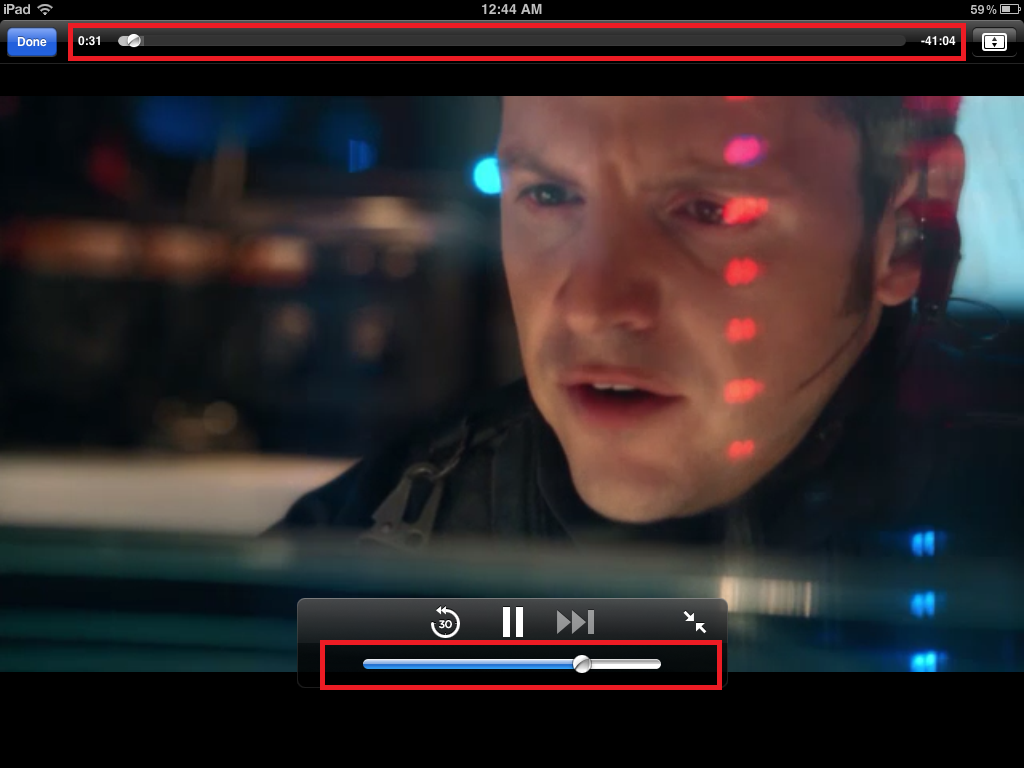
(Figure 6: Two progress bars in full screen mode.)
Conclusion
Whereas CTV is one of the most viewed channels in Canada, some
functions of its iPad’s application are not considerable, and some problems are
shared in other similar applications. In addition, as an on-line TV application,
it lacks sufficient information, for example: the details of cast, related news.
There are some users suggest that a link to other website for more information
should be provided (I.e., IMDb). However, the high consistency throughout the
application (i.e., color design, layout) still brings users not bad experiences
regardless of the limited number of shows.
References
[1] Wikipedia, CTV
Television Network,http://en.wikipedia.org/wiki/CTV_Television_Network
[2] J. Nielsen, Link List Color on Intranets, 2008, http://www.useit.com/alertbox/link-list-color.html
This comment has been removed by a blog administrator.
ReplyDeleteNice information...
ReplyDeleteThanks For Sharing...