Introduction
In this article, the University of Ottawa's Co-op Navigator is selected as the evaluated software. By using Nielsen's 1990 heuristics, all of the web pages related to the job searching feature in the Co-op Navigator are evaluated.During the evaluation, we found that Various heuristics such as "Provide shortcuts", "User simple and natural dialog" and "Be consistent" are violated. All the issues related to the job searching feature are carefully discussed and analyzed, and a conclusion for this evaluation is conducted in the end.
Description of the software evaluated
The University of Ottawa's Co-op Navigator is the most important website for uOttawas' Co-op students. |
| Figure 1: Co-op Navigator’s Front Page |
In this web application, students can do various operations, such as receiving Co-op admission, checking personal profile, building and viewing personal Co-op resume, searching Co-op jobs and ranking interviewed Co-op jobs.
In this evaluation, only those functions related to Co-op job searching are evaluated and discussed.
Usability Issues
1. Setting job searching conditions is difficult for users
By clicking the "Jobs - Job Postings" on the Co-op Navigator's navigation bar, users can enter the job searching page.
In the job searching page, some search criteria such as "Job Number," "Job Title," "Creation Date" are not only redundant for student users but also make first-time users feel confused. Obviously, “Use simple and natural dialogue" is not being followed.
What's more, the most important searching condition, "Program of studies" is put in a tiny text box, which makes students extremely hard to find their programs, because students have to scroll up and down in this tiny textbox to find their programs.
 |
| Figure2: Co-op Navigator Job Searching Page |
In the job searching page, some search criteria such as "Job Number," "Job Title," "Creation Date" are not only redundant for student users but also make first-time users feel confused. Obviously, “Use simple and natural dialogue" is not being followed.
 |
| Figure 3: Redundant Searching Criteria in the Job Detail Page |
What's more, the most important searching condition, "Program of studies" is put in a tiny text box, which makes students extremely hard to find their programs, because students have to scroll up and down in this tiny textbox to find their programs.
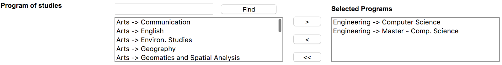 |
| Figure 4: Tiny textbox in the Job Detail Page |
Additionally, the searching conditions in "Select Columns" are also confusing: In default, all the conditions except for "Job Title" are marked with a check mark (✔). For first-time users, the searching results would be utterly confusing with the job posting information without job titles.
 |
| Figure 5: Select Columns in the Job Detail Page |
 |
Figure 6: "Job Title" in the Select Columns (default setting)
|
Suggested improvements to resolve the issue
1. Remove redundant job searching options.
2. Convert the text box of "Program of studies" to drop down bar or some other front-end components which could improve the user experience.
3. Set the "Job Title" in "Select Columns" marked with a check mark (✔) in default.
Additionally, unlike the previous page such as the job searching page, there is no “Apply” button at the bottom of the job details page, which also makes users confused.
Compared with those public commercial job-posting websites such as Indeed or Glassdoor, the Co-op Navigator is out-dated or even could be called a "legacy system." To improve the usability and user experience, designers could refer to the issues found in this report and those public job-posting websites to redesign the front-end of the Co-op Navigator.
2. Convert the text box of "Program of studies" to drop down bar or some other front-end components which could improve the user experience.
3. Set the "Job Title" in "Select Columns" marked with a check mark (✔) in default.
2. Job searching options have to be set every time
In the Job Searching Page. The Co-op Navigator does not save users’ previous searching conditions as default, and as a result, users have to do the cumbersome selecting searching conditions operations every time. “Provide shortcuts” is not being followed in the job searching page.
Suggested improvements to resolve the issue
1. Save users' previous searching conditions as default search criteria.
3. No visible notification for how to check job details in the job list page
After clicking the "Search" button at the bottom of the job searching page, the system will redirect to the job list page.
 |
| Figure 7: Job List Page |
In this page, students may not know that by clicking the hyperlinks of job number or job title in each row could redirect into the job details page. "Provide feedback" is not being followed.
 |
| Figure 8: Clickable hyperlinks in the job list |
Suggested improvements to resolve the issue
1. Make a visible notification for users: "Click the job number or the job title in each row for job details information."
2. Add a button “Details” at the end of each row in the job list.
4. No visible notification for how to sort the job list
In the job list page, users have no idea about how to use the sorting feature in the job list page. Only when they were told to click the various titles at the top of the job list, such as “Job No. ”, “City," "Organization" to sort the whole list did they realize the sorting feature does exist.
| Figure 9: Clickable titles in the job list |
Suggested improvements to resolve the issue
1. Make a public notification for users: "Click the job list’s titles to sort the list by different options.”
2. Add an independent soring feature (for example, a drop-down bar with different sorting options) at the top of the job list.
5. Inconsistent front-end display in the job details page
By clicking the job number or job title, the system will redirect into the job details page.
 |
| Figure 10: Job Details Page |
The front-end display of job details information in the job details page varied greatly between different information. For instance, "Job Number," "Job Title," "Organization" are displayed as pure text format, while "Job Status," "Number of positions," "Durations" are displayed in non-editable text inputs, and Job description is displayed in a text box." “Be consistent” is not being followed in the job details page.
 |
| Figure 11: Inconsistent display (1) |
 |
| Figure 12: Inconsistent display (2) |
 |
| Figure 13: Inconsistent display (3) |
 |
| Figure 14: Inconsistent display (4) |
Additionally, unlike the previous page such as the job searching page, there is no “Apply” button at the bottom of the job details page, which also makes users confused.
What’s more, the company address information is not in the “Basic info” sub-page but displayed in another independent sub-page called "Address." As a result, users do not know where the address information is.
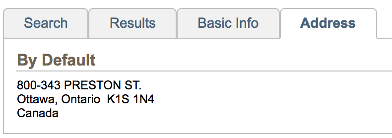 |
| Figure 15: Address Information |
Suggested improvements to resolve the issue
1. Convert the front-end display of job information from different formats to a unified format, such as pure text.
2. An "Apply" button should be added at the bottom of the page to keep consistency with the other parts of the system
3. Merge the address information into “Basic Info” and removing “Address” section.
6. No multiple-apply feature is provided for users
According to the University of Ottawa's Co-op Office, to make sure getting a Co-op job before the work term, a student should “apply for at least 50 or more jobs”. In the job list page, there is no multiple-apply feature, such as a checkbox at every row in the job list, so that student have to go into the job details page to apply for a single job. This defect greatly reduces the efficiency of the application work. Obviously, “Providing shortcuts” is not being followed in the job list page.
Suggested improvements to resolve the issue
1. Convert the front-end display of job information from different formats to a unified format, such as pure text.
2. An "Apply" button should be added at the bottom of the page to keep consistency with the other parts of the system
3. Merge the address information into “Basic Info” and removing “Address” section.
Conclusion
As the most critical web site for Co-op students at the University of Ottawa, the Co-op Navigator plays an essential role for students to find their Co-op jobs. However, those usability problems on the website inevitably reduce the user experience.
Compared with those public commercial job-posting websites such as Indeed or Glassdoor, the Co-op Navigator is out-dated or even could be called a "legacy system." To improve the usability and user experience, designers could refer to the issues found in this report and those public job-posting websites to redesign the front-end of the Co-op Navigator.
No comments:
Post a Comment